A heatmap as calendar
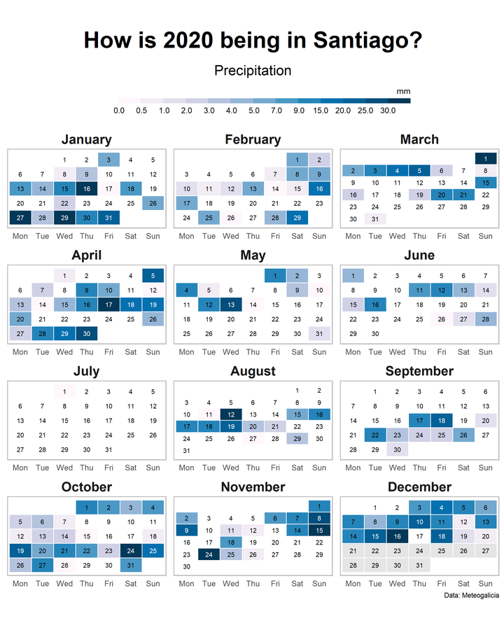
Recently I was looking for a visual representation to show the daily changes of temperature, precipitation and wind in an application xeo81.shinyapps.io/MeteoExtremosGalicia (in Spanish), which led me to use a heatmap in the form of a calendar. The shiny application is updated every four hours with new data showing calendars for each weather station. The heatmap as a calendar allows you to visualize any variable with a daily time reference.
Packages
In this post we will use the following packages:
| Package | Description |
|---|---|
| tidyverse | Collection of packages (visualization, manipulation): ggplot2, dplyr, purrr, etc. |
| lubridate | Easy manipulation of dates and times |
| ragg | ragg provides a set of high quality and high performance raster devices |
# instalamos los paquetes si hace falta
if(!require("tidyverse")) install.packages("tidyverse")
if(!require("ragg")) install.packages("ragg")
if(!require("lubridate")) install.packages("lubridate")

# paquetes
library(tidyverse)
library(lubridate)
library(ragg)
For those with less experience with tidyverse, I recommend the short introduction on this blog post.
Data
In this example we will use the daily precipitation of Santiago de Compostela for this year 2020 (until December 20) download.
# import the data
dat_pr <- read_csv("precipitation_santiago.csv")
dat_pr
## # A tibble: 355 x 2
## date pr
## <date> <dbl>
## 1 2020-01-01 0
## 2 2020-01-02 0
## 3 2020-01-03 5.4
## 4 2020-01-04 0
## 5 2020-01-05 0
## 6 2020-01-06 0
## 7 2020-01-07 0
## 8 2020-01-08 1
## 9 2020-01-09 3.8
## 10 2020-01-10 0
## # ... with 345 more rowsPreparation
In the first step we must 1) complement the time series from December 21 to December 31 with NA, 2) add the day of the week, the month, the week number and the day. Depending on whether we want each week to start on Sunday or Monday, we indicate it in the wday() function.
dat_pr <- dat_pr %>%
          complete(date = seq(ymd("2020-01-01"),
                              ymd("2020-12-31"),
                              "day")) %>%
          mutate(weekday = wday(date, label = T, week_start = 1),
                 month = month(date, label = T, abbr = F),
                 week = isoweek(date),
                 day = day(date))
In the next step we need to make a change in the week of the year, which is because in certain years there may be, for example, a few days at the end of the year as the first week of the following year. We also create two new columns. On the one hand, we categorize precipitation into 14 classes and on the other, we define a white text color for darker tones in the heatmap.
dat_pr <- mutate(dat_pr,
                 week = case_when(month == "December" & week == 1 ~ 53,
                                  month == "January" & week %in% 52:53 ~ 0,
                                  TRUE ~ week),
                 pcat = cut(pr, c(-1, 0, .5, 1:5, 7, 9, 15, 20, 25, 30, 300)),
                 text_col = ifelse(pcat %in% c("(15,20]", "(20,25]", "(25,30]", "(30,300]"),
                                   "white", "black"))

dat_pr
## # A tibble: 366 x 8
## date pr weekday month week day pcat text_col
## <date> <dbl> <ord> <ord> <dbl> <int> <fct> <chr>
## 1 2020-01-01 0 Wed January 1 1 (-1,0] black
## 2 2020-01-02 0 Thu January 1 2 (-1,0] black
## 3 2020-01-03 5.4 Fri January 1 3 (5,7] black
## 4 2020-01-04 0 Sat January 1 4 (-1,0] black
## 5 2020-01-05 0 Sun January 1 5 (-1,0] black
## 6 2020-01-06 0 Mon January 2 6 (-1,0] black
## 7 2020-01-07 0 Tue January 2 7 (-1,0] black
## 8 2020-01-08 1 Wed January 2 8 (0.5,1] black
## 9 2020-01-09 3.8 Thu January 2 9 (3,4] black
## 10 2020-01-10 0 Fri January 2 10 (-1,0] black
## # ... with 356 more rowsVisualization
First we create a color ramp from Brewer colors.
# color ramp
pubu <- RColorBrewer::brewer.pal(9, "PuBu")
col_p <- colorRampPalette(pubu)
Second, before building the chart, we define a custom theme as a function. To do this, we specify all the elements and their modifications with the help of the theme() function.
theme_calendar <- function(){

 theme(aspect.ratio = 1/2,

       axis.title = element_blank(),
       axis.ticks = element_blank(),
       axis.text.y = element_blank(),
       axis.text = element_text(family = "Montserrat"),

       panel.grid = element_blank(),
       panel.background = element_blank(),

       strip.background = element_blank(),
       strip.text = element_text(family = "Montserrat", face = "bold", size = 15),

       legend.position = "top",
       legend.text = element_text(family = "Montserrat", hjust = .5),
       legend.title = element_text(family = "Montserrat", size = 9, hjust = 1),

       plot.caption =  element_text(family = "Montserrat", hjust = 1, size = 8),
       panel.border = element_rect(colour = "grey", fill=NA, size=1),
       plot.title = element_text(family = "Montserrat", hjust = .5, size = 26,
                                 face = "bold",
                                 margin = margin(0,0,0.5,0, unit = "cm")),
       plot.subtitle = element_text(family = "Montserrat", hjust = .5, size = 16)
  )
}
Finally, we build the final chart using geom_tile() and specify the day of the week as the X axis and the week number as the Y axis. As you can see in the variable of the week number (-week), I change the sign so that the first day of each month is in the first row. With geom_text() we add the number of each day with its color according to what we defined previously. In guides we make the adjustments of the colorbar and in scale_fill/colour_manual() we define the corresponding colors. An important step is found in facet_wrap() where we specify the facets composition of each month. The facets should have free scales and the ideal would be a 4 x 3 facet distribution. It is possible to modify the position of the day number to another using the arguments nudge_* in geom_text() (eg bottom-right corner: nudge_x = .35, nudge_y = -.25).
    ggplot(dat_pr,
           aes(weekday, -week, fill = pcat)) +
      geom_tile(colour = "white", size = .4)  +
      geom_text(aes(label = day, colour = text_col), size = 2.5) +
      guides(fill = guide_colorsteps(barwidth = 25,
                                     barheight = .4,
                                    title.position = "top")) +
       scale_fill_manual(values = c("white", col_p(13)),
                         na.value = "grey90", drop = FALSE) +
       scale_colour_manual(values = c("black", "white"), guide = FALSE) +
       facet_wrap(~ month, nrow = 4, ncol = 3, scales = "free") +
       labs(title = "How is 2020 being in Santiago?",
             subtitle = "Precipitation",
             caption = "Data: Meteogalicia",
             fill = "mm") +
       theme_calendar()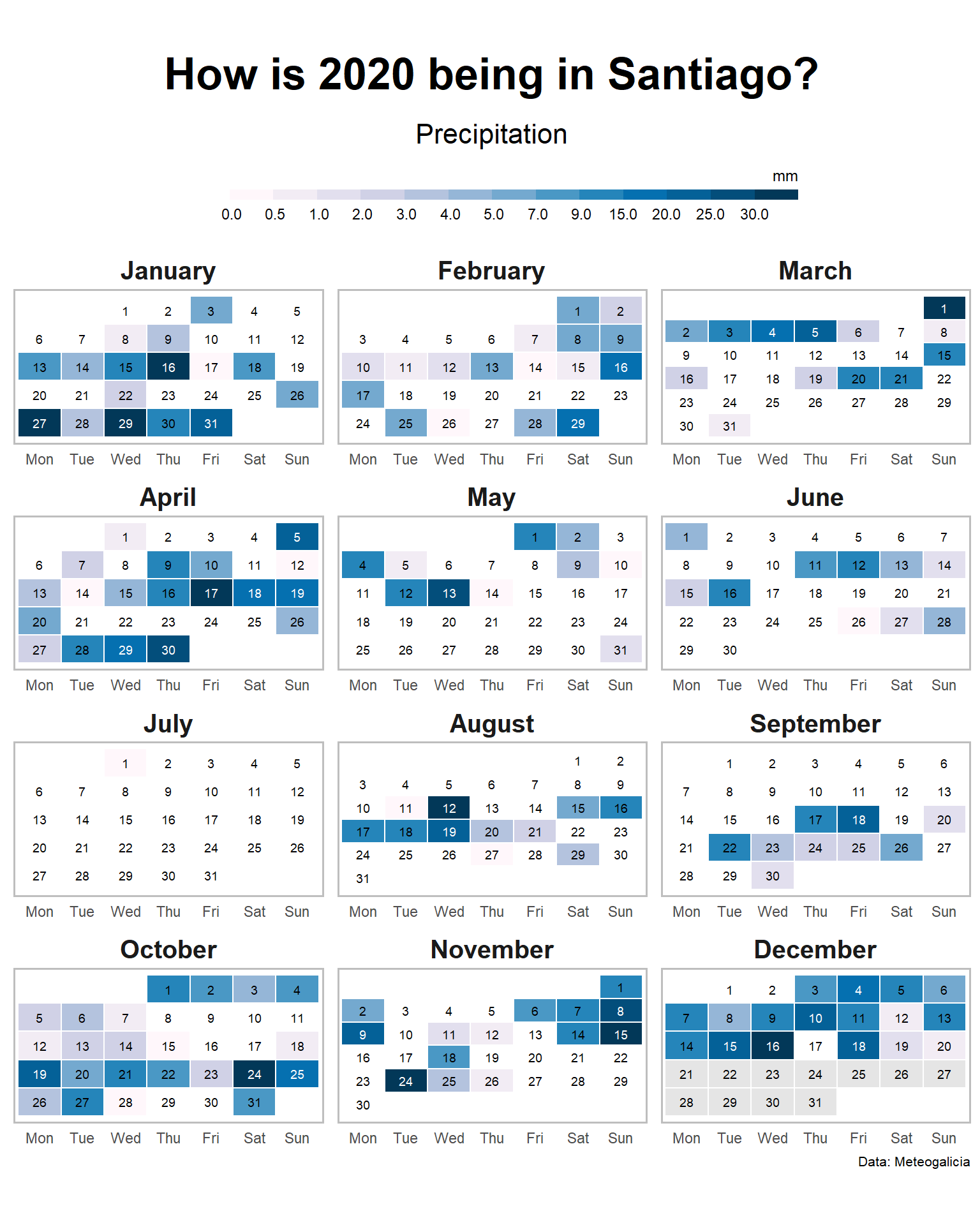
To export we will use the ragg package, which provides higher performance and quality than the standard raster devices provided by grDevices.
ggsave("pr_calendar.png", height = 10, width = 8, device = agg_png())In other heatmap calendars I have added the predominant wind direction of each day as an arrow using geom_arrow() from the metR package (it can be seen in the aforementioned application).
![]()