# install the packages if necessary

if (!require("tidyverse")) install.packages("tidyverse")
if (!require("ggh4x")) install.packages("ggh4x")
if (!require("ggdist")) install.packages("ggdist")
if (!require("ggbeeswarm")) install.packages("ggbeeswarm")
if (!require("ggtext")) install.packages("ggtext")
if (!require("climaemet")) install.packages("climaemet")
if (!require("geomtextpath")) install.packages("geomtextpath")
if (!require("ggrepel")) install.packages("ggrepel")

# packages

library(tidyverse)
library(ggh4x)
library(ggdist)
library(ggbeeswarm)
library(ggtext)
library(geomtextpath)
library(ggrepel)
library(MetBrewer)
library(climaemet)Broken Chart: discover 9 visualization alternatives
R
R:Intermediate
Visualization
Charts
Remake
Bad practice
Distribution
Temperature
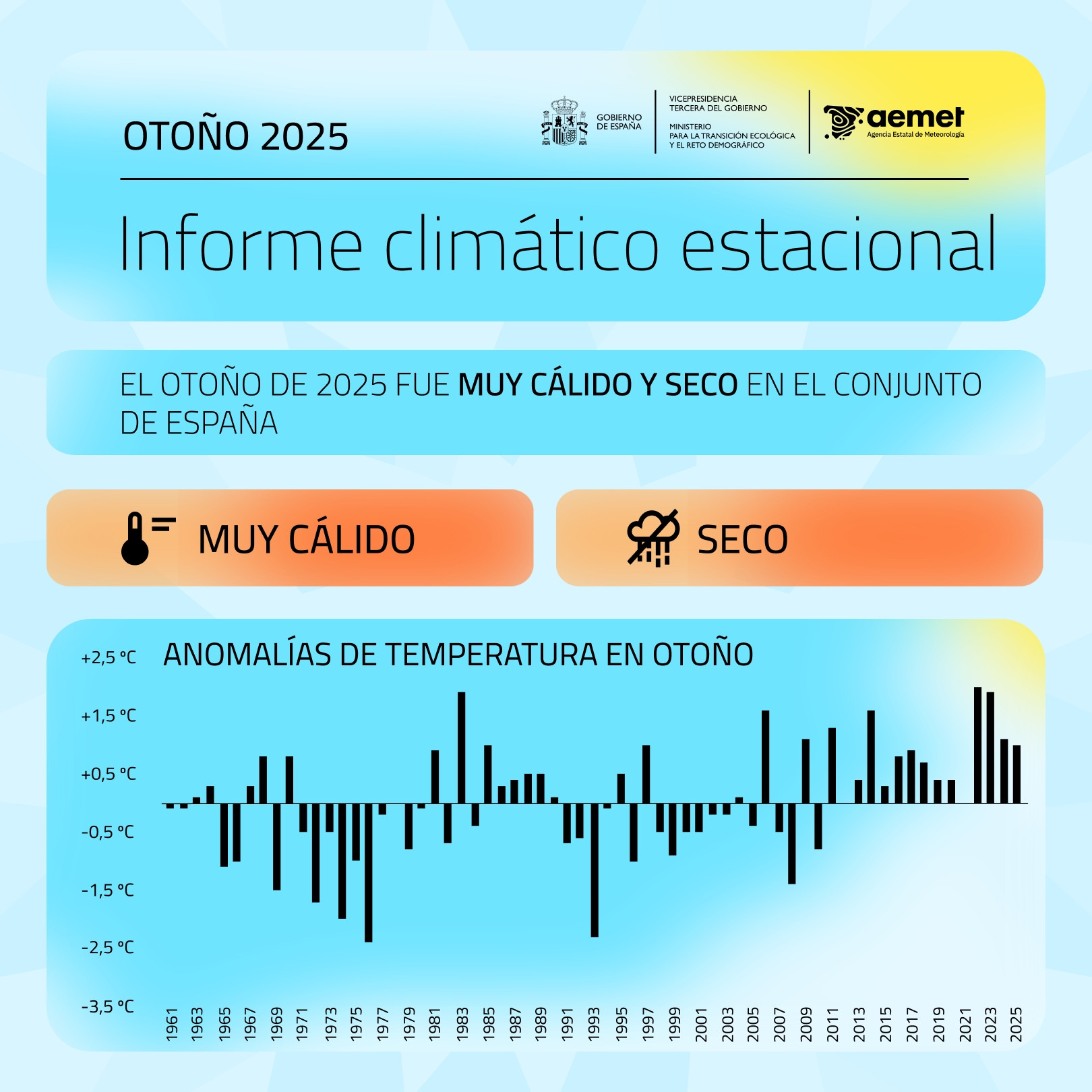
I’ve wanted to write a post for a while about a graph that the Spanish Ministry for Ecological Transition publishes every month, summarizing the average monthly temperature in Spain. If we look closely, there is a misuse of the geometry type to present the temperature variable. In this specific case, columns have always a baseline at 0. The issue here is that 0 in degrees Celsius doesn’t represent an absolute zero or a meaningful starting point for comparison of magnitudes.
Why column charts are inappropriate for temperature? Well, column charts are used to show magnitude, with height being the visual variable used for encoding, and the zero-baseline is essential. They are typically used for ratio scale or absolute quantity data (e.g., population, sales, frequency counts). The height of the column is directly proportional to the value, allowing for easy, accurate comparison of ratios (e.g., one bar being twice as tall means the value is twice as large). Temperature scales like Celsius (\(^{\circ}C\)) and Fahrenheit (\(^{\circ}F\)) are interval scales. The zero point is arbitrary (it doesn’t mean “no temperature” or “absence of heat”), and although the \(0^{\circ}C\) case is the freezing point, it is still inadequate. Furthermore, when using the zero-baseline for temperatures, the visual representation can be misleading, visually distorting the variability and difference between months and reducing it.
Moreover, there is a visual inconsistency when columns are used to display the temperature for a specific year (such as 2025) while lines are simultaneously employed to represent the temperature of previous years (such as 2024) or the normal reference period. This mixing of chart types for the same kind of data (temperature over time) hinders direct comparison and can confuse the reader about which magnitude is being emphasized. Additionally, this increases cognitive load, as the reader must first identify the midpoint of the line and then mentally compare its position with the height of the column, adding an extra step and reducing the clarity of the message.
So, what alternatives can we propose? Let’s not forget that our visualization is conditioned by its objective and also by the audience.
Packages
| Package | Description |
|---|---|
| tidyverse | Collection of packages (visualization, manipulation): ggplot2, dplyr, purrr, etc. |
| ggh4x | a flexible extension for ggplot2 that provides advanced and less common graphic components |
| climaemet | a specialized tool that simplifies the download, cleaning, and preparation of meteorological and climate data directly from the Spanish State Meteorological Agency (AEMET) |
| ggdist | an extension for ggplot2 specialized in visualizing distributions and uncertainty using tidy data principles |
| ggbeeswarm | provides quasirandom and beeswarm plots for ggplot2 |
| ggtext | improved text rendering support for ggplot2 |
| geomtextpath | an extension of the ggplot2 package, designed to simplify the process of adding text in charts, especially when you need the text to follow a curved path |
| ggrepel | provides geoms for ggplot2 to repel overlapping text labels |
| MetBrewer | provides color palettes based on objects from the Metropolitan Museum of Art in New York |
Data
In this post, we will use the monthly average temperature for Spain derived from 42 reference weather stations. These stations are no longer used by AEMET for calculating the national temperature, as the agency now relies on gridded datasets which are not publicly available.
We can download and access data from the Spanish AEMET API using the climaemet package. Anyone who wants to perform this step will find all the details in the following code chunk. In any case, I have prepared the data to make it easier (download), see the following code chunk for the API use.
Code
## API key
aemet_api_key() # get it from https://opendata.aemet.es/centrodedescargas/inicio

# stations IDs
stats <- c(
  "0076", "0367", "1024E", "1082", "1109", "1249I", "1387", "1484C",
  "1690A", "2030", "2331", "2462", "2539", "2614", "2661", "2867",
  "3013", "3195", "3260B", "3469A", "4121", "4452", "4642E", "5270B",
  "5402", "5514", "5783", "6155A", "6325O", "7031", "8025", "8175",
  "8368U", "8416", "9170", "9263D", "9434", "9771C", "9981A", "B228",
  "B893", "B954"
)

# you should use the following robust function from github issue
# https://github.com/rOpenSpain/climaemet/issues/74#issuecomment-3172675722

data_daily <- robust_climate_download(stats, start_date = "1971-01-01", end_date = today())

# clean up
data_daily <- select(data_daily, date = fecha, id = indicativo, tmed, tmin, tmax) |>
  mutate(date = ymd(date), across(tmed:tmax, parse_number))
First, we load the prepared dataset and compute the monthly average temperature across all stations. Next, we calculate the climatological normals for the reference periods 1971–2000 and 1991–2020. Finally, we add additional columns for the month and label to complete the data preparation.
Code
# load station data
load("aemet_refstations.RData")

# add year-month column and calculate average temperature by month-year
tmed_esp <- mutate(data_daily, yrmo = floor_date(date, "month")) |>
  select(yrmo, tmed) |>
  group_by(yrmo) |>
  summarise(tmed = mean(tmed, na.rm = T))


# normal reference for each month 1971-2000 and 1991-2020
norm_p1 <- filter(tmed_esp, year(yrmo) %in% 1971:2000) |>
  group_by(mo = month(yrmo)) |>
  summarise(
    tmed_norm = mean(tmed)
  ) |>
  mutate(period = "1971-2000")

norm_p2 <- filter(tmed_esp, year(yrmo) %in% 1991:2020) |>
  group_by(mo = month(yrmo)) |>
  summarise(
    tmed_norm = mean(tmed)
    ) |>
  mutate(period = "1991-2020")

# main dataset with month label
tmed_esp <- mutate(tmed_esp,
  mo = month(yrmo),
  mo_lab = month(yrmo, label = T)
)
TipWhat is a “normal period” and why does it matter?
According to the World Meteorological Organization (WMO), a climatological normal is the average of a meteorological variable (such as temperature or precipitation) calculated over a 30-year period. These periods provide a consistent reference for comparing current conditions with long-term climate patterns. For instance, the actual normal is 1991–2020 (previously 1981–2010).
The WMO recommends using 1961–1990 when possible for illustrating climate change, because it represents a baseline before the most significant warming trends began. This makes it easier to show how much the climate has shifted. However, national meteorological services usually adopt the most recent normal period (e.g., 1991–2020) to describe the current climate, as this is more relevant for operational forecasting and public information.
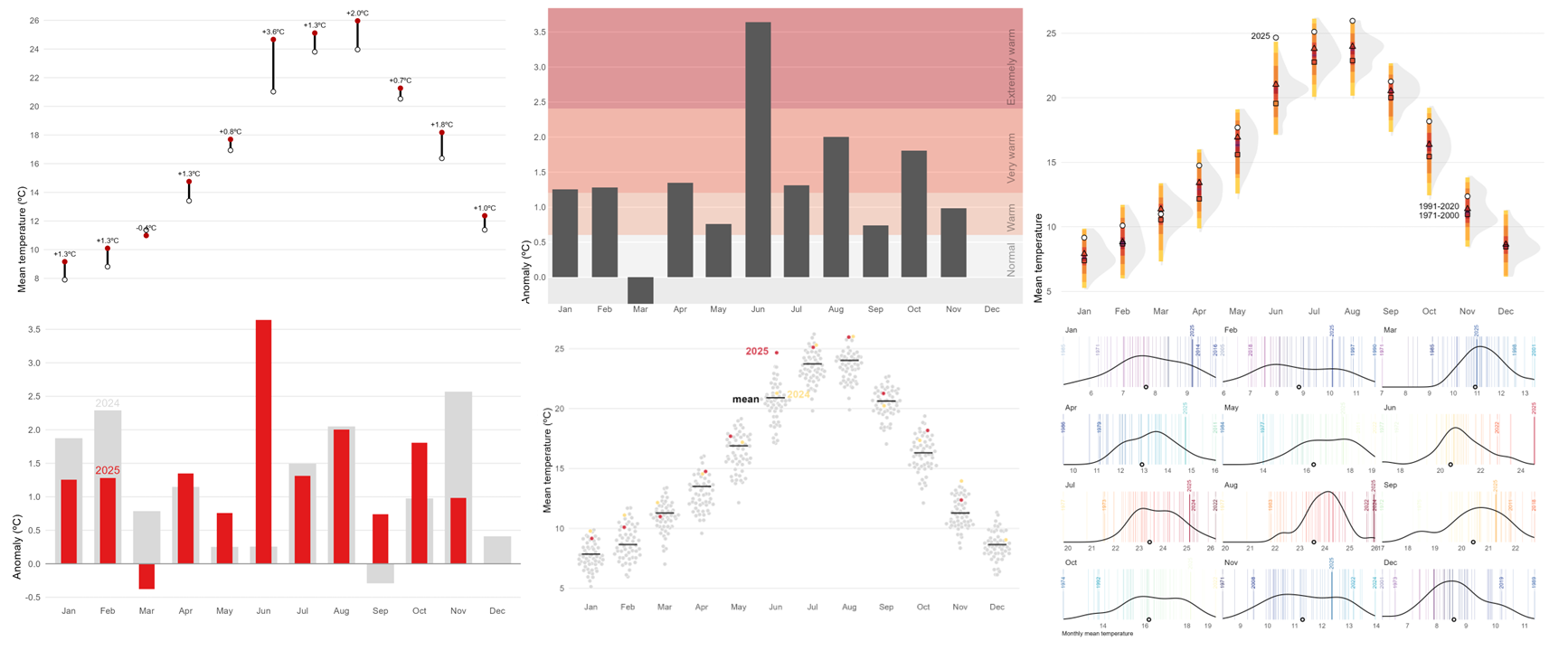
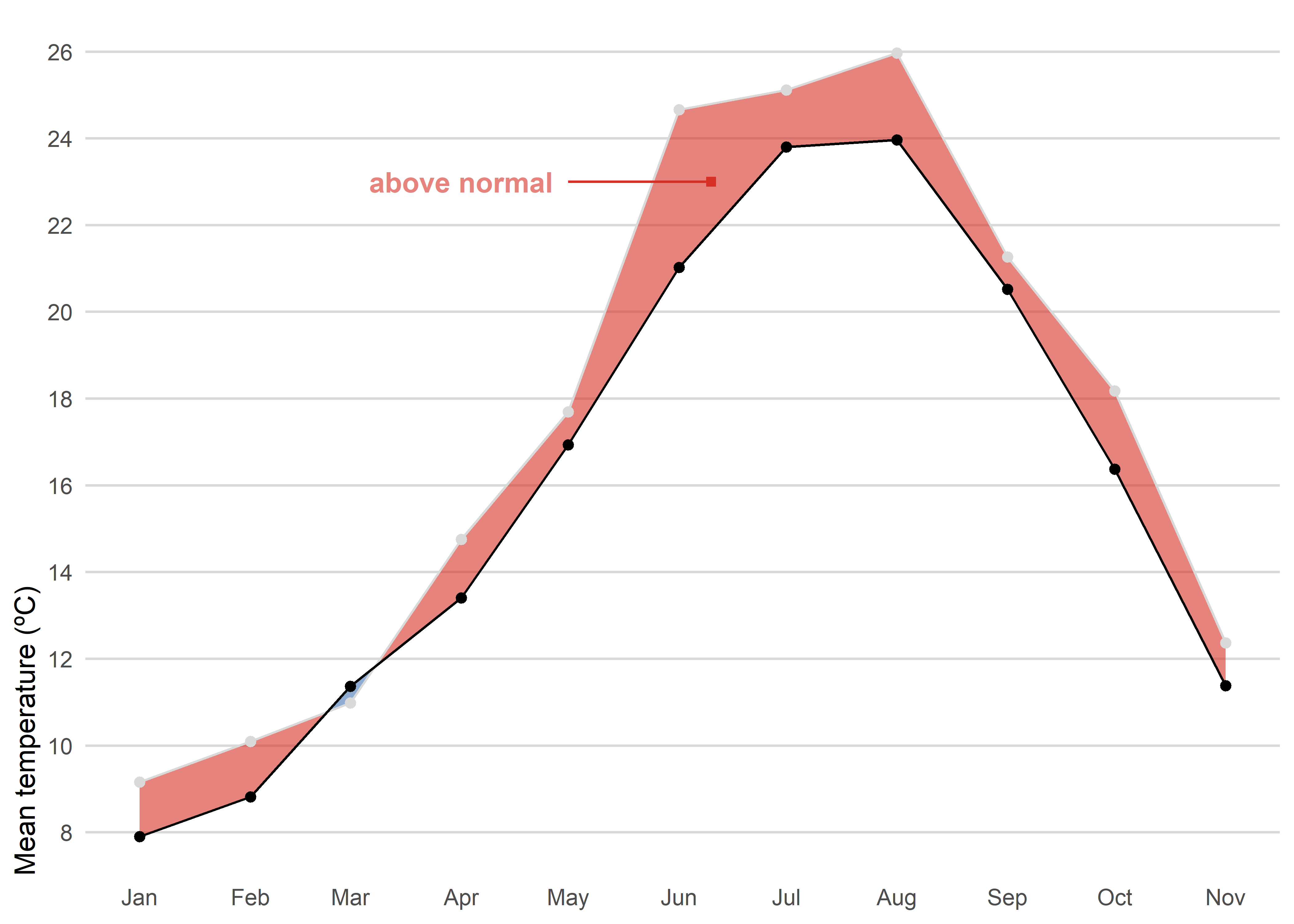
Option Set 1
The first option is straightforward. We use a simple line chart combined with a colored shaded area between the 2025 observations and the recent normal period to highlight the observed anomaly (blue for negative anomalies or red for positive anomalies). Unlike column charts, a line chart does not require a baseline at zero, which allows us to better appreciate the actual magnitude of the difference.
Code
left_join(tmed_esp, norm_p2, by = "mo") |> # join with reference period
filter(year(yrmo) == 2025) |> # only 2025
  ggplot(aes(yrmo, tmed)) +
  stat_difference(aes(ymin = tmed_norm, ymax = tmed),
    alpha = 0.6,
    levels = c("above normal", "below normal"),
    show.legend = F,
  ) +
  #geom_line(colour = "grey85") +
  geom_point(fill = "white", shape = 21, stroke = .3) +
  geom_line(aes(y = tmed_norm)) +
  geom_point(aes(y = tmed_norm)) +
  annotate("text",
           label = "above normal",
           x = ymd("2025-04-01"),
           y = 23,
           color = "#d73027",
           alpha = .6,
           fontface = "bold") +
  annotate("segment",
           x = ymd("2025-05-01"),
           y = 23,
           xend = ymd("2025-06-10"),
           colour = "#d73027") +
  annotate("point",
           x = ymd("2025-06-10"),
           y = 23,
           shape = 15,
           colour = "#d73027") +
  scale_x_date(date_breaks = "month", date_labels = "%b") +
  scale_y_continuous(breaks = seq(8, 30, 2), expand = expansion(c(0.05, .05))) +
  scale_fill_manual(values = c("#d73027", "#4575b4"), drop = F) +
  labs(x = NULL, y = "Mean temperature (ºC)", fill = NULL) +
  theme_minimal() +
  theme(
    panel.grid.minor = element_blank(),
    axis.ticks = element_blank(),
    axis.title.y = element_text(hjust = 0),
    panel.grid.major.x = element_blank(),
    panel.grid.major = element_line(colour = "grey85"),
    legend.position = "bottom",
    legend.justification = 0,
    legend.key.height = unit(.5, "lines"),
  )
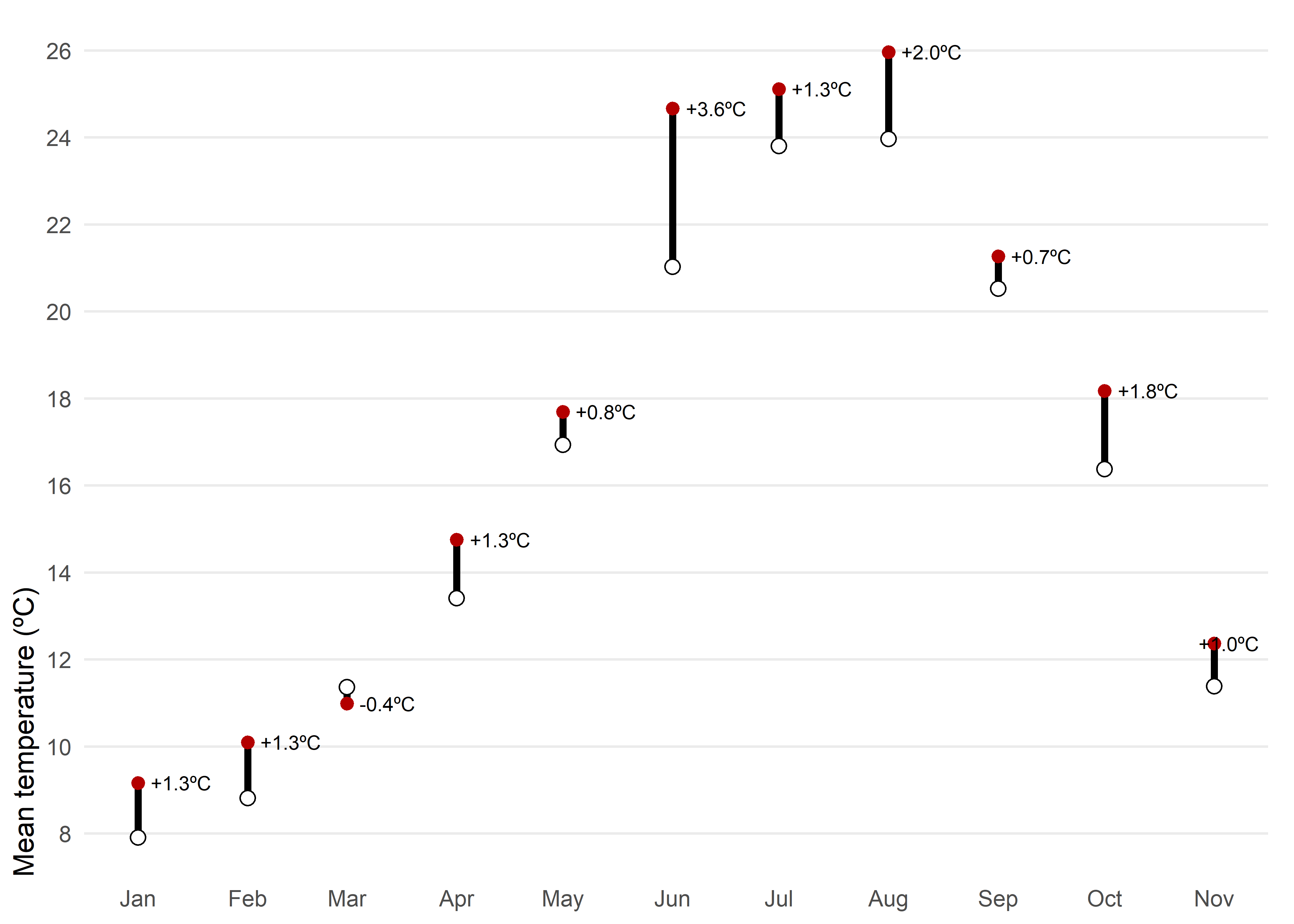
Another posibility would be a dumbbell chart. For each month of 2025, the chart shows observed mean temperature (red) against the climatological normal (white), connected by a vertical segment. A dumbbell chart is essentially a way to show the difference between two values for the same category, connected by a line. The label above each point reports the anomaly, allowing quick identification of warmer or cooler months and the magnitude of the difference.
Code
left_join(tmed_esp, norm_p2, by = "mo") |>
filter(year(yrmo) == 2025) |> # filter only 2025
mutate(anom = tmed - tmed_norm) |>
  ggplot(aes(yrmo, tmed)) +
  geom_segment(aes(y = tmed_norm, yend = tmed), linewidth = 1.3) +
  geom_point(colour = "#b30000", size = 2) +
  geom_point(aes(y = tmed_norm), shape = 21, fill = "white", size = 2.5) +
  geom_text_repel(aes(label = scales::number(anom, accuracy = 0.1,
                                       suffix = "ºC",
                                       style_positive = "plus"),
                      y = tmed),
                   direction = "x",
                   nudge_x = 0.05,
                  seed = 12345,
            size = 2.7, hjust = .5) +
  scale_x_date(date_breaks = "month", date_labels = "%b") +
  scale_y_continuous(breaks = seq(8, 30, 2), expand = expansion(c(0.05, .05))) +
  labs(x = NULL, y = "Mean temperature (ºC)") +
  theme_minimal() +
  theme(
    panel.grid.minor = element_blank(),
    axis.ticks = element_blank(),
    axis.title.y = element_text(hjust = 0),
    panel.grid.major.x = element_blank(),
    plot.margin = margin(5, 10, 5, 5)
  )
A line chart or a dumbbell chart are both very effective options for comparing observed mean temperature with the climatological normal because they are simple and easy to interpret. However, this simplicity comes at the cost of losing important context. These charts do not show intra-month variability, extremes, or uncertainty in the data. They are highly accessible even for non-technical audiences.
Option Set 2
Instead of using absolut values, we can summarize monthly temperature for Spain in 2025 relative to the recent normal. Background bands mark severity thresholds at 0.5σ, 1σ, and 2σ (σ: standard deviation), computed from 1991–2020 anomalies, while bars show the actual anomaly for each month. Centering the scale at zero makes it straightforward to judge both the sign and the magnitude of departures from normal. In this case, however, using bars is appropriate because the anomalies are centered around a clear reference point at zero.
Code
# standard deviation for the whole year
std_7120 <- filter(tmed_esp,
                   between(year(yrmo), 1991, 2020)) |>
            left_join(norm_p1, by = "mo") |>
            summarise(std = sd(tmed - tmed_norm, na.rm = TRUE)) |>
            pull(std)

# anomaly plot
left_join(tmed_esp, norm_p2, by = "mo") |>
  filter(year(yrmo) == 2025) |> # filter only current year
  mutate(anom = tmed - tmed_norm) |> # anomaly
ggplot(aes(yrmo, anom)) +
  annotate("rect",
    xmin = -Inf, ymin = c(0, std_7120 * .5, std_7120, std_7120 * 2),
    xmax = Inf, ymax = c(std_7120 * .5, std_7120, std_7120 * 2, Inf),
    fill = c("white", "#fcae91", "#fb6a4a", "#cb181d"),
    alpha = .4
  ) +
  annotate("text",
    x = ymd("2025-12-01"),
    y = c(0, .85, 1.7, 3.2),
    angle = 90,
    vjust = 3,
    label = c("Normal", "Warm", "Very warm", "Extremely warm"),
    alpha = .8, color = "white"
  ) +
  geom_col(width = 20) +
  scale_x_date(date_breaks = "month", date_labels = "%b", expand = expansion(c(.01, .07))) +
  scale_y_continuous(breaks = seq(0, 5, .5), expand = expansion(c(0, .05)),
                     limits = c(-std_7120 * .5, NA)) +
  labs(x = NULL, y = "Anomaly (ºC)") +
  theme(
    panel.grid.minor = element_blank(),
    axis.ticks = element_blank(),
    axis.title.y = element_text(hjust = 0),
    panel.grid.major.x = element_blank(),
    panel.grid.major = element_line(colour = "white")
  )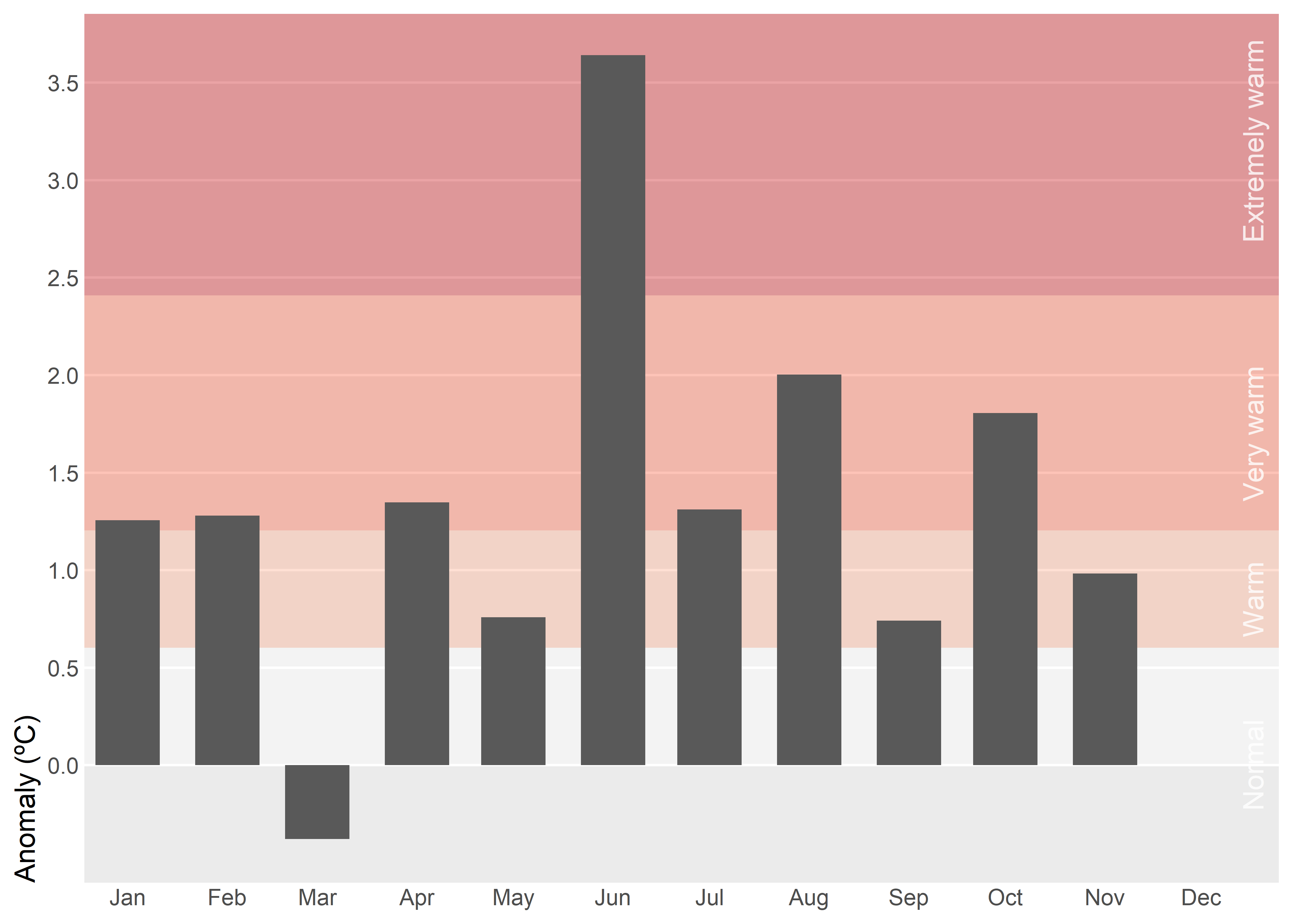
Tip
Monthly standard deviation (σ) varies greatly, so using month-specific thresholds would make the same anomaly appear “extreme” in winter but only “warm” in summer, which is confusing in a single annual chart. A single annual σ provides a consistent scale and makes comparisons across months clear.
Important
3D effects in column charts distort perception by shifting comparisons from aligned position/length to noisier cues like area, volume, perspective foreshortening, and occlusion, making identical values look unequal. They add cognitive load and visual clutter (shading, skewed labels, depth) without adding information, harming accuracy, speed, and accessibility.
Another variant would be to select a single month — for instance, July — and show its entire historical time series instead of just the current year. This approach adds much more context because it allows the reader to compare the current value with previous years, identify long-term trends, and clearly see the effect of climate change over time. It shifts the focus from a snapshot comparison to a broader perspective, making anomalies more meaningful by placing them within a historical trajectory.
Code
# standard deviation for reference period
std_7120_jul <- filter(tmed_esp, between(year(yrmo), 1991, 2020), mo == 7) |>
                 left_join(norm_p2, by = "mo") |>
                    summarise(std = sd(tmed - tmed_norm, na.rm = T)) |>
                pull(std)

left_join(tmed_esp, norm_p1, by = "mo") |>
filter(mo_lab == "Jul") |>  # select July
mutate(anom = tmed - tmed_norm) |>  # anomaly
  ggplot(aes(yrmo, anom)) +
  annotate("rect",
    xmin = -Inf, ymin = c(0, std_7120_jul * .5, std_7120_jul, std_7120_jul * 2),
    xmax = Inf, ymax = c(std_7120_jul * .5, std_7120_jul, std_7120_jul * 2, Inf),
    fill = c("white", "#fcae91", "#fb6a4a", "#cb181d"),
    alpha = .4
  ) +
  annotate("rect",
    xmin = -Inf, ymin = c(0, std_7120_jul * .5, std_7120_jul, std_7120_jul * 2) * -1,
    xmax = Inf, ymax = c(std_7120_jul * .5, std_7120_jul, std_7120_jul * 2, Inf) * -1,
    fill = c("white", "#bdd7e7", "#6baed6", "#2171b5"),
    alpha = .4
  ) +
  geom_col() +
  annotate("text",
    x = ymd(c("1975-04-10", "1973-10-10", "1972-01-20",
              "1972-09-20", "1972-04-20", "1973-10-10", "1975-06-10")),
    y = c(-3.2, -1.8,-.8, 0.2, .8, 1.8, 5.2),
    label = c("Extremely Cold", "Very Cold", "Cold",
              "Normal", "Warm", "Very warm", "Extremely warm"),
    alpha = .6, color = "white"
  ) +
  geom_hline(yintercept = 0) +
  scale_x_date(date_breaks = "5 year",
               date_labels = "%Y",
               expand = expansion(c(.01, .01))) +
  scale_y_continuous(breaks = seq(-5, 5, 1),
                     expand = expansion(c(.05, .05))) +
  labs(x = NULL, y = "Anomaly (ºC)") +
  coord_cartesian(clip = "off") +
  theme(
    panel.grid.minor = element_blank(),
    axis.ticks = element_blank(),
    axis.title.y = element_text(hjust = 0),
    panel.grid.major.x = element_blank(),
    panel.grid.major = element_line(colour = "white"),
    plot.margin = margin(5, 5, 5, 5)
  )
Important
Keep axis labels horizontal because they’re faster to scan, reduce cognitive load, and maintain a consistent baseline that improves legibility and accessibility compared with rotated or stacked labels. In time series charts, avoid labeling every data point since dense annotations create visual noise and obscure the signal; instead rely on clear axis ticks and date formatting, and add labels only at meaningful milestones—peaks, troughs, regime shifts, or events.
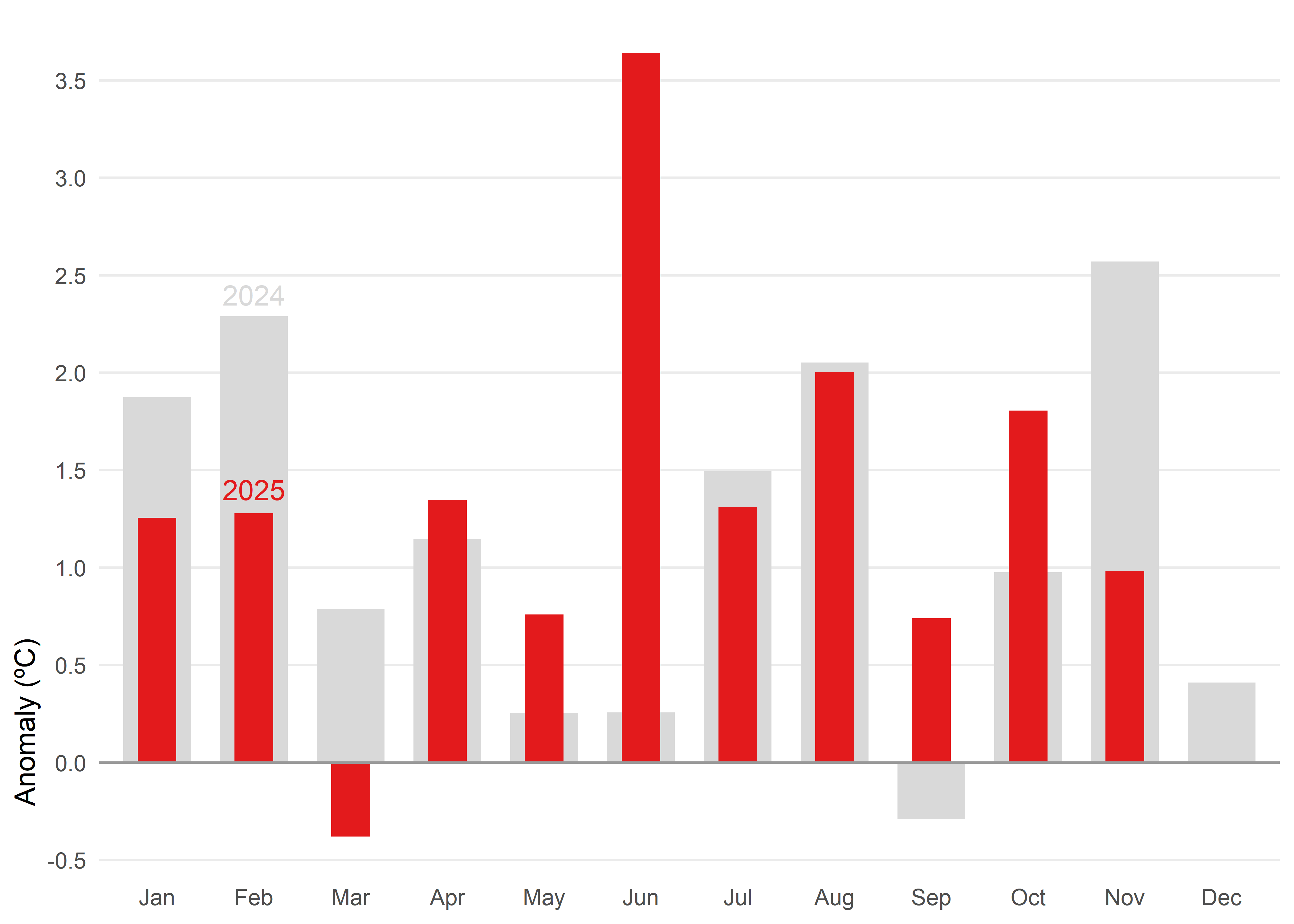
When you need to compare two values side by side and keep a reference in view, another alternative would be a bullet chart. In this case, they give us a snapshot of how 2025 anomalies stack up against 2024.
Code
# data prepation
df_anom <- tmed_esp |>
  left_join(norm_p2, by = "mo") |>
  mutate(
    anom = tmed - tmed_norm,
    yr   = year(yrmo)
  ) |>
  filter(yr %in% 2024:2025) |>
  select(yr, mo_lab, anom, tmed_norm) |>
  pivot_wider(
    names_from   = yr,
    values_from  = anom,
    names_glue   = "yr{yr}"
  )

# bullet chart
ggplot(df_anom) +
  geom_col(aes(x = mo_lab, y = yr2024), fill = "grey85", width = 0.7) +
  geom_col(aes(x = mo_lab, y = yr2025), fill = "#e31a1c", width = 0.4) +
  geom_hline(yintercept = 0, color = "grey60", linewidth = 0.5) +
  annotate("text", label= c("2025", "2024"),
           x = "Feb", y = c(1.4, 2.4),
           colour = c("#e31a1c", "grey85")) +
  scale_y_continuous(breaks = seq(-4, 4, 0.5)) +
  labs(x = NULL, y = "Anomaly (ºC)") +
  theme_minimal() +
  theme(
    panel.grid.minor = element_blank(),
    panel.grid.major.x = element_blank(),
    axis.title.y = element_text(hjust = 0.1)
  )
If we want to display anomalies in their intra-annual context across the entire time range, a heatmap is an effective choice. This type of visualization allows us to represent anomalies by month and year, using color intensity to indicate the magnitude of deviation from the climatological normal. By organizing the data in a grid where rows correspond to years and columns to months, the heatmap provides an immediate overview of seasonal patterns, long-term variability, and extreme events. It also makes it possible to identify trends over time and understand the recent climate context in relation to historical conditions. Importantly, the goal here is not to decode exact numerical values, but rather to reveal trends and patterns in a clear and intuitive way.
Code
tmed_esp |>
  left_join(norm_p1, by = "mo") |>
  mutate(
    anom = tmed - tmed_norm,
    anom = case_when(anom > 3.5 ~ 3.5,
                     anom < -3.5 ~ -3.5,
                     TRUE ~ anom),
    yr   = year(yrmo)
  ) |>
ggplot(aes(mo_lab, yr, fill = anom)) +
  geom_tile(colour = "white") +
  scale_fill_gradientn(colors = rev(RColorBrewer::brewer.pal(9, "RdBu")),
                       breaks = seq(-3, 3, 1)) +
  scale_y_continuous(breaks = seq(1970, 2025, 5)) +
  labs(x = NULL, y = NULL, fill = "Anomaly (ºC)") +
  coord_cartesian(expand = FALSE) +
  theme_minimal() +
  theme(panel.grid = element_blank(),
        legend.position = "bottom",
        legend.key.width = unit(2.5, "line"),
        legend.key.height = unit(.4, "line"),
        legend.title.position = "top",
        legend.justification = 0,
        plot.margin = margin(10, 10, 10, 10))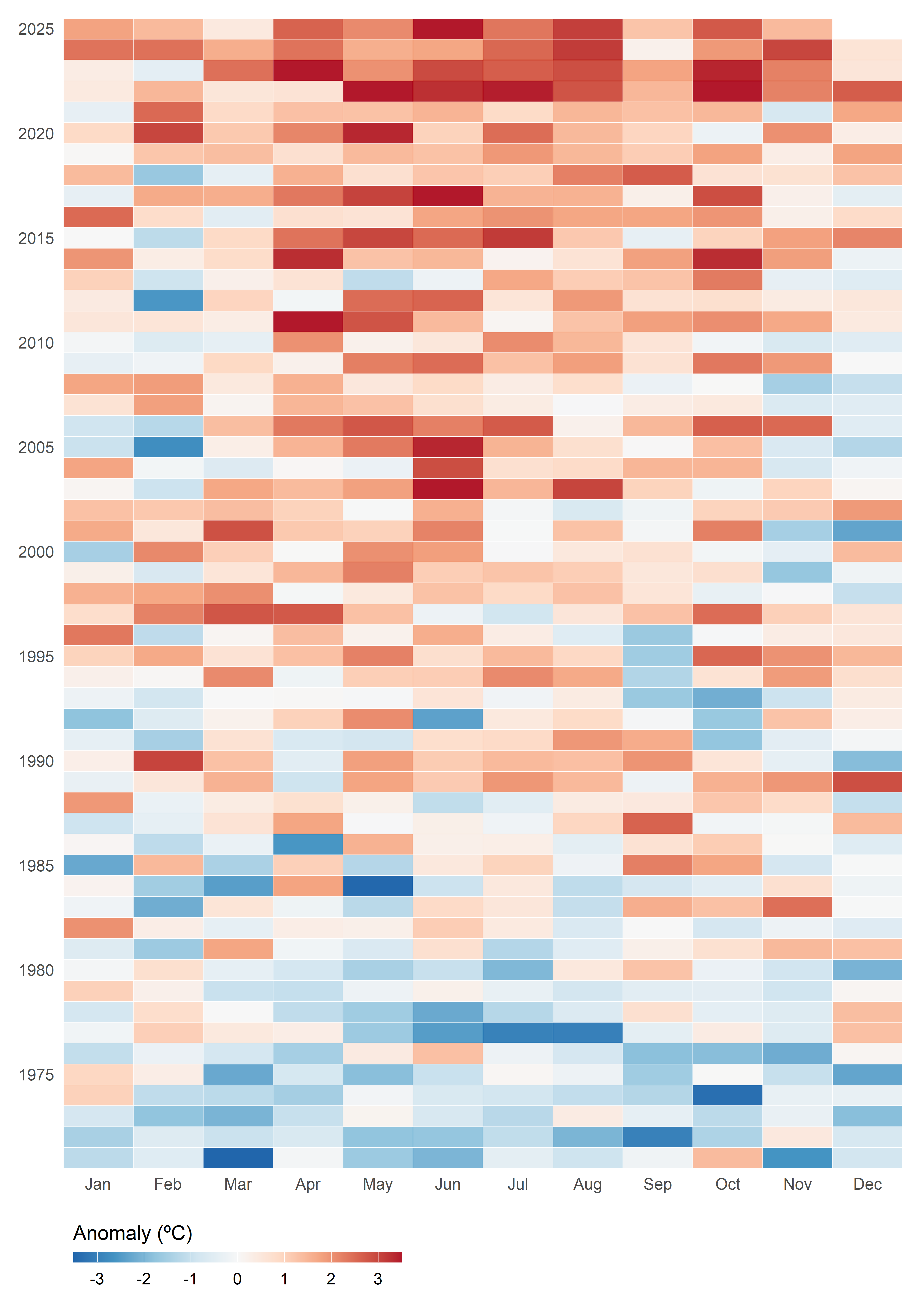
Option Set 3
Instead of focusing on individual values as in column charts, the following charts shifts the perspective toward distributions—revealing patterns, variability, and extremes that single numbers can’t capture.
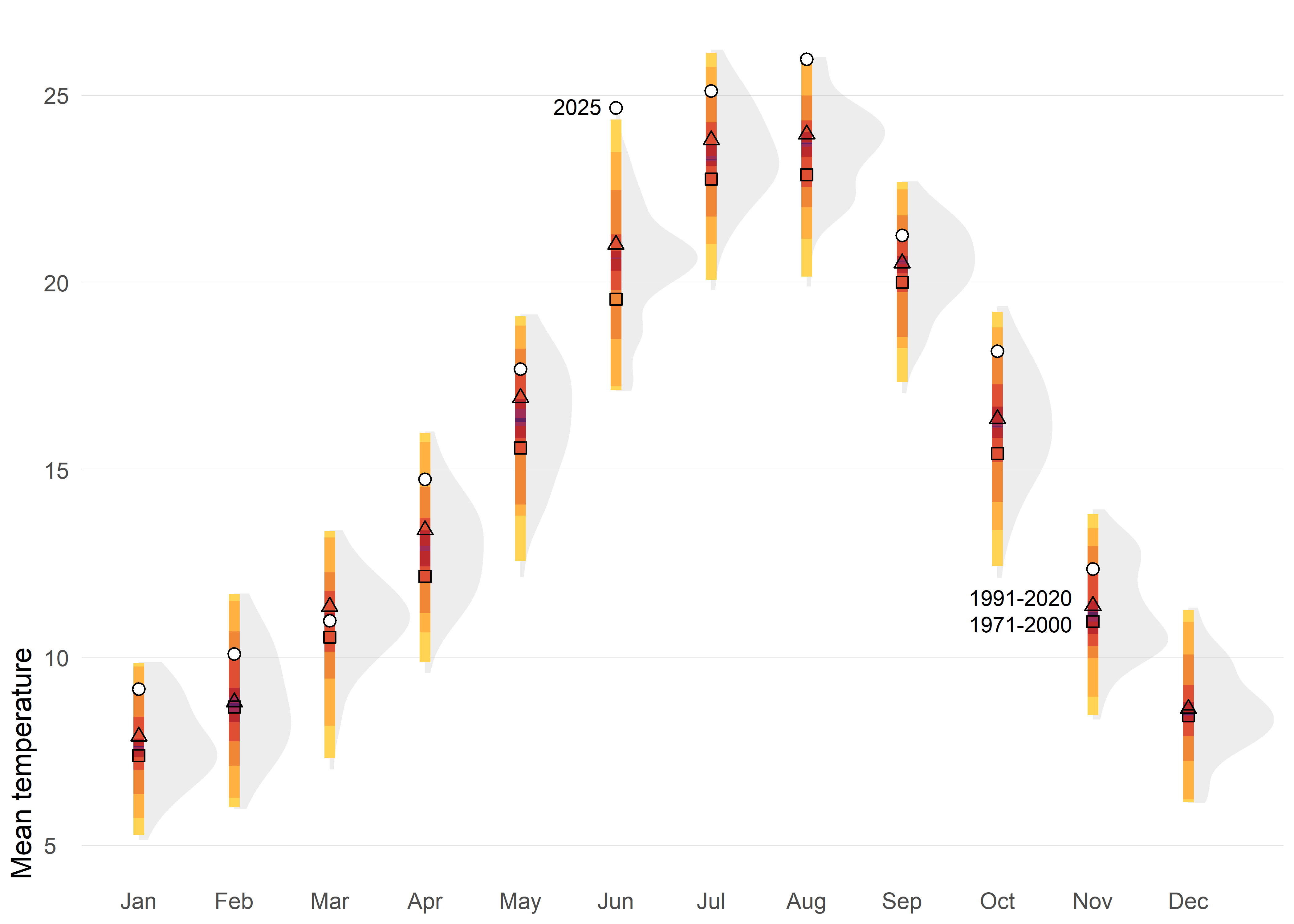
The first option displays the historical distribution of monthly air temperatures using shaded shapes (density function) that represent how frequently different values occur: wider sections indicate common temperatures, while narrower parts show extremes. Over these distributions, percentile-based colored intervals (such as 50%, 80%, 95%, and 99%) are added to highlight typical ranges and rare conditions. Reference points for two climatological normals (1971–2000 and 1991–2020) are included, along with markers for the year 2025, making it easy to compare current observations against historical variability and standard benchmarks.
This approach provides a richer picture of climate variability by showing not only averages but also the full spread and frequency of values. Percentile intervals make it easy to distinguish typical conditions from extremes, while integrating distributions, reference normals, and current observations.
Code
ggplot(tmed_esp, aes(mo_lab, tmed)) +
  stat_slab(fill_type = "segments", alpha = 0.2) +
  stat_interval(.width = c(0.01, 0.05, 0.2, 0.5, 0.8, 0.95, .99), size = 2) +
  geom_point(
    data = bind_rows(norm_p1, norm_p2) |>
                    mutate(mo = factor(month(mo), 1:12, month.abb)),
    aes(mo, tmed_norm, shape = period),
    size = 1.8,
    show.legend = F
  ) +
  geom_point(
    data = filter(tmed_esp, year(yrmo) == 2025),
    shape = 21, fill = "white", size = 2
  ) +
  annotate("text",
    x = "Jun", y = 24.7,
    size = 3, hjust = 1.3,
    label = "2025"
  ) +
  annotate("text",
    x = "Nov", y = c(10.9, 11.6),
    size = 3, hjust = 1.2,
    label = c("1971-2000", "1991-2020")
  ) +
  scale_shape_manual(values = c(0, 2)) +
  scale_y_continuous(breaks = c(0, 5, 10, 15, 20, 25)) +
  scale_color_manual(
    values = met.brewer("Tam"),
    guide = "none"
  ) +
  labs(fill = NULL, x = NULL, y = "Mean temperature") +
  theme_minimal() +
  theme(
    panel.grid = element_blank(),
    panel.grid.major.y = element_line(linewidth = 0.1, color = "grey75"),
    plot.title = element_text(),
    plot.title.position = "plot",
    plot.subtitle = element_textbox_simple(
      margin = margin(t = 4, b = 16), size = 10
    ),
    plot.caption = element_textbox_simple(
      margin = margin(t = 12), size = 7
    ),
    plot.caption.position = "plot",
    axis.text.y = element_text(hjust = 0, margin = margin(r = -10), family = "Fira Sans SemiBold"),
    plot.margin = margin(4, 4, 4, 4),
    axis.title.y = element_text(hjust = 0),
  )
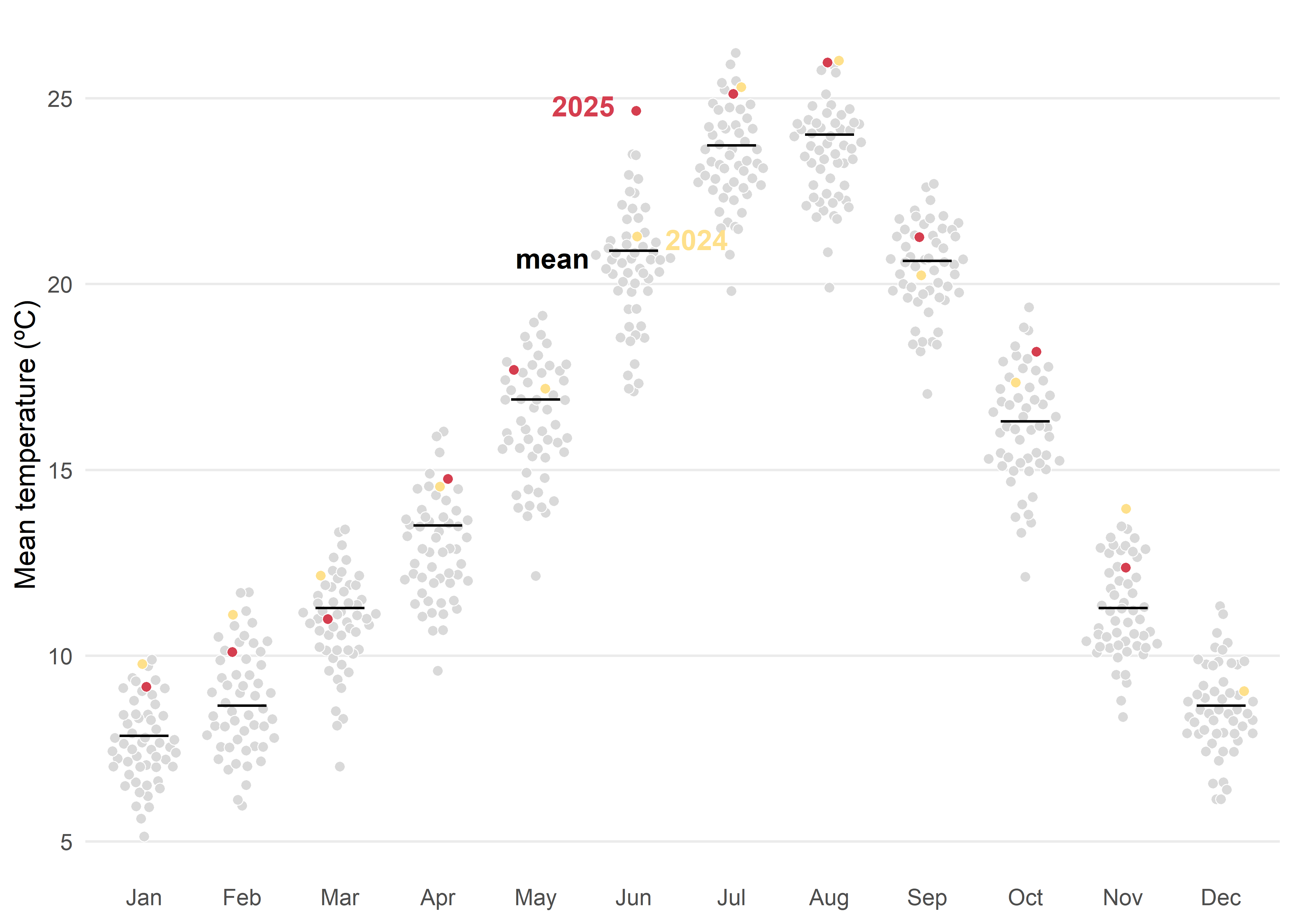
Another posibility based on distribution would be quasi-random jittered points which reveal the historical spread for each month. The black tick marks indicate the 1991–2020 mean, while colored markers highlight 2024 and 2025 against the background distribution. This design makes it easy to judge how recent months compare with typical conditions and with the broader historical variability.
Tip
Whenever possible, direct labeling should be preferred over a legend, as it improves readability and reduces cognitive load for the viewer.
Code
med <- filter(tmed_esp, year(yrmo) %in% 1991:2020) |>
  group_by(mo_lab) |>
  summarise(normal = median(tmed))

ggplot() +
  geom_quasirandom(
    data = mutate(tmed_esp, dummy = case_when(
      year(yrmo) == 2025 ~ "2025",
      year(yrmo) == 2024 ~ "2024",
      TRUE ~ "otros"
    )),
    aes(x = mo_lab, y = tmed, fill = dummy),
    size = 1.8,
    shape = 21, stroke = 0.3, color = "white"
  ) +
  geom_errorbar(
    data = med, aes(x = mo_lab, ymin = normal, ymax = normal),
    color = "black", linewidth = .5, width = .5
  ) +
  annotate("text",
    x = "Jun", y = c(24.8, 21.2, 20.7),
    hjust = c(1.3, -0.5, 1.6), fontface = "bold",
    label = c("2025", "2024", "mean"), color = c("#d53e4f", "#fee08b", "black")
  ) +
  scale_fill_manual(
    values = c("#fee08b", "#d53e4f", "grey85"),
    guide = NULL
  ) +
  scale_y_continuous(breaks = c(0, 5, 10, 15, 20, 25)) +
  labs(fill = NULL, x = NULL, y = "Mean temperature (ºC)") +
  theme_minimal() +
  theme(
    legend.position = "bottom",
    legend.justification = 0,
    panel.grid.minor = element_blank(),
    panel.grid.major.x = element_blank()
  )
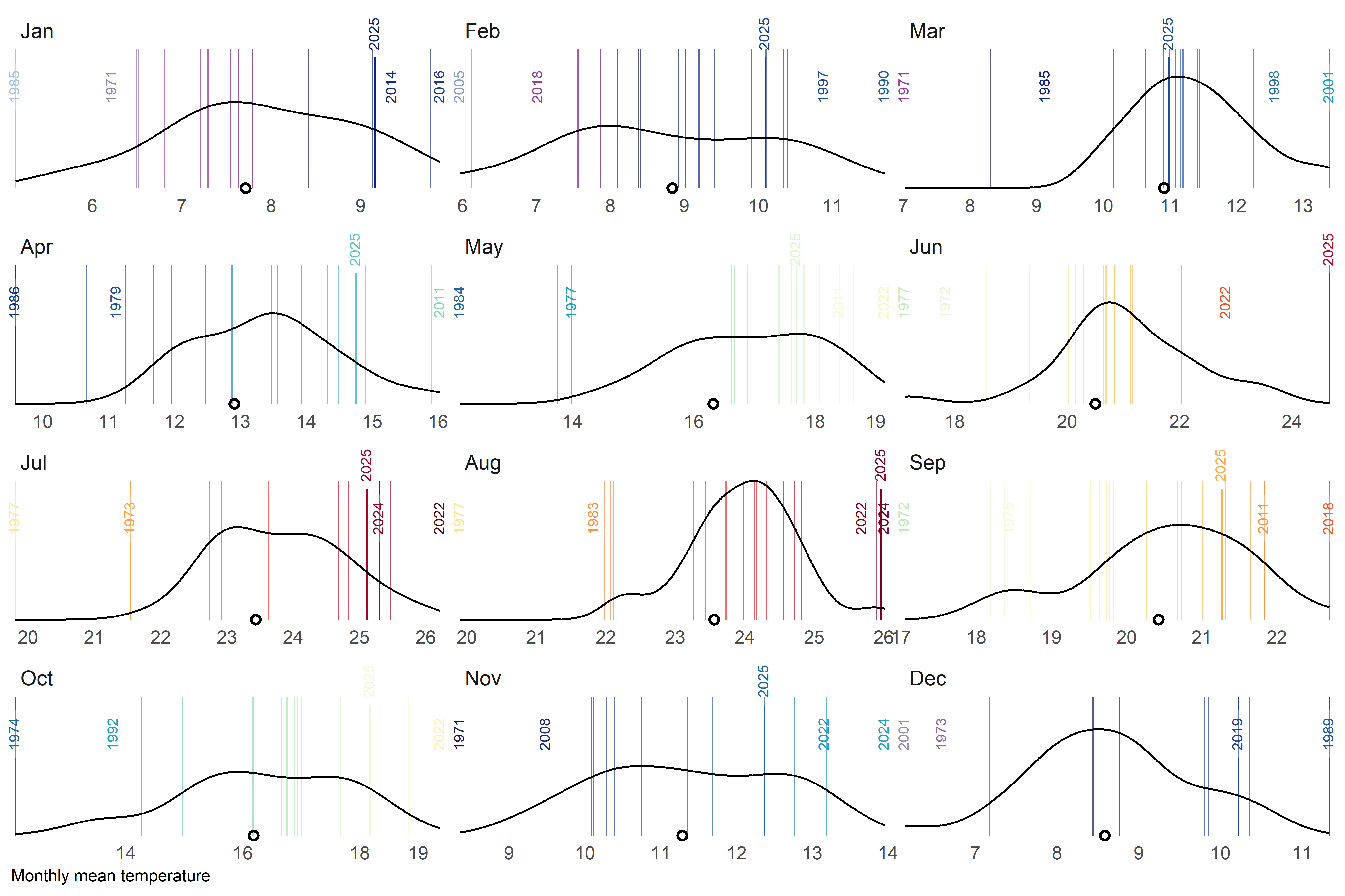
A final alternative approach could be a barcode-style chart where each thin vertical bar represents a single year within the historical record for a given month. The bars are positioned along the horizontal axis according to their monthly mean temperature, creating a visual distribution of all observed values. To highlight key information, the most extreme years—both the warmest and the coldest—are labelled, while the current year is marked with a more prominent style, such as a thicker bar. Additionally, a point indicates the long-term climatological average, allowing viewers to quickly assess how individual years compare to the historical norm. By faceting the chart by month, this design provides a compact yet detailed view of variability, extremes, and the position of the current year within the broader climate context.
Code
# global parameters
thres     <- 2 # how close should be labels?
current_yr  <- 2025

# labeled years
obs_lab <- tmed_esp |>
  group_by(mo_lab) |>
  slice_min(order_by = tmed, n = 5, with_ties = FALSE) |>
  bind_rows(
    tmed_esp |>
      group_by(mo_lab) |>
      slice_max(order_by = tmed, n = 5, with_ties = FALSE)
  ) |>
  arrange(mo_lab, yrmo) |>
  ungroup()

# current year
obs_current <- filter(tmed_esp, year(yrmo) == current_yr)

# filter function for clusters of very close values
filter_extreme_and_current <- function(data, x, group, threshold, current_year) {

    #1) Detect clusters of very close values.
    group_by(data, {{ group }}) |>  #
    arrange({{ x }}) |>
    mutate(cluster = cumsum(({{ x }} - lag({{ x }}, default = -Inf)) > threshold)) |>
    ungroup() |>
    # 2) For each month and cluster, extract only the minimum and the maximum.
    group_by({{ group }}, cluster) |>
    filter({{ x }} == min({{ x }}) | {{ x }} == max({{ x }})) |>
    ungroup() |>
    select(-cluster) |>
    # 3) Add the rows for the current year (if they exist).
    filter(year(yrmo) != current_year) |>
    # 4) Remove duplicates (in case the current year was already marked as an extreme)
    distinct()
}

# filter out labels to close
obs_lab_sel <- filter_extreme_and_current(obs_lab, tmed, mo_lab, thres, current_yr)

# mean temperature by month
med <- group_by(tmed_esp, mo_lab) |> summarise(normal = mean(tmed, na.rm = T))
Code
# colour palette for bar code lines
col_temp <- c(
  "#cbebf6", "#a7bfd9", "#8c99bc", "#974ea8", "#830f74",
  "#0b144f", "#0e2680", "#223b97", "#1c499a", "#2859a5",
  "#1b6aa3", "#1d9bc4", "#1ca4bc", "#64c6c7", "#86cabb",
  "#91e0a7", "#c7eebf", "#ebf8da", "#f6fdd1", "#fdeca7",
  "#f8da77", "#fcb34d", "#fc8c44", "#f85127", "#f52f26",
  "#d10b26", "#9c042a", "#760324", "#18000c"
)

# custom break function
custom_breaks <- function(limits) {
  round(c(limits[1], pretty(limits, n = 5), limits[2]))
}


# barcode plot
ggplot(tmed_esp) +
  geom_vline(aes(xintercept = tmed, colour = tmed),
    alpha = .7,
    linewidth = 0.1
  ) +
  geom_textvline(
    data = obs_lab_sel,
    aes(
      xintercept = tmed, label = year(yrmo),
      colour = tmed
    ),
    linewidth = 0.1, hjust = .8, size = 2.5,
    vjust = .5
  ) +
  geom_textvline(
    data = filter(obs_lab_sel, year(yrmo) == current_yr),
    aes(
      xintercept = tmed, label = year(yrmo),
      colour = tmed
    ),
    linewidth = 0.4, hjust = 1.3, size = 2.5,
    vjust = .5
  ) +
  geom_textvline(
    data = obs_current,
    aes(
      xintercept = tmed, label = year(yrmo),
      colour = tmed
    ),
    linewidth = 0.4, hjust = 1.3, size = 2.5,
    vjust = .5
  ) +
  geom_density(data = filter(tmed_esp, year(yrmo) %in% 1991:2020), aes(tmed)) +
  geom_point(data = med, aes(x = normal, y = 0), shape = 1, stroke = 1) +
  scale_colour_gradientn(
    colours = col_temp,
    limits = c(4.4, 26.8),
    guide = "none"
  ) +
  scale_x_continuous(
    breaks = custom_breaks,
    expand = expansion(.01)
  ) +
  scale_y_continuous(expand = expansion()) +
  labs(y = NULL, x = "Monthly mean temperature") +
  facet_wrap(mo_lab ~ ., ncol = 3, scale = "free_x") +
  coord_cartesian(clip = "off") +
  theme_minimal() +
  theme(
    axis.text.y = element_blank(),
    axis.ticks.y = element_blank(),
    panel.grid = element_blank(),
    axis.title.x = element_text(hjust = 0, size = 8),
    strip.text.x = element_text(hjust = 0, size = 10)
  )
Final Thoughts
There is no such thing as a perfect visualization. Each of the nine examples comes with its own strengths and weaknesses, and their effectiveness depends largely on the purpose and the audience. I also believe we should not be afraid to use slightly more complex charts or to present data that is inherently complex. Sometimes, embracing complexity is the only way to convey the full story behind the numbers.
Reuse
Citation
For attribution, please cite this work as:
Royé, Dominic. 2025. “Broken Chart: Discover 9 Visualization
Alternatives.” December 14, 2025. https://dominicroye.github.io/blog/2025-12-14-broken-charts/.