Meeting People Where They R
This is my blog where I practice sharing my curiosity about R, particularly, the world of cartography and data visualization. I take this opportunity to invite you to participate in the #30DayChartChallenge.
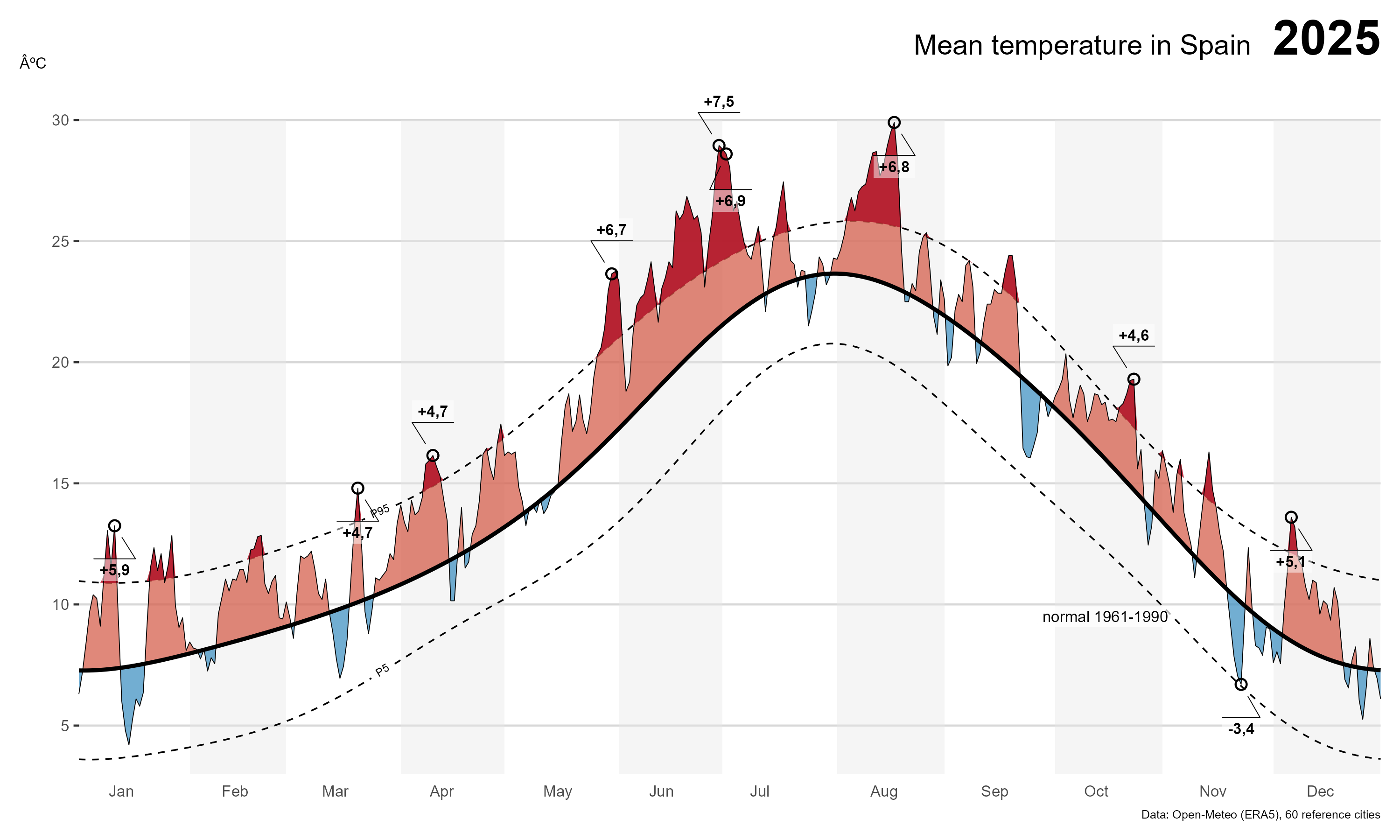
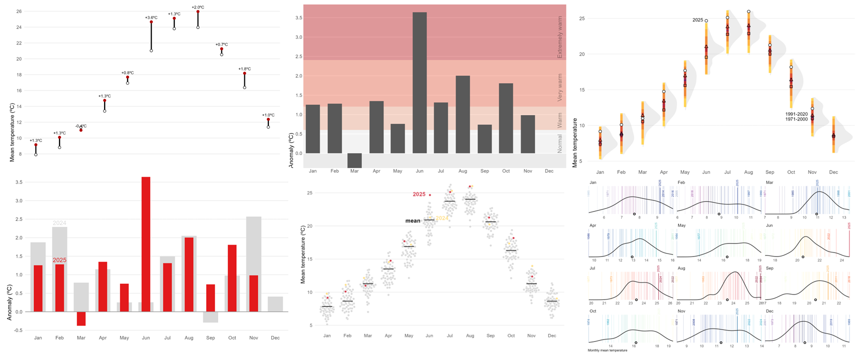
A data-driven normal for the Spain temperature chart
R
R:Advanced
Visualization
Climate
Anomaly
Temperature
Open-Meteo
Smoothing
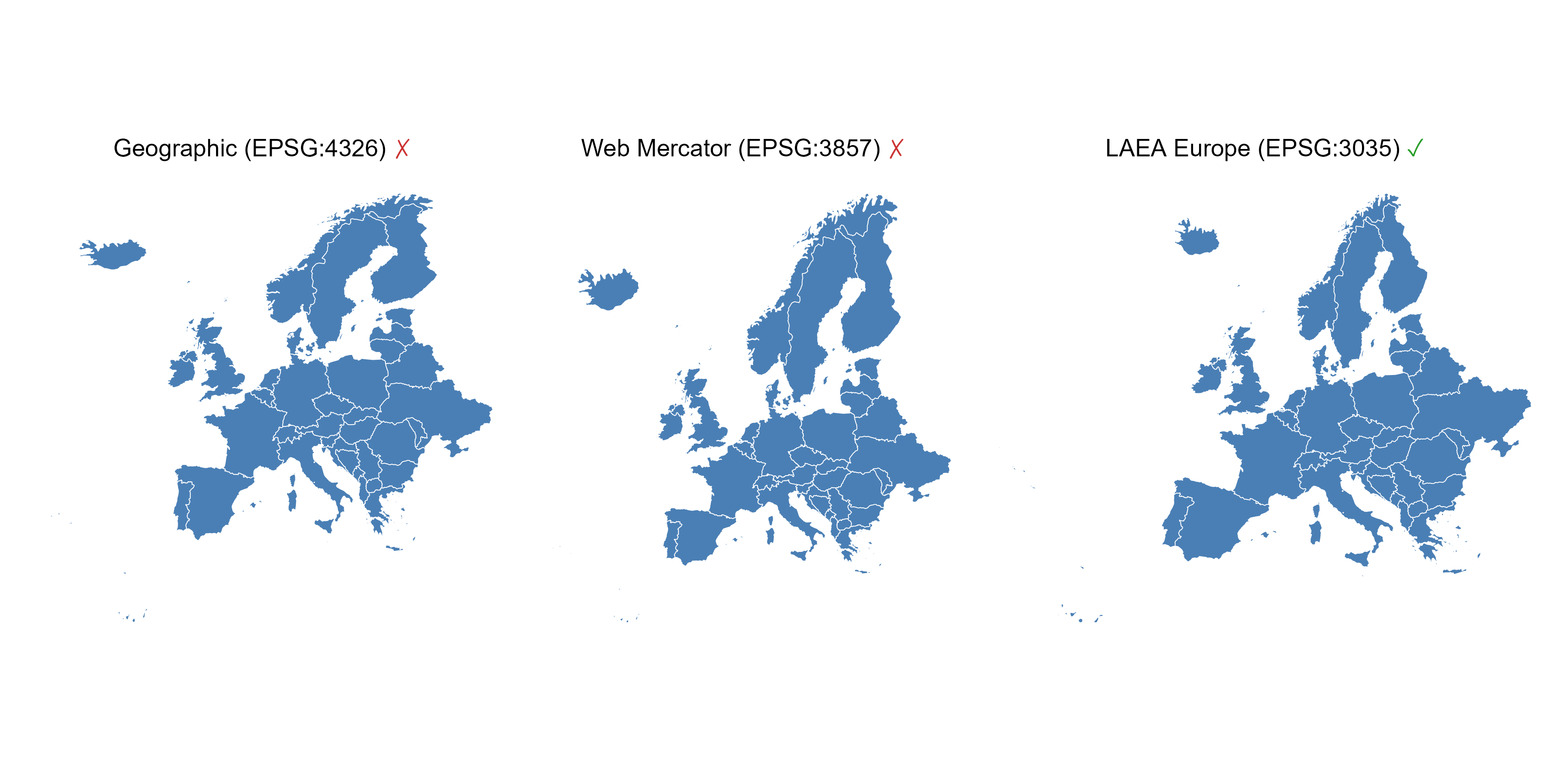
Map projections: a practical guide to common mistakes and how to fix them
R
R:Intermediate
Visualization
Maps
Bad practice
Projections
GIS
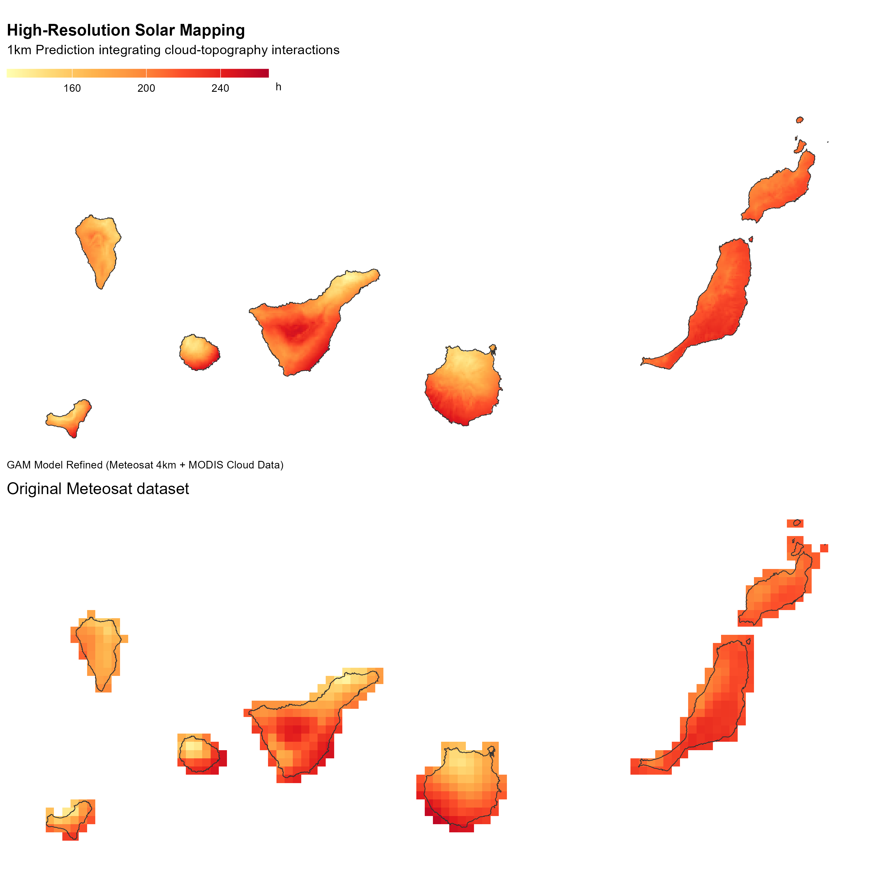
Downscaling solar radiation in the Canary Islands with GAM
Spatial analysis
Geostatistics
R:Advanced
GAM
R
terra
downscaling
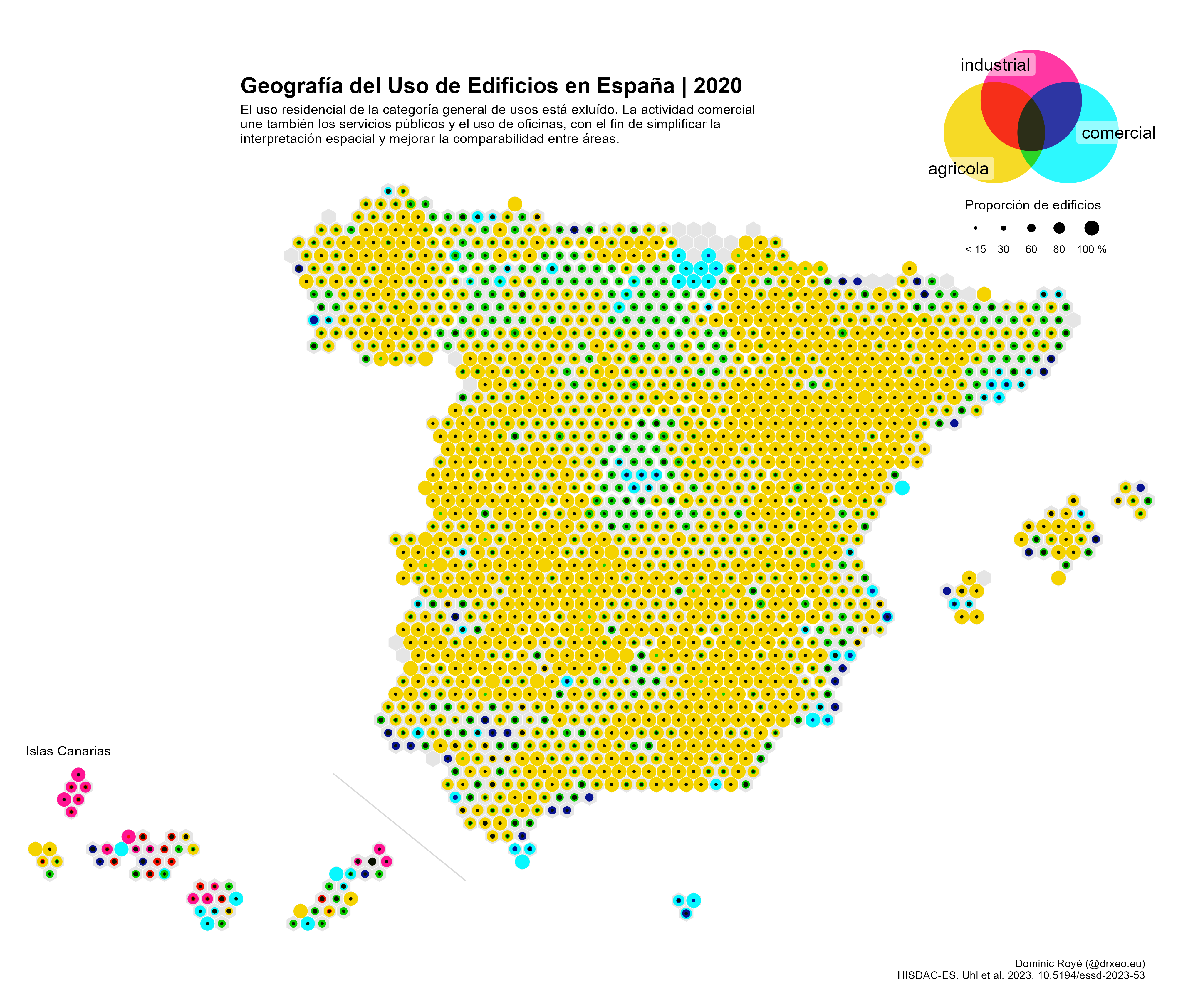
Mapping building use with a hexagonal grid
Spatial analysis
Cartography
GIS
R
R:Elementary
raster
hexagonal grid
Broken Chart: discover 9 visualization alternatives
R
R:Intermediate
Visualization
Charts
Remake
Bad practice
Distribution
Temperature
Always normalize your data
GIS
R
R:Elementary
Visualization
Map
Proportional symbol
Normalize
Map of circles grouped in multiple locations
GIS
R
R:Advanced
Visualization
Map
Proportional symbol
Circles
Inserted maps with ggplot2
GIS
R
R:Elementary
Visualization
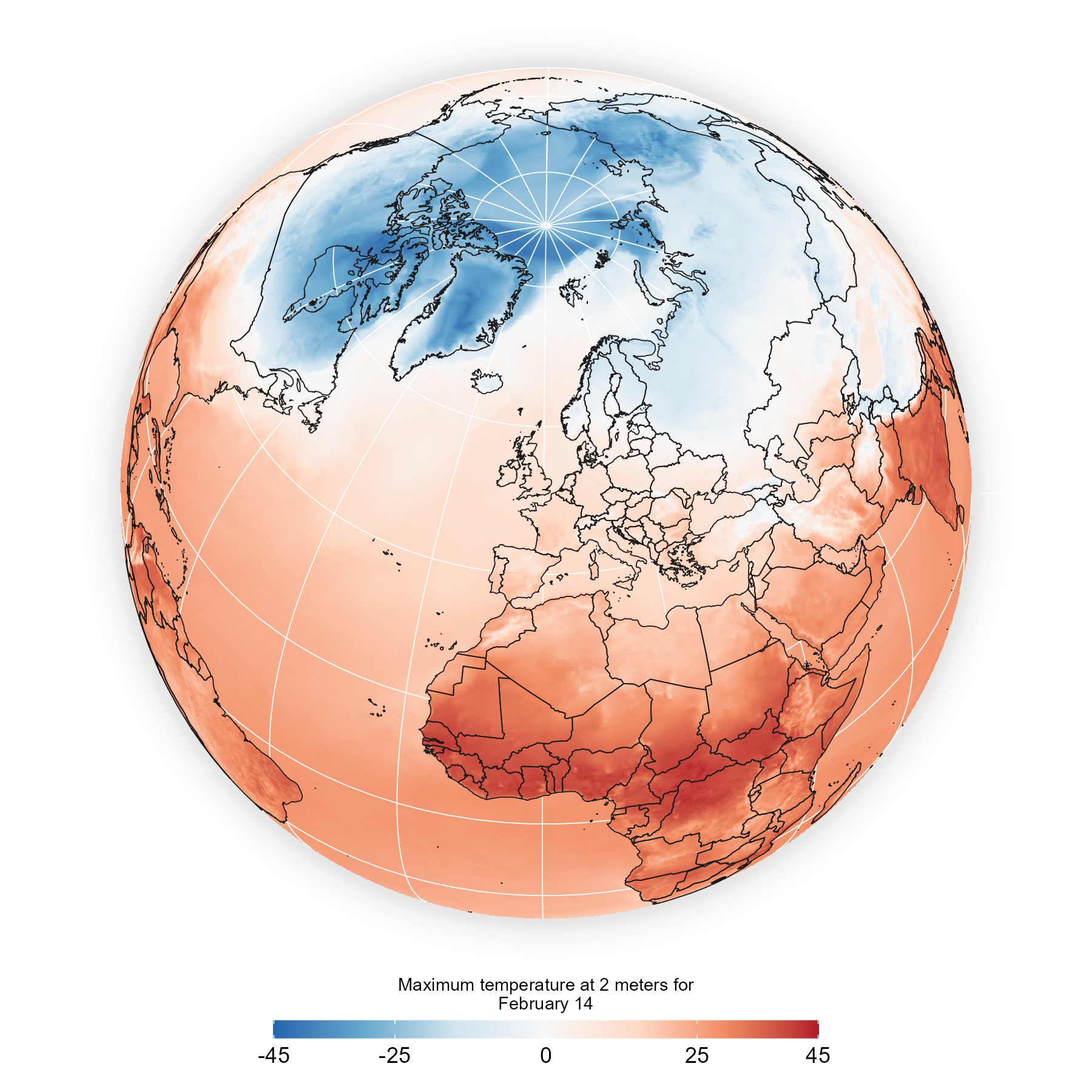
Tomorrow’s weather
GIS
R
R:Advanced
Visualization
Hillshade effects
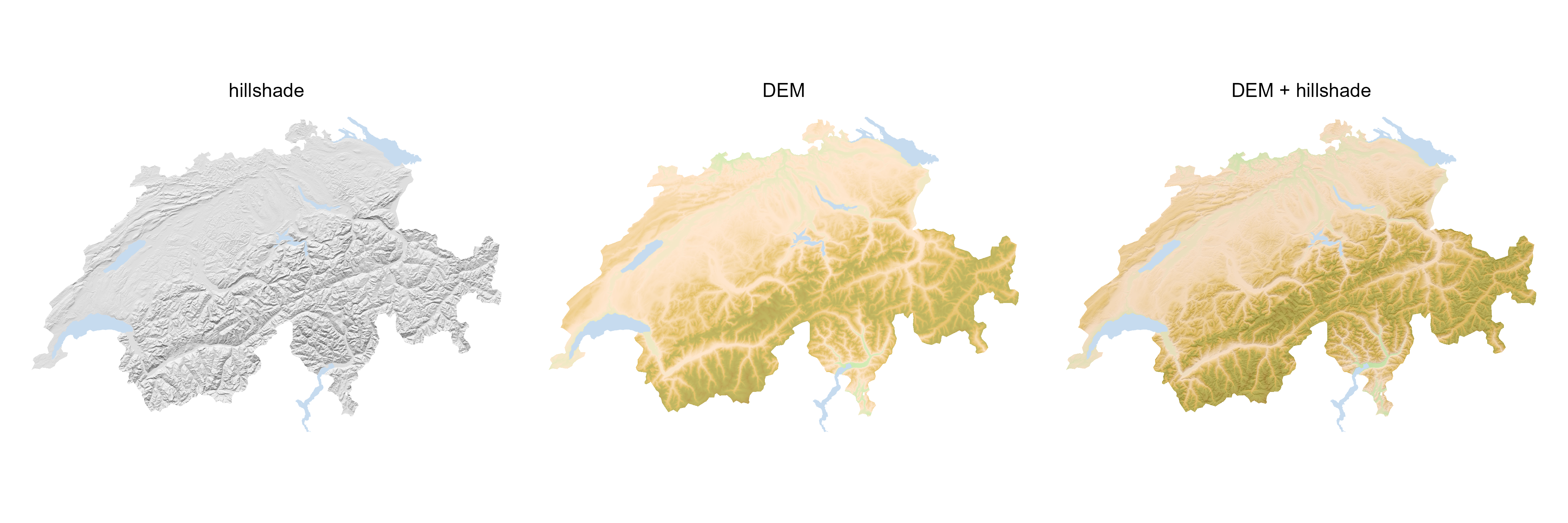
GIS
R
R:Intermediate
Visualization
Hillshade
DEM
Elevation
Use of multidimensional spatial data
GIS
R
R:Advanced
Visualization
NCDF
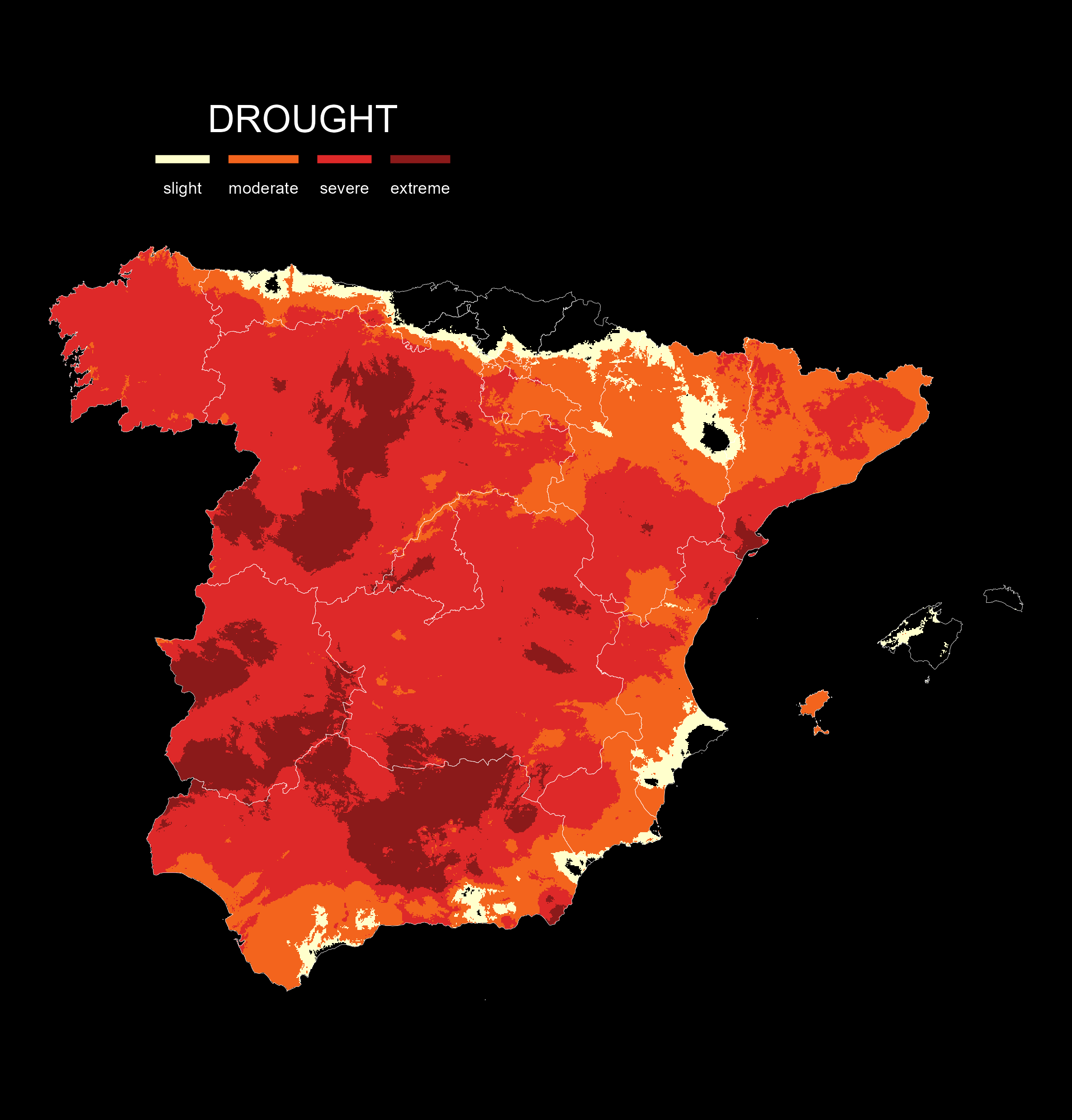
Drought
Spain
Raster
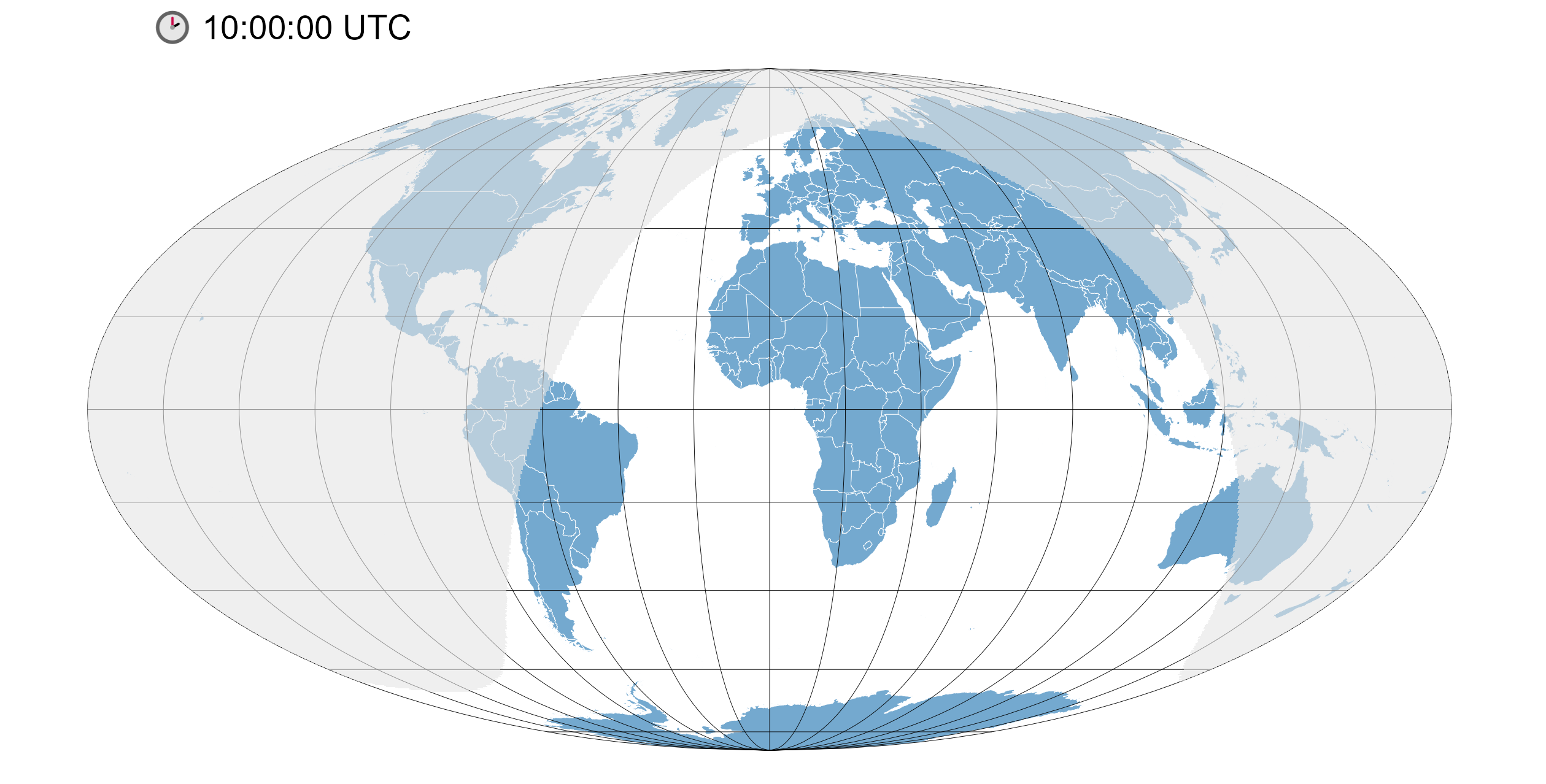
Visualize the day-night cycle on a world map
GIS
R
R:Intermediate
Visualization
World map
Day-night
Animation
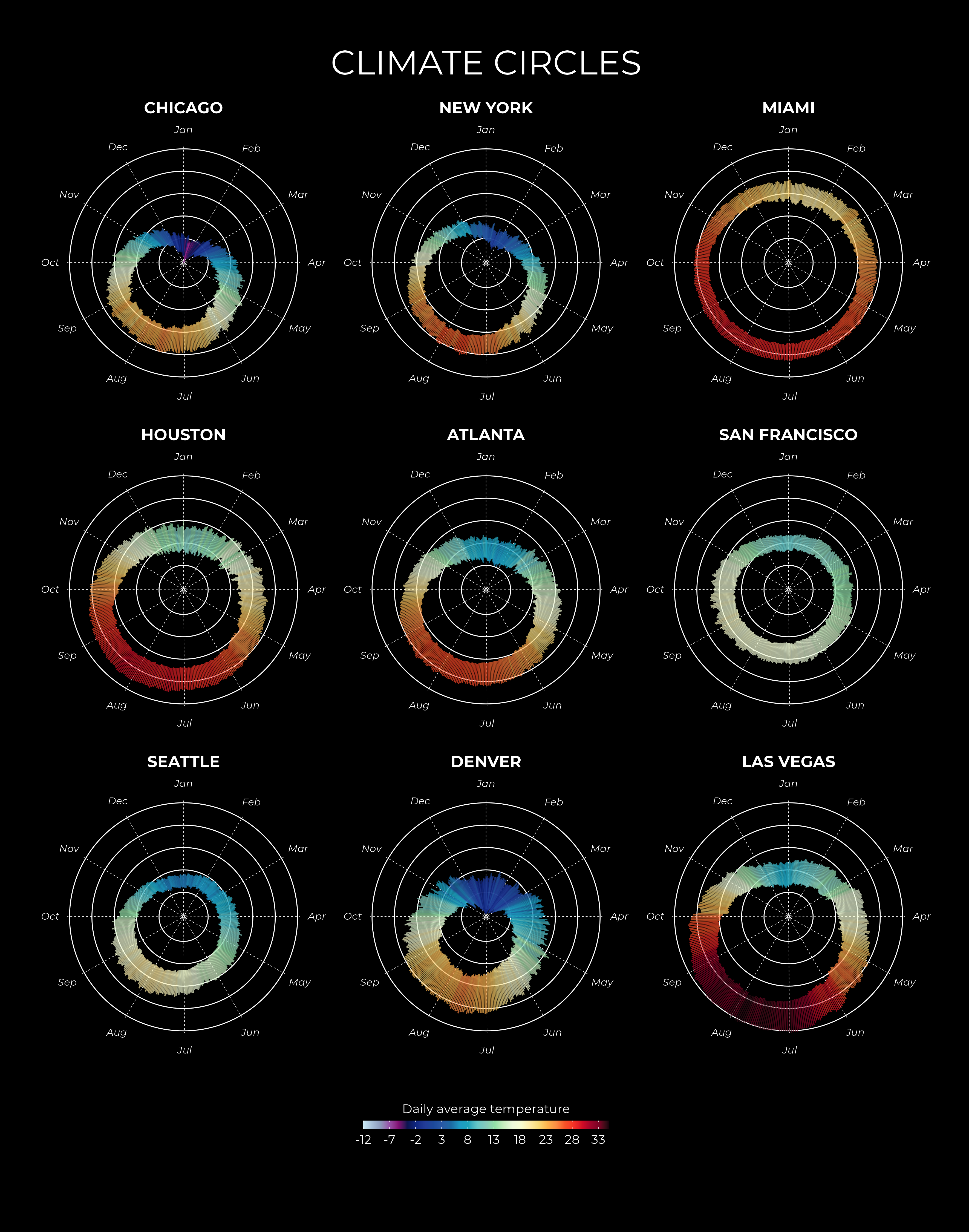
Climate circles
R
R:Elementary
Visualization
Climate
Polar
Temperature
Firefly cartography
GIS
R
R:Intermediate
Visualization
Firefly
Map
Cartography
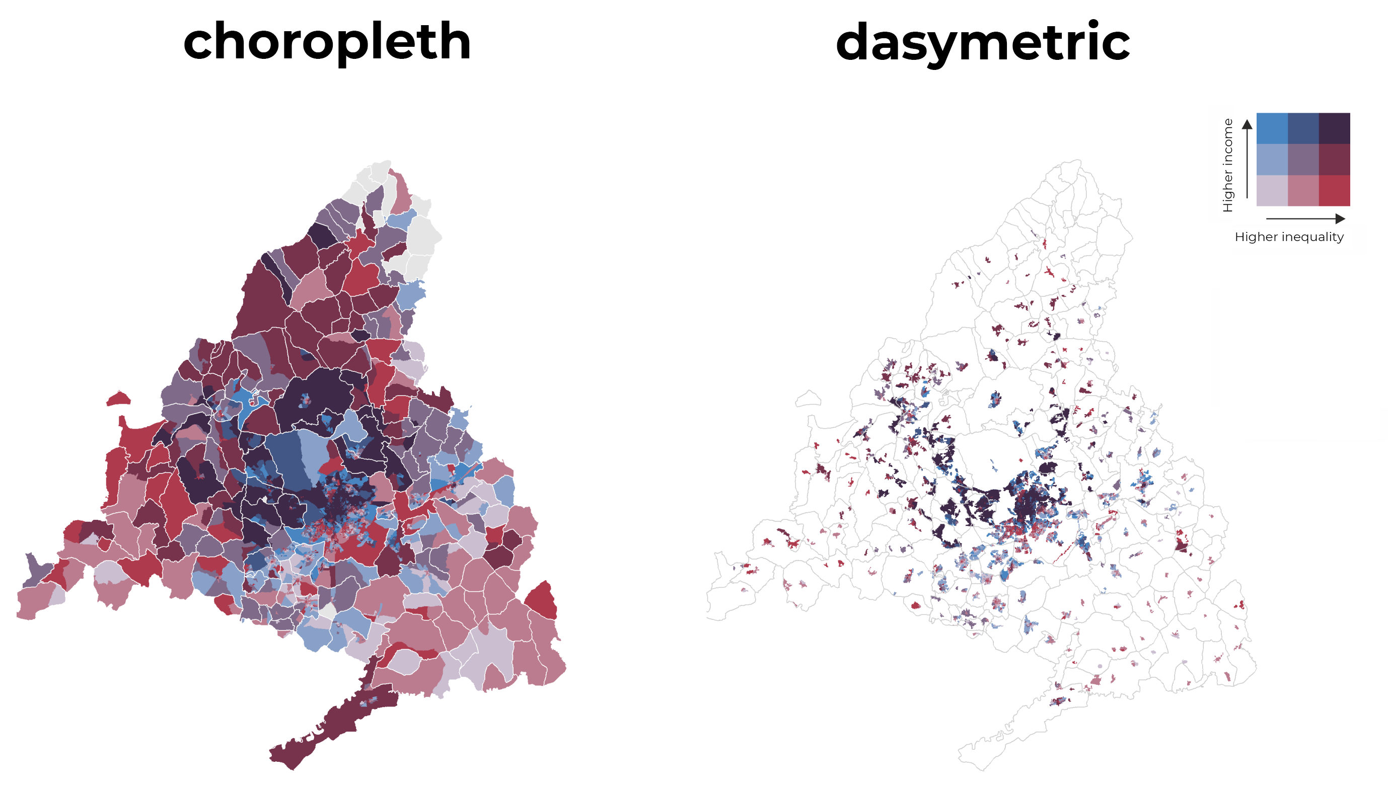
Bivariate dasymetric map
GIS
R
R:Advanced
Visualization
Bivariate
Map
Income
Urban
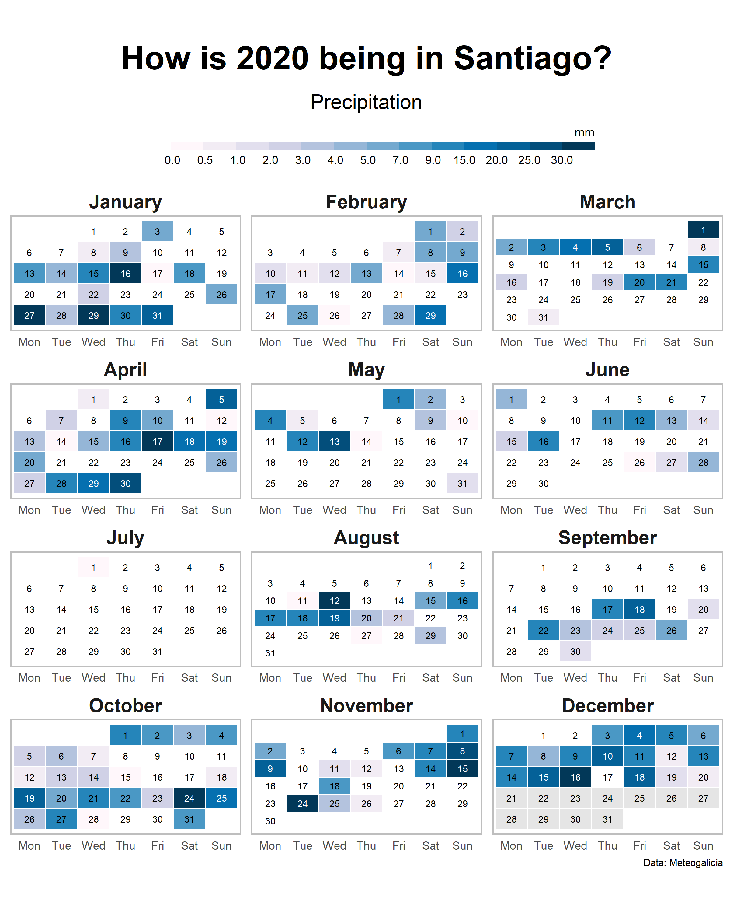
A heatmap as calendar
Visualization
R
R:Intermediate
Calendar
Heatmap
Climate
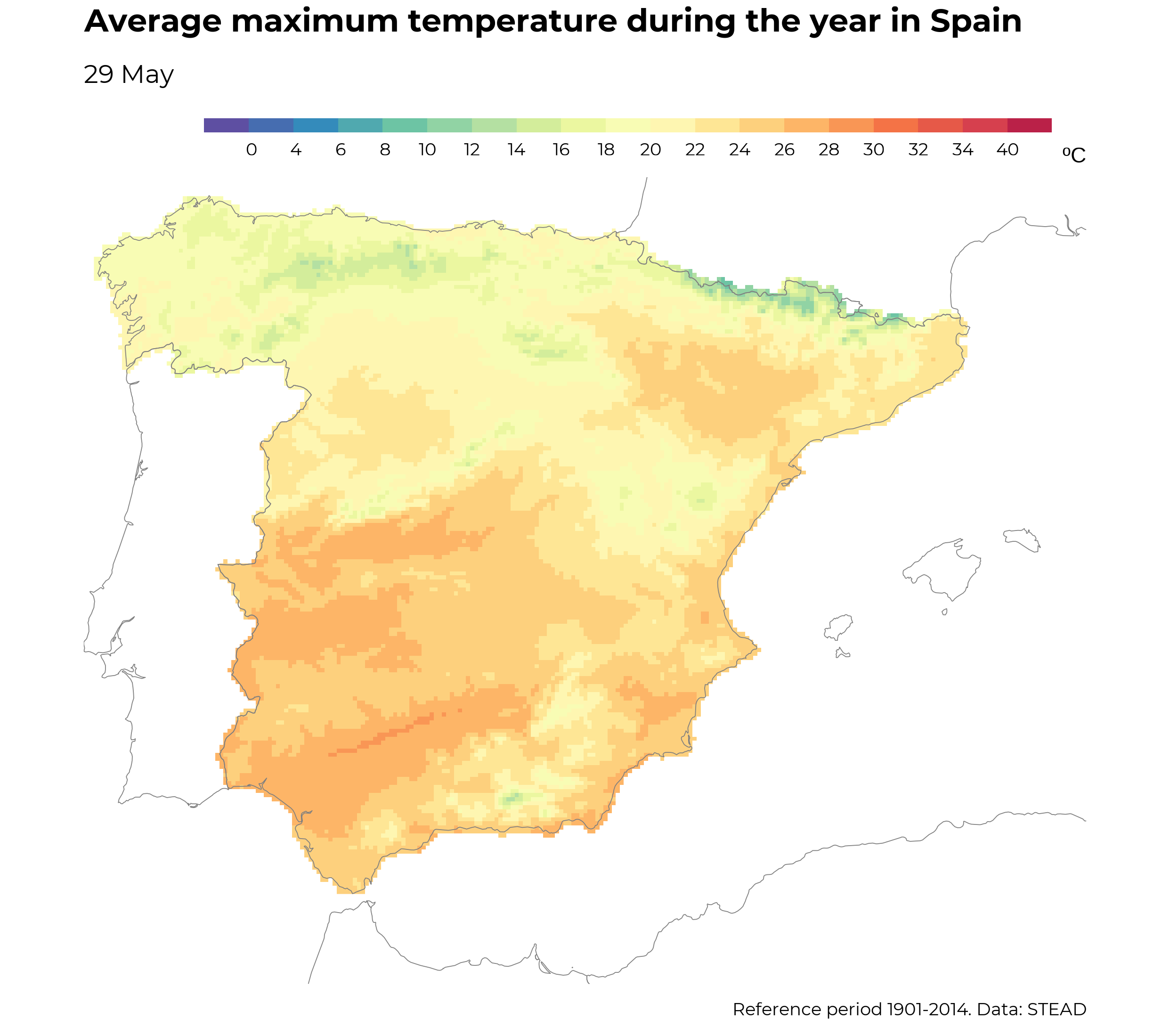
Climate animation of maximum temperatures
Visualization
R
R:Advanced
Animation
Temperature
Climate
GIS
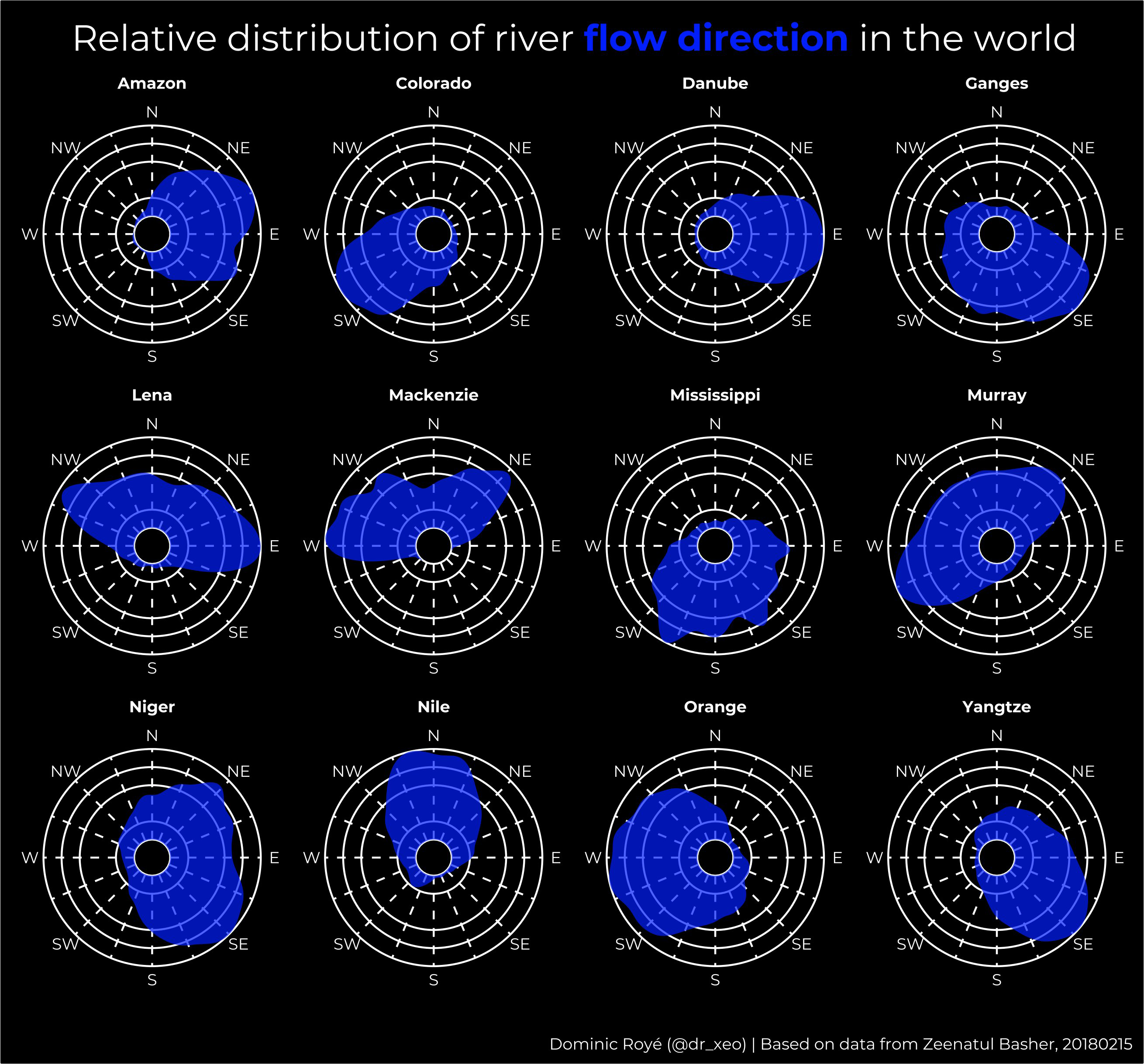
River flow directions
GIS
R
R:Advanced
River
Directions
Distribution
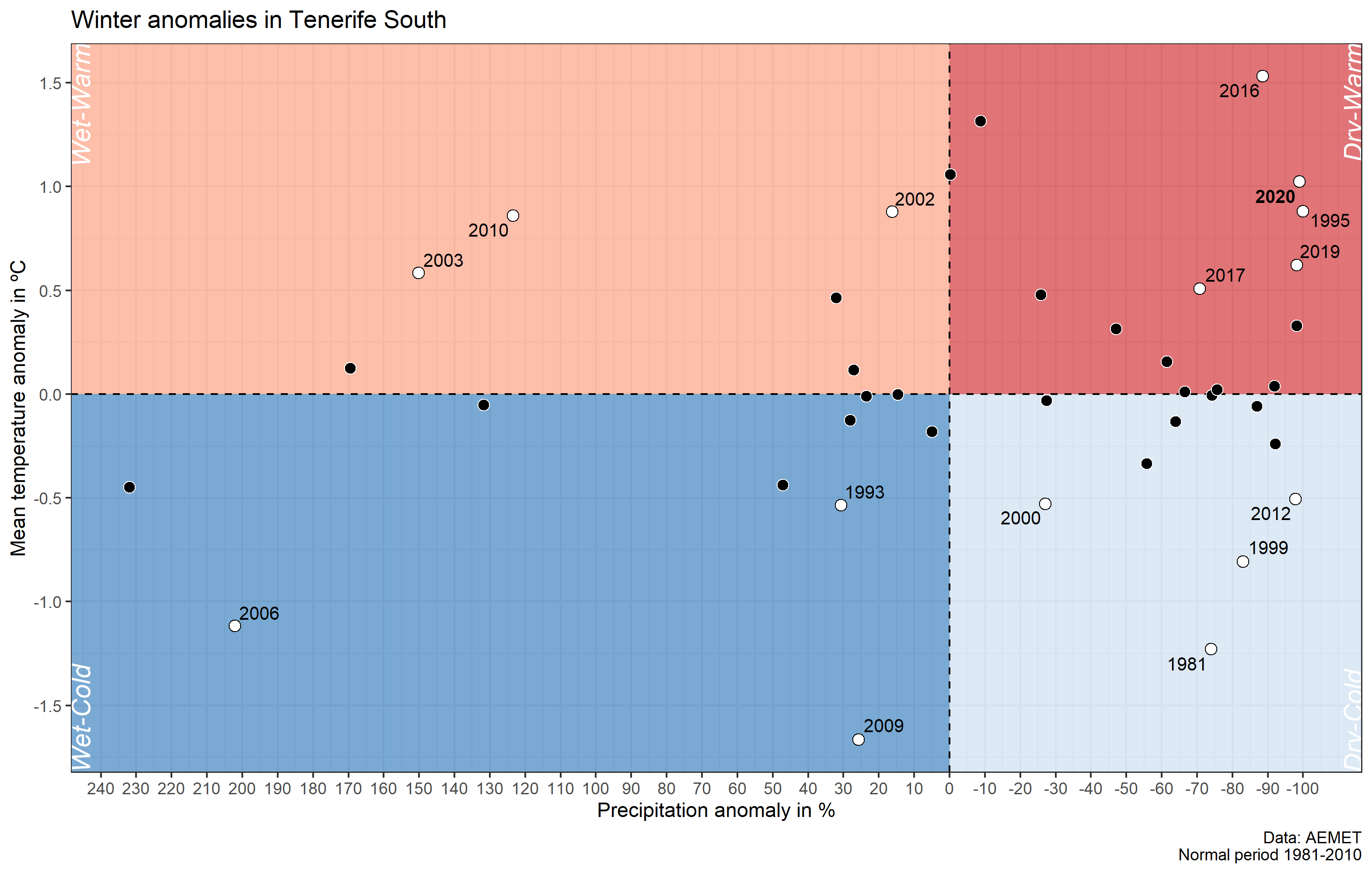
Visualize climate anomalies
Visualization
R
R:Intermediate
Climate
Anomaly
Temperature
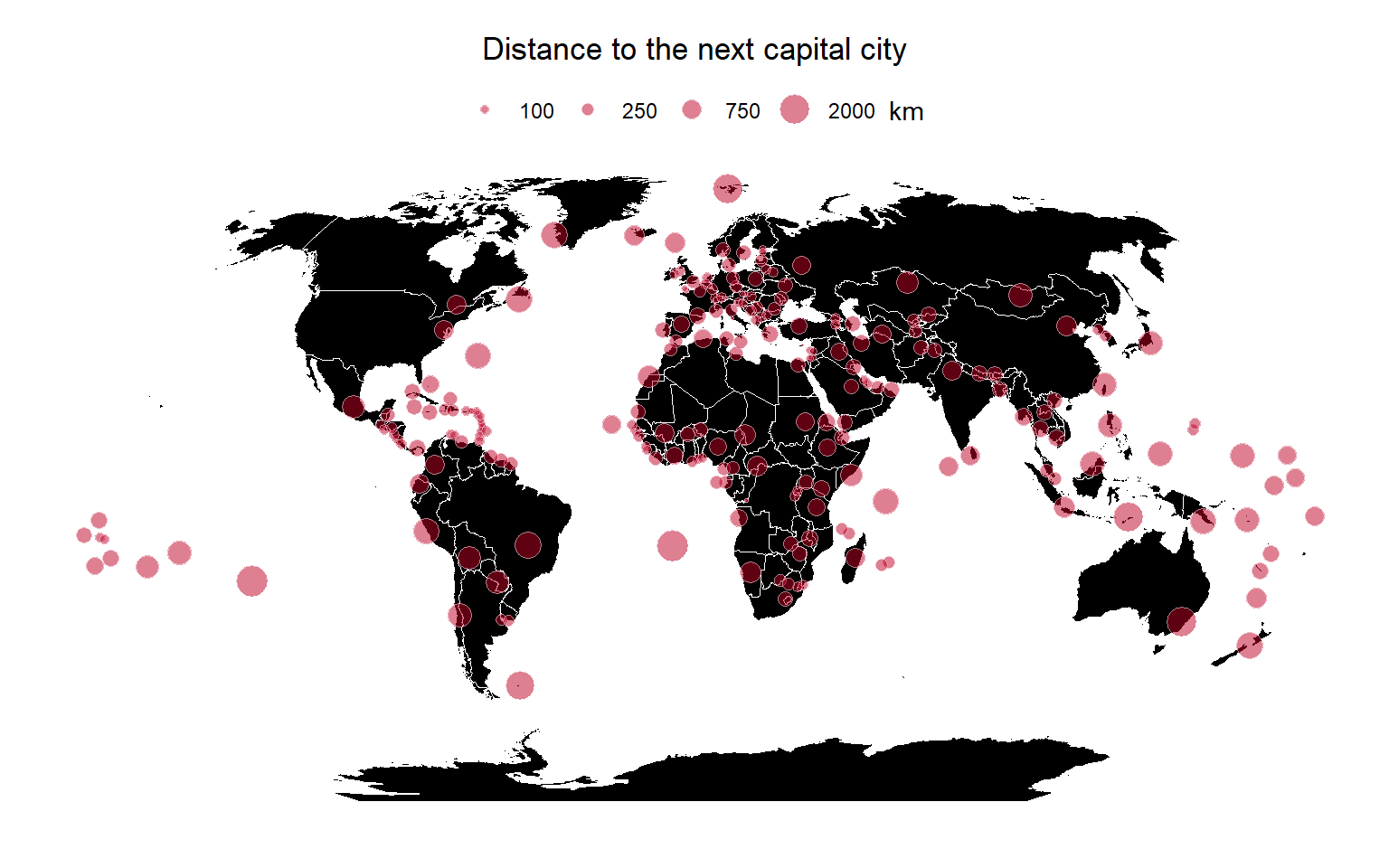
Geographic distance
Spatial analysis
R
R:Elementary
GIS
Distance
Cities

Visualize urban growth
Visualization
R
R:Elementary
GIS
City
Geography
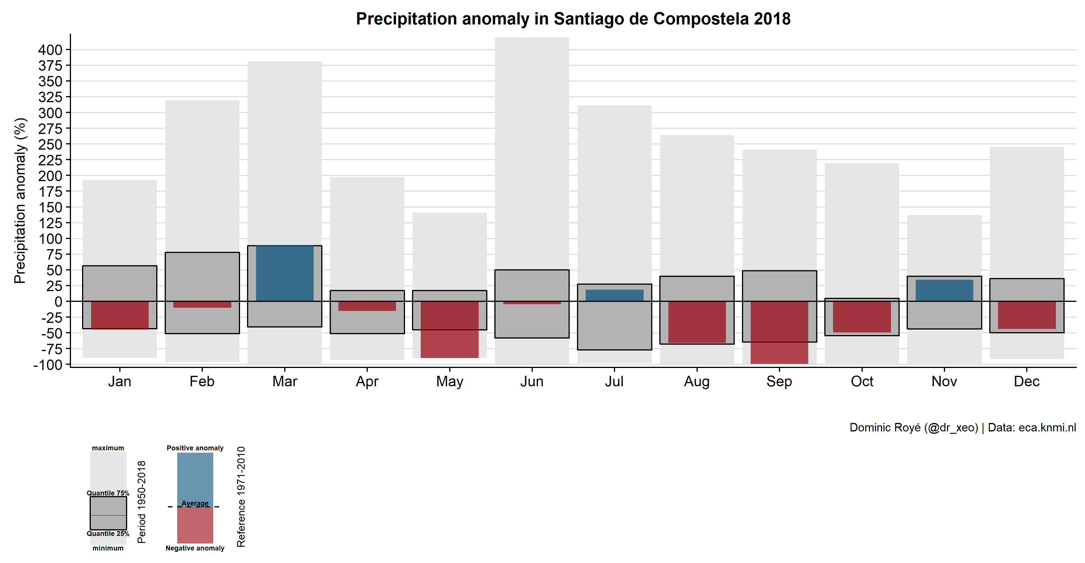
Visualize monthly precipitation anomalies
Visualization
R
R:Intermediate
Anomaly
Climate
Precipitation
Boxplot
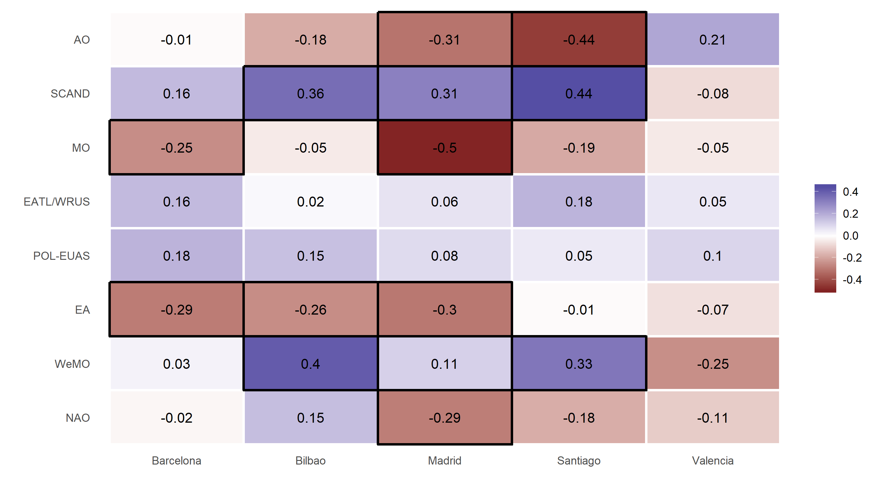
Tidy correlation tests in R
Statistics
R
R:Advanced
Correlation
Tests

Import Excel sheets with R
Management
R
R:Intermediate
Excel
Sheets
Calculating the distance to the sea in R
GIS
R
R:Elementary
Distance
Raster

How to create ‘Warming Stripes’ in R
Visualization
R
R:Elementary
Warming stripes
Global warming
Accessing OpenStreetMap data with R
Visualization
R
R:Elementary
Map
OSM
Point of interest
No matching items