# install the packages if necessary
if (!require("tidyverse")) install.packages("tidyverse")
if (!require("patchwork")) install.packages("patchwork")
if (!require("sf")) install.packages("sf")
if (!require("terra")) install.packages("terra")
if (!require("biscale")) install.packages("biscale")


# packages
library(tidyverse)
library(sf)
library(readxl)
library(biscale)
library(patchwork)
library(terra)Bivariate dasymetric map
Initial considerations
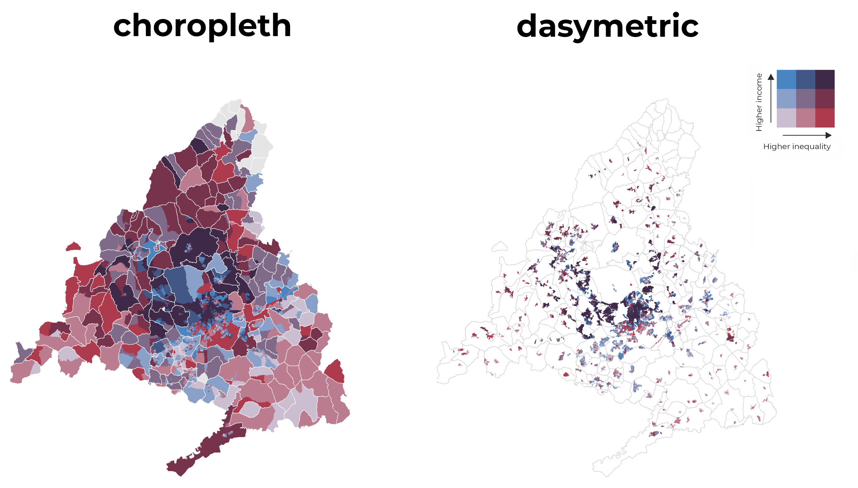
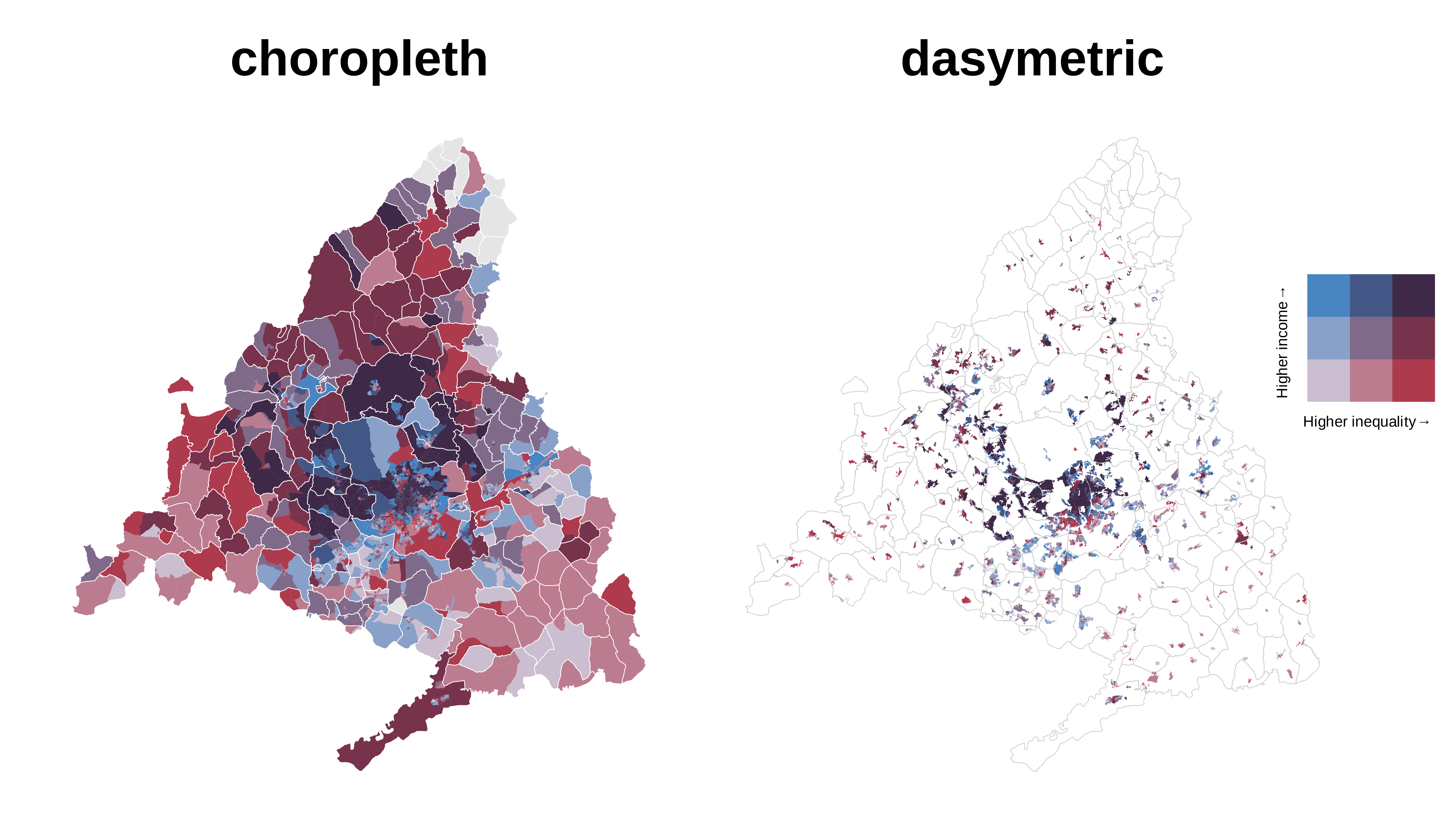
A disadvantage of choropleth maps is that they tend to distort the relationship between the true underlying geography and the represented variable. It is because the administrative divisions do not usually coincide with the geographical reality where people live. Besides, large areas appear to have a weight that they do not really have because of sparsely populated regions. To better reflect reality, more realistic population distributions are used, such as land use. With Geographic Information Systems techniques, it is possible to redistribute the variable of interest as a function of a variable with a smaller spatial unit.
With point data, the redistribution process is simply clipping points with population based on land use, usually classified as urban. We could also crop and mask with land use polygons when we have a vectorial polygon layer, but an interesting alternative is the same data in raster format. We will see how we can make a dasymetric map using raster data with a resolution of 100 m. This post will use data from census sections of the median income and the Gini index for Spain. We will make a dasymetric and bivariate map, representing both variables with two ranges of colours on the same map.
Packages
In this post we will use the following packages:
| Package | Description |
|---|---|
| tidyverse | Collection of packages (visualization, manipulation): ggplot2, dplyr, purrr, etc. |
| patchwork | Simple grammar to combine separate ggplots into the same graphic |
| raster | Import, export and manipulate raster |
| sf | Simple Feature: import, export and manipulate vector data |
| biscale | Tools and Palettes for Bivariate Thematic Mapping |
| sysfonts | Load fonts in R |
| showtext | Use fonts more easily in R graphs |
Preparation
Data
First we download all the necessary data. With the exception of the CORINE Land Cover (~ 200 MB), the data stored on this blog can be obtained directly via the indicated links.
- CORINE Land Cover 2018 (geotiff): COPERNICUS
- Income data and Gini index (excel): INE (download)
- Census limits of Spain (vectorial): INE (download)
Import
The first thing we do is to import the land use raster, the income and Gini index data, and the census boundaries.
# raster of CORINE LAND COVER 2018
urb <- rast("U2018_CLC2018_V2020_20u1.tif")

# income data and Gini index
renta <- read_excel("30824.xlsx")
gini <- read_excel("37677.xlsx")

# census boundaries
limits <- read_sf("SECC_CE_20200101.shp")
Land uses
In this first step we filter the census sections to obtain those of the Autonomous Community of Madrid, and we create the municipal limits. To dissolve the polygons of census tracts we apply the function group_by() in combination with summarise().
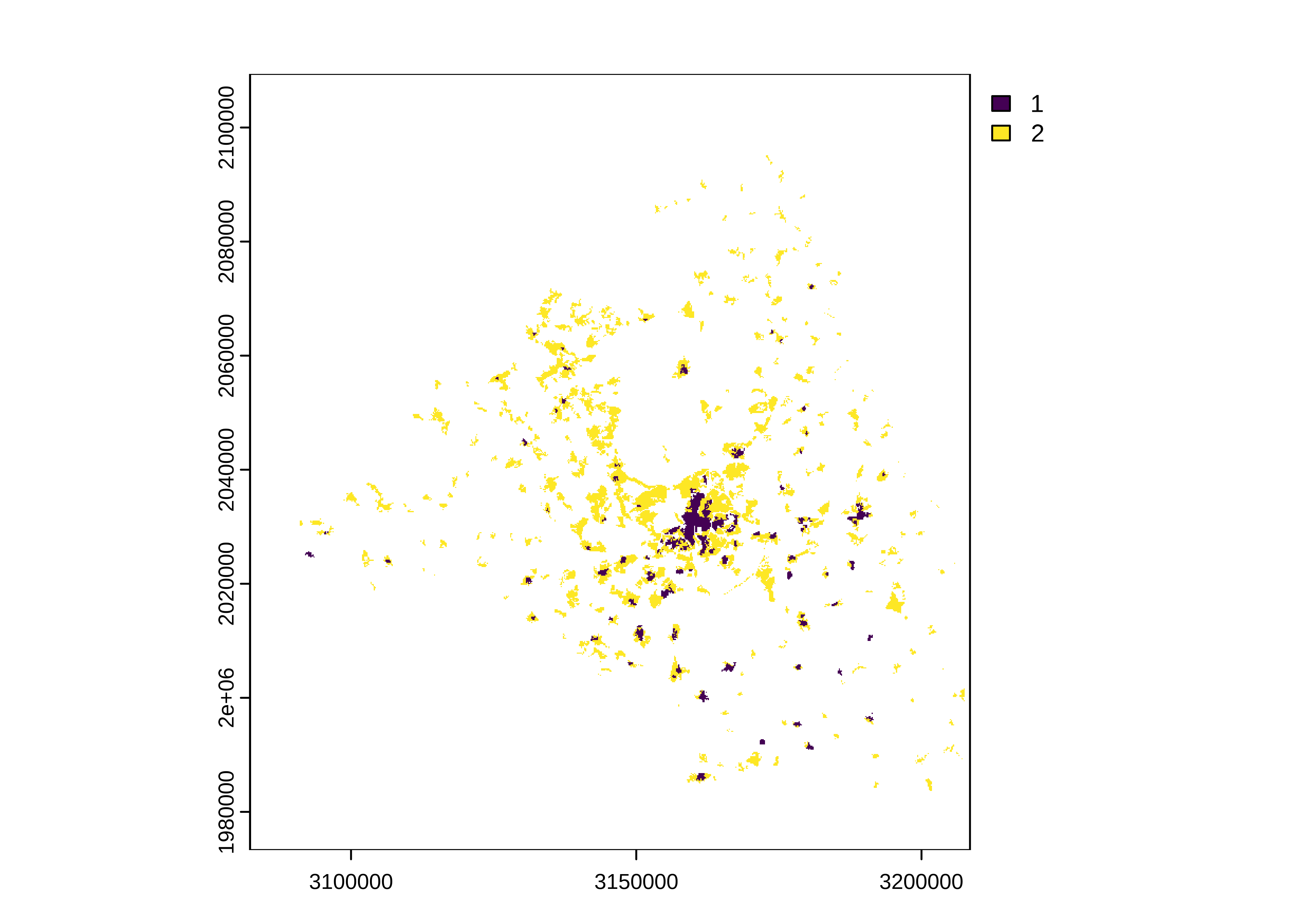
In the next step we cut the land use raster with the limits of Madrid. I recommend always using the crop() function first and then mask(), the first function crop to the required extent and the second mask the values. Subsequently, we remove all the cells that correspond to 1 or 2 (urban continuous, discontinuous). Finally, we project the raster.
# project
urb_mad <- project(urb_mad, "EPSG:4326")
In this step, we convert the raster data into a point sf object.
# transform the raster to xyz and a sf object
urb_mad <- as.data.frame(urb_mad, xy = TRUE) |>
              st_as_sf(coords = c("x", "y"), crs = 4326)

# add the columns of the coordinates
urb_mad <- urb_mad |> rename(urb = 1) |>
            cbind(st_coordinates(urb_mad))
Income data and Gini index
The format of the Excels does not coincide with the original of the INE, since I have cleaned the format before in order to make this post easier. What remains is to create a column with the codes of the census sections and exclude data that correspond to another administrative level.
## income and Gini index data

renta_sec <- mutate(renta,
  NATCODE = str_extract(CUSEC, "[0-9]{5,10}"),
  nc_len = str_length(NATCODE),
  mun_name = str_remove(CUSEC, NATCODE) |> str_trim()
) |>
  filter(nc_len > 5)

gini_sec <- mutate(gini,
  NATCODE = str_extract(CUSEC, "[0-9]{5,10}"),
  nc_len = str_length(NATCODE),
  mun_name = str_remove(CUSEC, NATCODE) |> str_trim()
) |>
  filter(nc_len > 5)
In the next step we join both tables with the census tracts using left_join() and convert columns of interest in numerical mode.
Bivariate variable
To create a bivariate map we must construct a single variable that combines different classes of two variables. Usually we make three classes of each variable which leads to nine combinations; in our case, the average income and the Gini index. The biscale package includes helper functions to carry out this process. With the bi_class() function we create the classification variable using quantiles as algorithm. Since in both variables we find missing values, we correct those combinations between both variables where an NA appears.
We finish by redistributing the inequality variable over the pixels of urban land use. The st_join() function joins the data with the land use points.
# redistribute urban pixels to inequality
mapdasi <- st_join(urb_mad, st_transform(mapbivar, 4326))
Map building
Legend and font
Before constructing both maps we must create the legend using the bi_legend() function. In the function we define the titles for each variable, the number of dimensions and the color scale. Finally, we add the Montserrat font for the final titles in the graphic.
# bivariate legend
legend2 <- bi_legend(
  pal = "DkViolet",
  dim = 3,
  xlab = "Higher inequality",
  ylab = "Higher income",
  size = 9
)
Dasymetric map
We build this map using geom_tile() for the pixels and geom_sf() for the municipal boundaries. In addition, it will be the map on the right where we also place the legend. To add the legend we use the annotation_custom() function indicating the position in the geographical coordinates of the map. The biscale package also helps us with the color definition via the bi_scale_fill() function.
p2 <- ggplot(mapdasi) +
  geom_tile(
    aes(X, Y,
      fill = bi_class
    ),
    show.legend = FALSE
  ) +
  geom_sf(
    data = mun_limit,
    color = "grey80",
    fill = NA,
    size = 0.2
  ) +
  annotation_custom(ggplotGrob(legend2),
    xmin = -3.25, xmax = -2.65,
    ymin = 40.55, ymax = 40.95
  ) +
  bi_scale_fill(
    pal = "DkViolet",
    dim = 3,
    na.value = "grey90"
  ) +
  labs(title = "dasymetric", x = NULL, y = NULL) +
  bi_theme() +
  theme(plot.title = element_text(family = "Montserrat", size = 30, face = "bold"),
        plot.margin = margin(5, 50, 5, 5)) +
  coord_sf(crs = 4326, clip = "off")
Choropleth map
The choropleth map is built in a similar way to the previous map with the difference that we use geom_sf().
p1 <- ggplot(mapbivar) +
  geom_sf(aes(fill = bi_class),
    colour = NA,
    size = .1,
    show.legend = FALSE
  ) +
  geom_sf(
    data = mun_limit,
    color = "white",
    fill = NA,
    size = 0.2
  ) +
  bi_scale_fill(
    pal = "DkViolet",
    dim = 3,
    na.value = "grey90"
  ) +
  labs(title = "choropleth", x = NULL, y = NULL) +
  bi_theme() +
  theme(plot.title = element_text(family = "Montserrat", size = 30, face = "bold")) +
  coord_sf(crs = 4326)
Merge both maps
With the help of the patchwork package, we combine both maps in a single row, first the choropleth map and on its right the dasymmetric map. More details of the grammar used for the combination of graphics here.
# combine
p <- p1 | p2

# final map
p

