# we install the packages if necessary
if (!require("tidyverse")) install.packages("tidyverse")
if (!require("ggrepel")) install.packages("ggrepel")

# packages
library(tidyverse)
library(ggrepel)Visualize climate anomalies
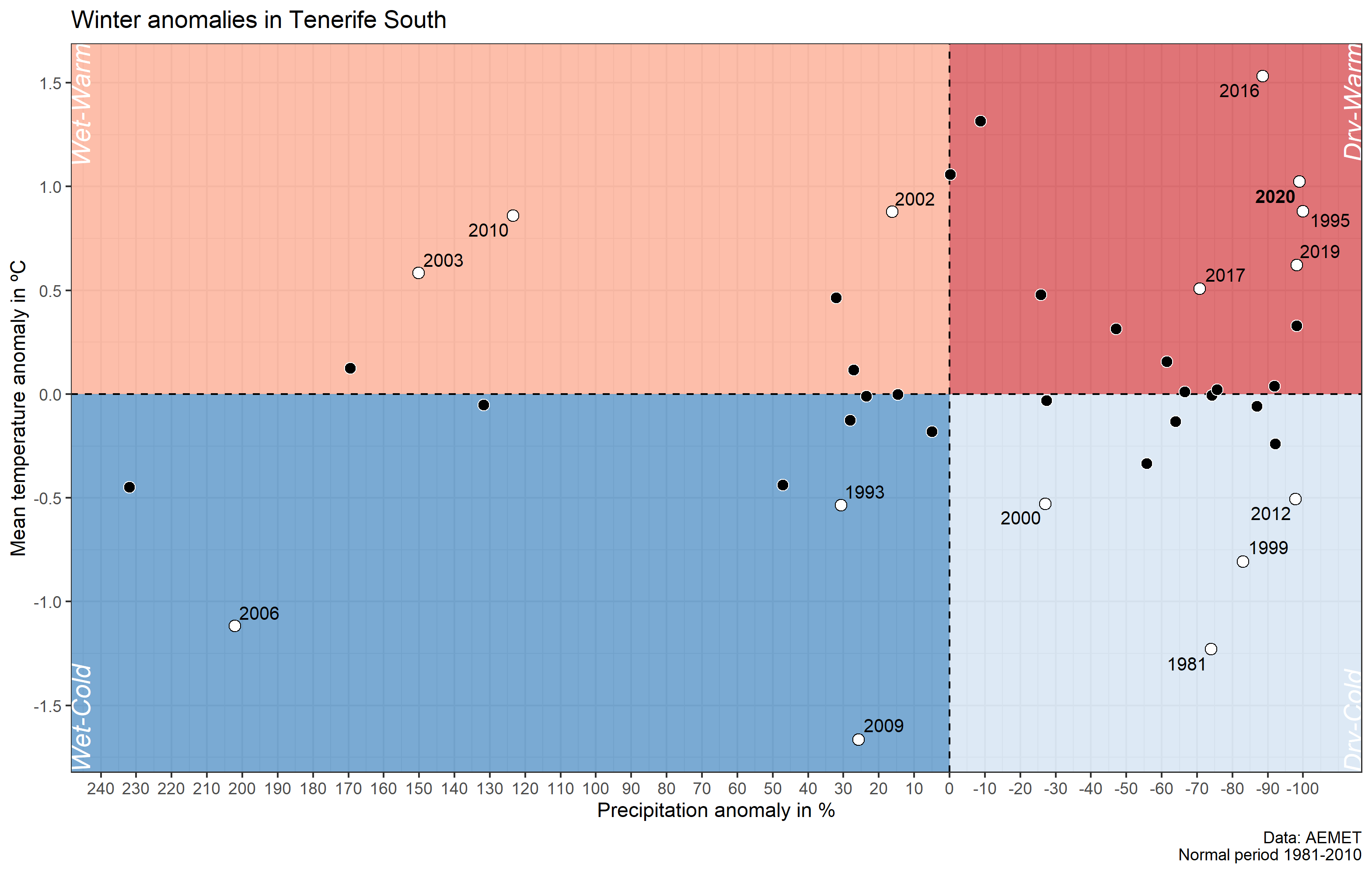
When we visualize precipitation and temperature anomalies, we simply use time series as bar graph indicating negative and positive values in red and blue. However, in order to have a better overview we need both anomalies in a single graph. In this way we could more easly answer the question of whether a particular season or month was dry-warm or wet-cold, and even compare these anomalies in the context of previous years.
Packages
In this post we will use the following packages:
| Package | Description |
|---|---|
| tidyverse | Collection of packages (visualization, manipulation): ggplot2, dplyr, purrr, etc. |
| ggrepel | Repel overlapping text labels in ggplot2 |
Preparing the data
First we import the daily precipitation and temperature data from the selected weather station (download). We will use the data from Tenerife South (Spain) [1981-2020] accessible through Open Data AEMET. In R there is a package called meteoland that facilitates the download with specific functions to access data from AEMET (Spanish State Meteorological Agency), Meteogalicia (Galician Meteorological Service) and Meteocat (Catalan Meteorological Service).
Step 1: import the data
We import the data in csv format, the first column is the date, the second column the precipitation (pr) and the last column the average daily temperature (ta).
data <- read_csv("meteo_tenerife.csv")
data
Step 2: preparing the data
In the second step we prepare the data to calculate the anomalies. To do this, we create three new columns: the month, the year, and the season of the year. Since our objective is to analyse winter anomalies, we cannot use the calendar year, because winter includes the month of December of one year and the months of January and February of the following. The concept is similar to the hydrological year in which it starts on October 1.
We will use many functions of the package collection tidyverse. The mutate() function helps to add new columns or change existing ones. To define the seasons, we use the case_when() function from the dplyr package, which has many advantages compared to a chain of ifelse(). In case_when() we use two-side formulas, on the one hand the condition and on the other the action when that condition is met. A two-sided formula in R consists of the operator ~. The binary operator %in% allows us to filter several values in a greater set.
Step 3: estimate winter anomalies
In the next step we create a subset of the winter months. Then we group by the defined meteorological year and calculate the sum and average for precipitation and temperature, respectively. To facilitate the work, the magrittr package and later R Base introduces the operator called pipe in the form %>% and |> with the aim of combining several functions without the need to assign the result to a new object. The pipe operator passes the output of a function applied to the first argument of the next function. This way of combining functions allows you to chain several steps simultaneously. The |> must be understood and pronounced as then.
Now we only have to calculate the anomalies of precipitation and temperature. The columns pr_mean and ta_mean will contain the climate average, the reference for the anomalies with respect to the normal period 1981-2010. Therefore, we need to filter the values to the period before 2010, which we will do in the usual way of filtering vectors in R. Once we have the references we estimate the anomalies pr_anom and ta_anom. To facilitate the interpretation, in the case of precipitation we express the anomalies as percentage, with the average set at 0% instead of 100%.
In addition, we add three required columns with information for the creation of the graph: 1) labyr contains the year of each anomaly as long as it has been greater/less than -+10% or -+0.5ºC, respectively (this is for reducing the number of labels), 2) symb_point is a dummy variable in order to be able to create different symbols between the cases of (1), and 3) lab_font for highlighting in bold the year 2020.
data_inv <- mutate(data_inv,
  pr_mean = mean(pr[winter_yr <= 2010]),
  ta_mean = mean(ta[winter_yr <= 2010]),
  pr_anom = (pr * 100 / pr_mean) - 100,
  ta_anom = ta - ta_mean,
  labyr = case_when(
    pr_anom < -10 & ta_anom < -.5 ~ winter_yr,
    pr_anom < -10 & ta_anom > .5 ~ winter_yr,
    pr_anom > 10 & ta_anom < -.5 ~ winter_yr,
    pr_anom > 10 & ta_anom > .5 ~ winter_yr
  ),
  symb_point = ifelse(!is.na(labyr), "yes", "no"),
  lab_font = ifelse(labyr == 2020, "bold", "plain")
)
Creating the graph
We will build the chart adding layer by layer the distinctive elements: 1) the background with the different grids (Dry-Warm, Dry-Cold, etc.), 2) the points and labels, and 3) the style adjustments.
Part 1
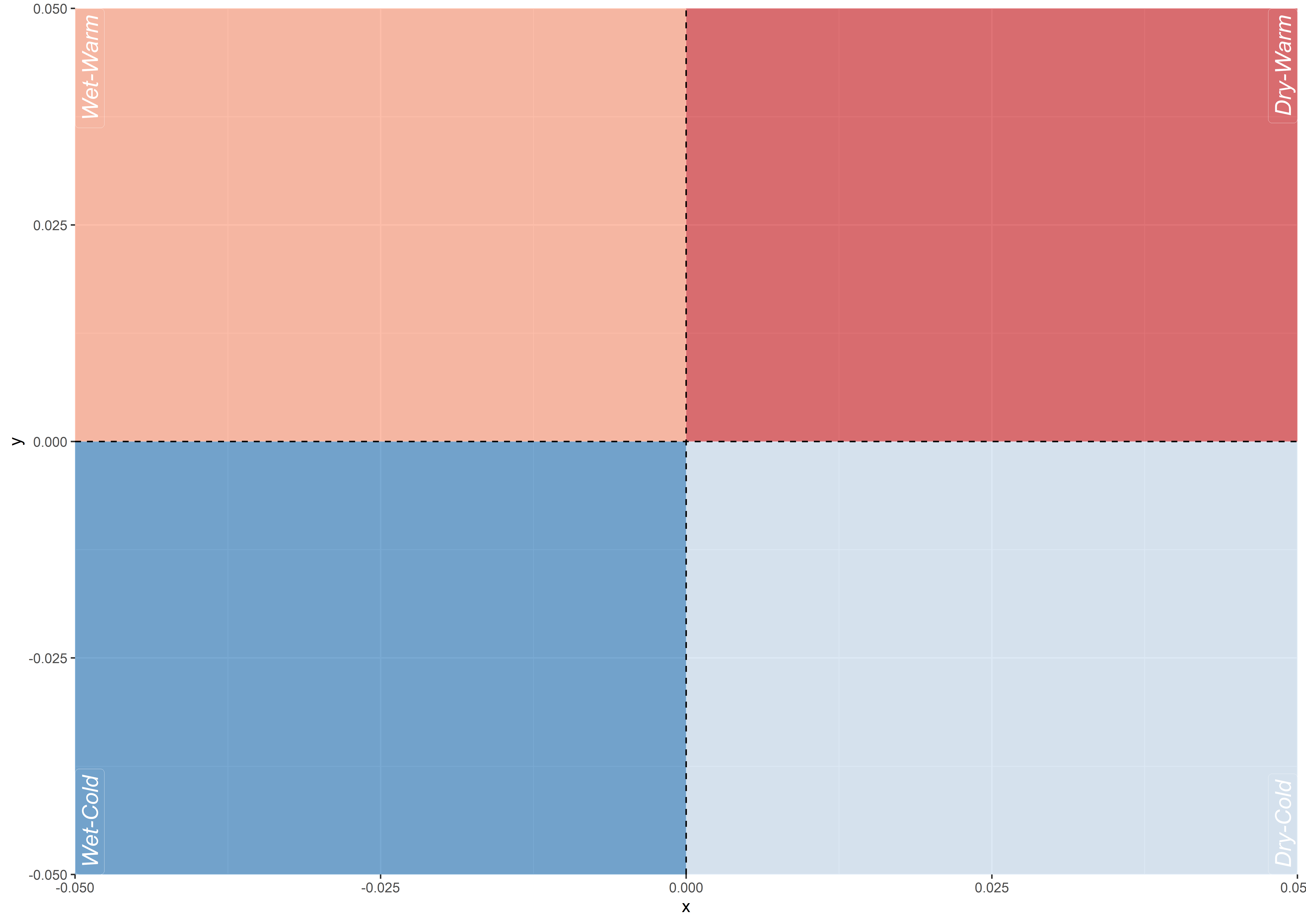
The idea is that the points with dry-warm anomalies are located in quadrant I (top-right) and those with wet-cold in quadrant III (bottom-left). Therefore, we must invert the sign in the precipitation anomalies. Then we create a data.frame with the label positions of the four quadrants. For the positions in x and y Inf and -Inf are used, which is equivalent to the maximum panel sides with respect to the data. However, it is necessary to adjust the position towards the extreme points within the panel with the known arguments of ggplot2: hjust and vjust.
Part 2
In the second part we can start building the chart by adding all graphical elements. First we create the background with different colors of each quadrant. The function annotate() allows adding geometry layers without the use of variables within data.frames. With the geom_hline() and geom_vline() function we mark the quadrants horizontally and vertically using a dashed line. Finally, we draw the labels of each quadrant, using the function geom_text(). When we use other data sources than the main one used in ggplot(), we must indicate it with the argument data in the corresponding geometry function.
g1 <- ggplot(
  data_inv_p,
  aes(pr_anom, ta_anom)
) +
  annotate("rect", xmin = -Inf, xmax = 0, ymin = 0, ymax = Inf, fill = "#fc9272", alpha = .6) + # wet-warm
  annotate("rect", xmin = 0, xmax = Inf, ymin = 0, ymax = Inf, fill = "#cb181d", alpha = .6) + # dry-warm
  annotate("rect", xmin = -Inf, xmax = 0, ymin = -Inf, ymax = 0, fill = "#2171b5", alpha = .6) + # wet-cold
  annotate("rect", xmin = 0, xmax = Inf, ymin = -Inf, ymax = 0, fill = "#c6dbef", alpha = .6) + # dry-cold
  geom_hline(
    yintercept = 0,
    linetype = "dashed"
  ) +
  geom_vline(
    xintercept = 0,
    linetype = "dashed"
  ) +
  geom_label(
    data = bglab,
    aes(x, y, label = lab, hjust = hjust, vjust = vjust),
    fontface = "italic", size = 5,
    label.size = .000001,
    fill = NA,
    angle = 90, colour = "white"
  )

g1
Part 3
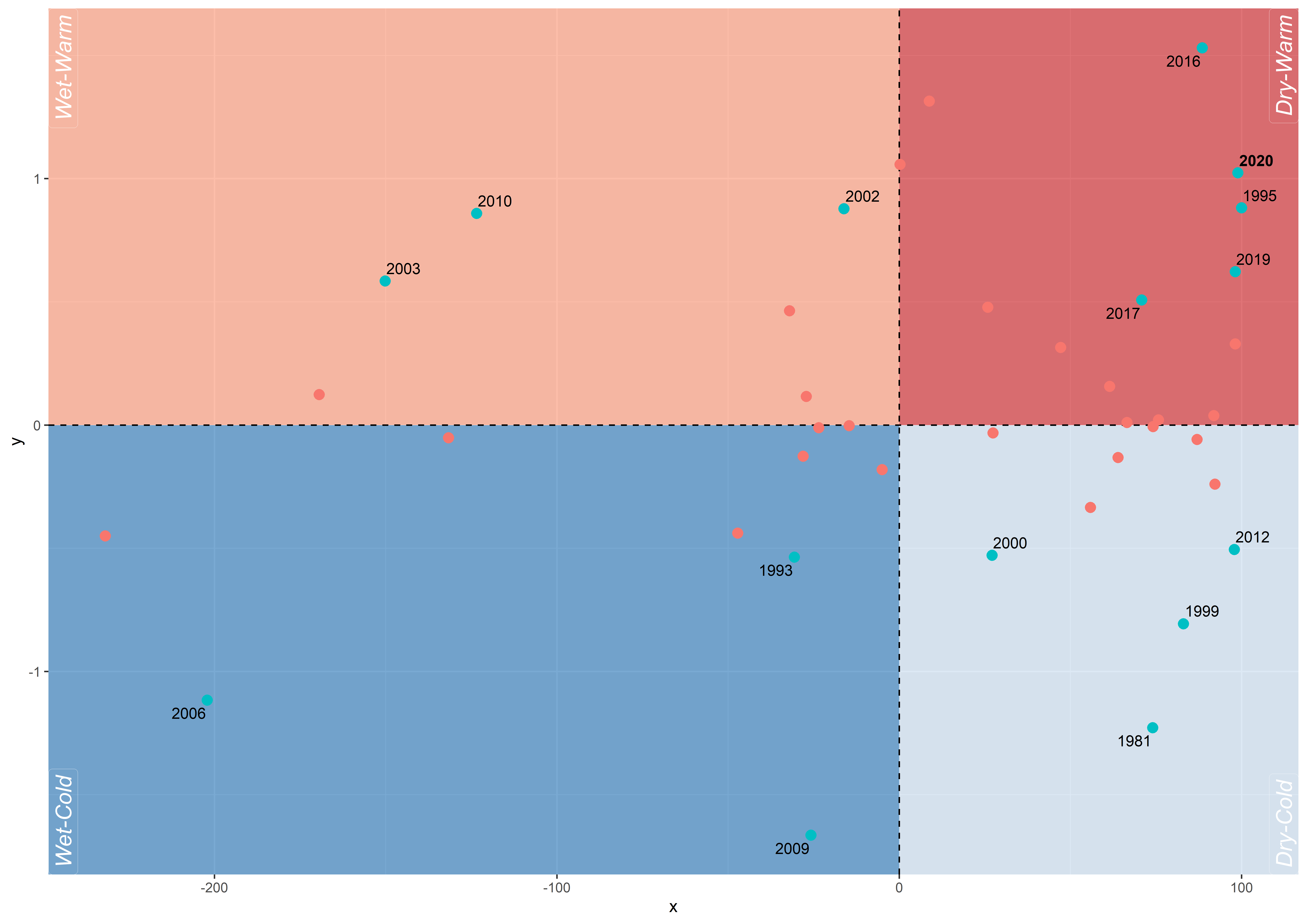
In the third part we simply add the points of the anomalies and the labels of the years. The geom_text_repel() function is similar to the one known by default in ggplot2, geom_text(), but it repels overlapping text labels away from each other.
g2 <- g1 + geom_point(aes(fill = symb_point, colour = symb_point),
  size = 2.8, shape = 21, show.legend = FALSE
) +
  geom_text_repel(aes(label = labyr, fontface = lab_font),
    max.iter = 5000,
    size = 3.5
  )
g2
Part 4
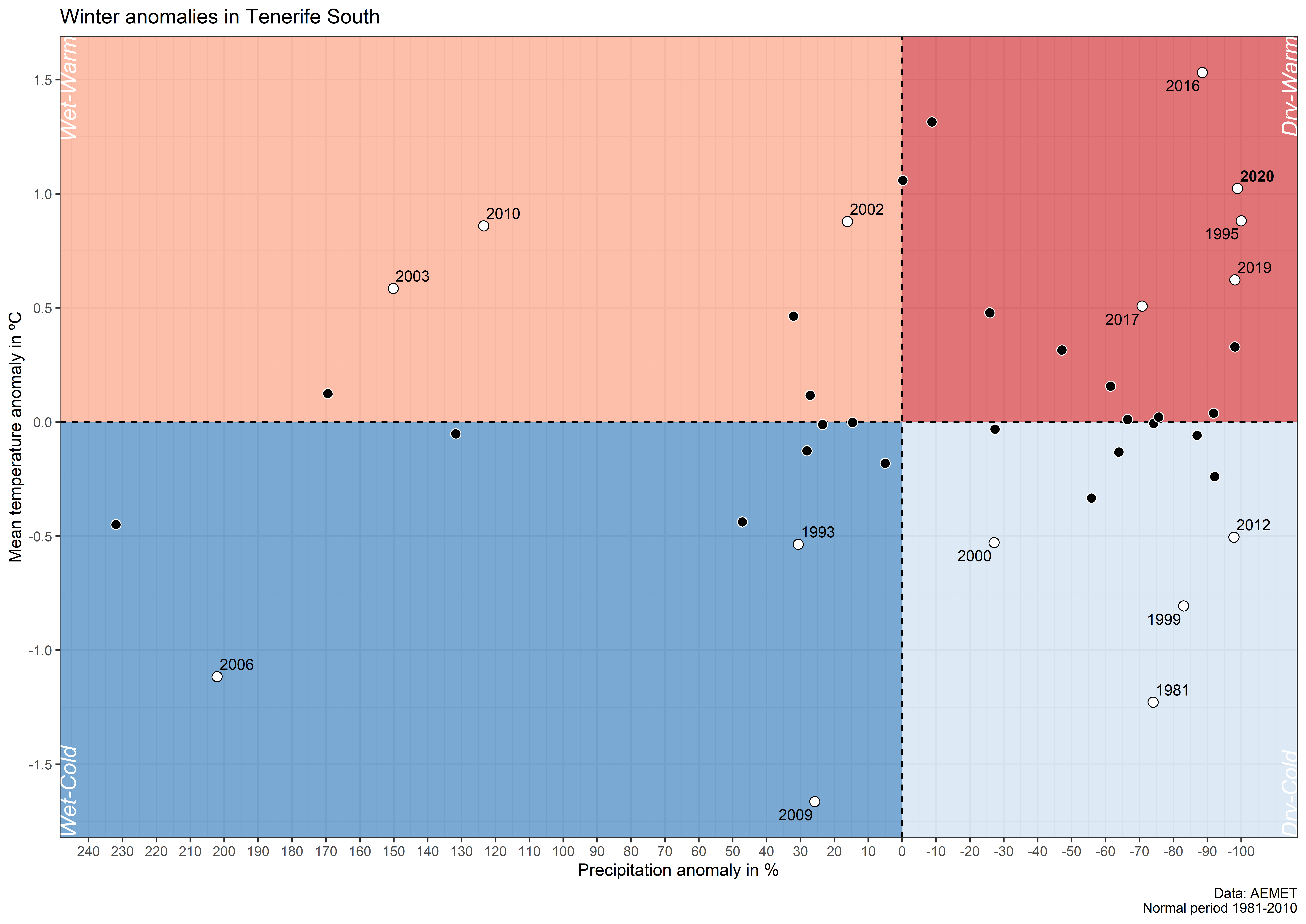
In the last part we adjust, in addition to the general style, the axes, the color type and the (sub)title. Remember that we changed the sign on precipitation anomalies. Hence, we must use the arguments breaks and labels in the function scale_x_continouous() to reverse the sign in the labels corresponding to the breaks.
g3 <- g2 +
  scale_x_continuous(
  breaks = seq(-100, 250, 10) * -1,
  labels = seq(-100, 250, 10),
  limits = c(min(data_inv_p$pr_anom), 100),
  expand = expansion(.01)
  ) +
  scale_y_continuous(
    breaks = seq(-2, 2, 0.5),
    expand = expansion(.01)
  ) +
  scale_fill_manual(values = c("black", "white")) +
  scale_colour_manual(values = rev(c("black", "white"))) +
  labs(
    y = "Mean temperature anomaly in ºC",
    x = "Precipitation anomaly in %",
    title = "Winter anomalies in Tenerife South",
    caption = "Data: AEMET\nNormal period 1981-2010"
  ) +
  theme_bw() +
  theme(panel.grid.minor = element_blank())

g3


