# install the packages if necessary
if (!require("tidyverse")) install.packages("tidyverse")
if (!require("ropenmeteo")) pak::pak("FLARE-forecast/ropenmeteo")
if (!require("sf")) install.packages("sf")
if (!require("giscoR")) install.packages("giscoR")
if (!require("ggtext")) install.packages("ggtext")
if (!require("geomtextpath")) install.packages("geomtextpath")
if (!require("ggforce")) install.packages("ggforce")
if (!require("ggthemes")) install.packages("ggthemes")
if (!require("ggh4x")) install.packages("ggh4x")
if (!require("ggnewscale")) install.packages("ggnewscale")

library(tidyverse)
library(ropenmeteo)
library(sf)
library(giscoR)
library(ggtext)
library(geomtextpath)
library(ggforce)
library(ggthemes)
library(ggh4x)
library(ggnewscale)A data-driven normal for the Spain temperature chart
R
R:Advanced
Visualization
Climate
Anomaly
Temperature
Open-Meteo
Smoothing
For the past few years I’ve kept this chart running: the daily mean temperature in Spain against its climatological normal, with the anomaly shaded in red (above normal) and blue (below). Whenever I want to know “is this heatwave or cold snap actually unusual, or does it just feel that way”, this is the chart I reach for, a line, not a column, because temperature is an interval scale and a zero baseline makes no sense here (see the nine alternatives I discussed previously).
This post has two goals. The first is the obvious one: walk through how the chart above is built, end to end, where the data comes from, how “Spain” is defined as a set of locations, and how to turn 30 years of daily values into a single reference curve. The second goal is the one I find more interesting: how do you smooth a daily climatological reference? A monthly or annual normal is comparatively easy, average 30 Januaries together and you’re done. A daily normal is much harder: 366 noisy values, each based on only 30 observations, that need to trace out a smooth seasonal cycle without either following the day-to-day noise or flattening real features of that cycle, like the late-summer plateau typical of the Iberian climate. Get this wrong in either direction and the “normal” line either looks jagged for no good reason, or looks suspiciously perfect.
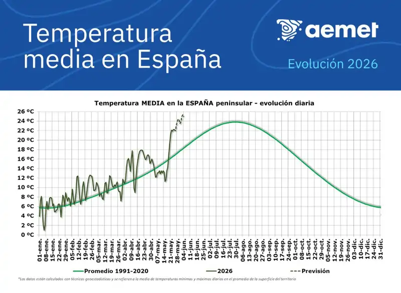
Recent examples motivated this post. AEMET’s own daily chart plots this year’s values against a line that is itself close to a single smooth curve. By the way it never turns the gap between the two lines into a shape the reader can read at a glance:
Copernicus also uses this type of graph in its reports, as you see below State of Climate 2024.
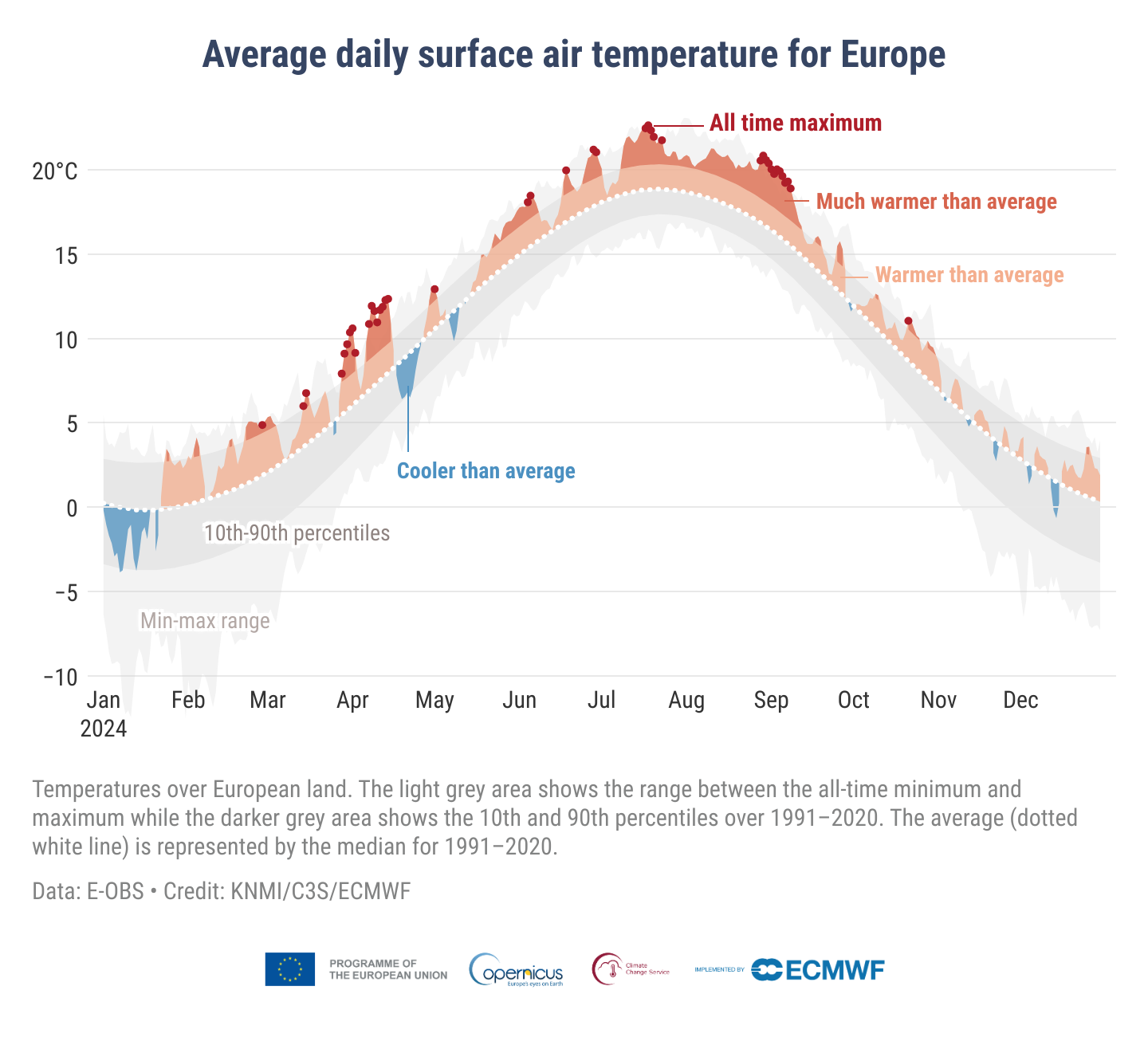
And then, just a few days ago, Reuters published its global temperature monitor, which pushes the same idea even further: its “normal year” curve is also very smooth and almost it looks like a single sine wave. From here, I said, I need to review my smoothing degree that I did ad hoc at the time, thinking a 30-day window would be enough, but what if we can test it statistically. If I’m going to draw a smooth reference curve and call it “normal,” I’d like to be able to say why it’s that smooth and not smoother, or rougher. I have even seen graphs of this type without smoothing, which is clearly a wrong way.
It turns out there isn’t a single “correct” way to do this. There are (at least) two well-established families of smoothers, loess and harmonic regression, that work in quite different ways but can both be tuned the same way: by cross-validation, letting the data pick how much to smooth rather than picking a number because it “looks right” or other physical rational. The rest of this post rebuilds the chart from scratch with Open-Meteo data (so the whole pipeline is reproducible), then walks through both families side by side, what each one actually does, how to let the data choose its tuning parameter, and how close (or far) they end up from each other and from the original guess.
Packages
| Package | Description |
|---|---|
| tidyverse | Collection of packages (visualization, manipulation): ggplot2, dplyr, purrr, etc. |
| ropenmeteo | R wrapper for the free Open-Meteo APIs (no API key required); the older openmeteo package has been removed from CRAN |
| sf | Simple features for spatial vector data |
| giscoR | Country and administrative boundaries from Eurostat’s GISCO service, used here to map the reference cities |
| ggtext | Improved text rendering (titles, labels) for ggplot2 |
| geomtextpath | Draw text that follows a curved path, used for the P5/P95 labels |
| ggforce | Extra geoms, including geom_mark_circle() for the monthly anomaly call-outs |
| ggthemes | A collection of additional ggplot2 themes |
| ggh4x | Extra ggplot2 helpers, including stat_difference() for correctly interpolated fill areas |
| ggnewscale | Multiple fill/colour scales in a single ggplot2 chart |
Step 1: choosing the reference locations
The original 42-station list is a legacy of AEMET’s homogenized climate series (by the way it isn’t anymore used, see below). Instead, now I built a list of 60 locations:
- The capital city of each of the 48 mainland and Balearic provinces, plus Ceuta and Melilla (50 in total). This is an objective, reproducible criterion: it is fixed by Spain’s administrative geography, not by a climatologist’s choice, and it guarantees at least one point in every region.
- 10 additional cities chosen for climatic rather than administrative reasons: places that are large (Vigo, Gijón, Cartagena, Jerez de la Frontera, Elche…) but are not provincial capitals, plus a couple of smaller places that sit in climatically distinctive spots, Ferrol and Santiago de Compostela for the Atlantic Galician interior/coast contrast, and Tarifa, which despite its modest population (~18,000) sits at the Strait of Gibraltar and experiences one of the most distinctive wind/temperature regimes in mainland Spain.
I deliberately leave out the Canary Islands’ two provincial capitals (Las Palmas de Gran Canaria, Santa Cruz de Tenerife). Geographically they’re Spain, but climatically they’re a different system: sub-tropical, oceanic, at a latitude shared with the Sahara rather than the Iberian Peninsula, with a seasonal cycle so muted it barely qualifies as one. Folding them into a single national median would mix two climates that don’t share the thing this whole post is about, a clear, single-peaked annual cycle, for the sake of a higher city count. The Balearics (Palma de Mallorca) stay in: same broad Mediterranean system as the mainland coast, just offshore.
The full list is available as a CSV (cities.csv):
cities <- read_csv("cities.csv")
cities
# A tibble: 60 x 7
name province type lat lon population note
<chr> <chr> <chr> <dbl> <dbl> <dbl> <chr>
1 A Coruna A Coruna capital 43.4 -8.41 245000 <NA>
2 Vitoria-Gasteiz Alava capital 42.8 -2.67 253000 <NA>
3 Albacete Albacete capital 39.0 -1.86 173000 <NA>
4 Alicante Alicante capital 38.3 -0.481 337000 <NA>
5 Almeria Almeria capital 36.8 -2.46 200000 <NA>
6 Oviedo Asturias capital 43.4 -5.84 219000 <NA>
7 Avila Avila capital 40.7 -4.68 57000 <NA>
8 Badajoz Badajoz capital 38.9 -6.97 150000 <NA>
9 Palma de Mallorca Baleares capital 39.6 2.65 419000 <NA>
10 Barcelona Barcelona capital 41.4 2.17 1620000 <NA>
# i 50 more rowsA quick map shows how the sample covers the country:
Code
spain <- gisco_get_countries(country = "Spain", resolution = "10")

cities_sf <- st_as_sf(cities, coords = c("lon", "lat"), crs = 4326)

ggplot() +
  geom_sf(data = spain, fill = "grey95", colour = "grey75", linewidth = .3) +
  geom_sf(data = cities_sf, aes(colour = type), size = 1.6) +
  scale_colour_manual(
    values = c(capital = "#2166ac", extra = "#b2182b"),
    labels = c(capital = "Provincial capital (+ Ceuta/Melilla)", extra = "Additional city")
  ) +
  coord_sf(xlim = c(-9.6, 4.5), ylim = c(35.5, 44)) +
  labs(colour = NULL, x = NULL, y = NULL) +
  theme_minimal() +
  theme(legend.position = "bottom",
        panel.grid = element_line(linewidth = .1))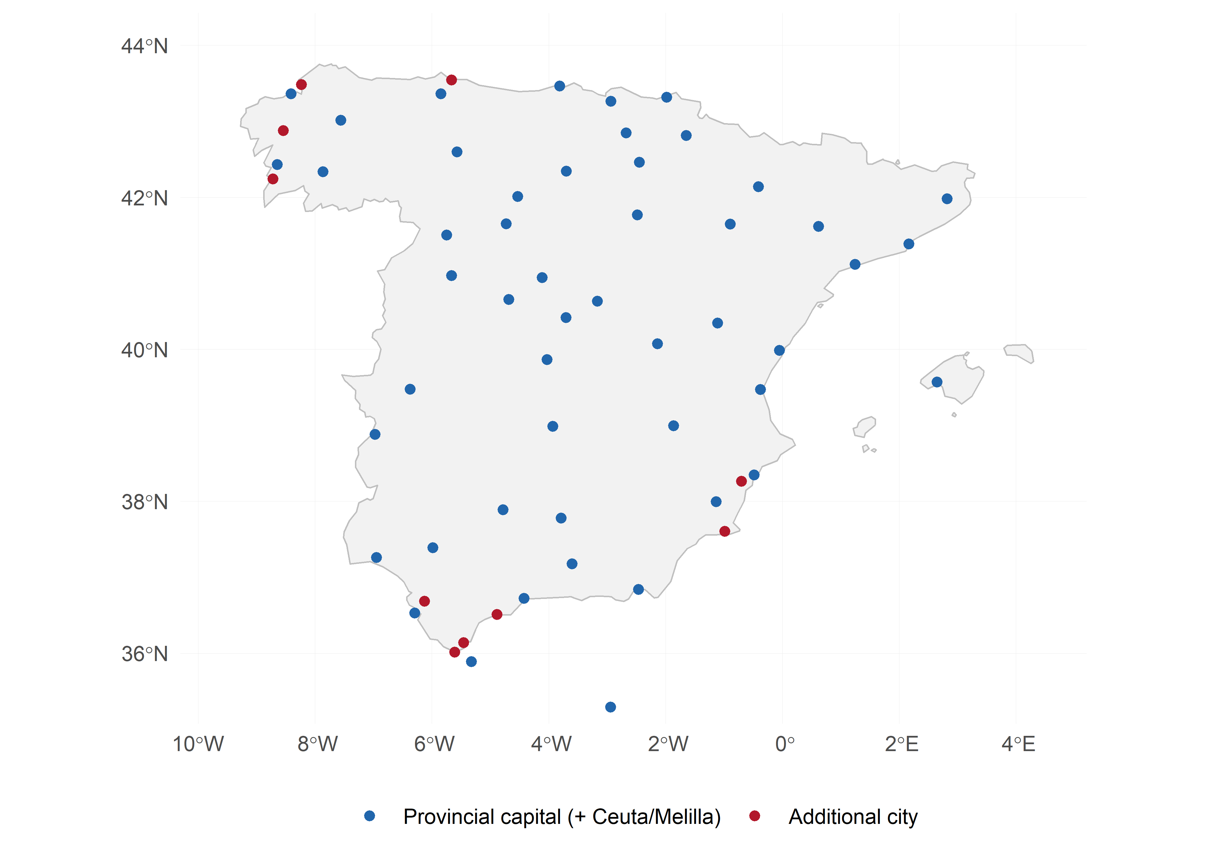
A note on what “the average of Spain” even means
AEMET’s own methodology has moved several years ago. The 42-station network the original script relied on is a legacy of an older approach: a fixed set of long, homogeneous series, chosen for detecting trends rather than for representativeness on any given day. More recently, AEMET computes its national daily average from a regular spatial grid covering the whole territory, including the large unpopulated stretches of the Meseta, the Pyrenees, and other mountain ranges that a station network tends to under-sample. That gridded product, however, isn’t published as open data, so it can’t be reproduced here.
The 60-city sample in this post takes a third approach, and it’s worth being explicit that it is population-representative rather than territory-representative. A regular grid gives a square kilometre of the Sierra de Gredos the same weight as a square kilometre of central Madrid; our sample instead gives roughly equal weight to places like A Coruña and Huesca, regardless of how much empty land surrounds either. Neither is “more correct”, a territory average answers “what is Spain’s climate, area by area”, while a population-based average answers something closer to “what does a day like this actually feel like for most people in Spain.” For a chart aimed at a general audience I think the second framing is the more honest one, but it does mean this post’s national series won’t exactly match AEMET’s, and that’s a deliberate trade-off rather than an oversight.
Step 2: getting the data from Open-Meteo
The Open-Meteo Historical Weather API serves ERA5 reanalysis data back to 1940 for any coordinate on Earth, with no API key. This removes the dependency on AEMET credentials, one consistent data source for both the 1961-1990 normal and the most recent observations.
The ropenmeteo package wraps this API. get_historical_weather() returns hourly ERA5 values in long format (one row per datetime/variable), so for a single location we request hourly temperature_2m and collapse it to a daily mean ourselves:
To build the full dataset we loop over the 60 locations and the two periods we need: the 1961-1990 reference period and the most recent complete year (2025). This is the slow part, 60 locations × 30 years of hourly data is a non-trivial amount of data, and Open-Meteo’s fair-use limits mean it is wise to add a short pause between requests, and to expect the occasional 429 Too Many Requests.
We can solve it with a robust_climate_download() helper: cache each unit of work to disk as soon as it succeeds, skip anything already cached, retry failures with a short backoff, and do a second pass over whatever is still missing at the end.
Code
robust_openmeteo_download <- function(cities, start_date, end_date,
                                       max_retries = 3, cache_dir = "cache_chunks") {
  dir.create(cache_dir, showWarnings = FALSE)

  get_history <- function(lat, lon) {
    get_historical_weather(
      latitude = lat, longitude = lon,
      start_date = start_date, end_date = end_date,
      variables = "temperature_2m"
    ) |>
      mutate(date = as_date(datetime)) |>
      group_by(date) |>
      summarise(tmed = mean(prediction, na.rm = TRUE), .groups = "drop")
  }

  # download one city, with retries; skip entirely if already cached
  download_one <- function(lat, lon, name) {
    cache_file <- file.path(cache_dir, str_glue("{name}_{start_date}_{end_date}.rds"))
    if (file.exists(cache_file)) return(TRUE) # already on disk, nothing to do

    for (attempt in 1:max_retries) {
      result <- tryCatch(
        get_history(lat, lon) |> mutate(city = name),
        error = function(e) {
          message(name, ", attempt ", attempt, " failed: ", e$message)
          NULL
        }
      )
      if (!is.null(result) && nrow(result) > 0) {
        saveRDS(result, cache_file)
        return(TRUE)
      }
      Sys.sleep(3 * attempt) # back off a little more on each retry
    }
    FALSE
  }

  run_pass <- function(city_rows) {
    ok <- pmap_lgl(
      list(city_rows$lat, city_rows$lon, city_rows$name),
      function(lat, lon, name) {
        Sys.sleep(1) # be nice to the free API, even on a cache hit
        download_one(lat, lon, name)
      }
    )
    city_rows$name[!ok]
  }

  still_failing <- run_pass(cities)
  if (length(still_failing) > 0) {
    message("Retrying ", length(still_failing), " cities: ", paste(still_failing, collapse = ", "))
    still_failing <- run_pass(filter(cities, name %in% still_failing))
  }
  if (length(still_failing) > 0) {
    warning("Never succeeded for: ", paste(still_failing, collapse = ", "))
  }

  # stitch together whatever made it to disk for this date range,
  # whether it was just downloaded or was already cached from a previous run
  list.files(cache_dir, pattern = str_glue("_{start_date}_{end_date}\\.rds$"), full.names = TRUE) |>
    map(readRDS) |>
    list_rbind()
}

normal_raw  <- robust_openmeteo_download(cities, "1961-01-01", "1990-12-31")
current_raw <- robust_openmeteo_download(cities, "2025-01-01", "2025-12-31")
The caching is what actually matters here: if the loop dies partway through (rate limit, a dropped connection, RStudio crashing at city 47 of 60), re-running the exact same call picks up where it left off instead of re-downloading everything, because download_one() checks for the cache file before making any request at all.
Important
For 60 locations and 30 years, this still downloads roughly 660,000 daily values and easily takes 10-15 minutes even with nothing going wrong. To keep this post reproducible without making you wait, I have pre-computed the national daily series, i.e. already collapsed to one median value per day across the 60 cities, and provide it as a small CSV (1961-1990, 2025).
Once normal_raw and current_raw are downloaded, collapsing them to a national daily series is a single group_by()/summarise():
From here on, we work with the cached files:
# A tibble: 10,957 x 4
   date        tmed    yd    yr
   <date>     <dbl> <dbl> <dbl>
 1 1961-01-01  6.9      1  1961
 2 1961-01-02  8        2  1961
 3 1961-01-03  9.2      3  1961
 4 1961-01-04  6.9      4  1961
 5 1961-01-05  6        5  1961
 6 1961-01-06  5.6      6  1961
 7 1961-01-07  8.55     7  1961
 8 1961-01-08 10.6      8  1961
 9 1961-01-09  8.95     9  1961
10 1961-01-10  7.7     10  1961
# i 10,947 more rows
Step 3: the daily climatology (1961-1990)
For each day of the year (1 to 366, to account for leap years), we take the median across the 30 years as the central reference, and the 5th/95th percentiles as the “typical range”:
# A tibble: 366 x 4
      yd tmed_norm    p5   p95
   <dbl>     <dbl> <dbl> <dbl>
 1     1      6.9   2.93 10.3
 2     2      7.4   3.92  9.65
 3     3      7.02  4.04  9.97
 4     4      6.95  3.64 10.7
 5     5      6.88  3.85 10.1
 6     6      6.8   3.48 10.9
 7     7      7.28  3.76 11.7
 8     8      7.38  4.39 11.5
 9     9      7.02  3.76 11.4
10    10      6.75  3.37 10.9
# i 356 more rows
This is conceptually the same normal data frame as in the original script, 366 noisy points, one per day of the year, each summarising 30 observations, just built from a different 30-year window (more on that below). Plotted directly, it looks like this:
Code
mutate(clim, date = as_date(yd, origin = "2000-01-01")) |>
ggplot(aes(date, tmed_norm)) +
  geom_point(size = .6, colour = "grey40") +
  labs(x = "Day of year", y = "ºC", title = "Raw daily climatology, 1961-1990 (before smoothing)") +
  scale_x_date(date_labels = "%b") +
  theme_minimal() +
  theme(panel.grid.minor = element_blank())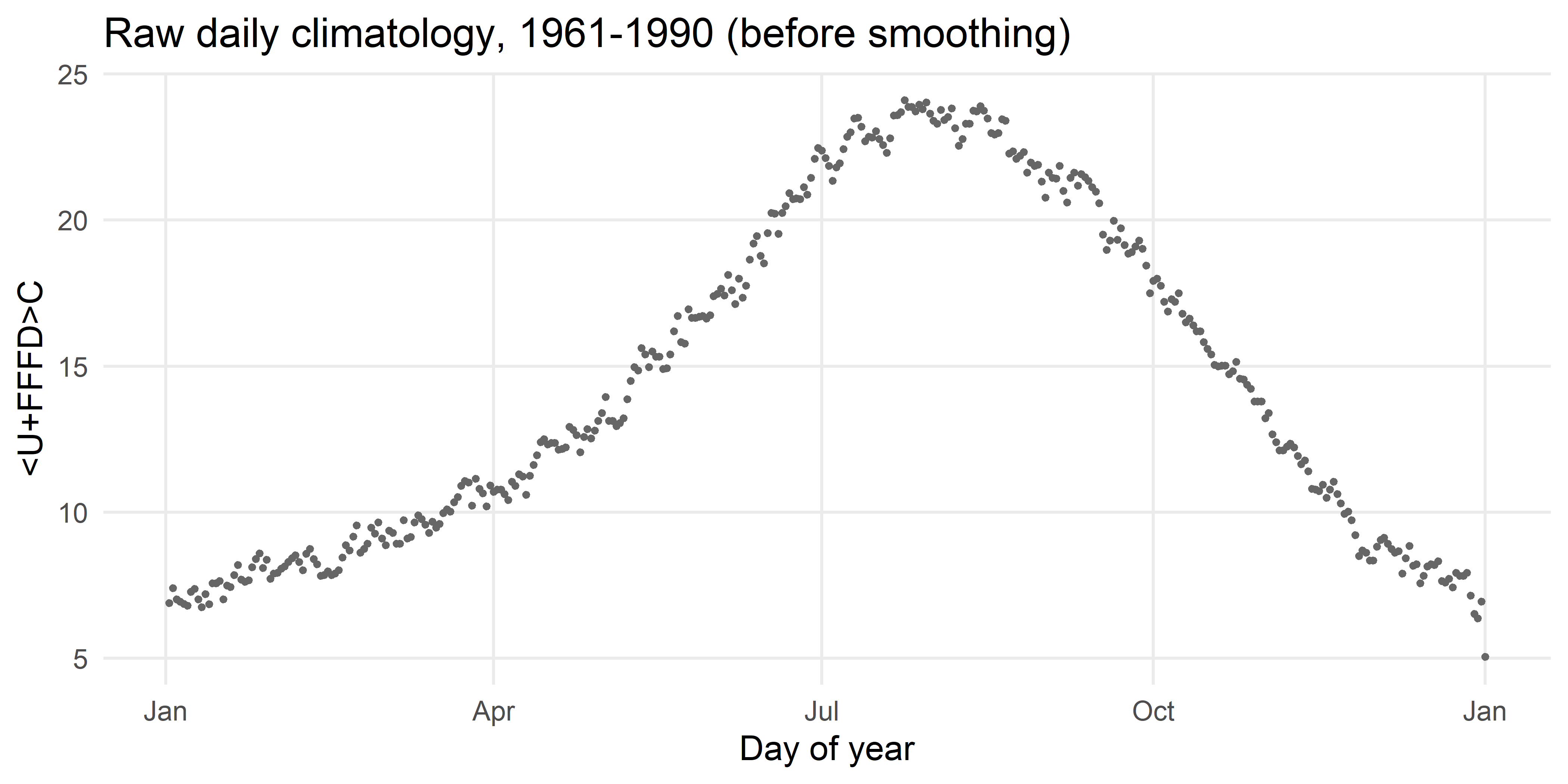
The seasonal cycle is obvious, but the line is jagged, each point still carries sampling noise from averaging only 30 years. Some smoothing is clearly needed. The question is how much.
Why 1961-1990, and not 1991-2020, or even 1971-2000?
Before getting to the smoothing, it’s worth being explicit about a choice that’s easy to miss: which 30 years count as “normal”? AEMET’s chart uses 1991-2020, the WMO’s current climatological standard normal, recomputed every decade and intended for everyday operational use (“is today warm or cold compared to the recent past?”).
This post uses an older, fixed baseline instead, for a different, complementary purpose: showing how much the climate has already changed. Because Spain’s climate has warmed over the intervening decades, a 1991-2020 normal sits noticeably warmer than an older one across most of the year. That has a direct, mechanical effect on a chart like this:
- Plotted against 1991-2020, this year’s temperatures look closer to “normal”, some of the warming is already baked into the reference line itself.
- Plotted against an older baseline, the same data shows a larger positive anomaly, because the reference hasn’t moved.
Neither choice is wrong, but a chart that doesn’t say which one it’s using is implicitly making an editorial decision for the reader.
So which older baseline? The original script used 1971-2000, which made sense at the time: the 42-station AEMET network is only really homogeneous and complete from around 1971 onward. With ERA5 that constraint disappears, Open-Meteo’s archive goes back to 1940 for any point on Earth, so this post moves to 1961-1990, the oldest 30-year block ERA5 supports comfortably. As a bonus, 1961-1990 also happens to be the baseline used by the Reuters monitor, which makes the smoothing comparison in the next section a closer apples-to-apples one.
Step 4: how much should we smooth?
Two ways to get it wrong
Too little smoothing simply reproduces the dots above: a “normal” that wiggles up and down by half a degree from one day to the next for no climatological reason. Day d and day d+1 are not meaningfully different in 1961-1990 Spain; that wiggle is noise, not signal.
Too much smoothing is the opposite failure, and it’s the one that motivated this post. When the “normal year” curve is so smooth that it looks like a single sine wave, essentially one cycle per year, with no asymmetry between seasons. The problem is that real seasonal cycles in Spain, or in specific locations, are not symmetric sine waves: spring warming and autumn cooling happen at different rates, and there is a well-known late-summer plateau (even a slight dip) around August in the Iberian daily climatology. A single sine wave smooths all of that away. It looks authoritative, but the smoothness itself is not telling you anything about the climate, it’s telling you about the (unstated) choice of smoothing window.
Both loess(span = .08) (my original script) and a single sine wave can be choices, made by eye, with no justification attached. We can do better by treating this as model selection: pick a family of smoothers of increasing flexibility, and use cross-validation to find the member of that family that predicts unseen data best. I’ll do this twice, for two families that solve the same problem in very different ways, loess and harmonic regression, and then compare what each one comes up with. I’ll first work through both on a single, ordinary city, then check whether that city’s answer generalises, before finally scaling everything up to the national average.
Two families, in plain terms
loess (“locally weighted regression”) works locally. To estimate the normal for, say, day 200, it looks only at a window of nearby days, controlled by span, roughly the fraction of the year’s days included in that window, and fits a simple curve through just those points. Slide the window along and you get a smooth curve for the whole year. A small span (a narrow window) follows local detail closely but is easily fooled by noise; a large span (a wide window) is smoother but slower to track real features of the seasonal cycle. One wrinkle: day 366 and day 1 are neighbours on the calendar, but not in the data, so loess needs help to “see” that the year wraps around. The usual fix is to glue three copies of the climatology end to end before smoothing, then keep only the middle copy.
Harmonic regression works globally. It describes the entire year-long curve as a sum of a handful of waves, sine/cosine pairs, of increasing speed: one full cycle per year, two cycles per year, three, and so on. The number of wave pairs, K, controls the flexibility. K = 1 is a single wave: a perfect sine curve. K = 2 adds a faster wave that lets the curve be asymmetric (spring can warm faster than autumn cools), K = 3 adds an even faster one (room for something like the August plateau), and so on. Because sines and cosines are periodic by construction, the curve automatically wraps around correctly, no gluing required.
Different machinery, but the same underlying idea: span and K both trade off “follow the data closely” against “stay smooth,” and both can be tuned the same way, hide some years, fit on the rest, check how well the result predicts the hidden years, repeat across several splits, and pick the value that predicts best on average.
A worked example: one city, two methods
Let’s tune them on one ordinary station first, Madrid, and only scale up to the national average once the mechanics are clear. I picked Madrid here for no special reason other than it’s a single, familiar place; the same five-city sample used below is cached as a small CSV (cities_sample_1961_1990.csv) so this is reproducible without the full 60-city download:
Harmonic regression models the climatological curve as a sum of \(K\) sine/cosine pairs with a 366-day period:
\[ \hat{T}(d) = a_0 + \sum_{k=1}^{K}\Big[a_k\cos\Big(\frac{2\pi k d}{366}\Big) + b_k\sin\Big(\frac{2\pi k d}{366}\Big)\Big] \]
\(K=1\) is a single sine wave. Larger \(K\) adds higher-frequency terms, giving the curve room for features like an asymmetric spring/autumn or a late-summer plateau. As \(K \to 183\), the curve would interpolate every single noisy daily value, meaning overfitting. Because this is just a linear model in disguise (the \(\cos\)/\(\sin\) terms are ordinary predictors), it’s trivial to fit with lm():
make_harmonics <- function(yd, K, period = 366) {
  map(1:K, function(k) {
    tibble(
      "cos{k}" := cos(2 * pi * k * yd / period),
      "sin{k}" := sin(2 * pi * k * yd / period)
    )
  }) |> list_cbind()
}
make_harmonics() just builds the predictor columns (\(\cos(2\pi \cdot 1 \cdot d/366)\), \(\sin(2\pi \cdot 1 \cdot d/366)\), \(\cos(2\pi \cdot 2 \cdot d/366)\), …) for a chosen \(K\); the actual fitting is plain lm(). To pick \(K\), we fit on the daily data directly (not an already-aggregated climatology), using 5-fold cross-validation split by year, so a given year’s 365/366 days stay together, fully in training or fully in test:
cv_rmse <- function(K, data, folds) {

  map_dbl(folds, function(test_years) {
    train <- filter(data, !yr %in% test_years)
    test  <- filter(data, yr %in% test_years)

    fit <- lm(tmed ~ ., data = bind_cols(tmed = train$tmed, make_harmonics(train$yd, K)))
    pred <- predict(fit, newdata = make_harmonics(test$yd, K))

    sqrt(mean((test$tmed - pred)^2))
  }) |> mean()

}

set.seed(42)
years <- unique(national_1961_1990$yr)
years
[1] 1961 1962 1963 1964 1965 1966 1967 1968 1969 1970 1971 1972 1973 1974 1975
[16] 1976 1977 1978 1979 1980 1981 1982 1983 1984 1985 1986 1987 1988 1989 1990$`1`
[1] 1977 1964 1987 1969 1973 1968
$`2`
[1] 1965 1978 1989 1983 1972 1988
$`3`
[1] 1961 1990 1974 1971 1962 1986
$`4`
[1] 1985 1975 1982 1980 1984 1966
$`5`
[1] 1970 1967 1963 1979 1976 1981cv_rmse() does the whole CV loop for one candidate \(K\): for each of the five folds, hold out that fold’s years, fit the harmonic model on the rest, predict the held-out days, and record the RMSE; map_dbl() runs this once per fold and the final mean() averages the five scores into one number for that \(K\). The folds themselves, five random groups of years, built once with a fixed seed, are reused for every model in this post, so every comparison from here on is apples-to-apples.
[1] 3Code
ggplot(cv_results_madrid, aes(K, rmse)) +
  geom_line(colour = "grey50") +
  geom_point(size = 1.3) +
  geom_vline(xintercept = best_K_madrid, linetype = "dashed", colour = "#b2182b") +
  scale_x_continuous(breaks = 1:10) +
  labs(x = "Number of harmonics (K)", y = "5-fold CV RMSE (ºC)",
       title = "Madrid: cross-validated error vs. model complexity") +
  theme_minimal() +
  theme(panel.grid.minor = element_blank())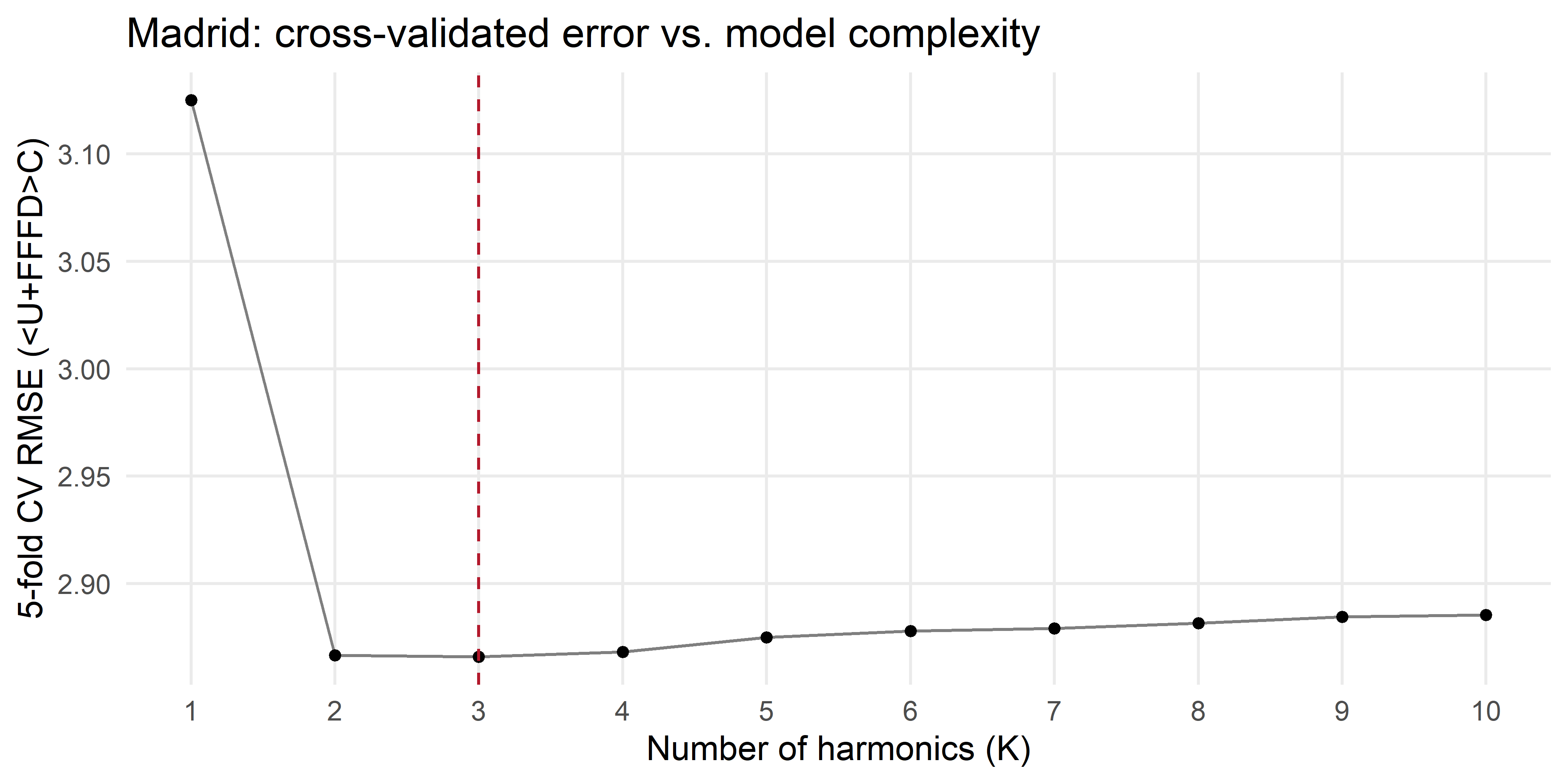
For Madrid, the error drops sharply from \(K=1\) to \(K=2\) and then flattens, extra harmonics beyond that mostly fit weather noise rather than climate signal. That minimum, 3, is our cross-validated answer for this one city.
Now the same question for loess. It needs one extra step: loess works on a climatology (one value per day of year), not raw daily data, and it needs help to “see” that day 366 and day 1 are neighbours, the fix used here is to glue three copies of the climatology end to end, smooth that, and keep only the middle copy:
loess_smooth <- function(yd, y, span, period = 366) {
  yd_ext <- c(yd - period, yd, yd + period)
  y_ext  <- c(y, y, y)
  fit <- loess(y_ext ~ yd_ext, span = span, degree = 2)
  predict(fit, newdata = data.frame(yd_ext = yd))
}

cv_rmse_loess <- function(span, data, folds) {
  map_dbl(folds, function(test_years) {
    train <- filter(data, !yr %in% test_years)
    test  <- filter(data, yr %in% test_years)

    clim_train <- train |>
      group_by(yd) |>
      summarise(tmed_norm = median(tmed, na.rm = TRUE)) |>
      complete(yd = 1:366) |>
      arrange(yd) |>
      fill(tmed_norm, .direction = "downup")

    smooth <- loess_smooth(clim_train$yd, clim_train$tmed_norm, span = span)
    pred <- smooth[test$yd]

    sqrt(mean((test$tmed - pred)^2))
  }) |> mean()
}
loess_smooth() is the padding trick plus a single call to base R’s loess(); cv_rmse_loess() mirrors cv_rmse() exactly, except each fold first collapses its training years to a 366-day climatology (filling any day of year missing from a given fold with tidyr::complete() + fill()) before smoothing it, then checks the result against the held-out years’ raw daily values, same folds, same logic, different smoother:
[1] 0.17A span of 0.17 corresponds to 62.22 days of window, i.e., approximately 2 months.
Code
ggplot(cv_results_loess_madrid, aes(span, rmse)) +
  geom_line(colour = "grey50") +
  geom_point(size = 1.3) +
  geom_vline(xintercept = best_span_madrid, linetype = "dashed", colour = "#2166ac") +
  scale_x_continuous(breaks = seq(0, .3, .02)) +
  labs(x = "span (fraction of the year per local window)", y = "5-fold CV RMSE (ºC)",
       title = "Madrid: cross-validated error vs. loess span") +
  theme_minimal() +
  theme(panel.grid.minor = element_blank())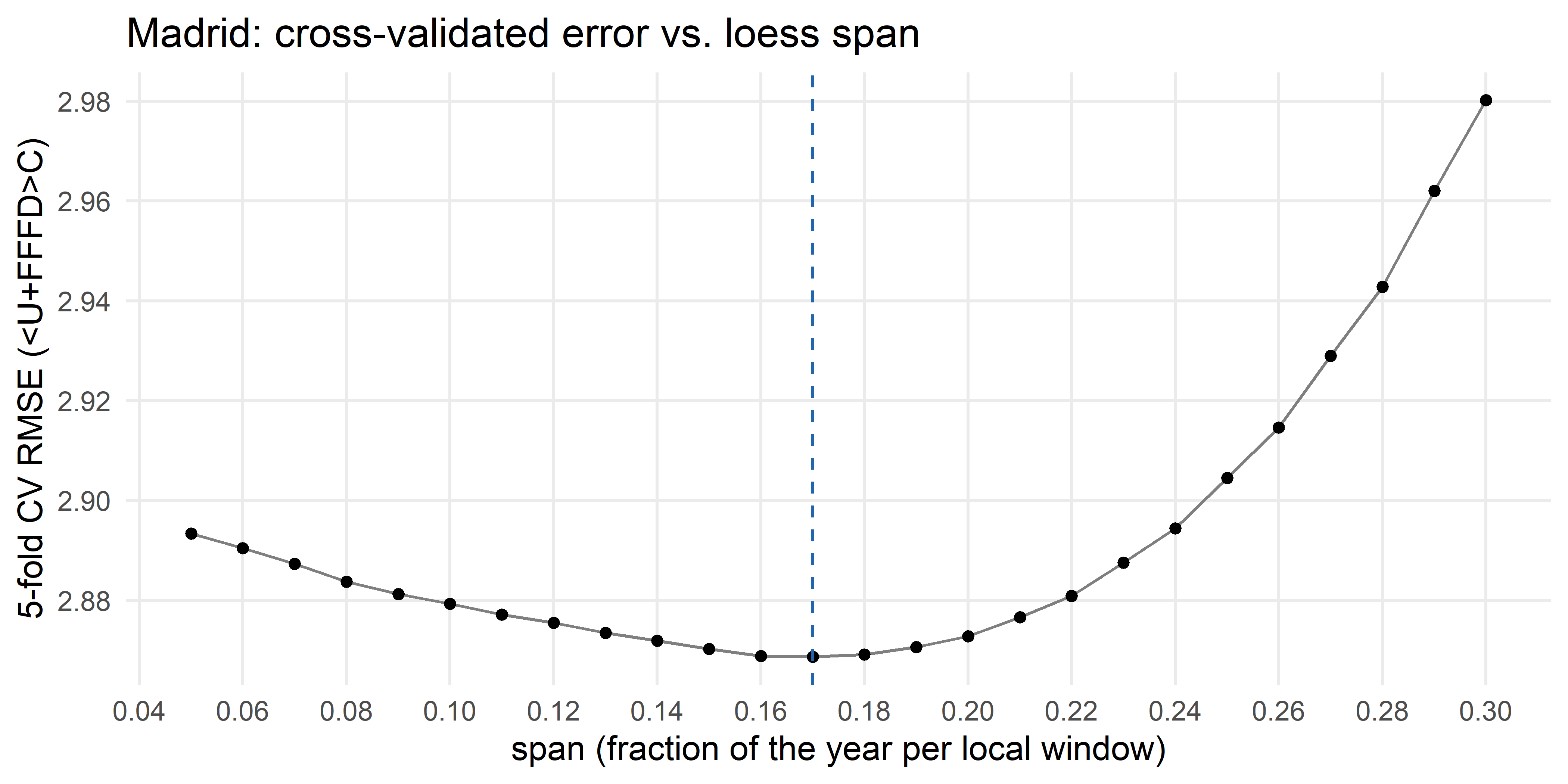
Two different machineries, same recipe, hide some years, fit on the rest, check the held-out years, repeat, average, and for Madrid they land on 3 harmonics and a span of 0.17, respectively. But a CV-RMSE number on its own doesn’t show what the curve actually looks like, it’s worth drawing it before moving on:
fit_harmonic <- function(y, yd, K, period = 366) {
  fit <- lm(y ~ ., data = bind_cols(y = y, make_harmonics(yd, K, period)))
  predict(fit)
}

madrid_clim <- madrid |>
  group_by(yd) |>
  summarise(tmed_norm = median(tmed, na.rm = TRUE)) |>
  mutate(
    smooth_harmonic = fit_harmonic(tmed_norm, yd, best_K_madrid),
    smooth_loess    = loess_smooth(yd, tmed_norm, span = best_span_madrid)
  )
Code
madrid_clim_plot <- mutate(madrid_clim, date = as_date(yd, origin = "2000-01-01"))

ggplot(madrid_clim_plot, aes(date)) +
  geom_point(aes(y = tmed_norm), size = .6, colour = "grey60", alpha = .6) +
  geom_line(aes(y = smooth_harmonic, colour = str_glue("{best_K_madrid} harmonics")), linewidth = 1, alpha = .8) +
  geom_line(aes(y = smooth_loess, colour = str_glue("loess span = {best_span_madrid}")), linewidth = 1, alpha = .8) +
  scale_colour_manual(name = NULL, values = c("#b2182b", "#1a9850")) +
  scale_x_date(date_labels = "%b", date_breaks = "month") +
  labs(x = NULL, y = "ºC", title = "Madrid: raw daily climatology vs. both CV-selected smoothers") +
  theme_minimal() +
  theme(legend.position = "bottom",
        panel.grid.minor = element_blank())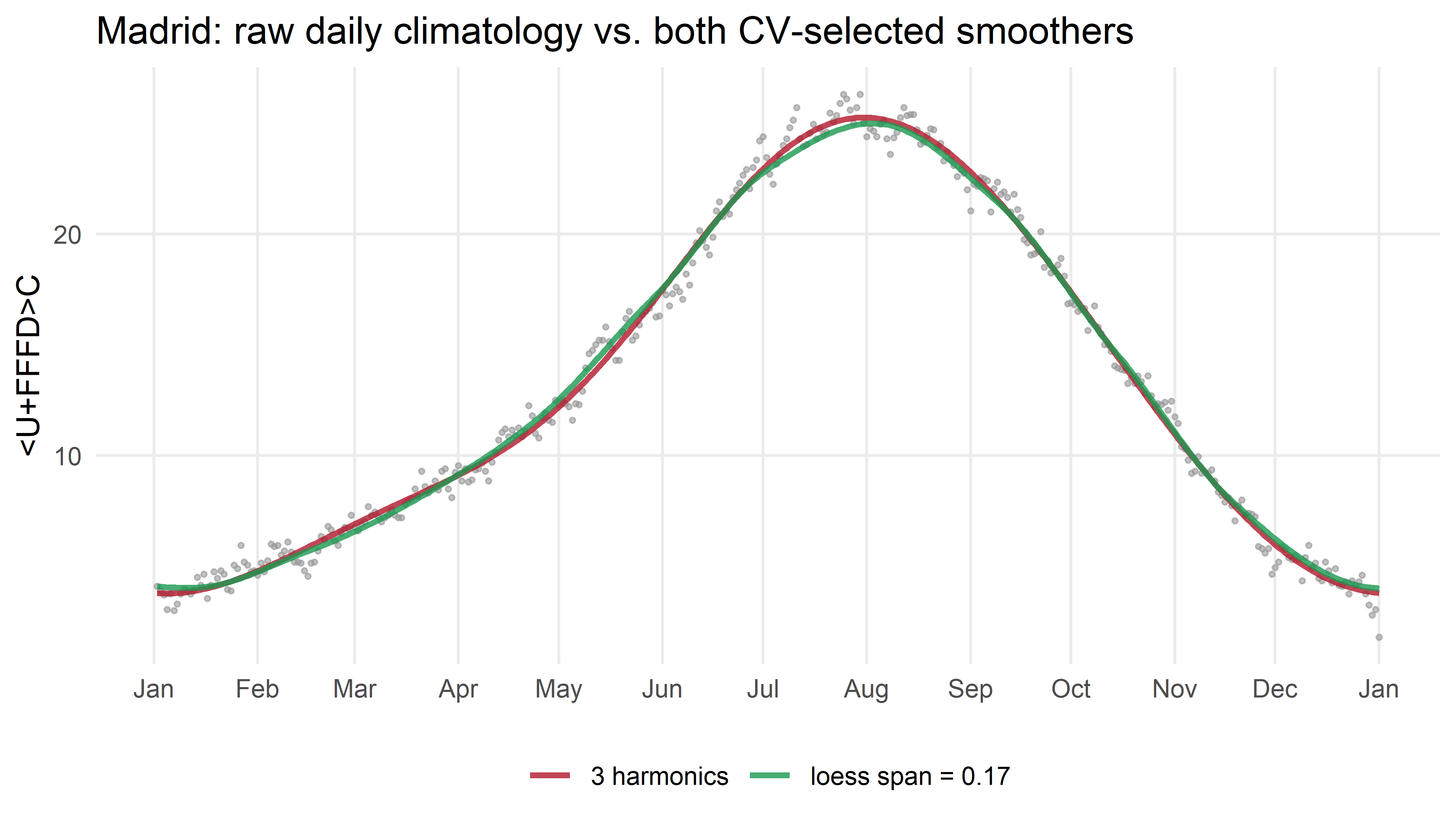
fit_harmonic() does the actual fitting step that cv_rmse() was only testing: build the harmonic predictors with make_harmonics(), run lm() on the full series (no held-out years this time, we already chose \(K\)), and read off the fitted values. The grey dots are Madrid’s raw, noisy daily-median climatology; both lines are fit to those same dots, just with a different family. They all but overlap here too, a first hint, on a single city.
Does the same answer hold everywhere?
Madrid is one city. Spain’s climate is not uniform, Atlantic coast, Mediterranean coast, high plateau, so it’s worth asking whether Madrid’s \(K\) and span are a coincidence of that particular location, or representative of the country as a whole. Reusing the exact same functions (and the same folds), I can run the identical procedure on a handful of other stations, a coarser grid is enough here, since the goal is a quick comparison, not a precise minimum:
station_K_span <- function(city_name) {
  city_data <- filter(cities_sample, city == city_name)

  k_grid <- 1:8
  best_K_city <- k_grid[which.min(map_dbl(k_grid, cv_rmse, data = city_data, folds = folds))]

  span_grid <- seq(.05, .30, by = .02)
  best_span_city <- span_grid[which.min(map_dbl(span_grid, cv_rmse_loess, data = city_data, folds = folds))]

  tibble(city = city_name, best_K = best_K_city, best_span = best_span_city)
}

stations <- c("Madrid", "Barcelona", "Santander", "A Coruna", "Sevilla")
station_results <- map_dfr(stations, station_K_span)
station_results
# A tibble: 5 x 3
city best_K best_span
<chr> <int> <dbl>
1 Madrid 3 0.17
2 Barcelona 4 0.15
3 Santander 3 0.15
4 A Coruna 2 0.17
5 Sevilla 2 0.15The span column is reassuringly stable, every city lands closley to Madrid’s. The best_K column is not: Barcelona’s optimum comes out noticeably higher than Madrid’s. That’s not random noise, either, I ran this same check, offline, across the full network of 60 reference cities (mainland and Balearics), and the cities that needed more harmonics than Madrid form a tight, sensible cluster: Barcelona, Girona, Tarragona, Lleida, Castellón de la Plana and Palma de Mallorca, the Mediterranean north-east and the Balearics, with no exceptions and no outliers from elsewhere in the country. A plausible physical reason: the Mediterranean Sea’s thermal inertia delays that coast’s autumn cooling relative to the rest of Spain, which is exactly the kind of asymmetry that a low-\(K\) harmonic curve (or a single sine wave) cannot represent and a higher one can. Put another way: loess is robust to location, while the harmonic is sensitive to local climate. If you wanted a single universal parameter for the whole network, span ≈ 0.19 works well everywhere.
Now, the national version
The mechanics are the same; only the data changes. We apply the identical cv_rmse() over a wider range of \(K\) (to see the overfitting tail, not just the minimum) and cv_rmse_loess() over the full span grid, this time to the national daily series:
[1] 4Code
ggplot(cv_results, aes(K, rmse)) +
  geom_line(colour = "grey50") +
  geom_point(size = 1.3) +
  geom_vline(xintercept = best_K, linetype = "dashed", colour = "#b2182b") +
  annotate("text", x = best_K + 1, y = max(cv_results$rmse), hjust = 0,
           label = str_glue("K = {best_K}\n(minimum CV error)"), colour = "#b2182b", size = 3) +
  labs(x = "Number of harmonics (K)", y = "5-fold CV RMSE (ºC)",
       title = "National average: cross-validated error vs. model complexity") +
  theme_minimal() +
  theme(panel.grid.minor = element_blank())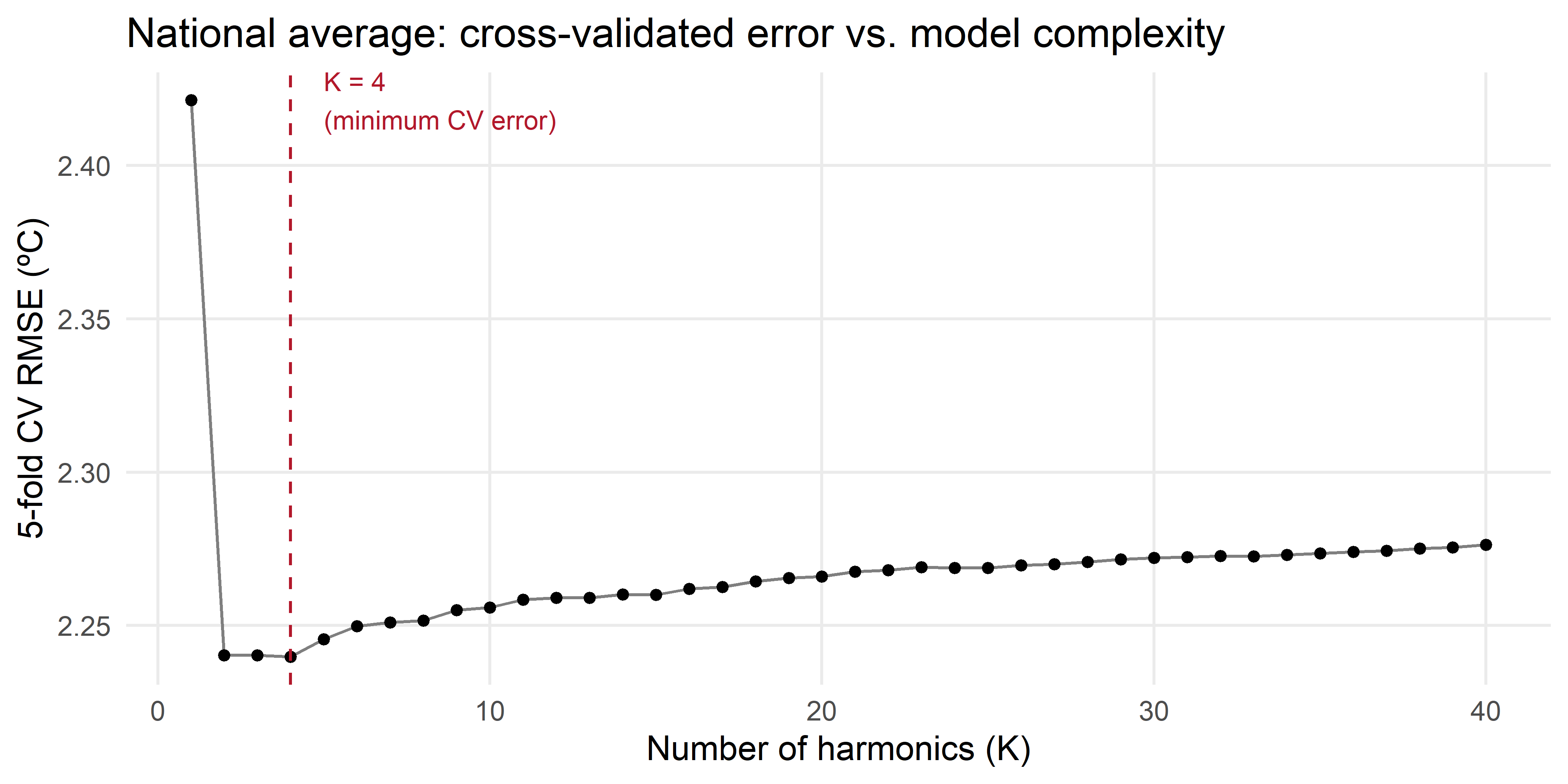
The error drops sharply from \(K=1\) to \(K=2\)-\(4\), bottoms out around \(K = 4\), matching Barcelona and the large majority of the 60-city network, then slowly increases again as the model starts fitting day-to-day weather noise instead of climate signal.
[1] 0.16Code
ggplot(cv_results_loess, aes(span, rmse)) +
  geom_line(colour = "grey50") +
  geom_point(size = 1.3) +
  geom_vline(xintercept = .08, linetype = "dotted", colour = "grey50") +
  geom_vline(xintercept = best_span, linetype = "dashed", colour = "#2166ac") +
  scale_x_continuous(breaks = seq(0, .3, .02)) +
  annotate("text", x = .08, y = max(cv_results_loess$rmse), hjust = -.05, vjust = 1,
           label = "span = .08\n(original guess)", colour = "grey50", size = 3) +
  annotate("text", x = best_span, y = max(cv_results_loess$rmse), hjust = -.1, vjust = 1,
           label = str_glue("span = {best_span}\n(minimum CV error)"), colour = "#2166ac", size = 3) +
  labs(x = "span (fraction of the year per local window)", y = "5-fold CV RMSE (ºC)",
       title = "National average: cross-validated error vs. loess span") +
  theme_minimal() +
  theme(panel.grid.minor = element_blank())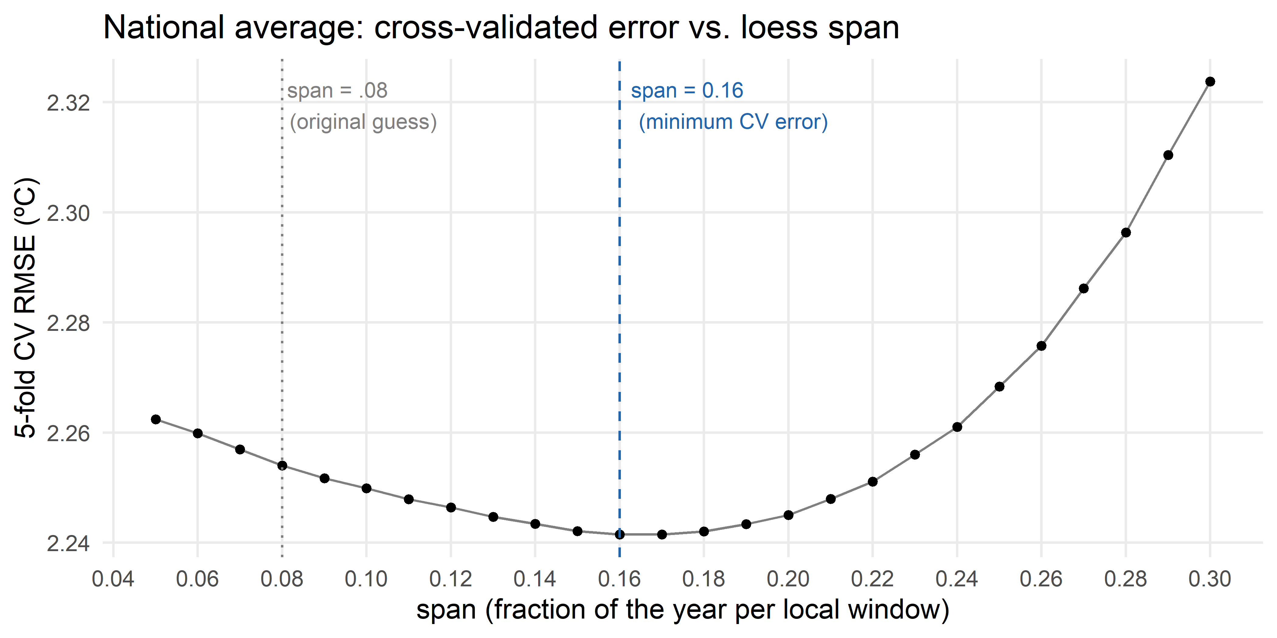
The minimum sits at span = 0.16, noticeably wider than the original .08. In other words, .08 wasn’t too smooth; if anything it was a touch under-smoothed, leaving a little day-to-day weather noise in the curve that a slightly wider window would average away. The curve around the minimum is fairly flat, though, so this isn’t a sharp cliff in either direction, several nearby spans would do almost as well, which is consistent with how little span moved between Madrid, Barcelona, Santander, A Coruña and Sevilla above.
Two families, one answer
fit_harmonic() is the same helper defined earlier for Madrid; applied here to the national climatology instead of one city’s:
clim <- clim |>
  mutate(
    smooth          = fit_harmonic(tmed_norm, yd, best_K),
    p5_smooth       = fit_harmonic(p5, yd, best_K),
    p95_smooth      = fit_harmonic(p95, yd, best_K),
    smooth_k1       = fit_harmonic(tmed_norm, yd, 1),
    smooth_loess08  = loess_smooth(yd, tmed_norm, span = .08),
    smooth_loess_cv = loess_smooth(yd, tmed_norm, span = best_span)
  )
Code
clim_plot <- mutate(clim, date = as_date(yd, origin = "2000-01-01"))

ggplot(clim_plot, aes(date)) +
  geom_point(aes(y = tmed_norm), size = .6, colour = "grey60", alpha = .6) +
  geom_line(aes(y = smooth_k1, colour = "K = 1 (a single sine wave, oversmoothed)"), linewidth = 1) +
  geom_line(aes(y = smooth_loess08, colour = "loess span = .08 (original guess)"), linewidth = .8, linetype = "22") +
  geom_line(aes(y = smooth_loess_cv, colour = str_glue("loess span = {best_span} (CV-selected)")), linewidth = 1, linetype = "42") +
  geom_line(aes(y = smooth, colour = str_glue("K = {best_K} harmonics (CV-selected)")), linewidth = 1) +
  scale_colour_manual(
    name = NULL,
    values = c("#2166ac", "black", "#1a9850", "#b2182b"),
    breaks = c("K = 1 (a single sine wave, oversmoothed)",
               "loess span = .08 (original guess)",
               str_glue("loess span = {best_span} (CV-selected)"),
               str_glue("K = {best_K} harmonics (CV-selected)"))
  ) +
  scale_x_date(date_labels = "%b", date_breaks = "month") +
  labs(x = NULL, y = "ºC", title = "Four smoothing choices for the 1961-1990 normal") +
  guides(color = guide_legend(nrow = 2)) +
  theme_minimal() +
  theme(legend.position = "bottom",
        legend.direction = "vertical",
        panel.grid.minor = element_blank())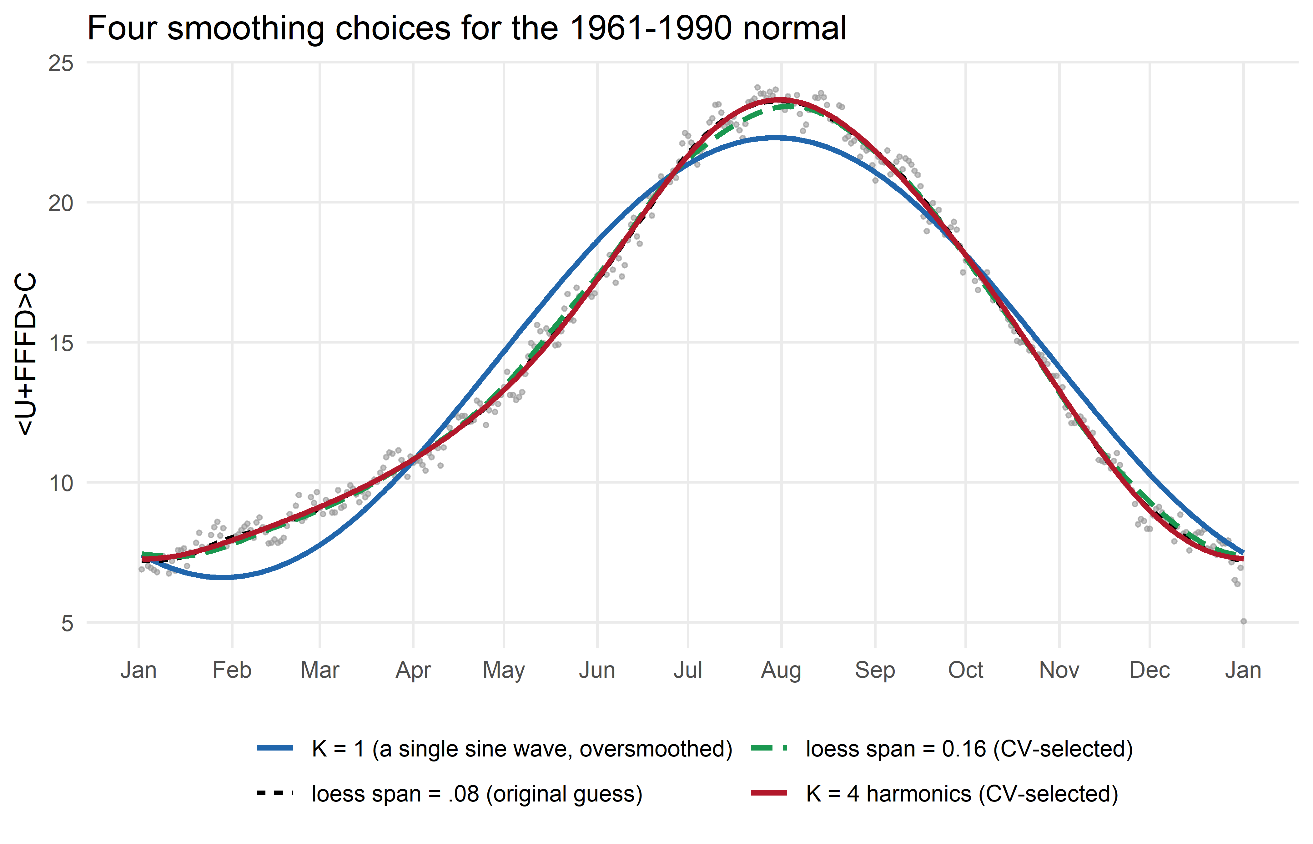
Three things stand out:
The single sine wave (blue) is visibly wrong in July-September, it cuts straight through the late-summer plateau instead of following it, and it’s too cold in spring and too warm in early winter. This is the textbook “too smooth” failure, drawn here on purpose as a worst case, not because AEMET or Reuters actually use a single sine wave (see the callout below: it turns out neither one does).
The two cross-validated curves, loess (green) and the 4-harmonic (red), are almost indistinguishable, despite coming from completely different families: one local and non-parametric, the other global and built from waves. Two unrelated methods, tuned the same way, landing on essentially the same curve is a useful sanity check, it suggests the answer reflects something real about the data, not an artefact of either method’s machinery.
The original
loess(span = .08)(dashed black) sits close to both, but is visibly a touch wigglier, consistent with the CV result above, where.08scored slightly worse than the wider, CV-selected span.
TipWhy bother with two families if they agree?
Precisely because they agree. If loess and harmonic regression had landed on noticeably different curves after both were cross-validated, that would be a sign that the “right” amount of smoothing depends on which family you pick, worth investigating further. Here, two structurally unrelated methods converge on nearly the same curve, which is a stronger argument for “this is roughly the right amount of smoothing” than either method’s cross-validation result on its own. From here on I’ll use the harmonic curve (K = 4), mainly because it’s periodic by construction and a little easier to reason about, but the loess version would give an almost identical chart.
Step 5: the new chart, layer by layer
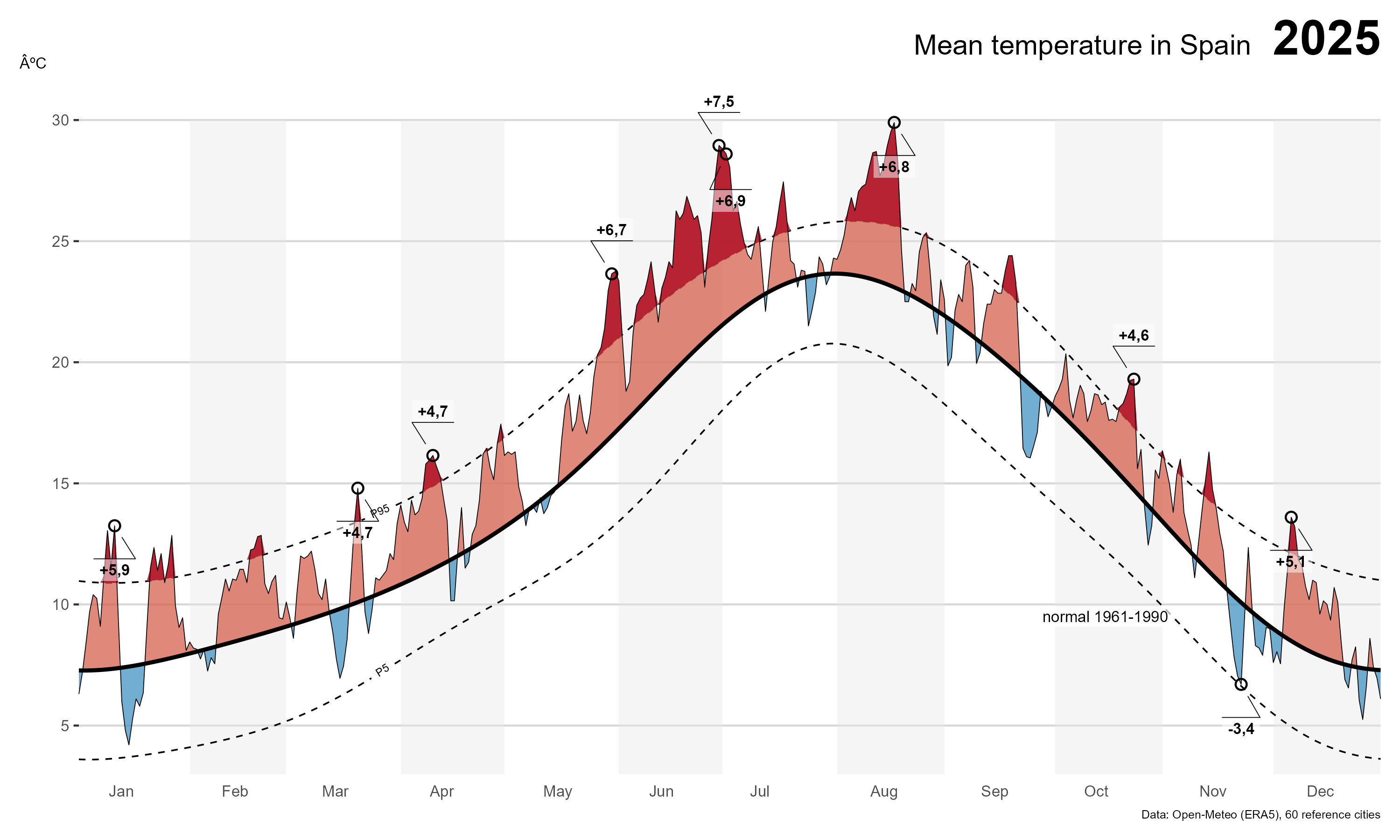
With clim$smooth, clim$p5_smooth and clim$p95_smooth as the data-driven normal and its typical range, we can now reproduce, and update, the original chart for 2025, the most recent complete year. First, join the normal onto this year’s daily data and compute the anomaly:
Code
final <- national_2025 |>
  left_join(select(clim, yd, smooth, p5_smooth, p95_smooth), by = "yd") |>
  mutate(anom = tmed - smooth)

# annotate the largest positive anomaly per month (a subset of months, to avoid clutter)
# plus the single largest negative anomaly of the year
anot <- final |>
  mutate(mo = month(date)) |>
  group_by(mo) |>
  slice_max(anom, n = 1, with_ties = FALSE) |>
  ungroup() |>
  filter(mo %in% c(1, 3:8, 10, 12)) |>
  bind_rows(slice_min(final, anom, n = 1, with_ties = FALSE))
ggplot draws layers in the order you add them, whatever goes down first ends up underneath. The chart below is built in three passes: a plain canvas, then the “how unusual is this” layer (the typical range and the coloured anomaly), and finally the data itself plus the annotations on top.
1. The canvas
Start with the axes, the month labels, and a faint alternating shading for every other two-month block, purely a reading aid, with no data in it yet:
Code
p <- ggplot() +
  geom_rect(aes(xmin = seq(ymd("2025-02-01"), ymd("2025-12-01"), "2 month"),
                xmax = seq(ymd("2025-02-01"), ymd("2025-12-01"), "2 month") + months(1) - days(1),
                ymin = 3, ymax = 30),
            fill = "grey90", alpha = .4) +
  scale_y_continuous(breaks = seq(0, 30, 5), limits = c(3, 32), expand = expansion(.01)) +
  scale_x_date(breaks = seq(ymd("2025-01-01"), ymd("2025-12-01"), "month"),
               date_labels = "%b", expand = expansion(0),
               limits = c(ymd("2025-01-01"), ymd("2025-12-31"))) +
  coord_cartesian(clip = "off") +
  labs(x = NULL, y = "ºC") +
  theme_hc(base_family = "Lato") +
  theme(panel.grid.minor = element_blank(),
        axis.text.x = element_text(size = 8, hjust = -1.2),
        axis.ticks.x = element_blank(),
        axis.text.y = element_text(size = 8),
        axis.title.y = element_text(angle = 0, size = 8, vjust = 1.01),
        plot.margin = margin(10, 10, 10, 10))

p
2. The reference range and the anomaly
This is the layer that does the actual work of the chart. Two dashed lines, drawn with geomtextpath::geom_textline() so the “P5”/“P95” labels sit directly on the lines instead of needing a separate legend, mark the smoothed typical range. Then ggh4x::stat_difference() fills the gap between this year’s temperature and the normal: salmon where today is above normal, light blue where it’s below. The key advantage over a plain geom_ribbon is that stat_difference() interpolates the exact crossing point when the two lines switch sides, so the coloured area always closes cleanly at the zero line without leaving visual artefacts.
The same logic is then repeated for the extreme zones, with ggnewscale::new_scale_fill() resetting the colour mapping so the two layers can use independent scale_fill_manual() calls. The reference line for the hot extreme is p95_smooth (anything above it gets dark red); for the cold extreme it is p5_smooth (anything below it gets dark blue). Setting the “wrong-side” level to NA in scale_fill_manual() makes those half-ribbons fully transparent, so only the genuine extreme areas are coloured:
Code
p <- p +
  geom_textline(data = final, aes(date, p5_smooth), label = "P5", size = 2,
                 hjust = .2,
                 straight = TRUE, linewidth = .4, linetype = "dashed") +
  geom_textline(data = final, aes(date, p95_smooth), label = "P95", size = 2,
                hjust = .2,
                 straight = TRUE, linewidth = .4, linetype = "dashed") +
  # Base anomaly: above smooth = salmon, below smooth = light blue
  stat_difference(
    data = final,
    aes(x = date, ymin = smooth, ymax = tmed),
    alpha = 0.75
  ) +
  scale_fill_manual(values = c("#f4a582", "#92c5de"), guide = "none") +
  new_scale_fill() +
  # Extreme hot: above P95 (positive diff only; negative → transparent)
  stat_difference(
    data = final,
    aes(x = date, ymin = p95_smooth, ymax = tmed),
    levels = c("above_p95", "below_p95"),
    alpha = 0.90
  ) +
  # Extreme cold: below P5 (positive diff only; negative → transparent)
  stat_difference(
    data = final,
    aes(x = date, ymin = tmed, ymax = p5_smooth),
    levels = c("below_p5", "above_p5"),
    alpha = 0.90
  ) +
  scale_fill_manual(
    values = c(above_p95 = "#b2182b", below_p95 = NA,
               below_p5  = "#2166ac", above_p5  = NA),
    na.value = NA,
    guide   = "none"
  )

p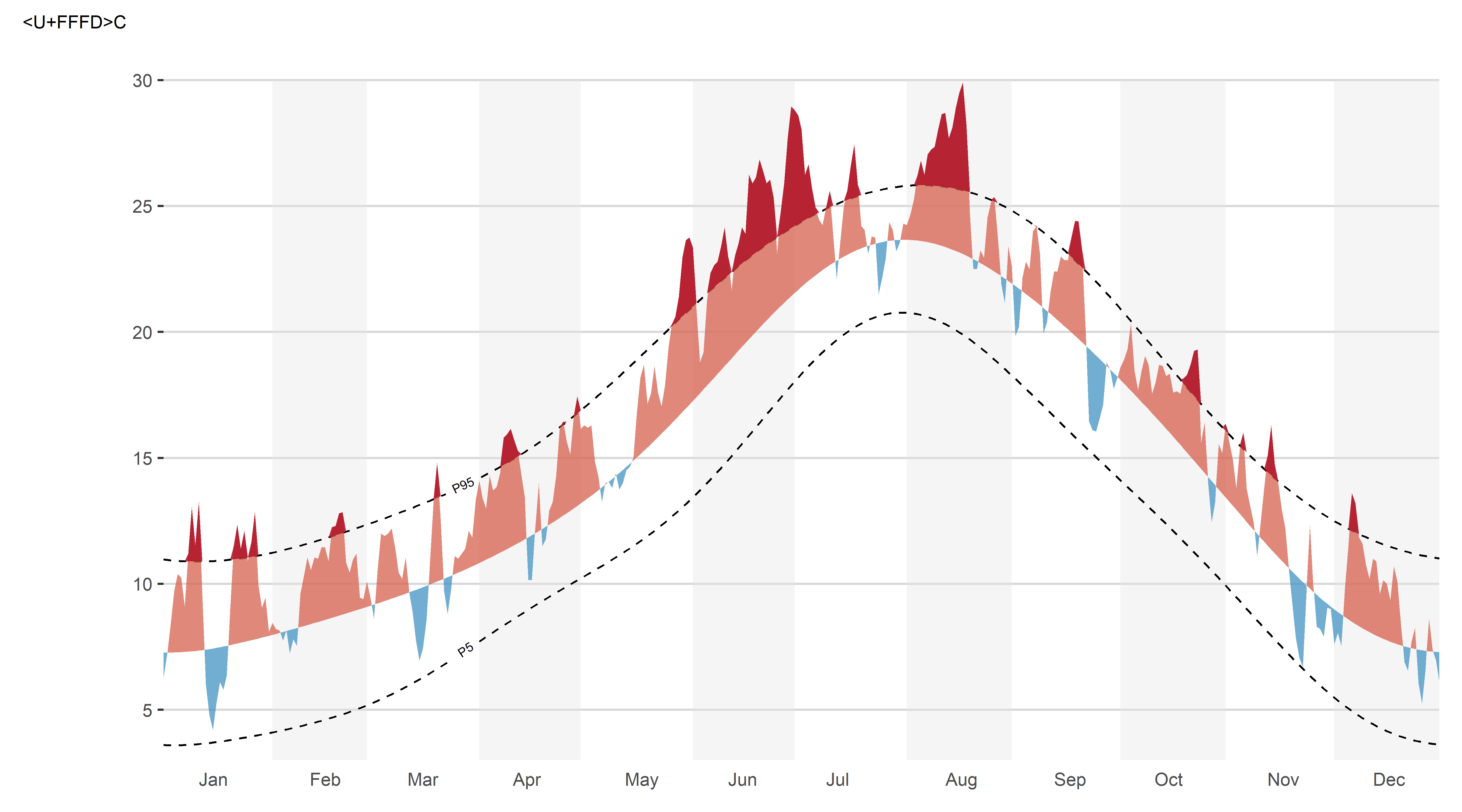
3. The data, the call-outs, and the finishing touches
Finally, the two lines that everything else is measured against, this year’s daily values (thin) and the smoothed normal (thick), go on top of the ribbons so they stay visible. ggforce::geom_mark_circle() adds the small circled labels for the largest anomaly each month, and a plain geom_label() documents which normal and which smoothing method the chart is using. labs(), scale_*() and theme() calls accumulate too, so the title, caption and remaining styling from the canvas step still apply:
Code
p +
  geom_line(data = final, aes(date, tmed), linewidth = .2) +
  geom_line(data = final, aes(date, smooth), linewidth = 1) +
  geom_mark_circle(data = anot,
                    aes(date, tmed,
                        description = scales::number(anom, accuracy = .1, decimal.mark = ",", style_positive = "plus"),
                        group = date),
                    expand = unit(1, "mm"), label.buffer = unit(3, "mm"),
                    con.cap = unit(1.5, "mm"), label.margin = margin(1, 1, 1, 1, "mm"),
                    con.size = .2, label.fontsize = 8, label.fontface = "bold",
                    con.type = "straight", label.fill = alpha("white", .5)) +
  geom_label(aes(ymd("2025-10-15"), 9.5),
             label = str_glue("normal 1961-1990"),
             fill = alpha("white", .7), label.size = .00001, size = 2.8, lineheight = .9) +
  labs(title = "Mean temperature in Spain <span style = 'font-size:25pt'><b> 2025</b></span>",
       caption = "Data: Open-Meteo (ERA5), 60 reference cities") +
  theme(plot.title = element_textbox_simple(hjust = 1, halign = 1),
        plot.caption = element_text(size = 6))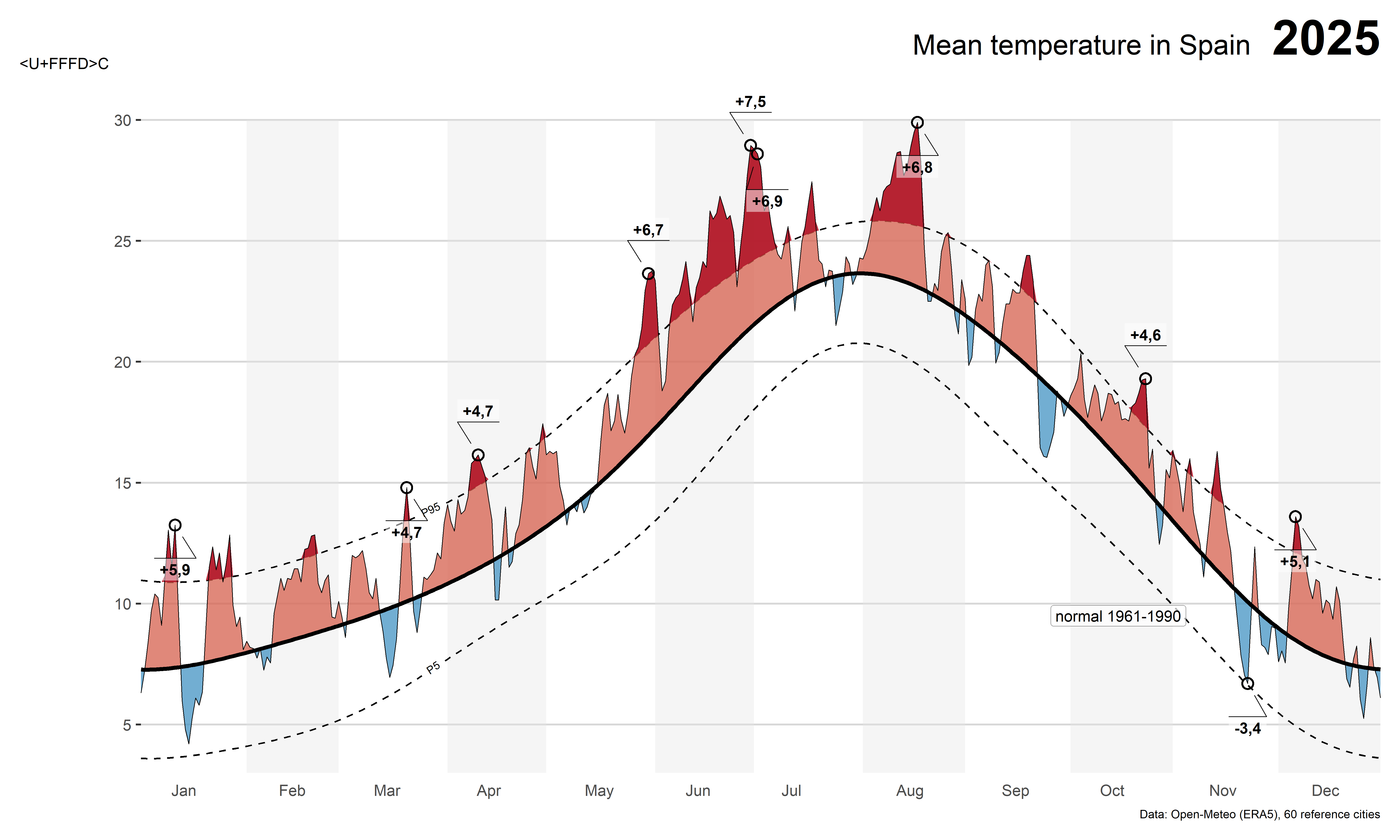
Because 2025 is now complete, the new chart covers the full year, instead of stopping in July as the live version did when I first built it. The headline number for the year:
# A tibble: 1 x 3
  mean_anom days_above_p95 days_below_p5
      <dbl>          <int>         <int>
1      1.83             97             0
2025 was, on average, about 1.8ºC warmer than the 1961-1990 normal across these 60 cities. Nearly a hundred days, more than a quarter of the year, were above the P95 threshold, concentrated in the warm season, while not a single day dropped below P5. That asymmetry is itself part of the story: against an older, fixed baseline, “normal cold” has essentially stopped happening.
Final thoughts
The two issues in this post are connected by the same idea: a chart that looks “clean” is not the same as a chart that is correct. A perfectly smooth sine-wave normal looks more “finished” than a slightly wiggly one, but it actively misrepresents the seasonal cycle of a place like Spain. Cross-validation doesn’t just pick a number for us, it gives us a way to show our work and to defend (or revise) that number when the data, the variable, or the region changes.
Reuse
Citation
For attribution, please cite this work as:
Royé, Dominic. 2026. “A Data-Driven Normal for the Spain
Temperature Chart.” June 23, 2026. https://dominicroye.github.io/blog/spain-temperature-normals-openmeteo/.