Data Vizualization
Welcome to my data visualization section. I explore the fascinating world of data through charts and maps. Data visualization not only allows us to better understand information but also helps us communicate findings clearly and effectively. Graphicacy education is essential.
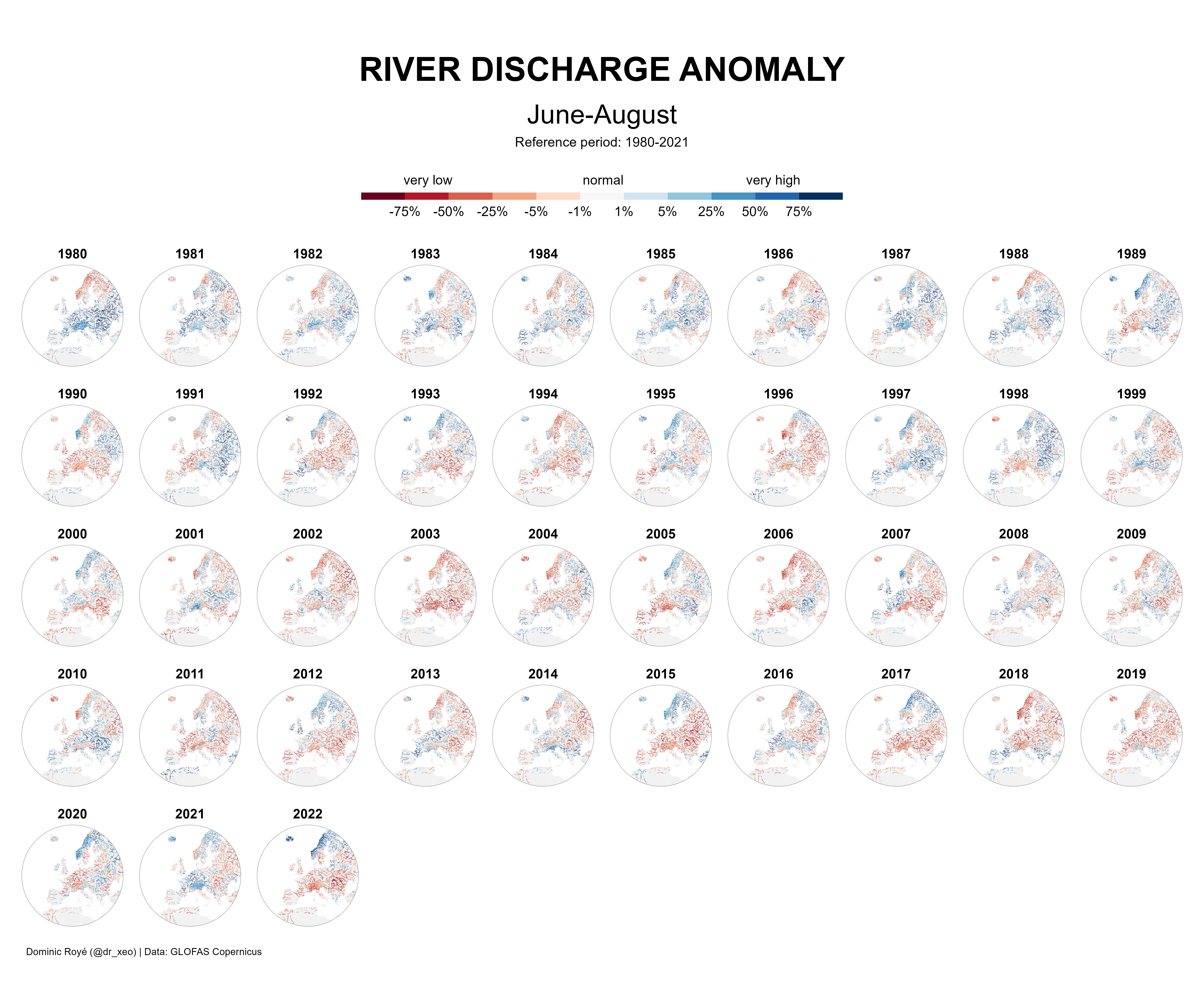
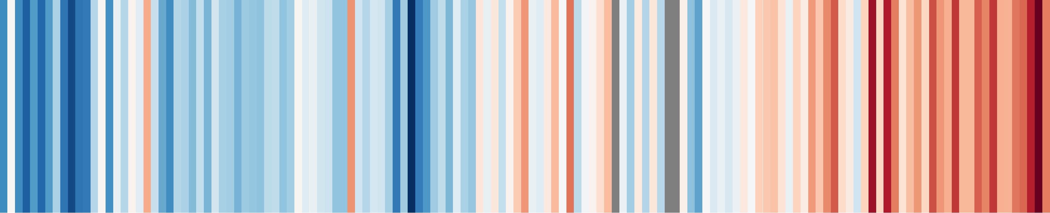
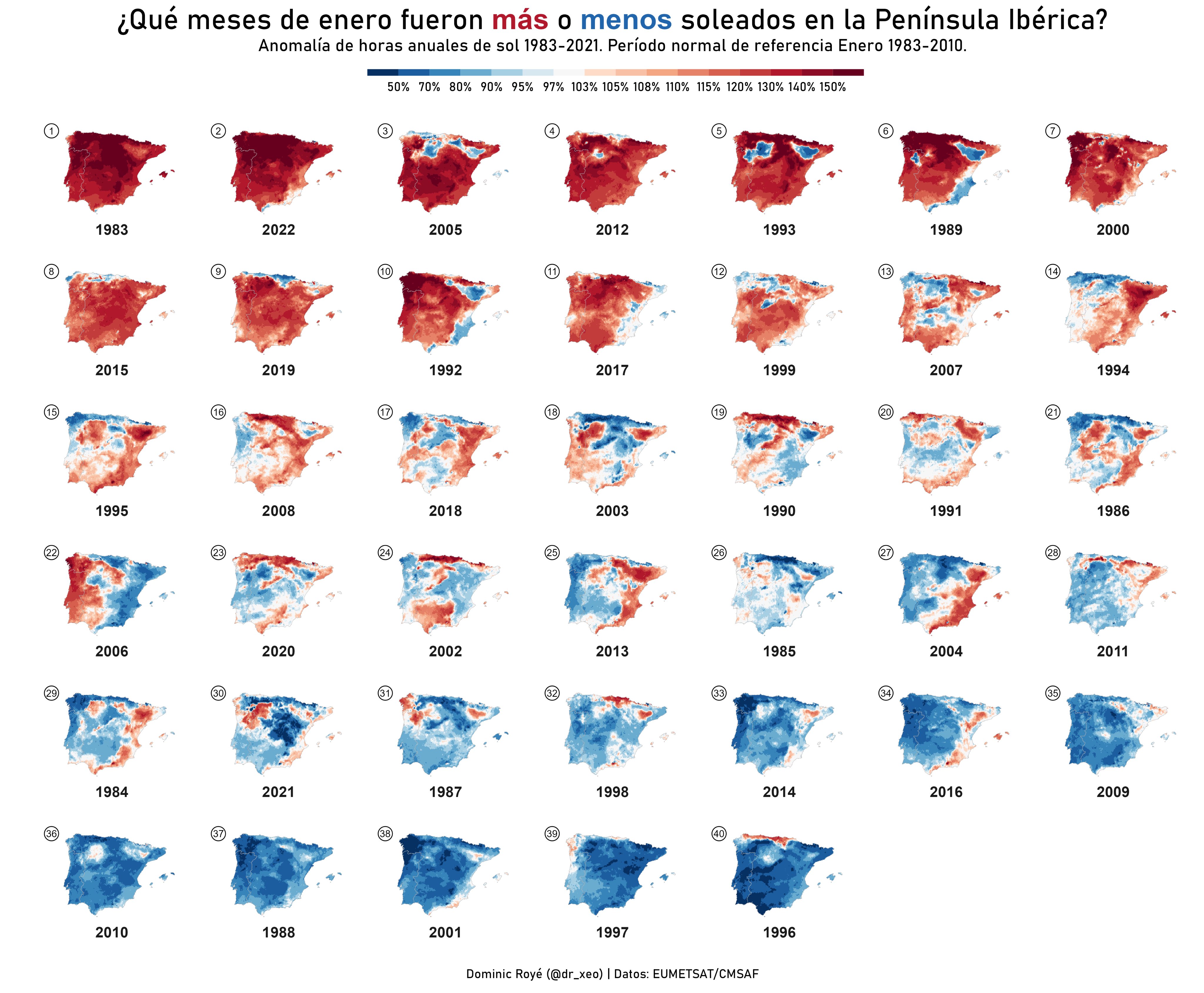
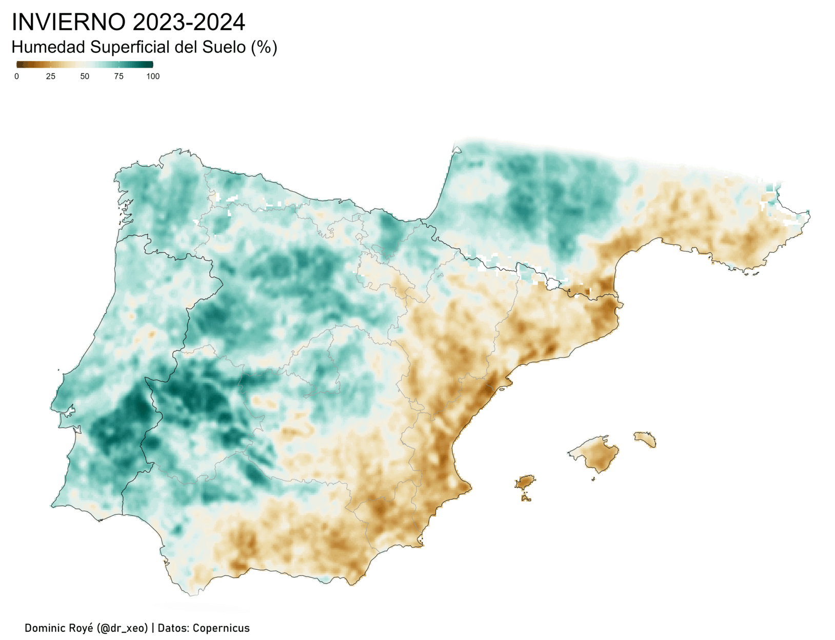
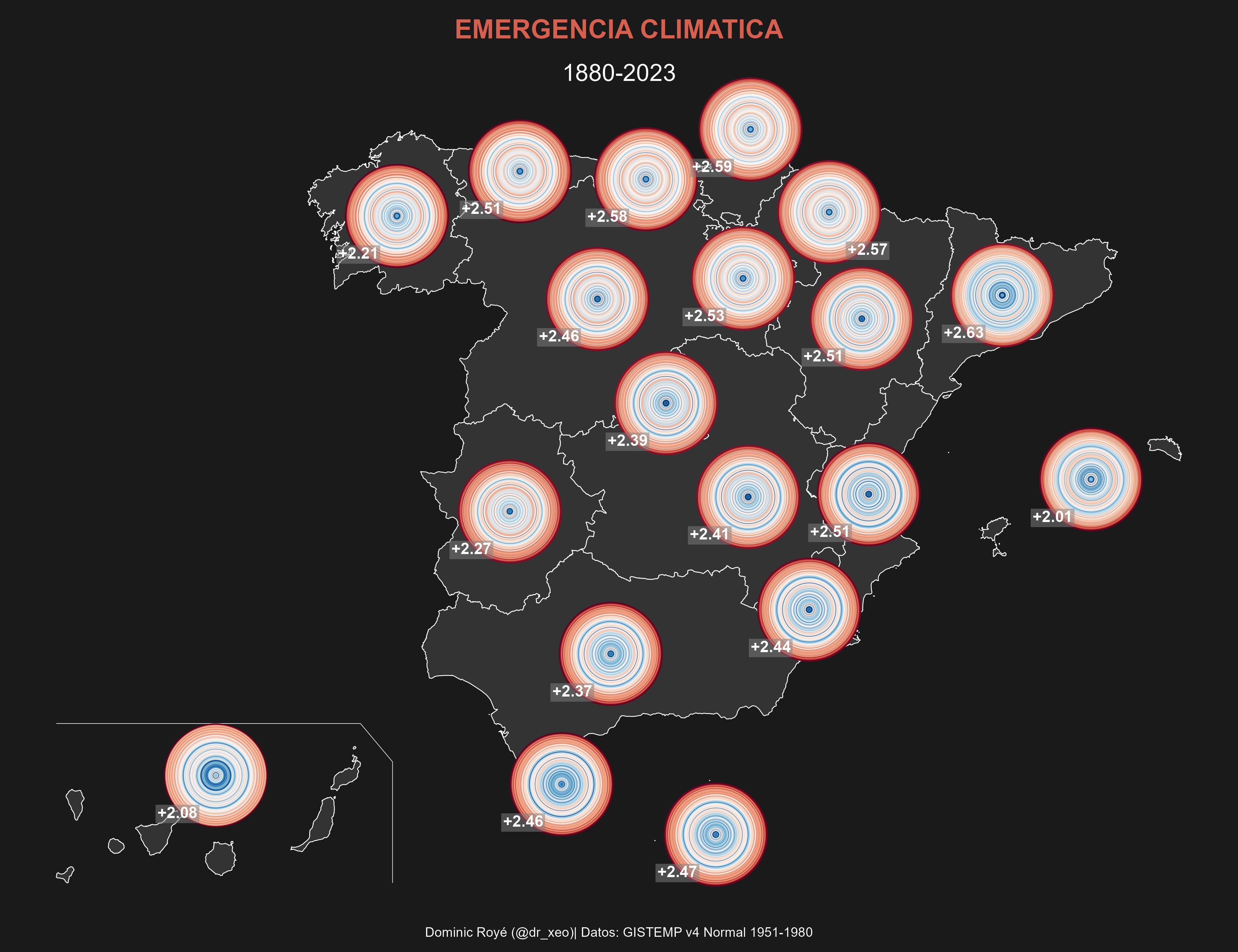
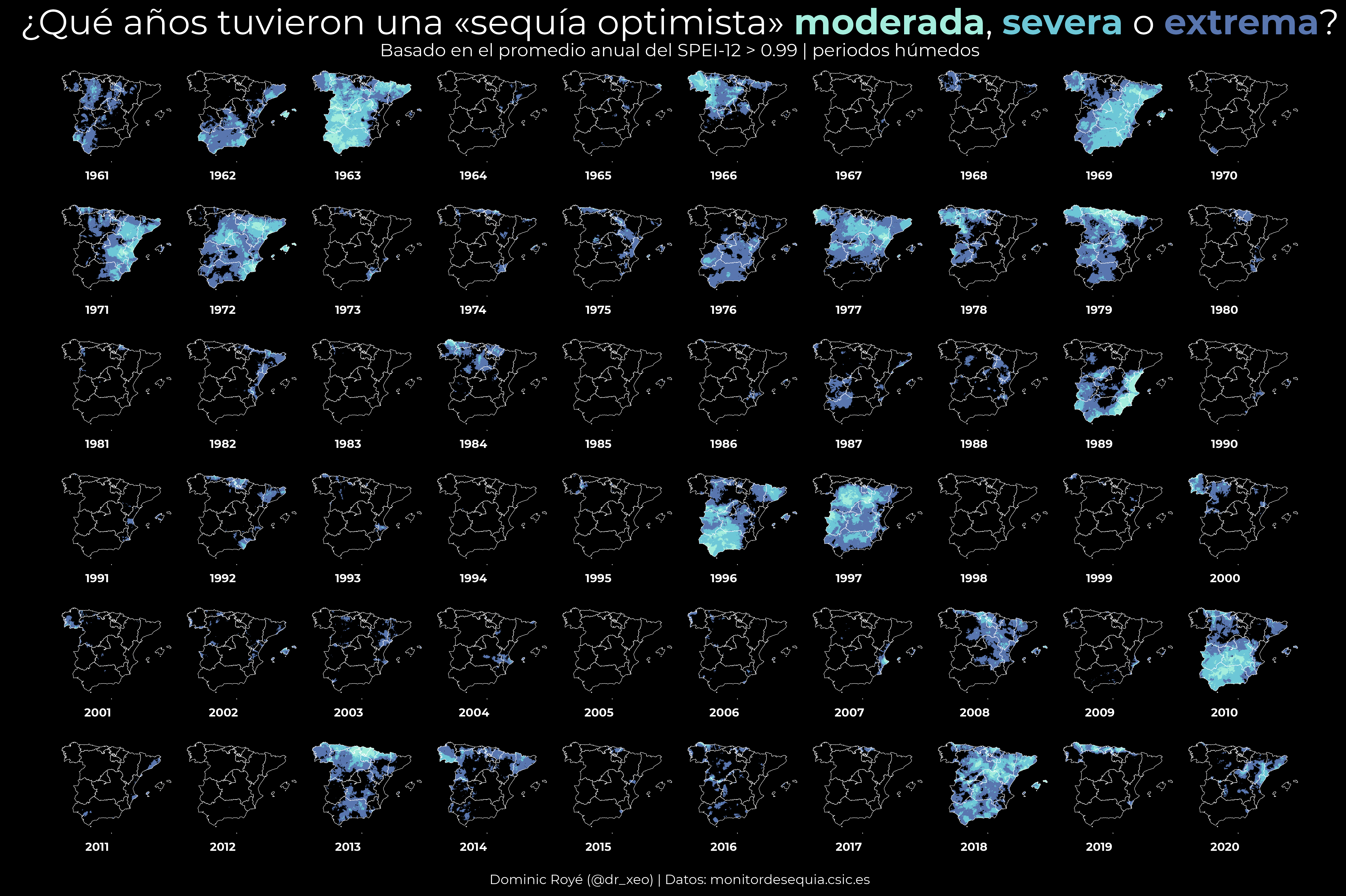
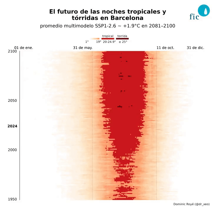
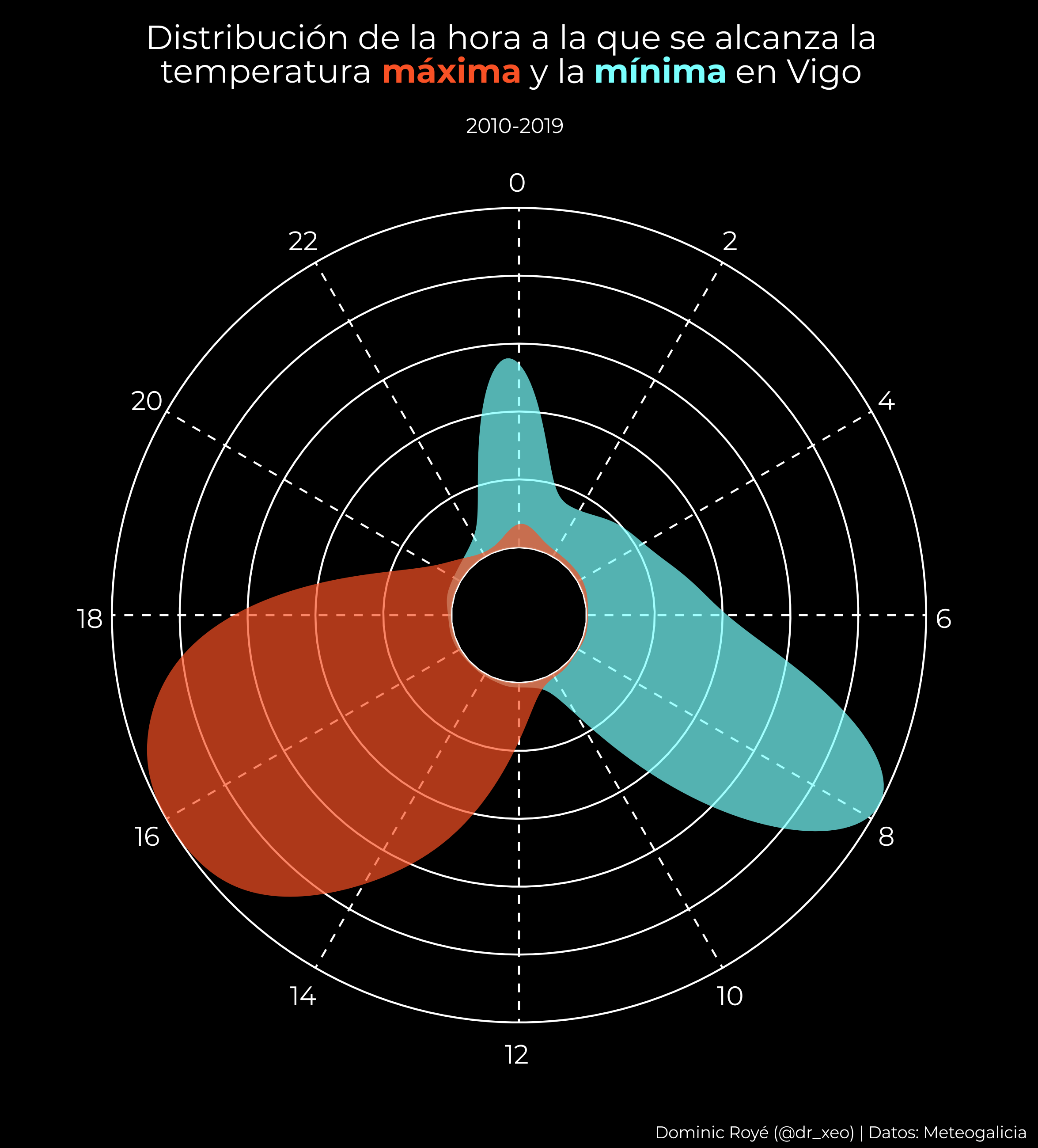
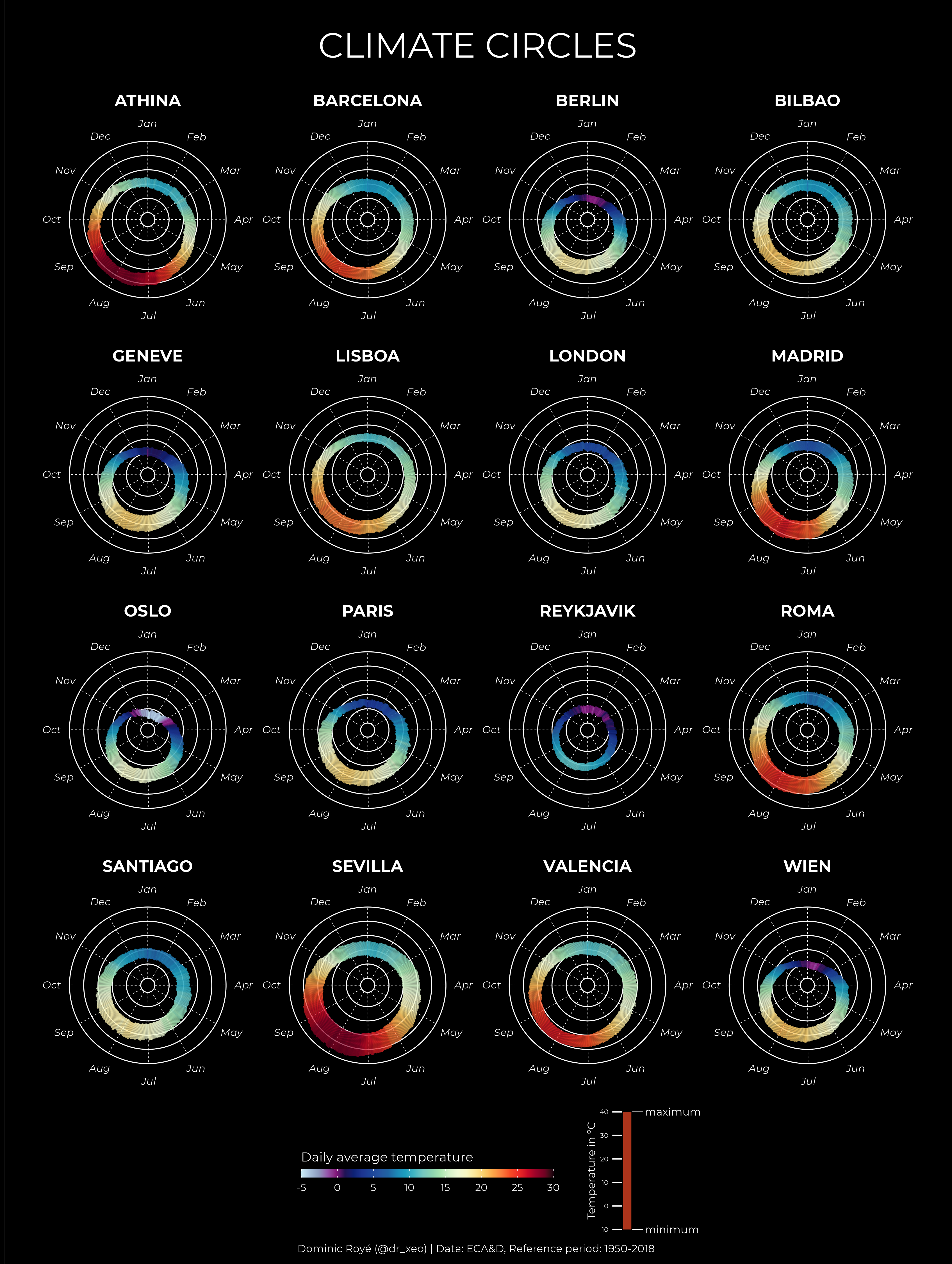
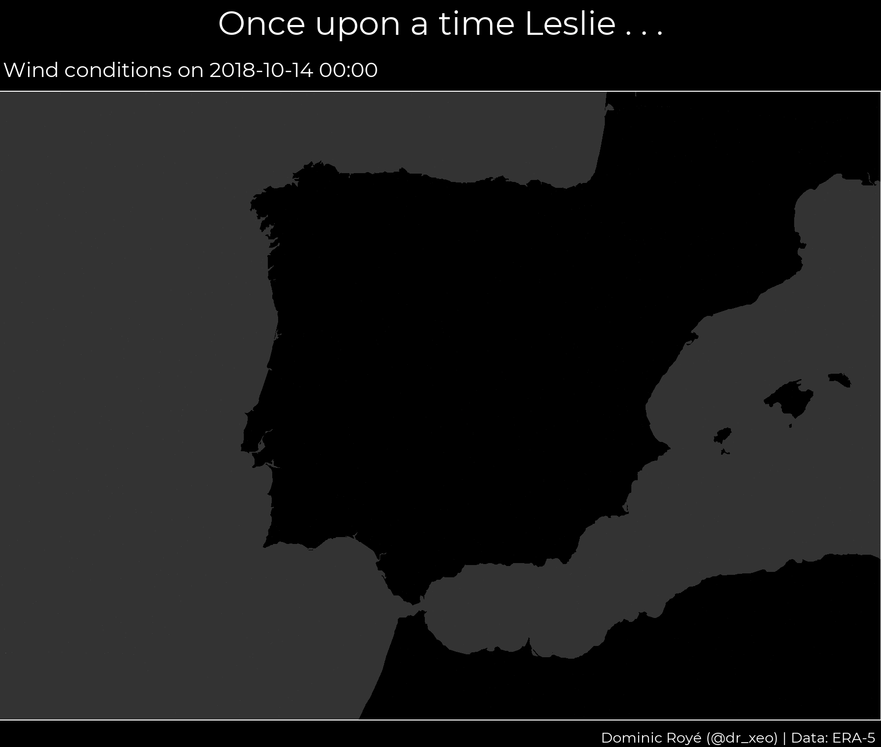
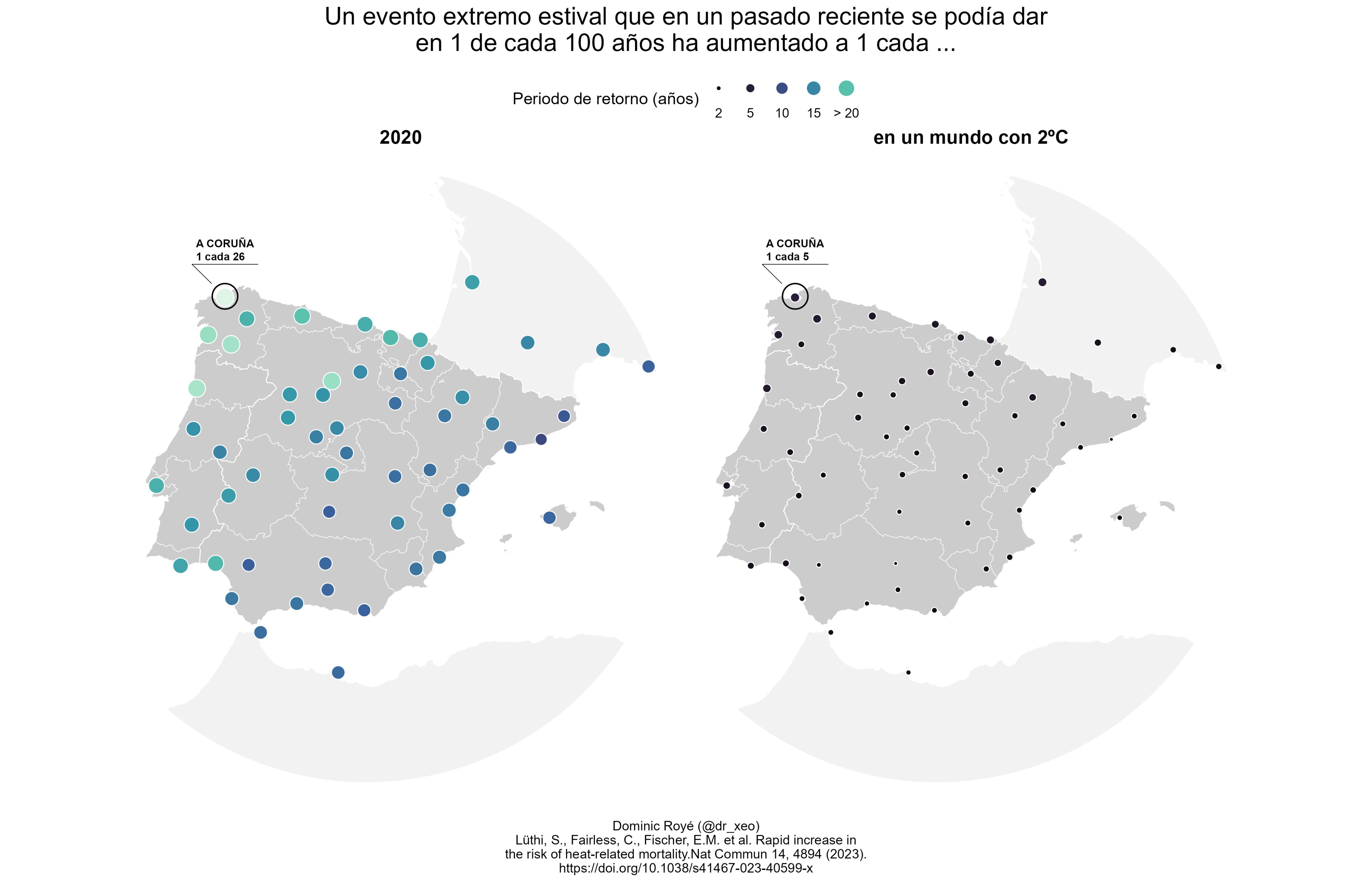
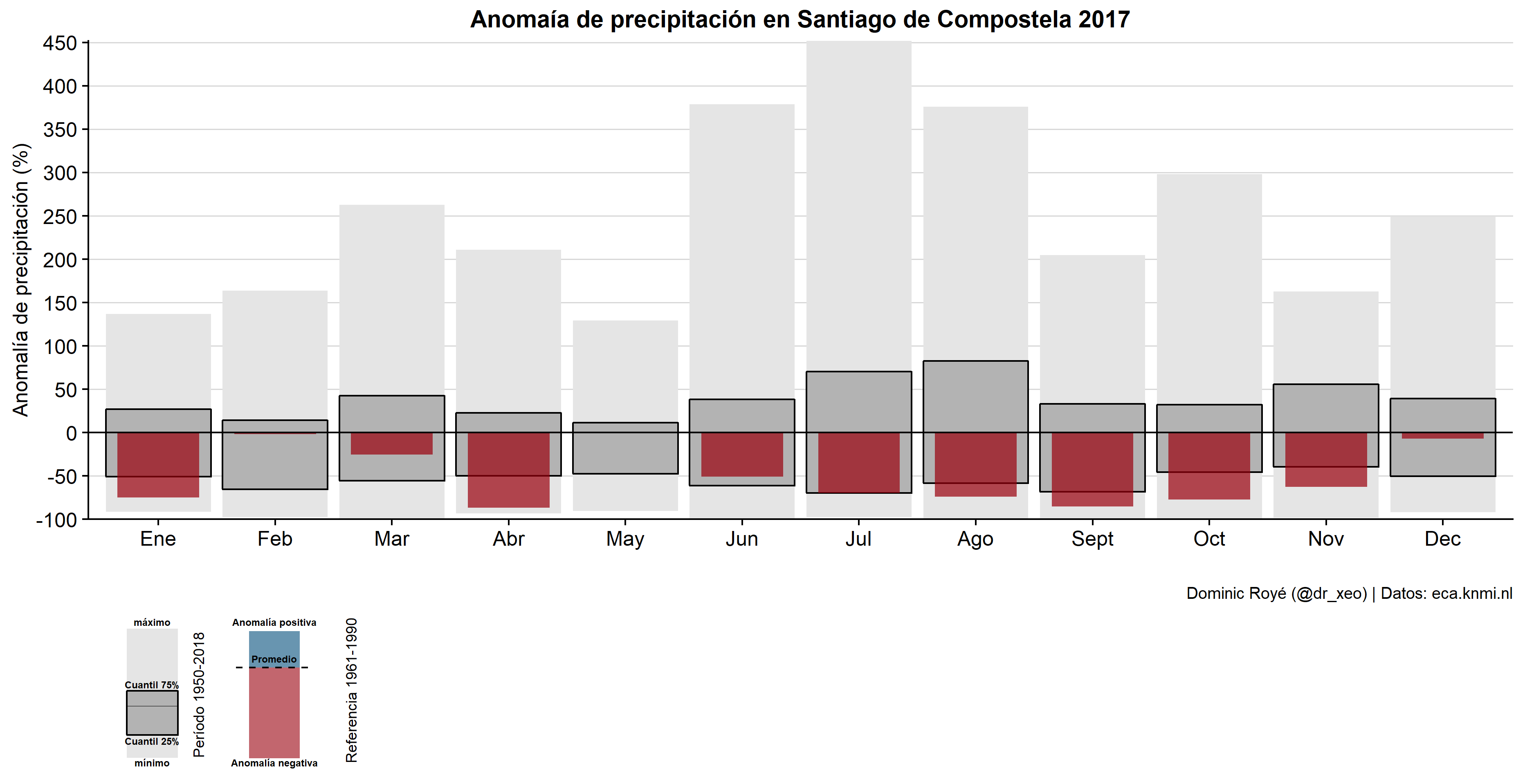
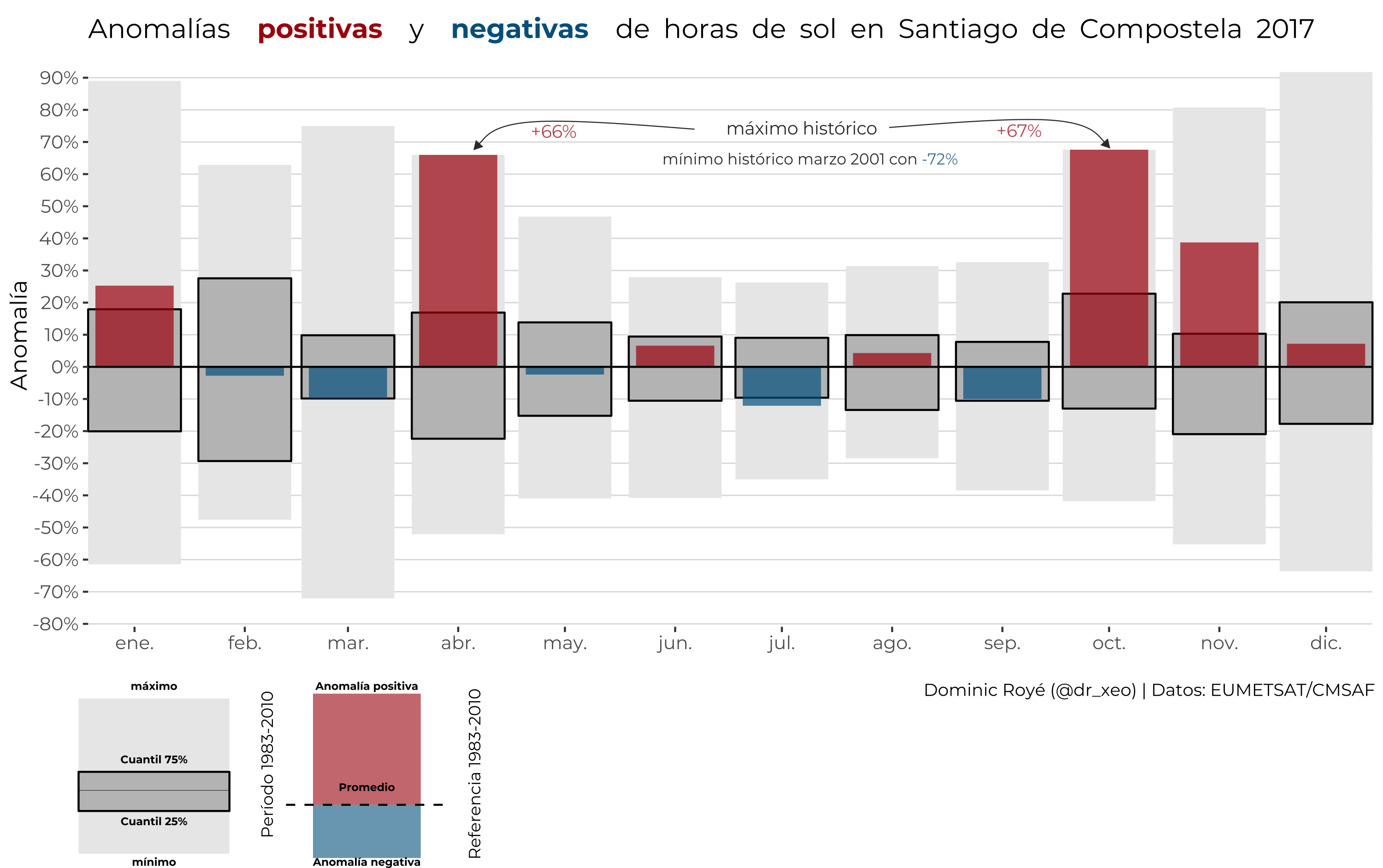
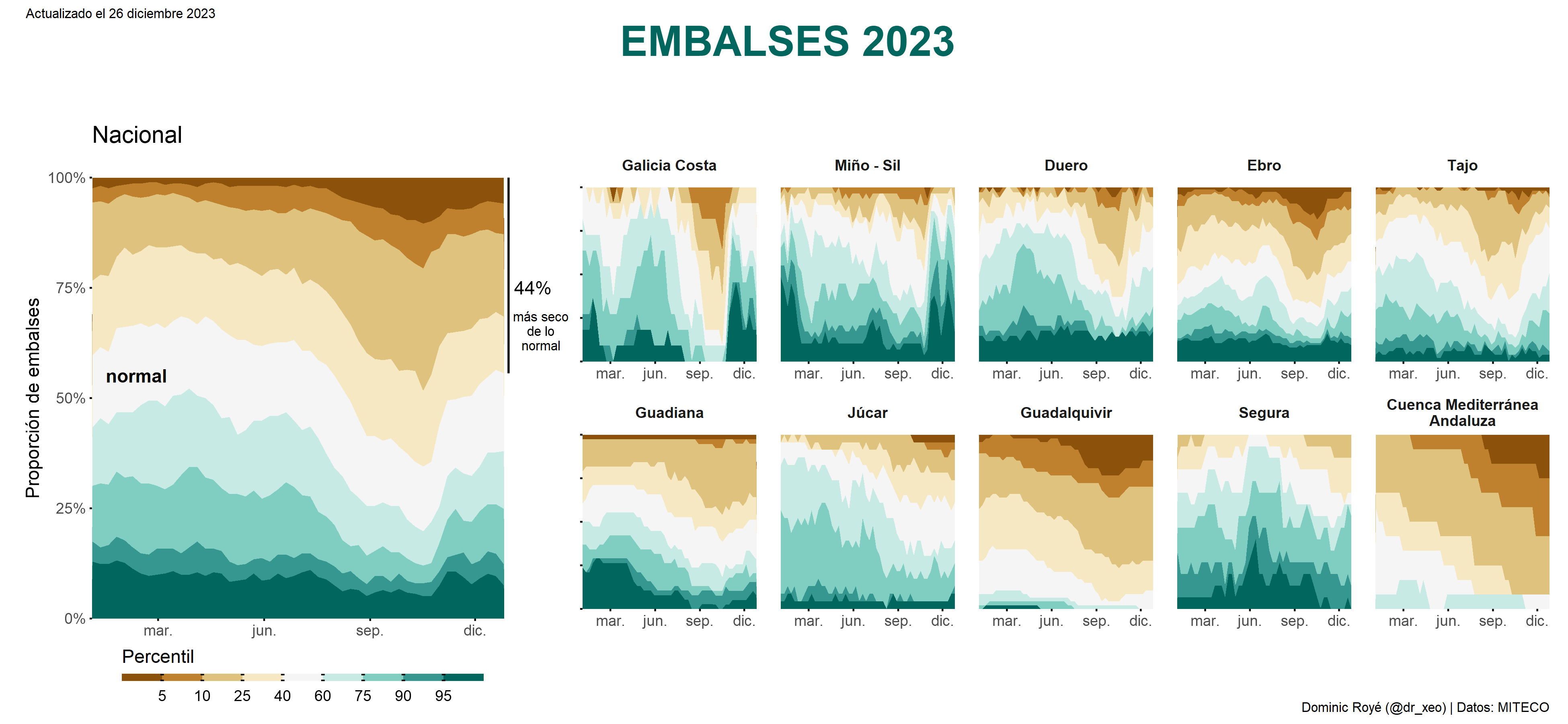
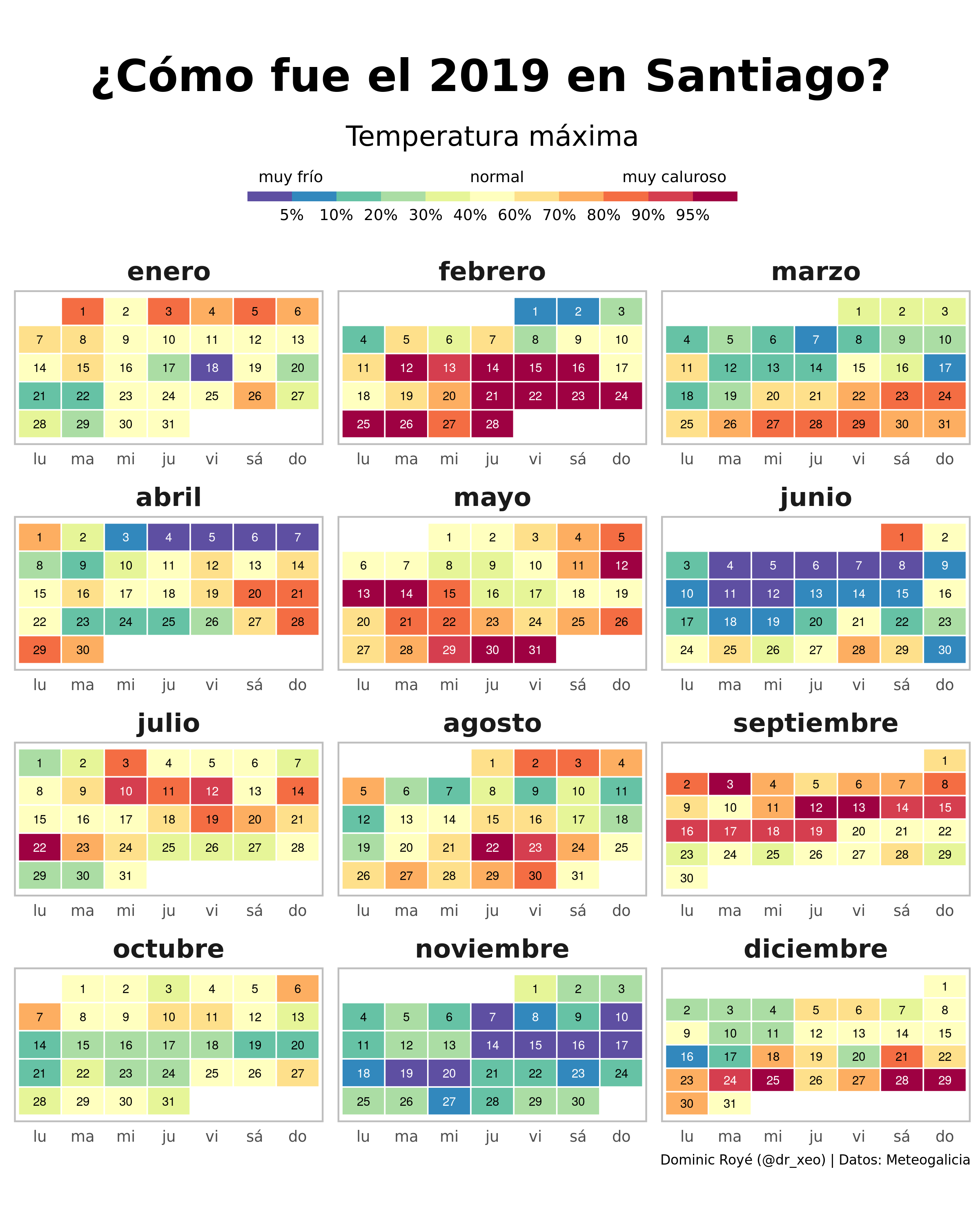
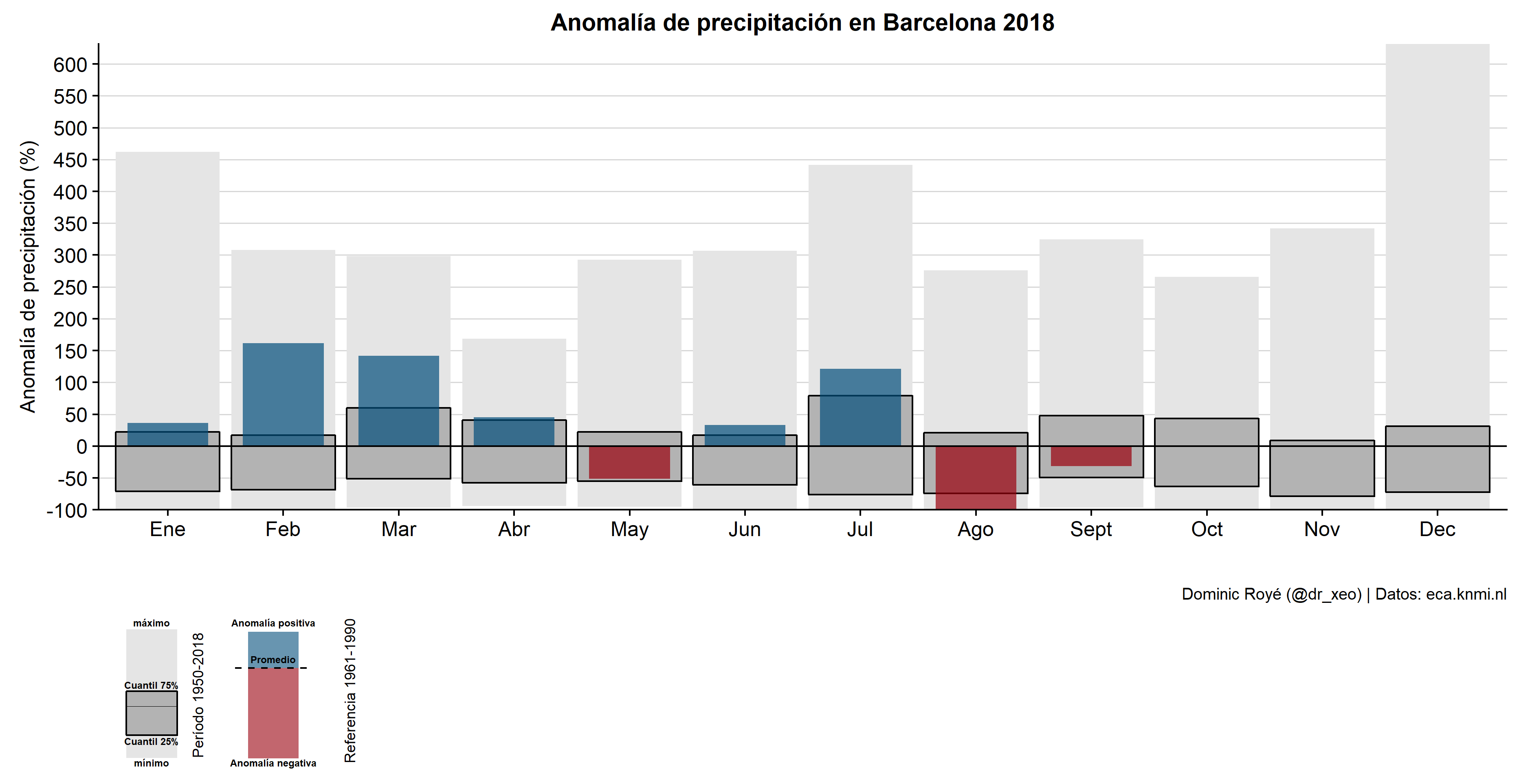
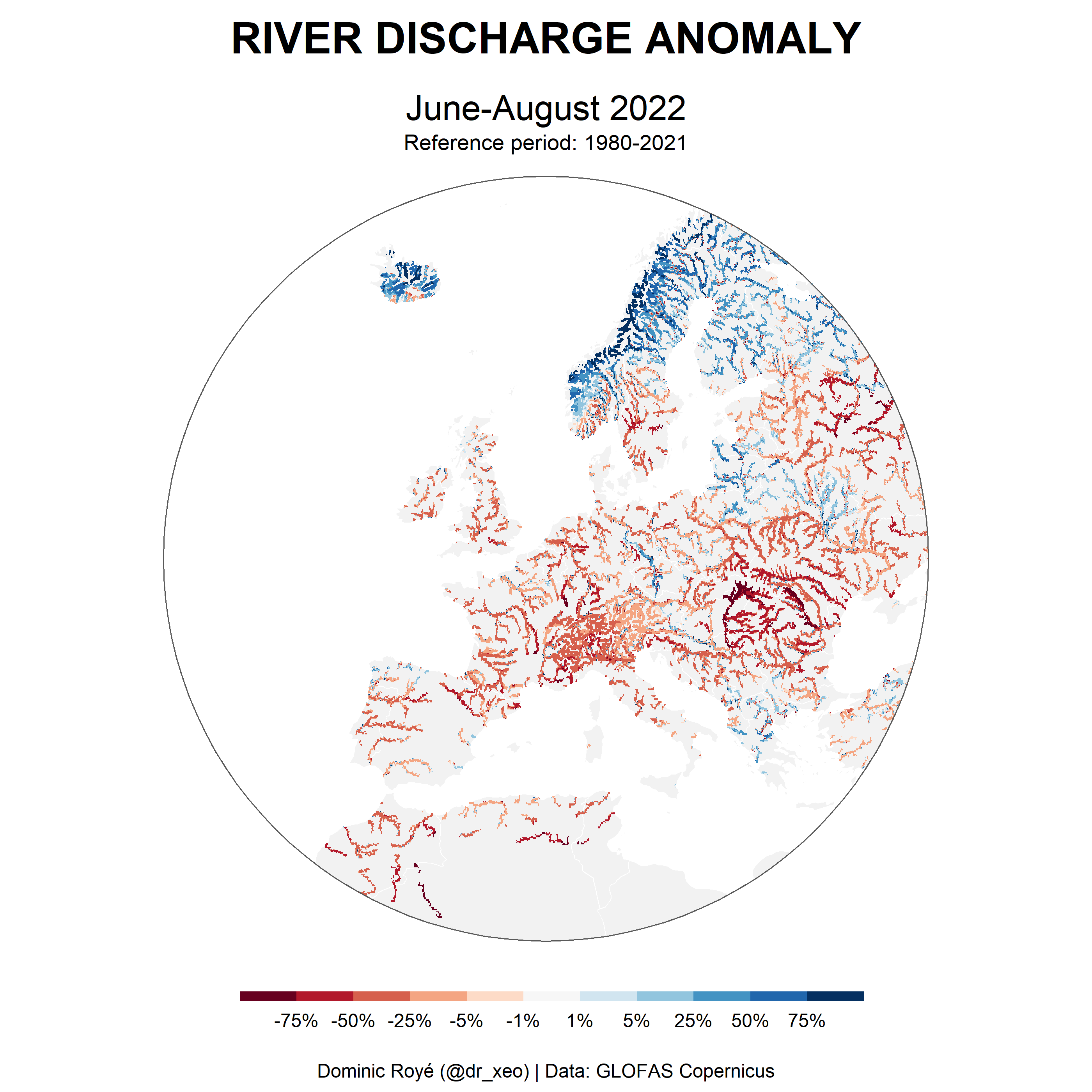
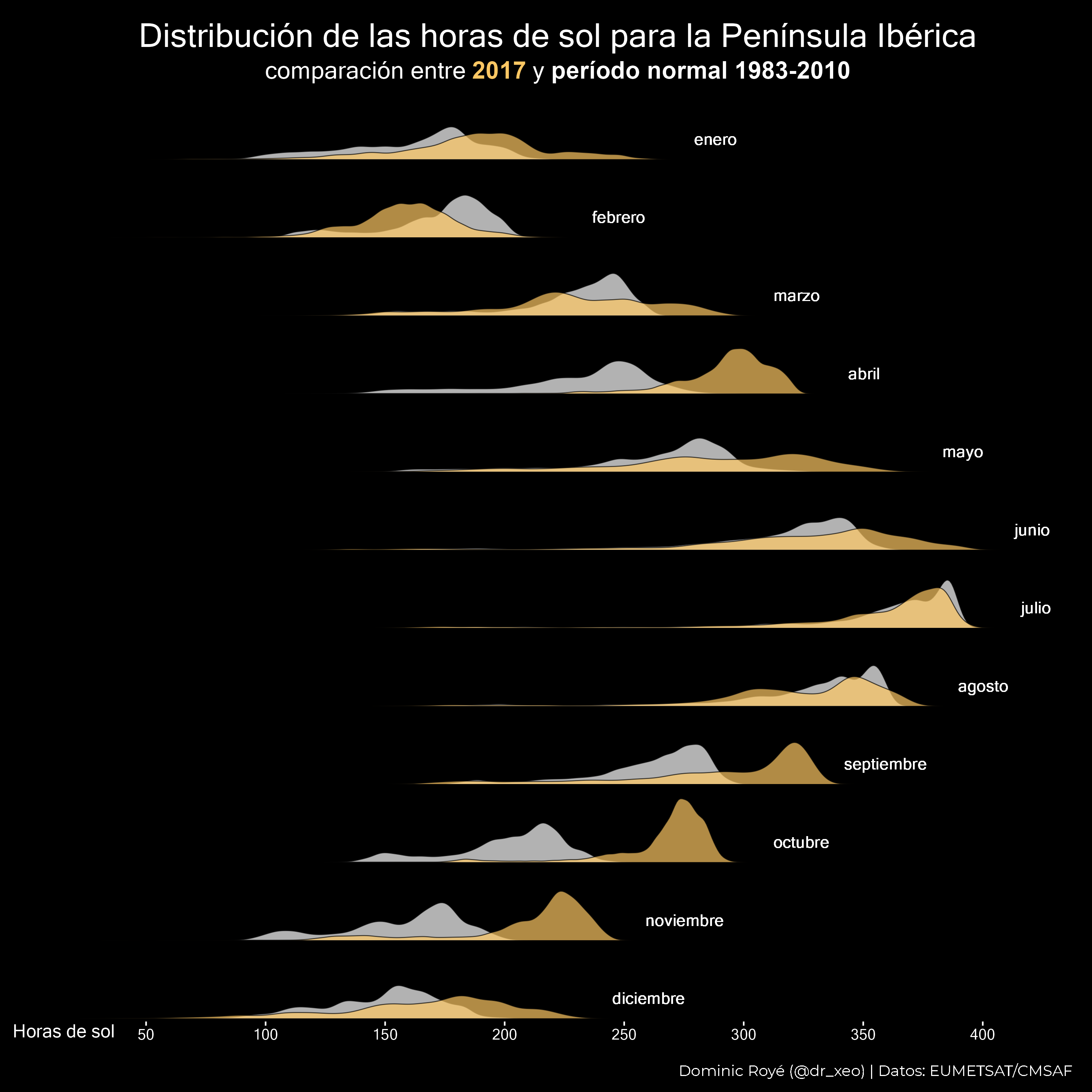
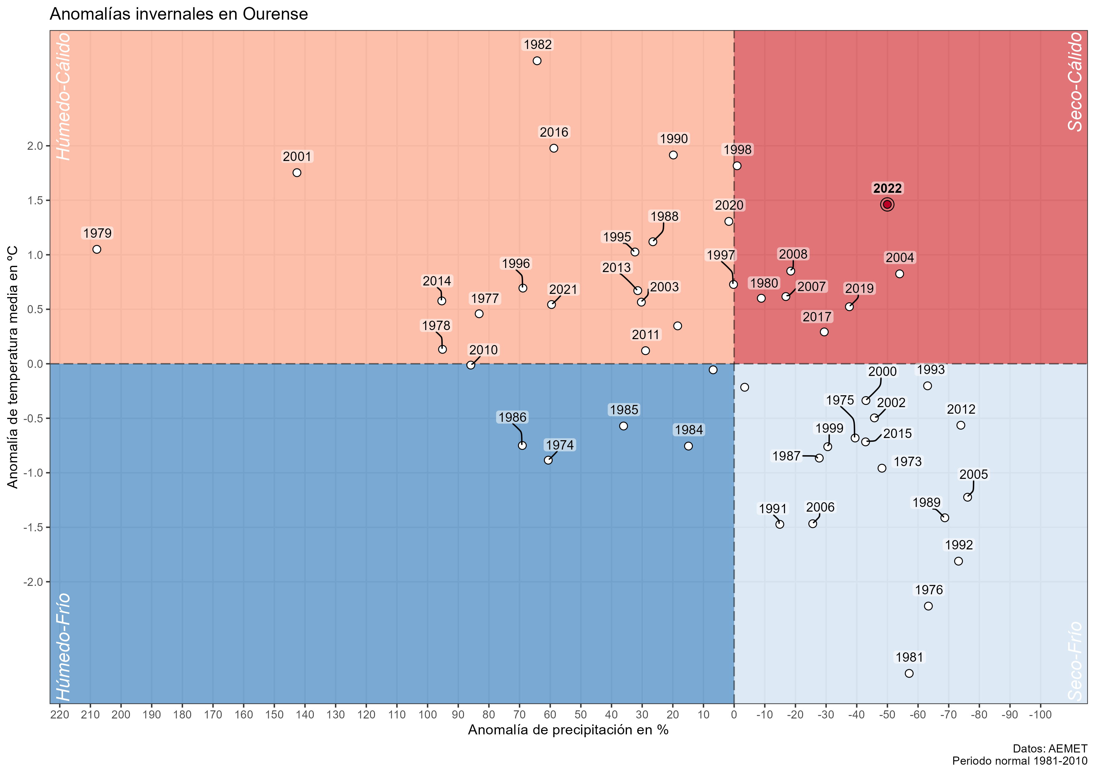
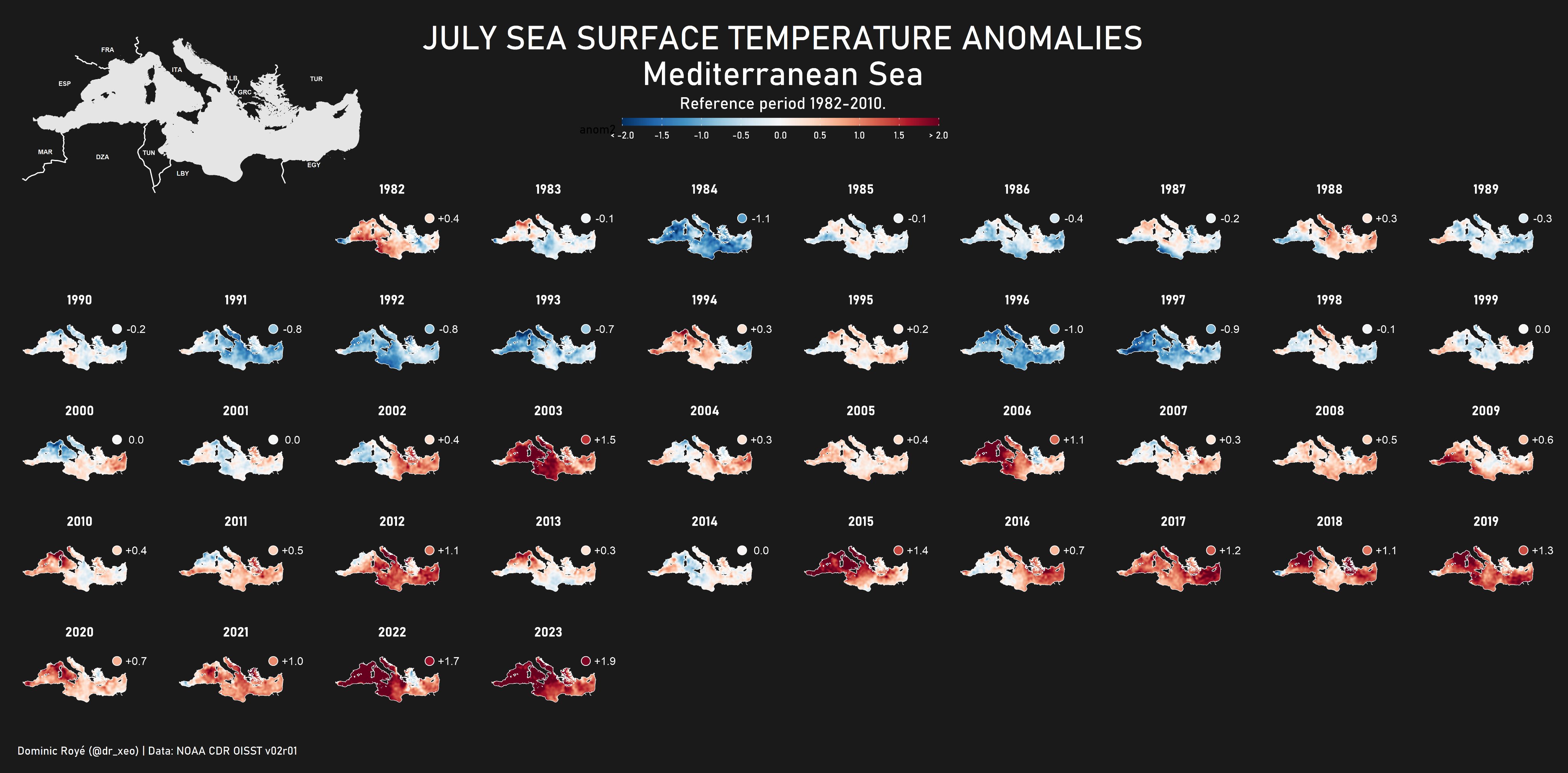
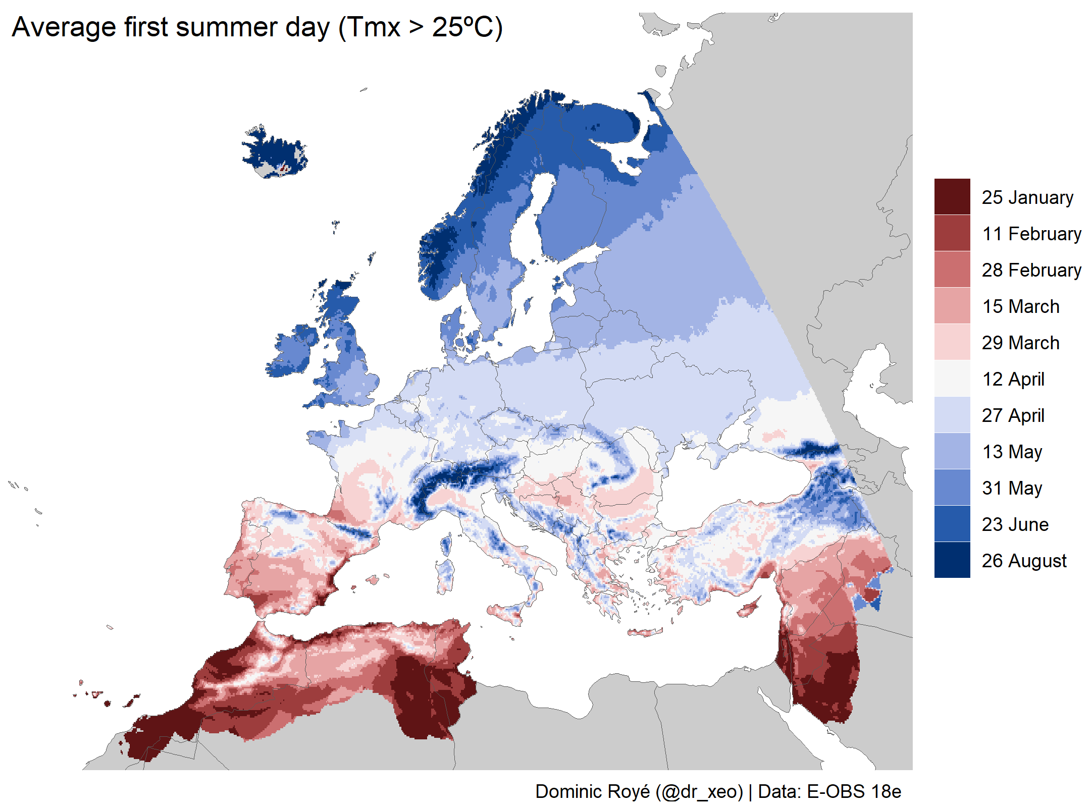
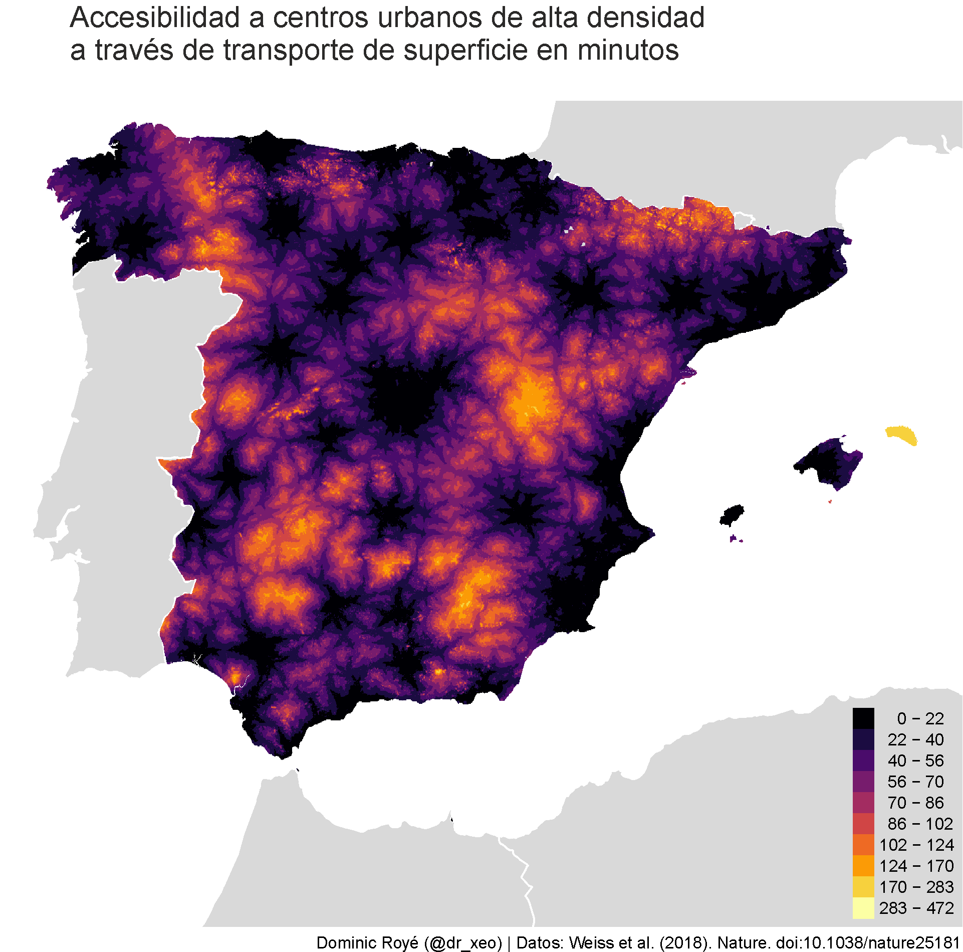
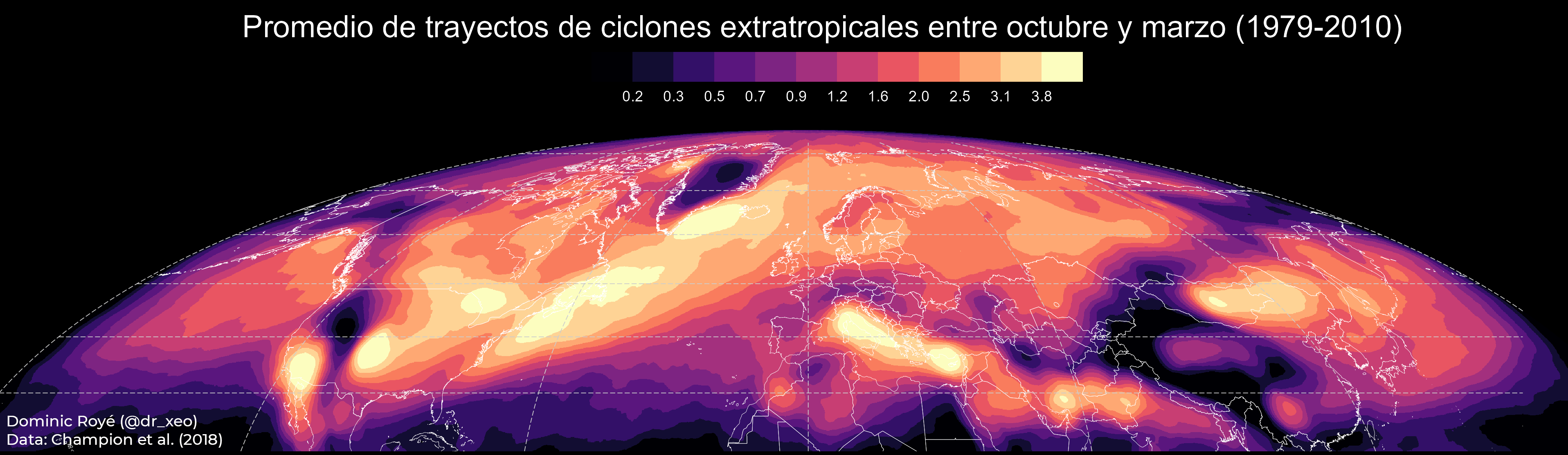
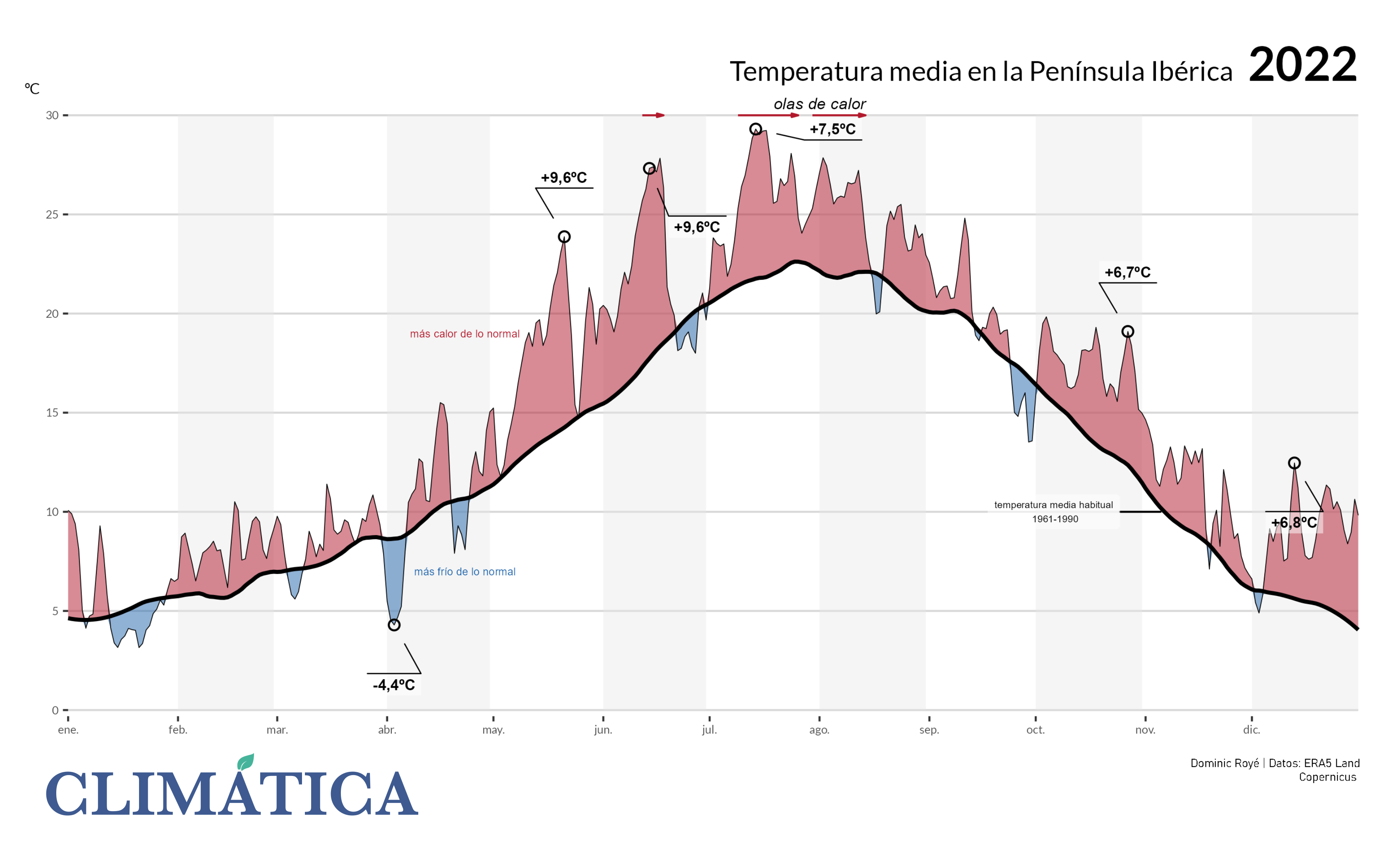
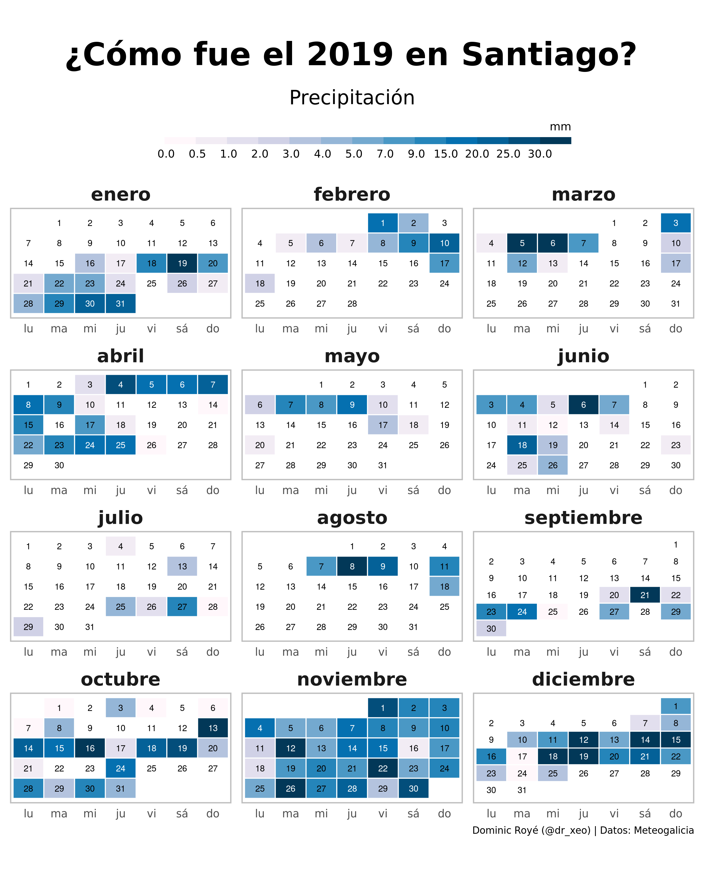
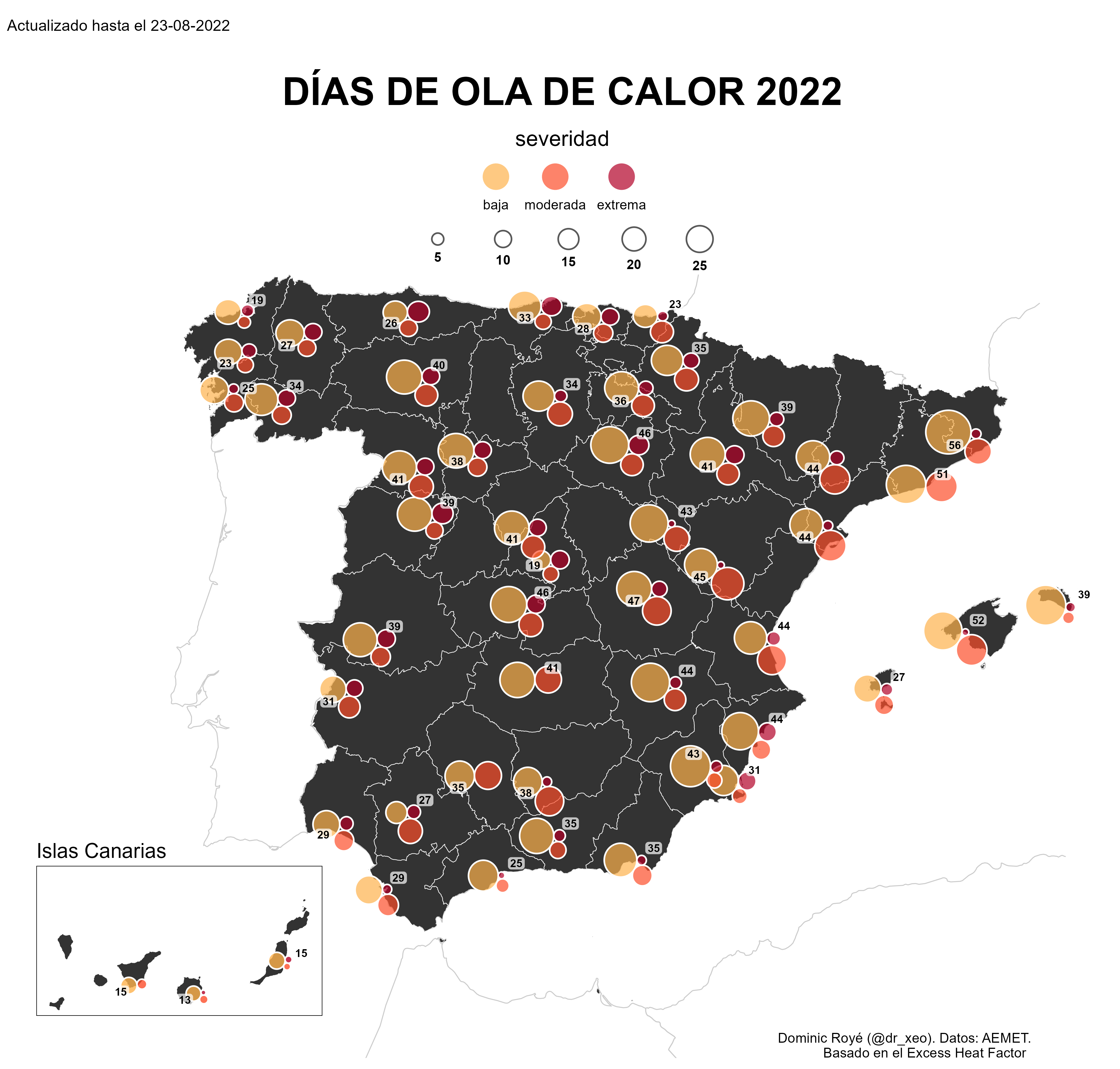
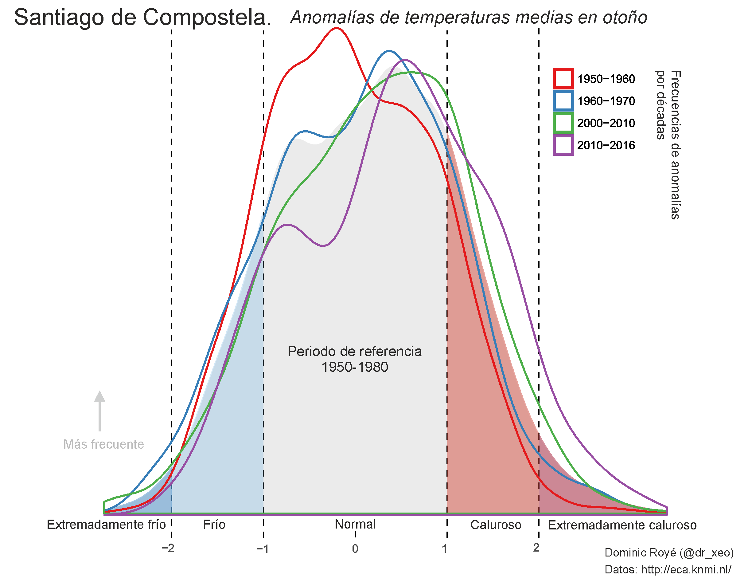
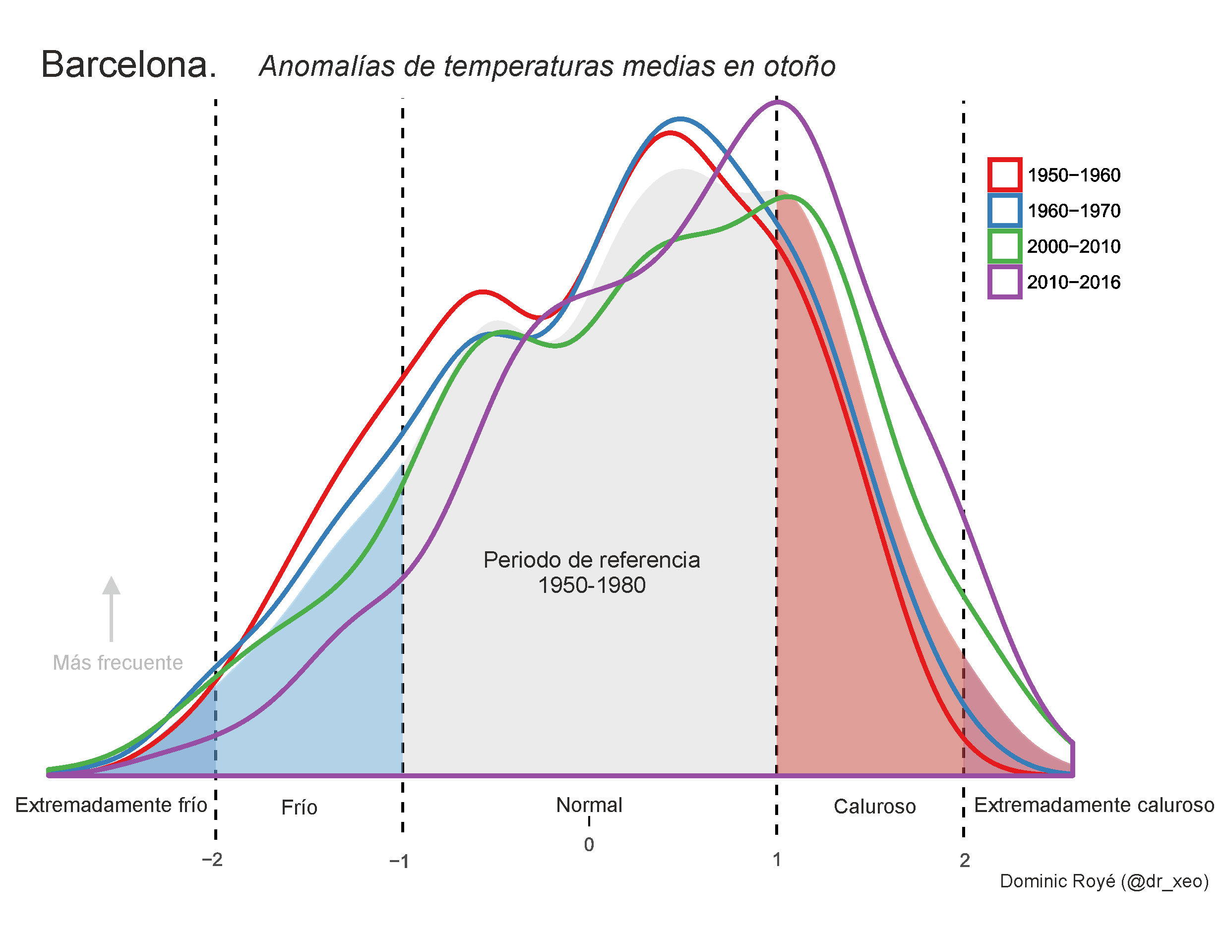
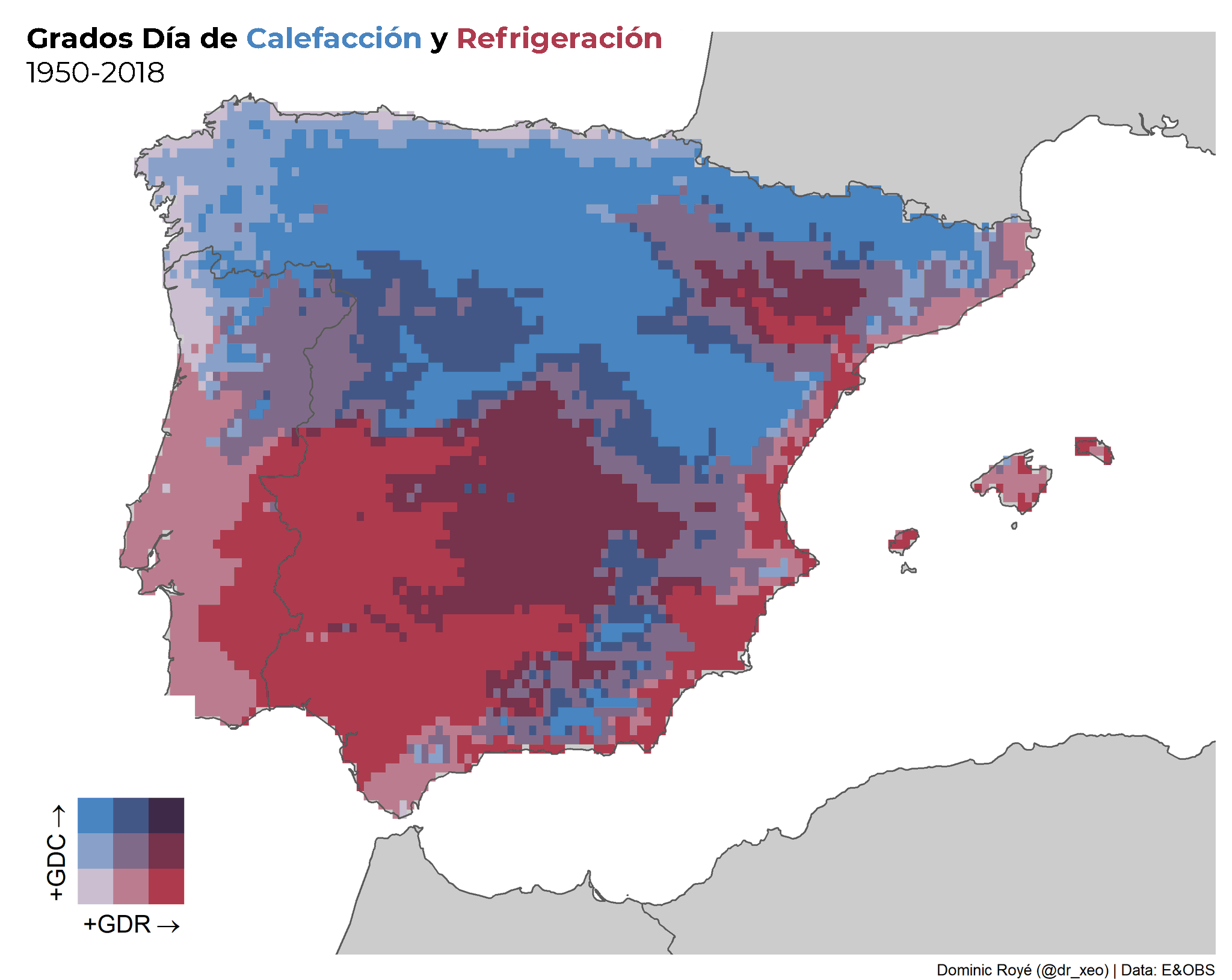
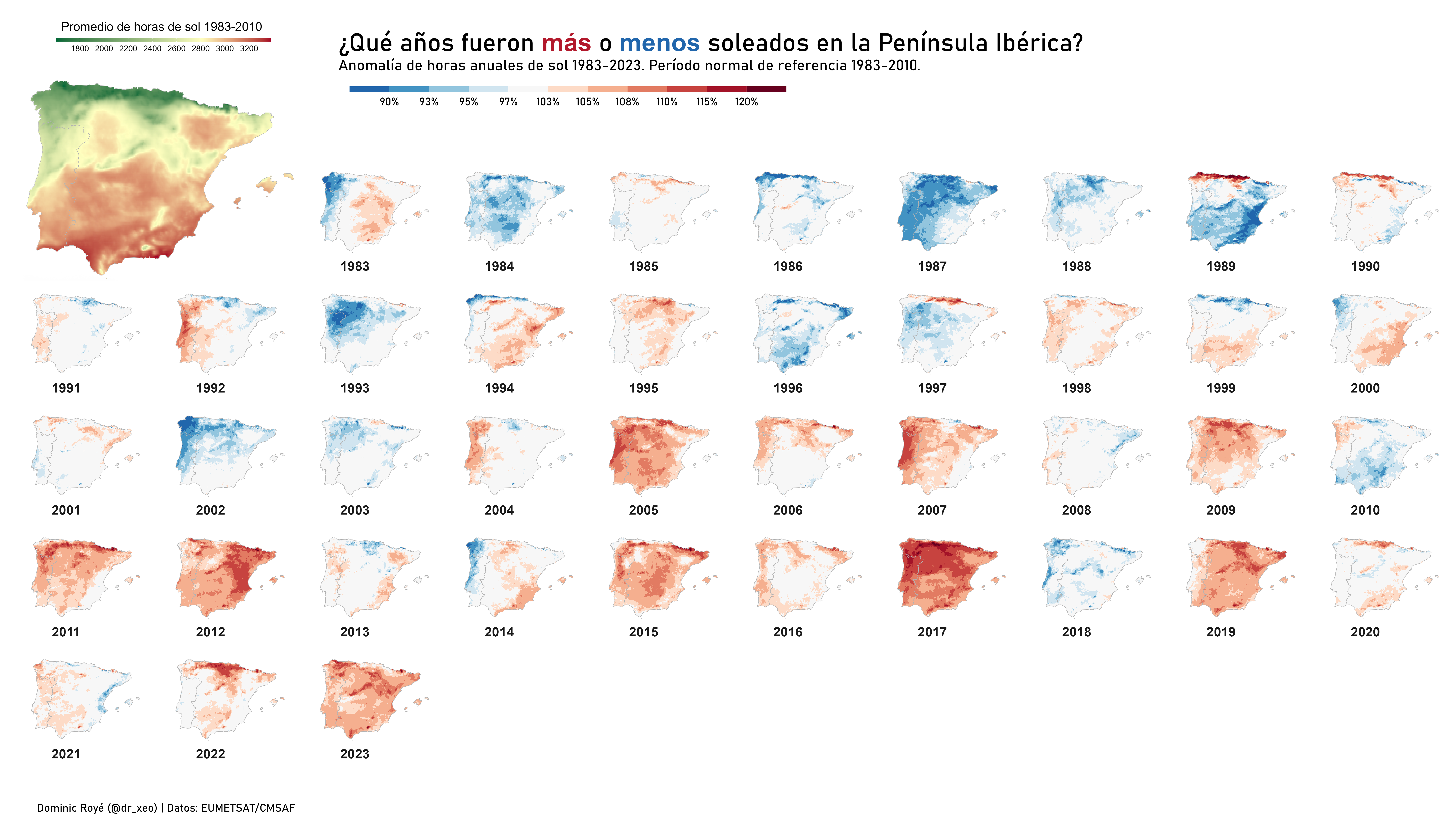
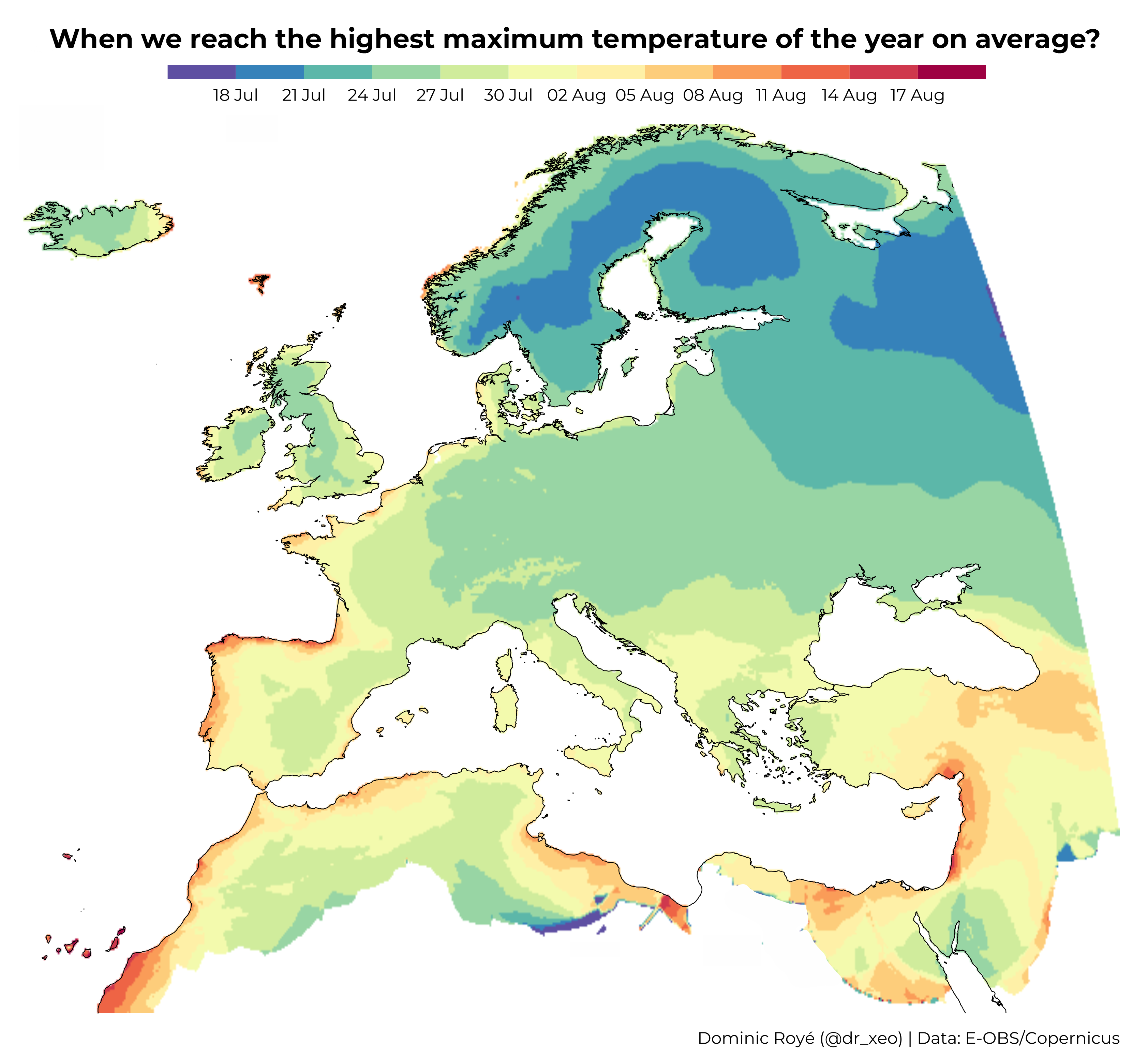
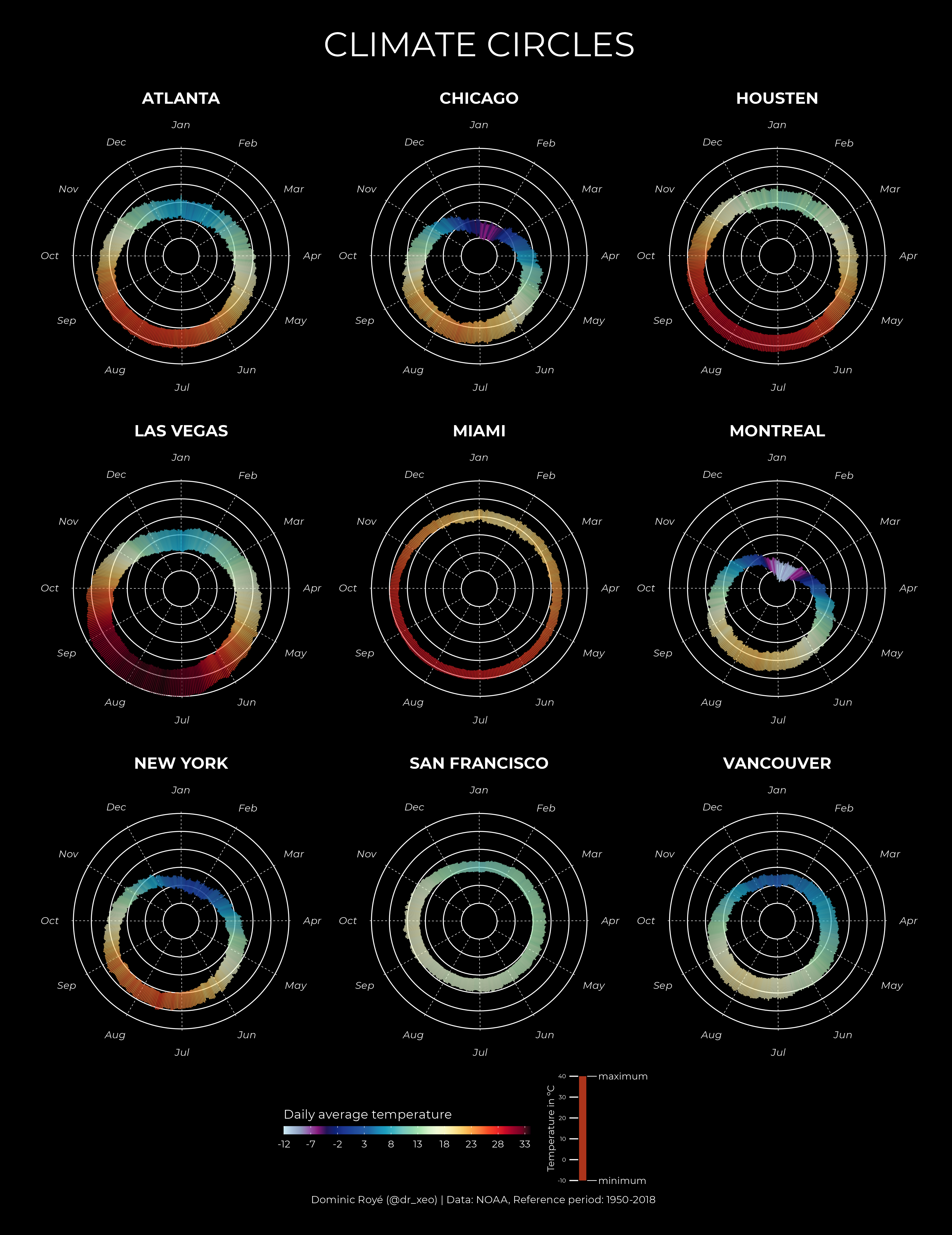
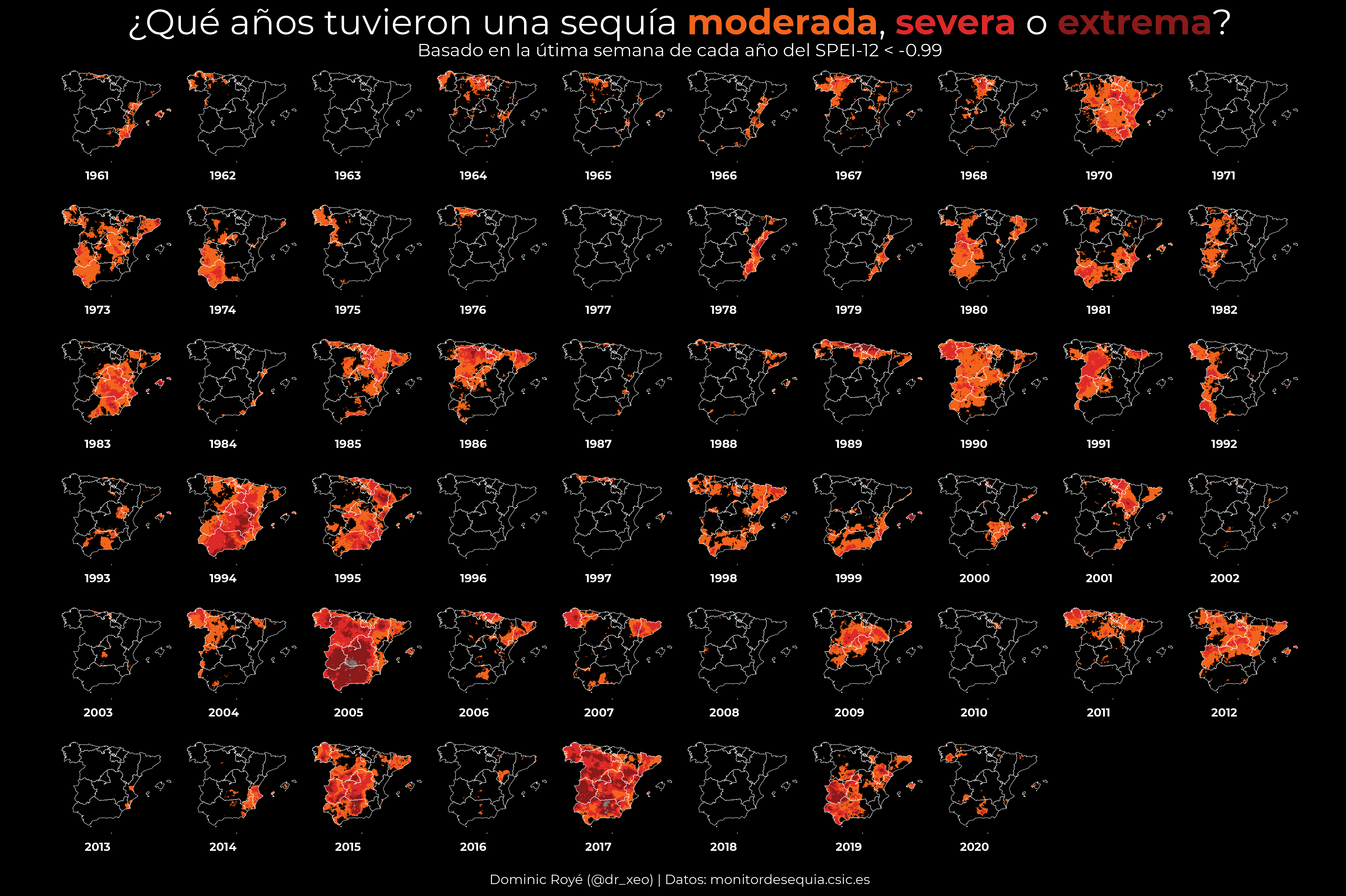
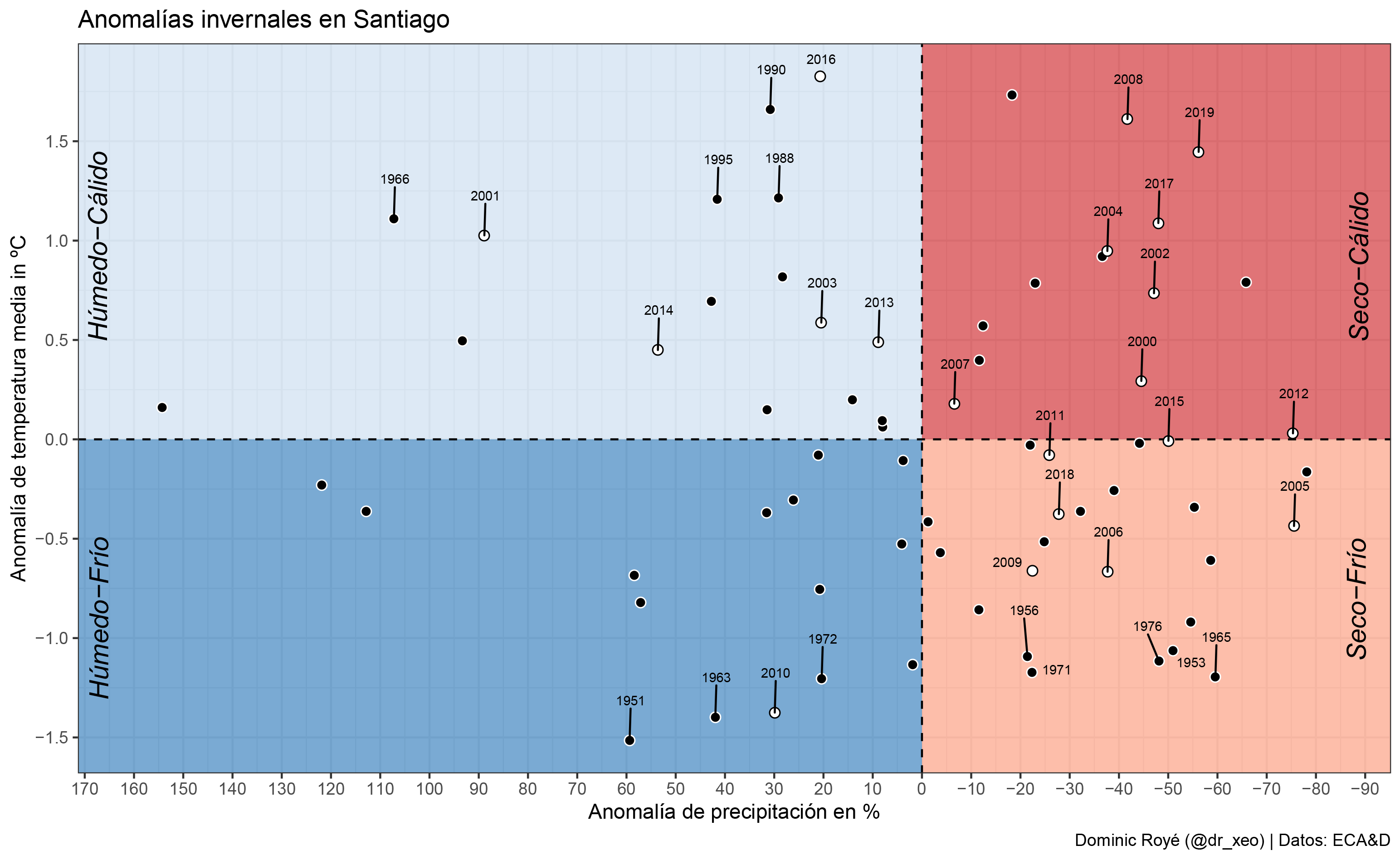
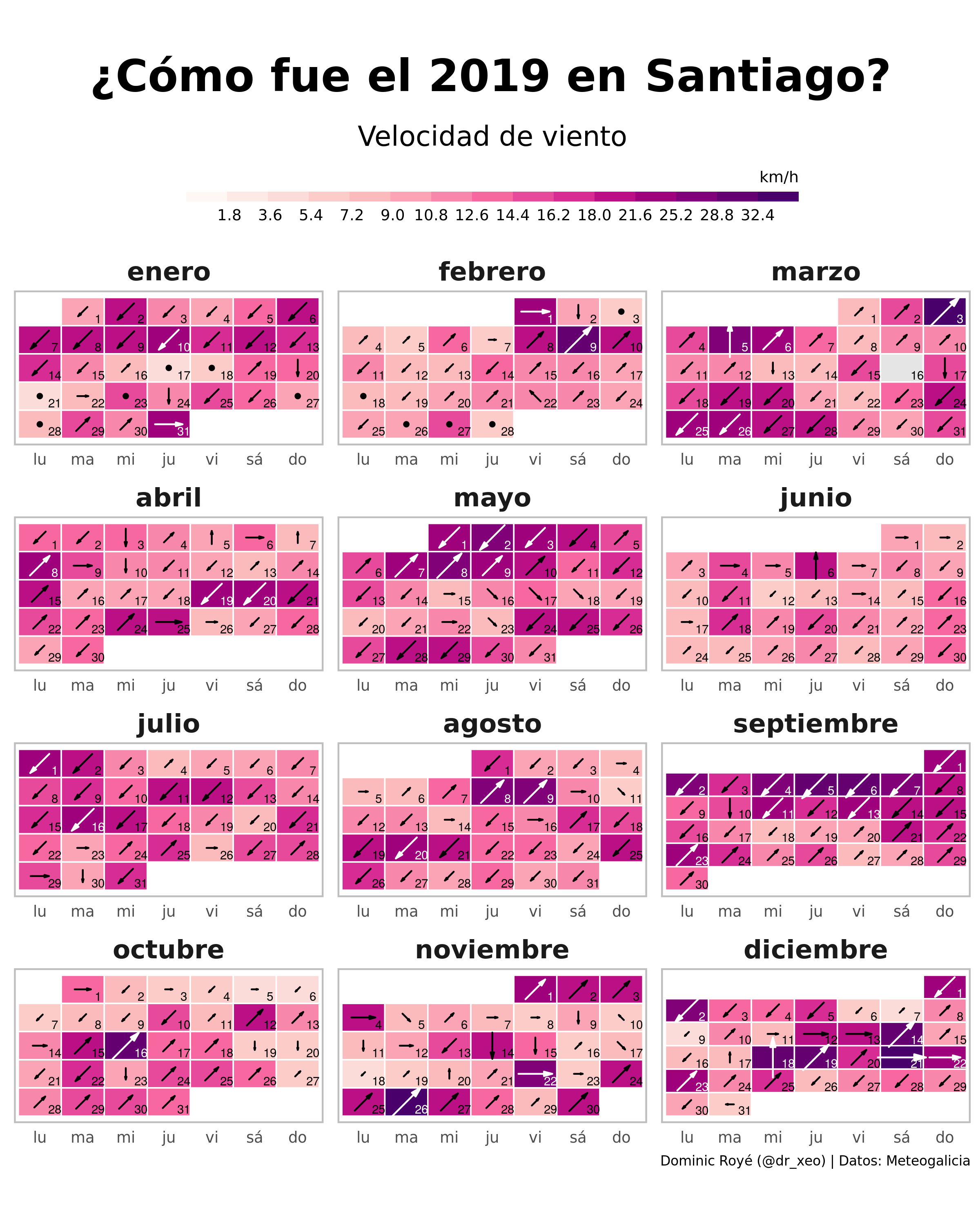
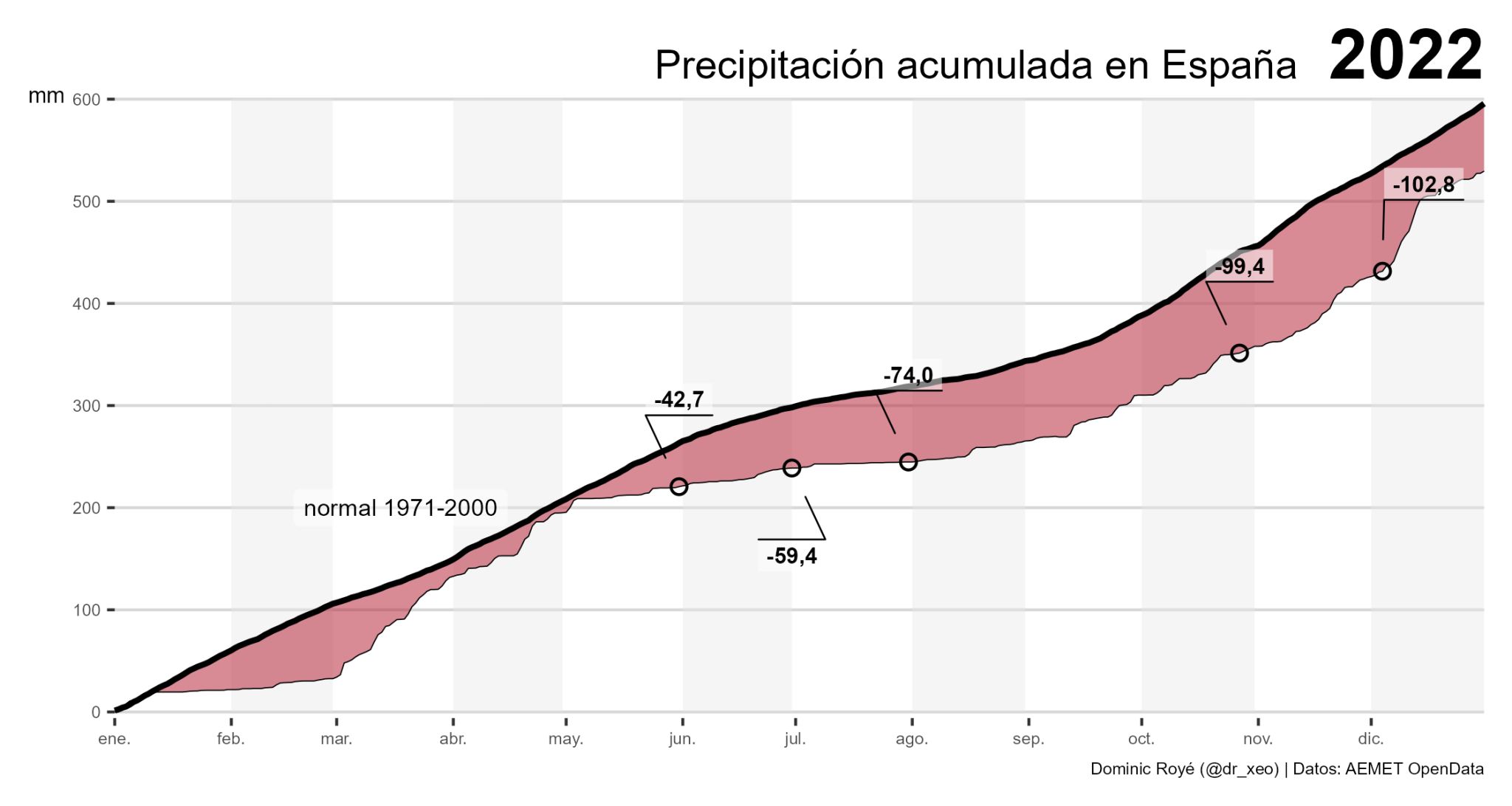
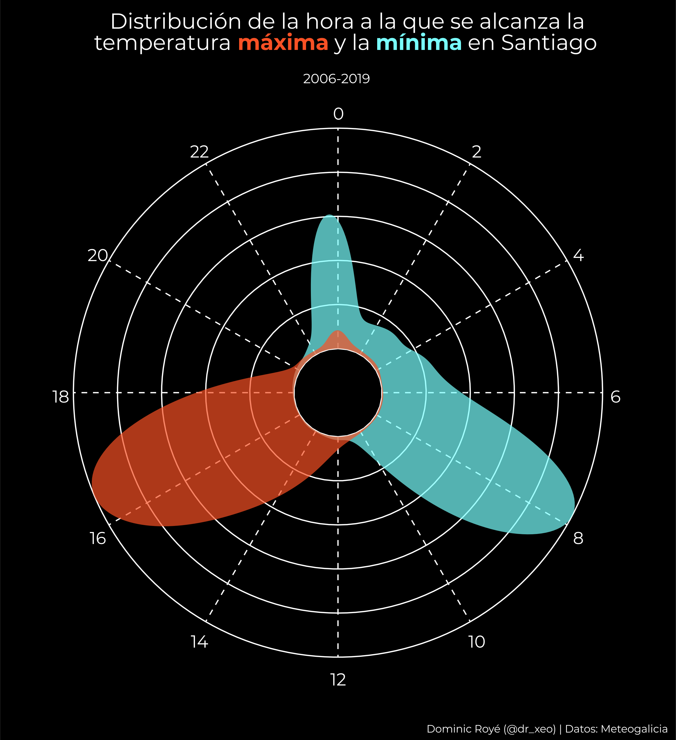
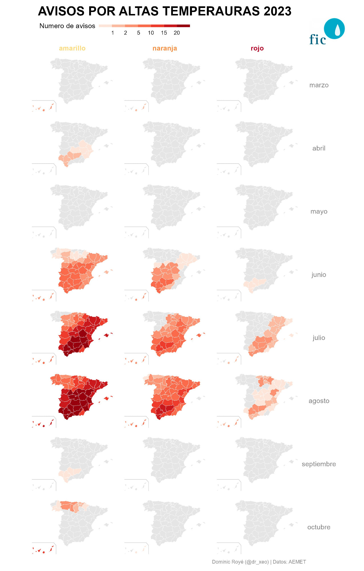
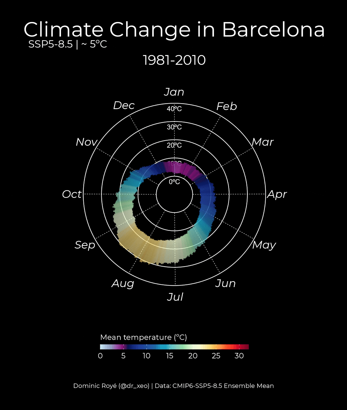
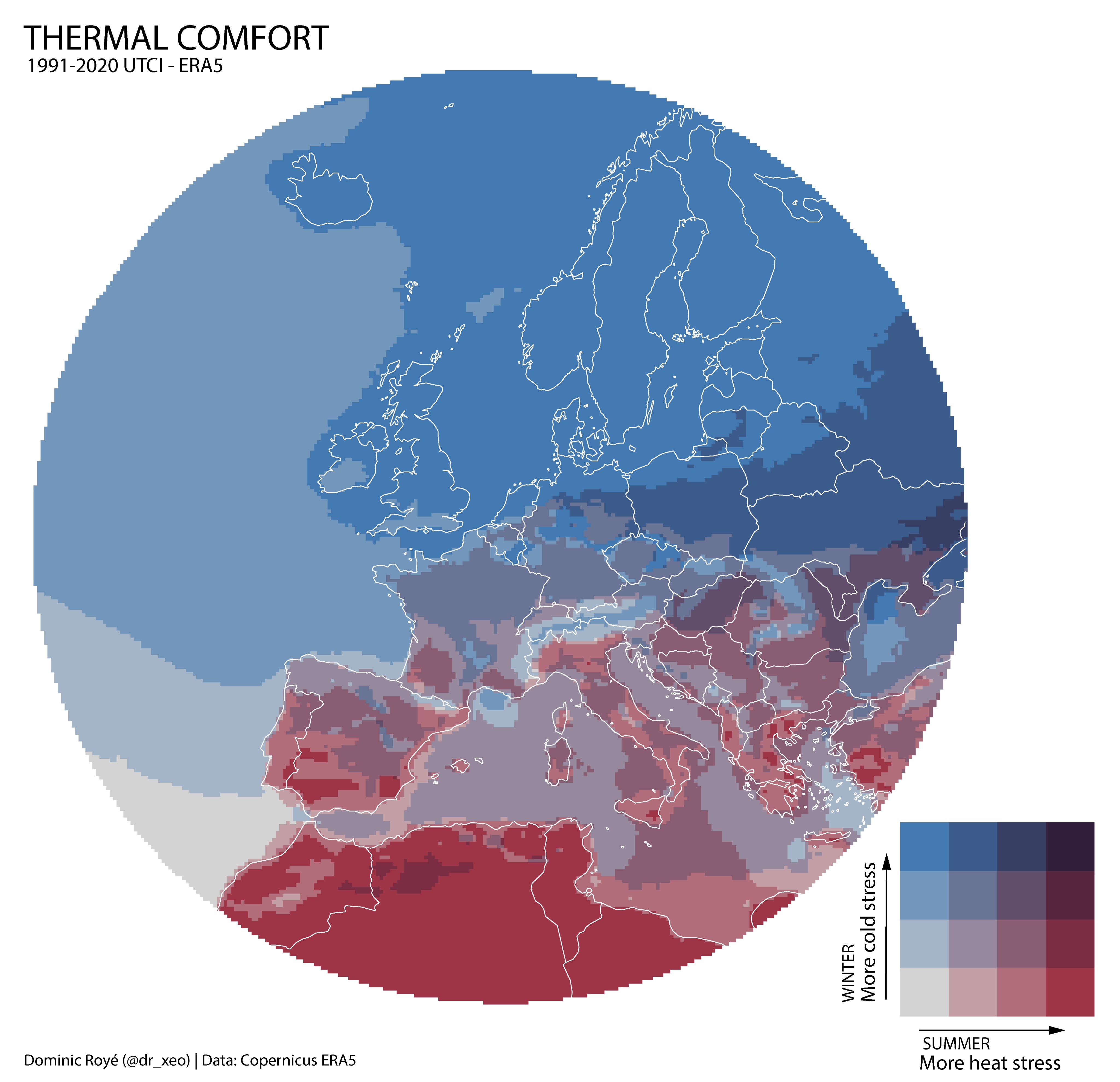
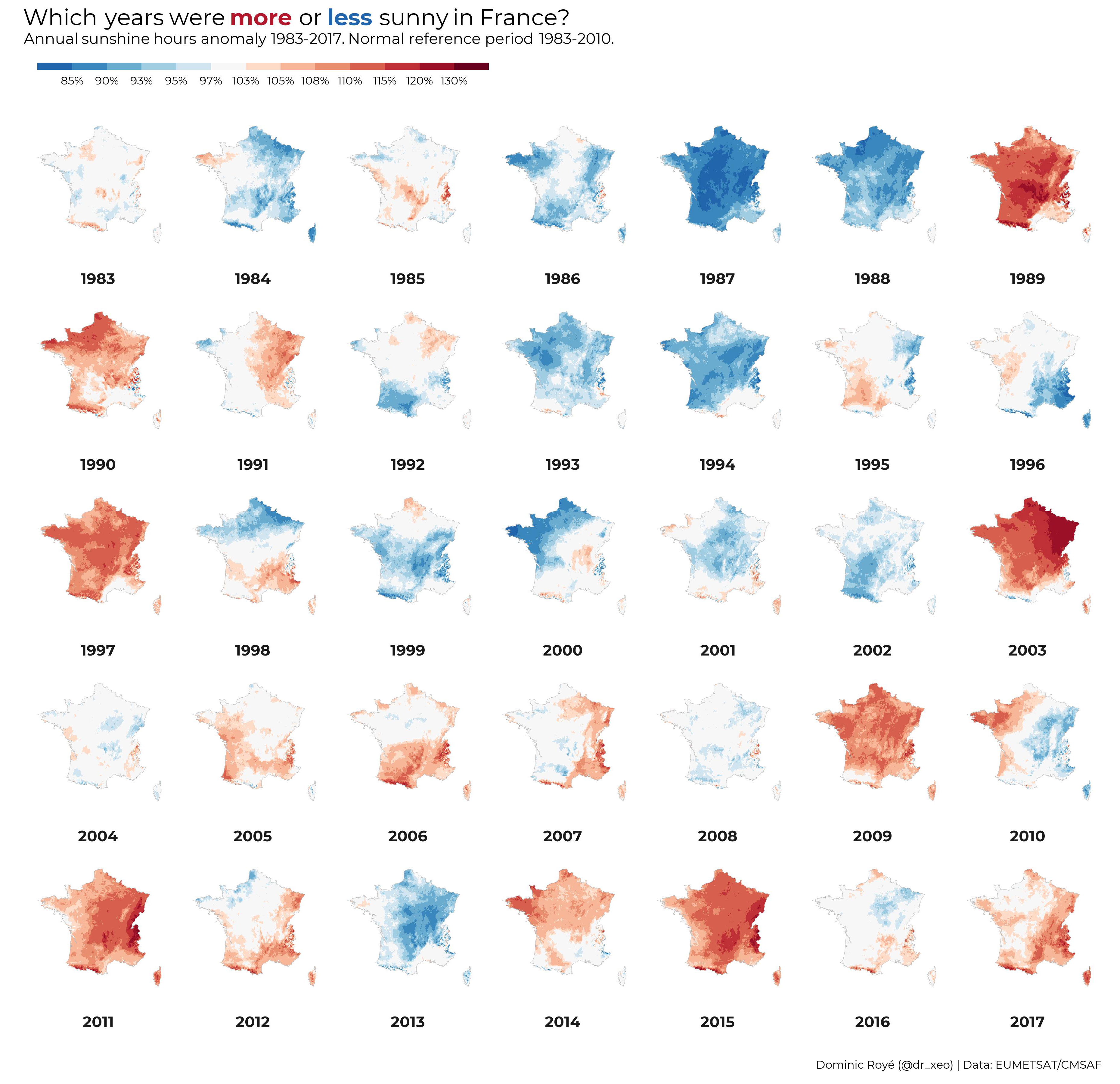
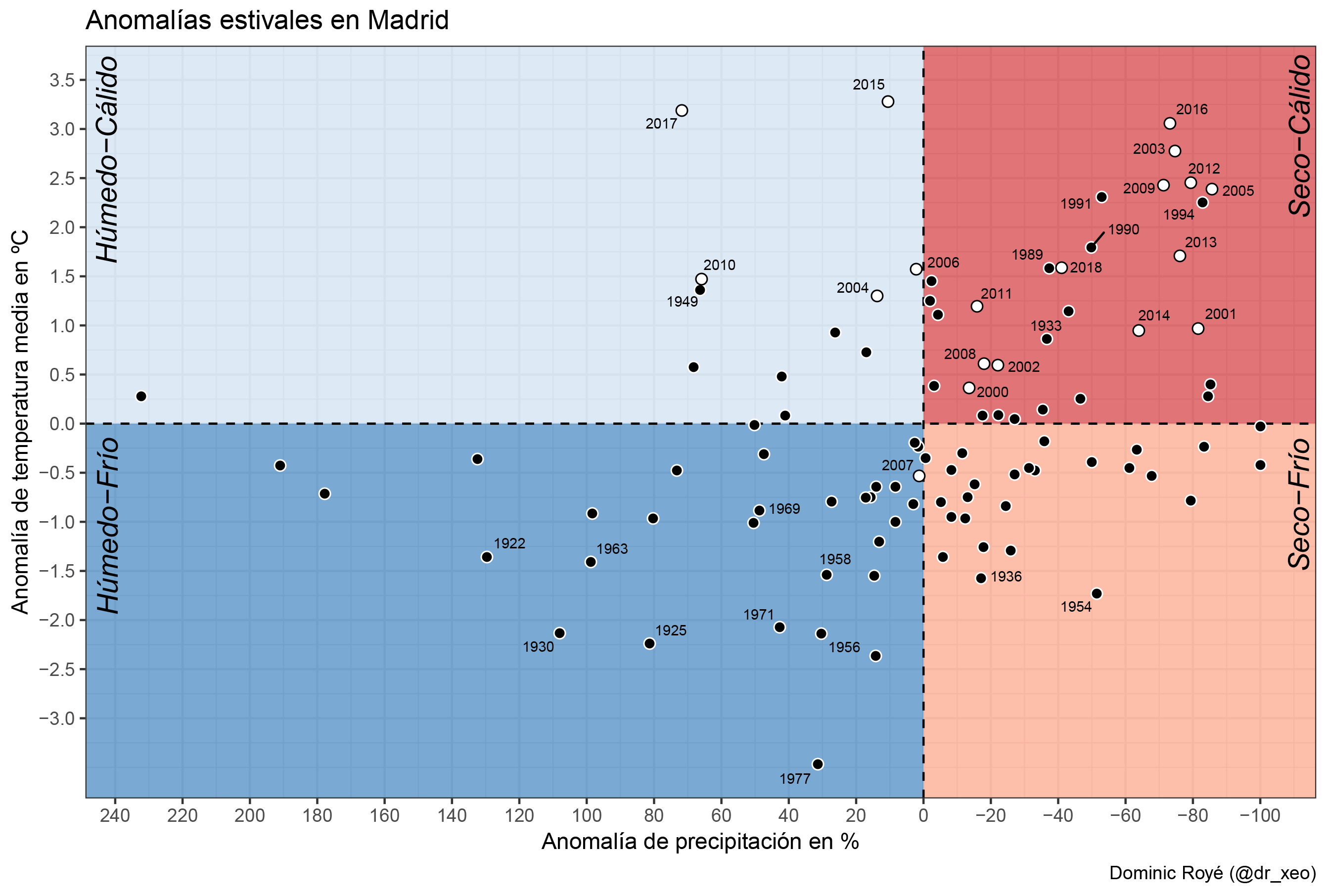
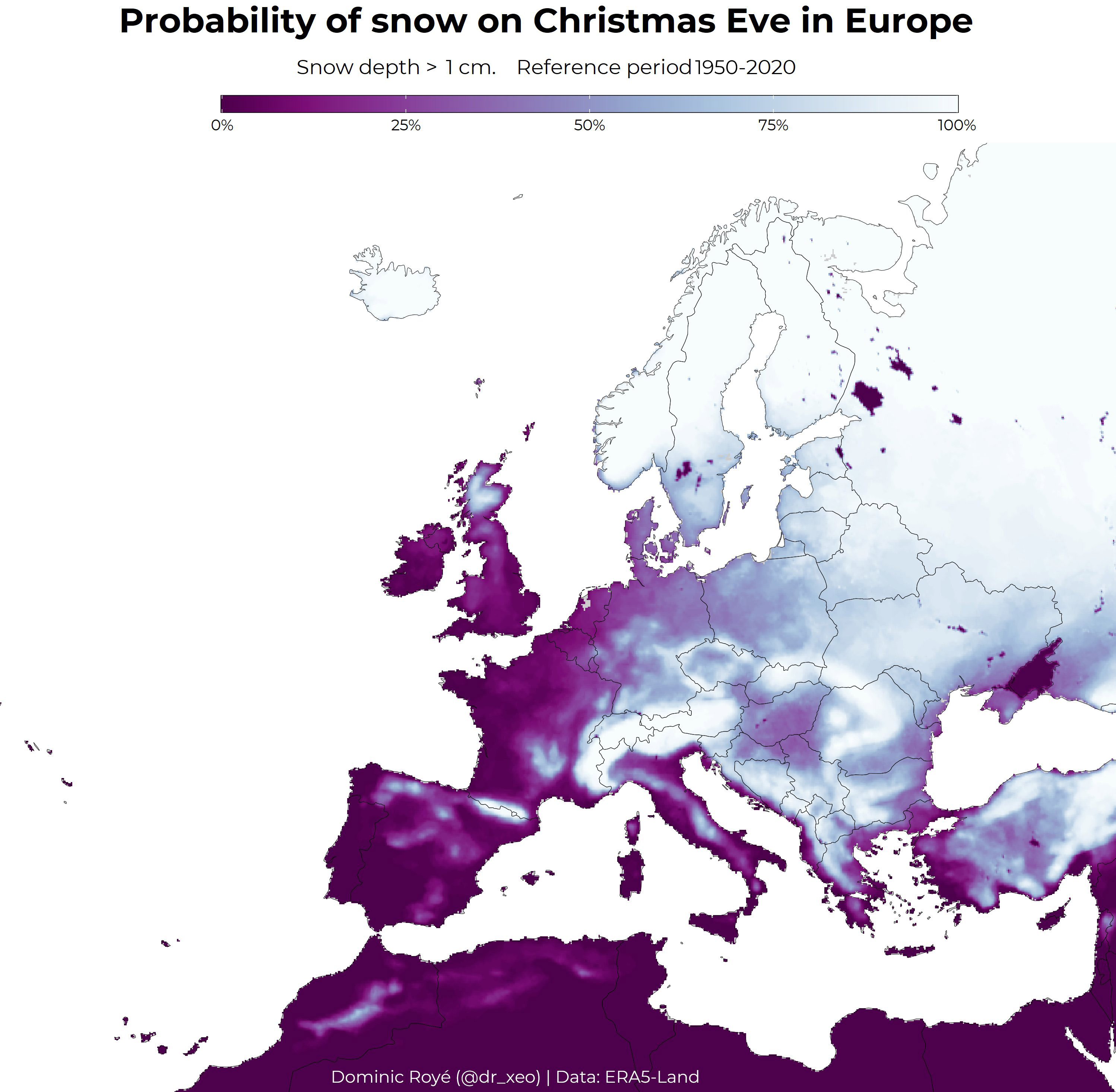
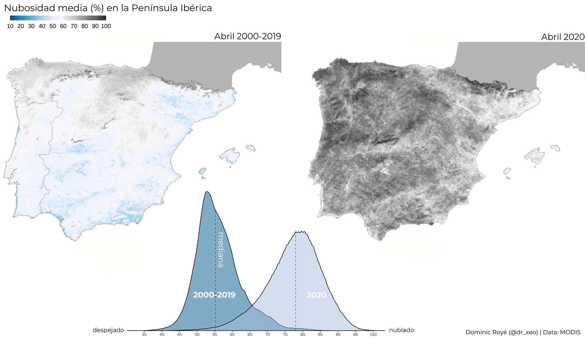
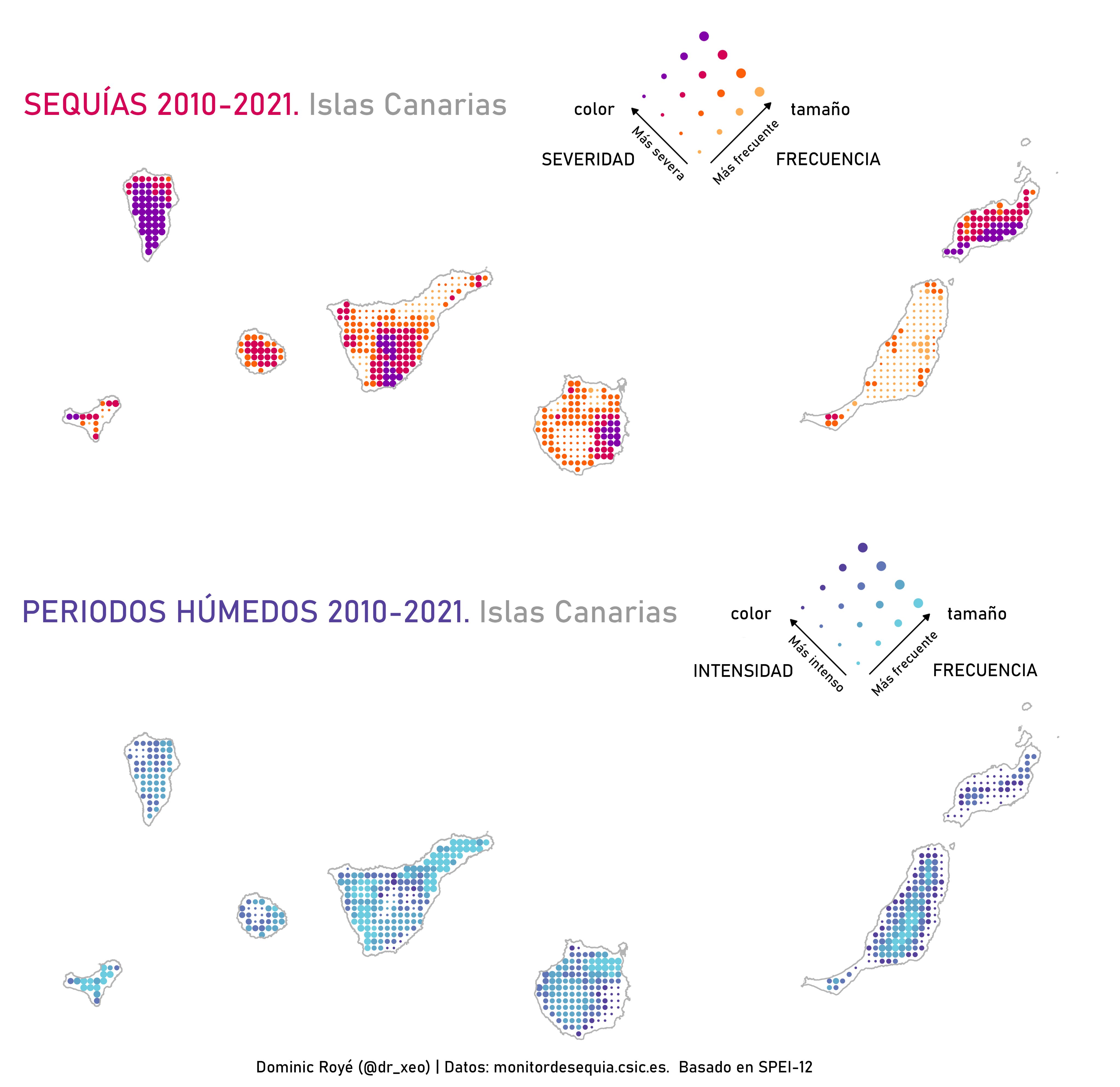
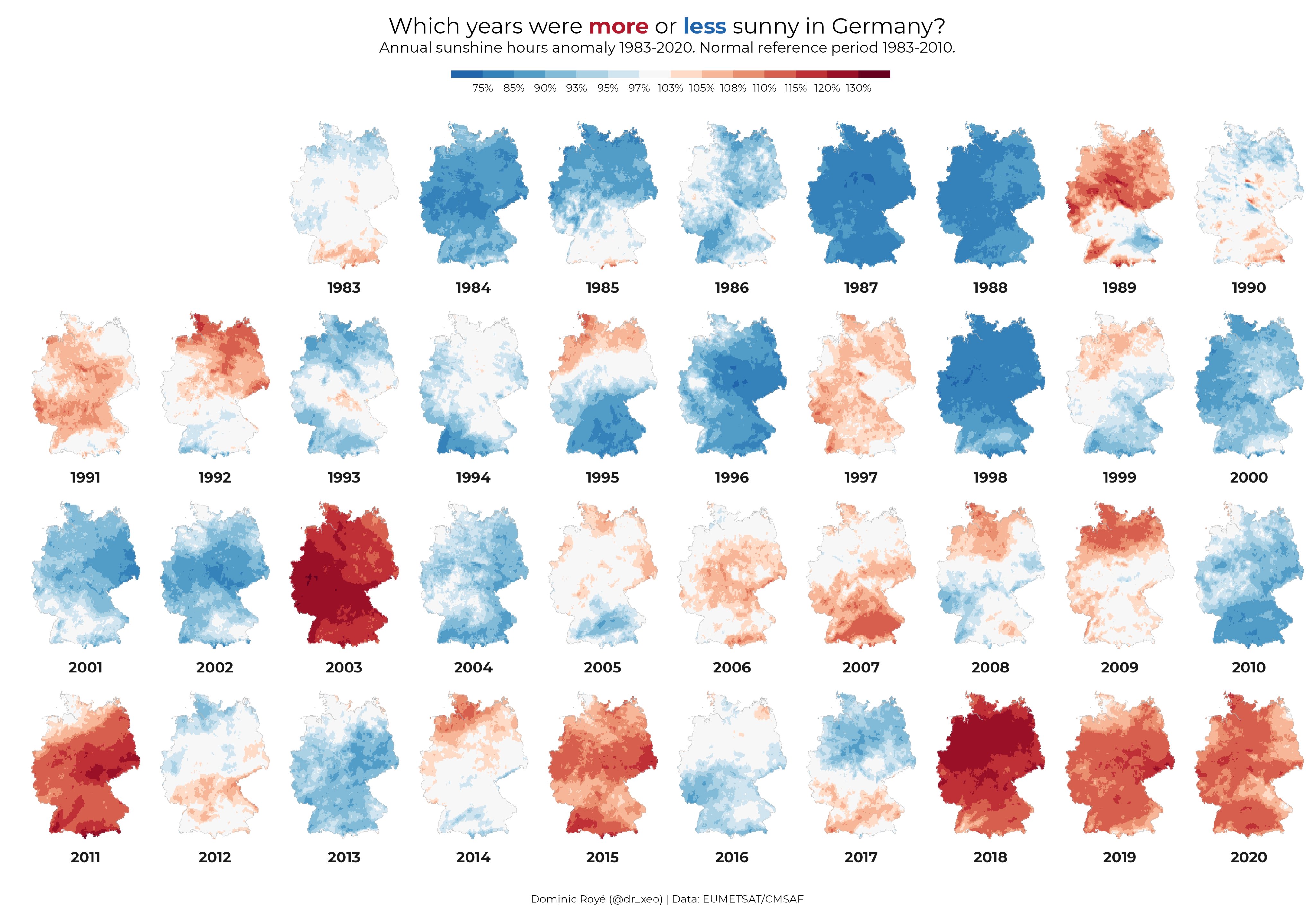
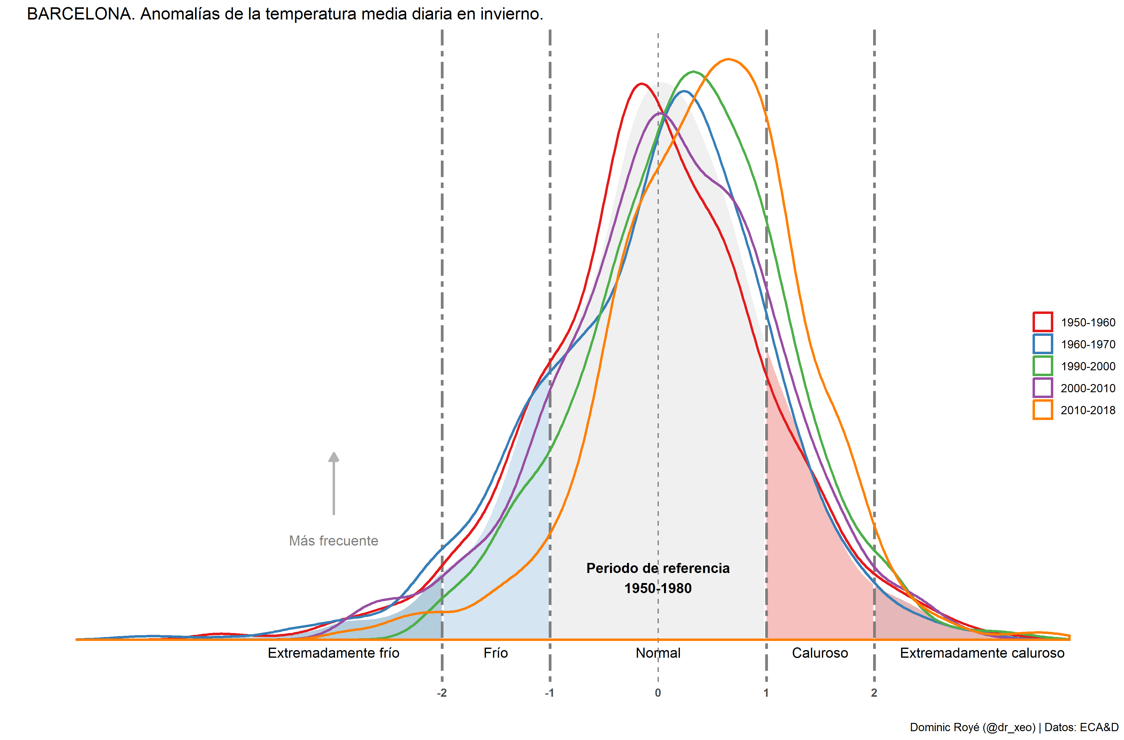
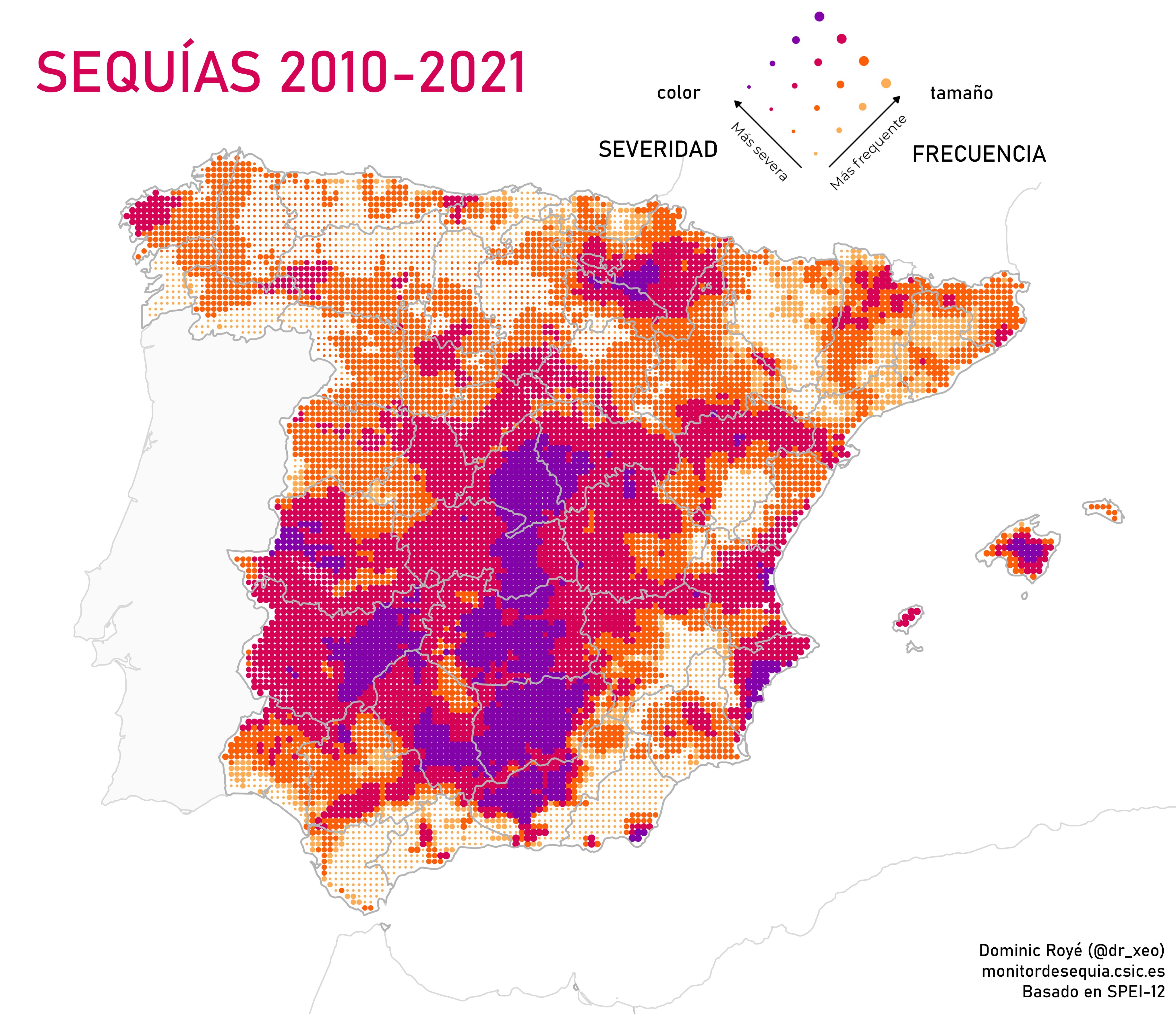
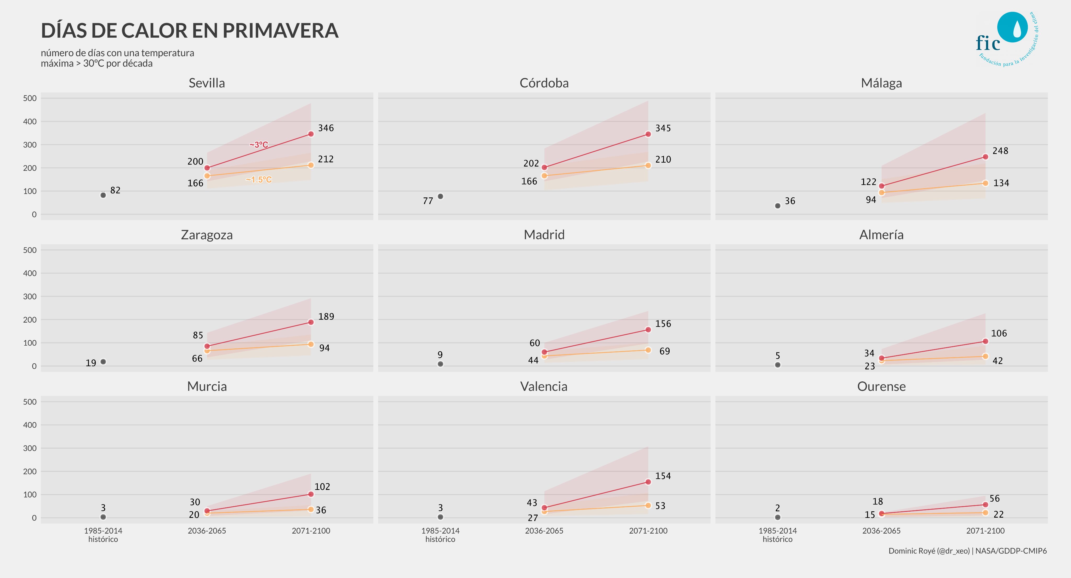
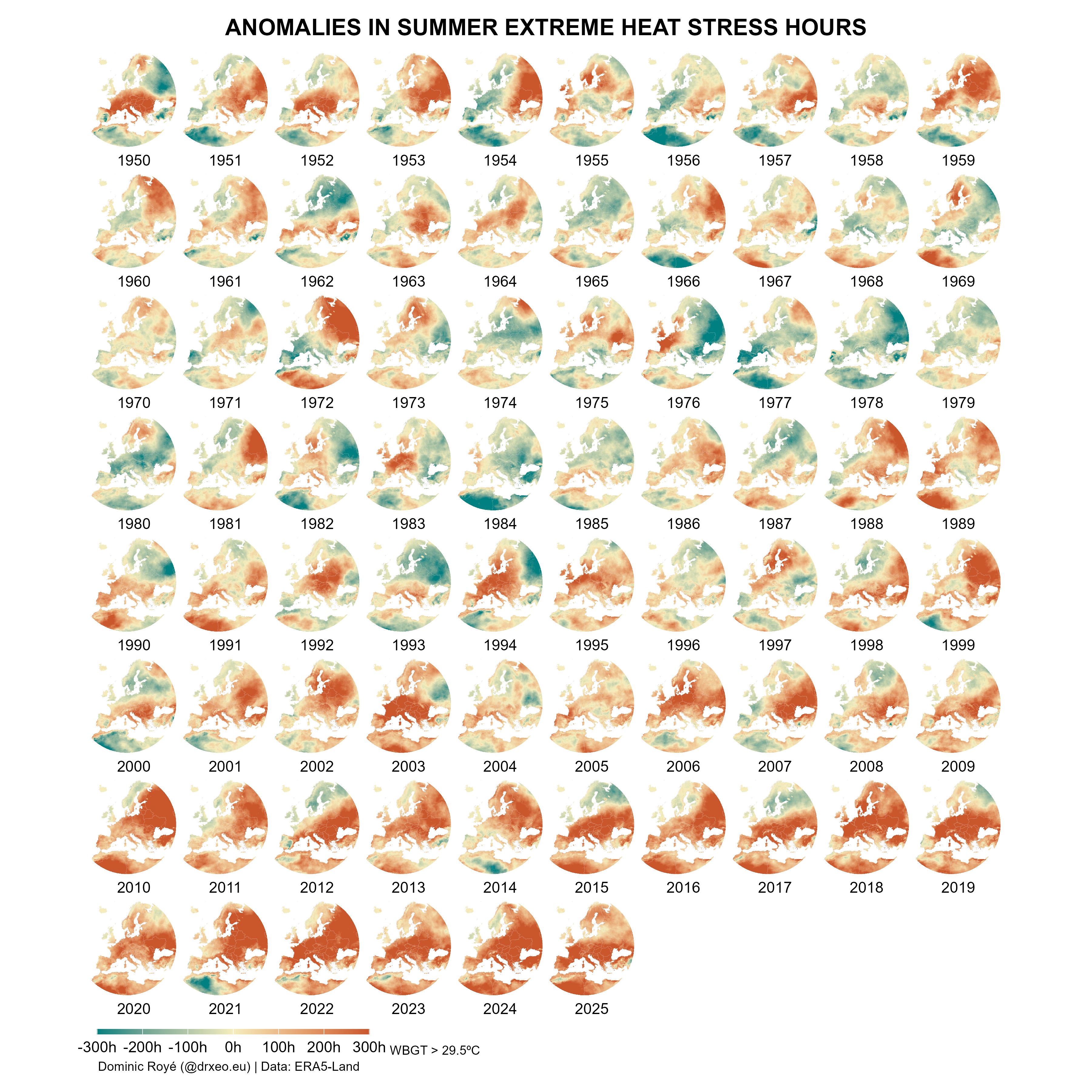
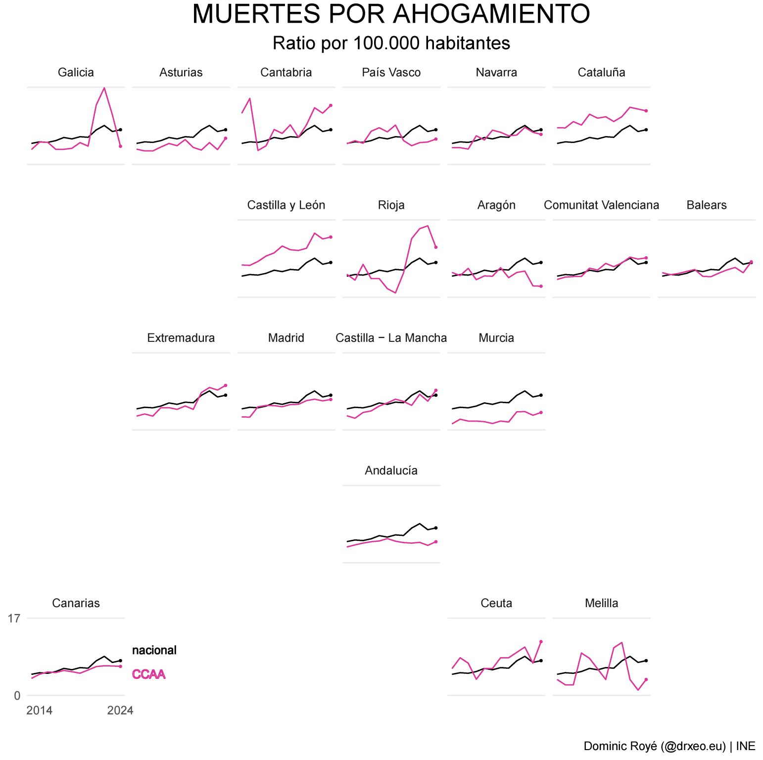
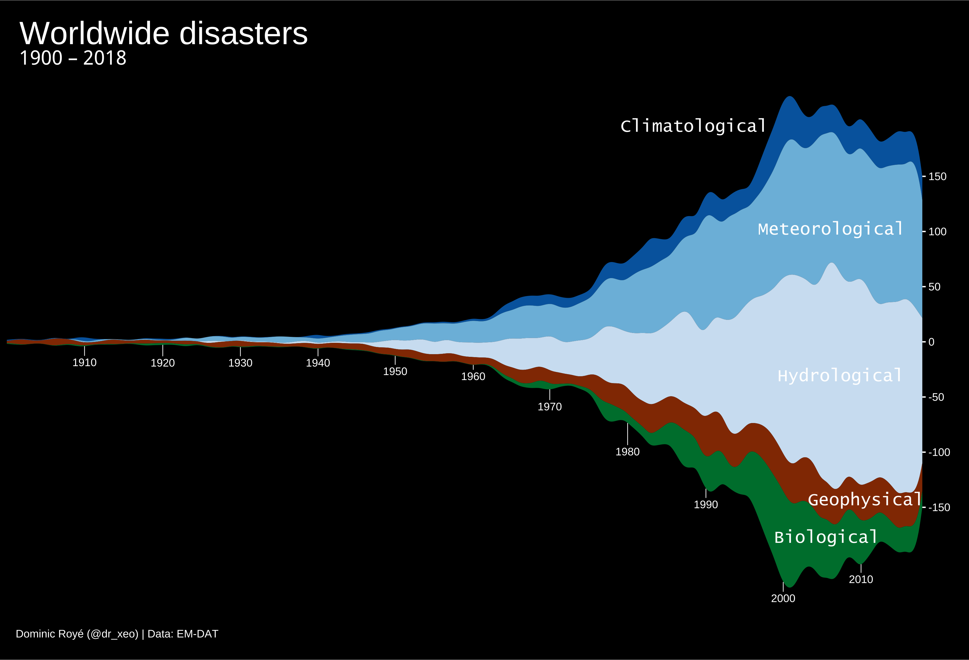
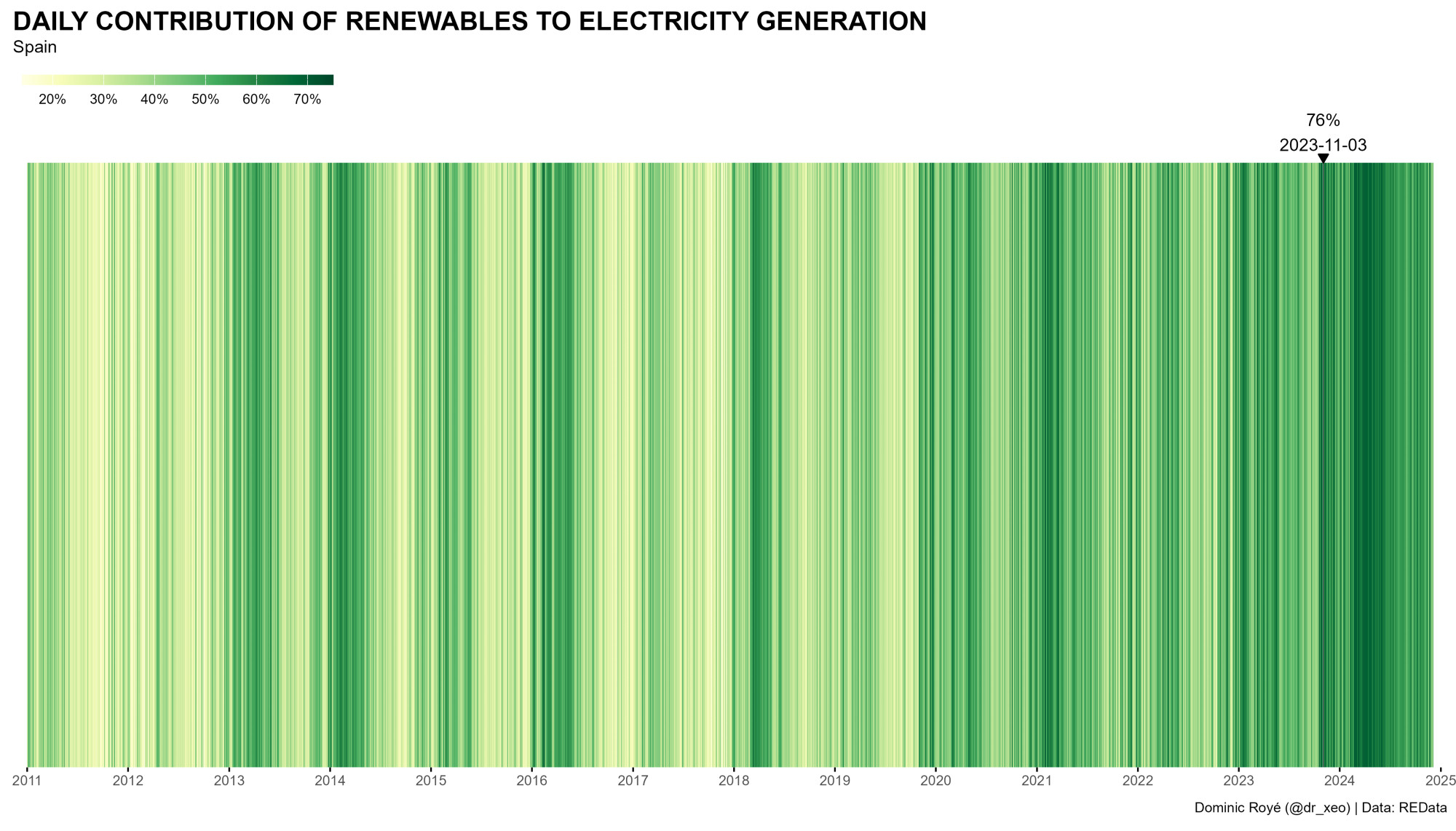
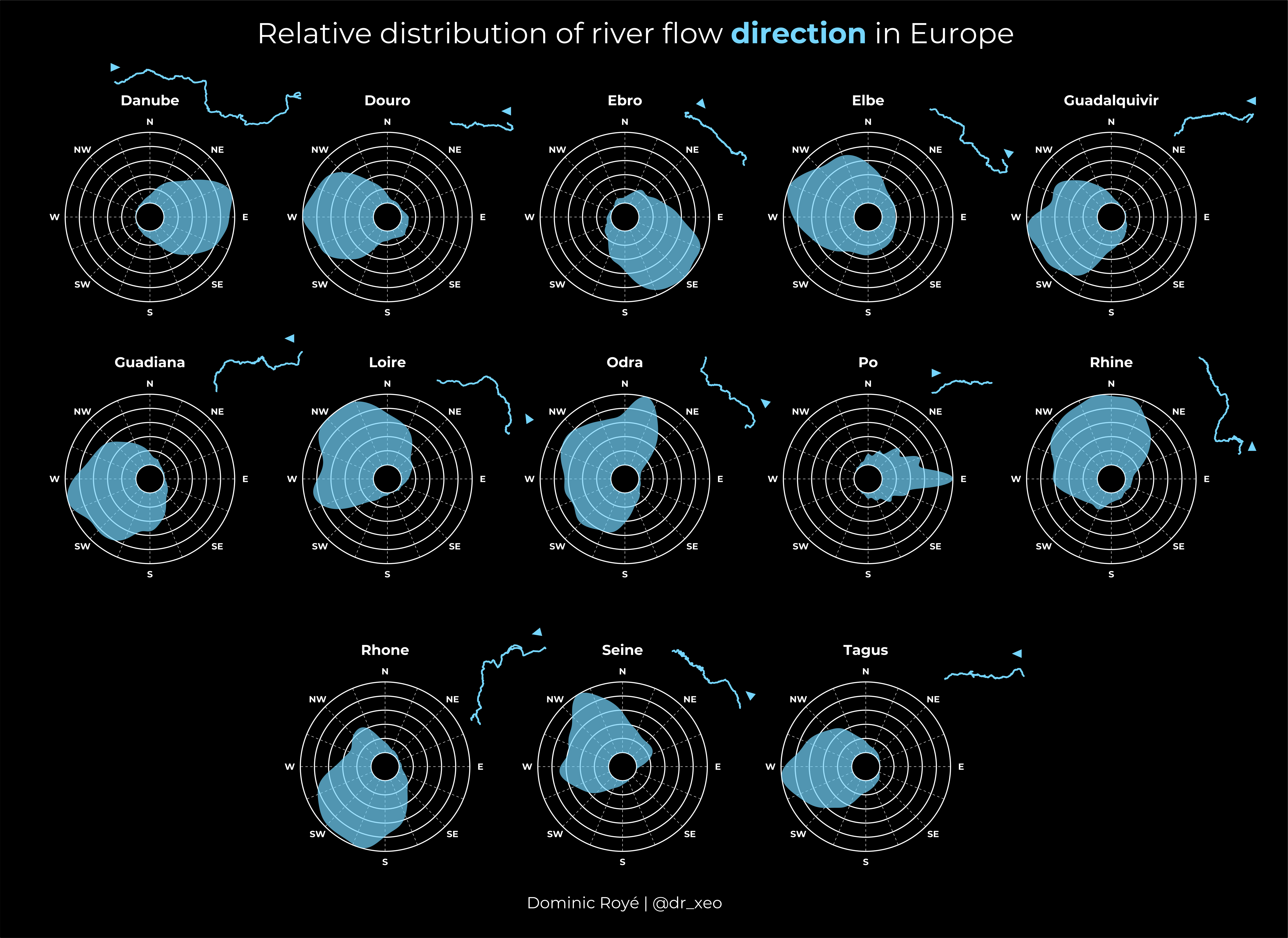
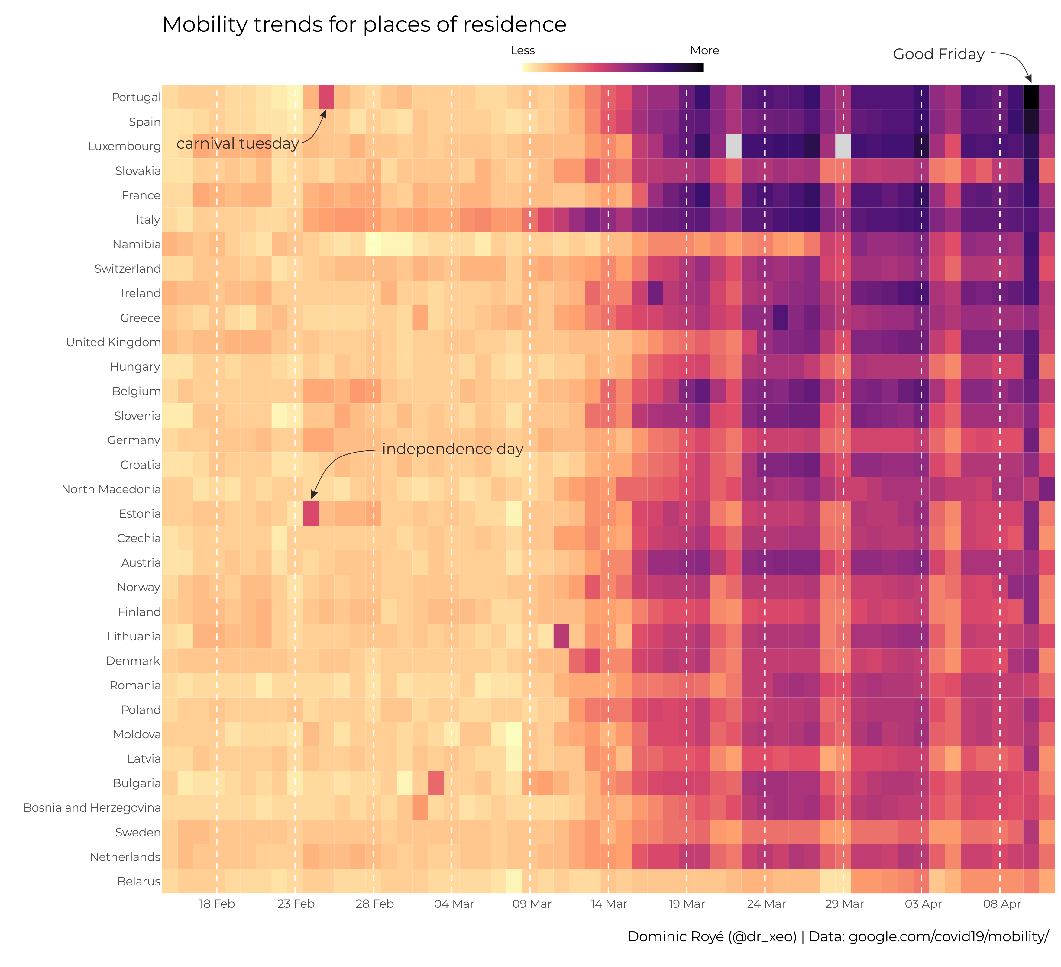
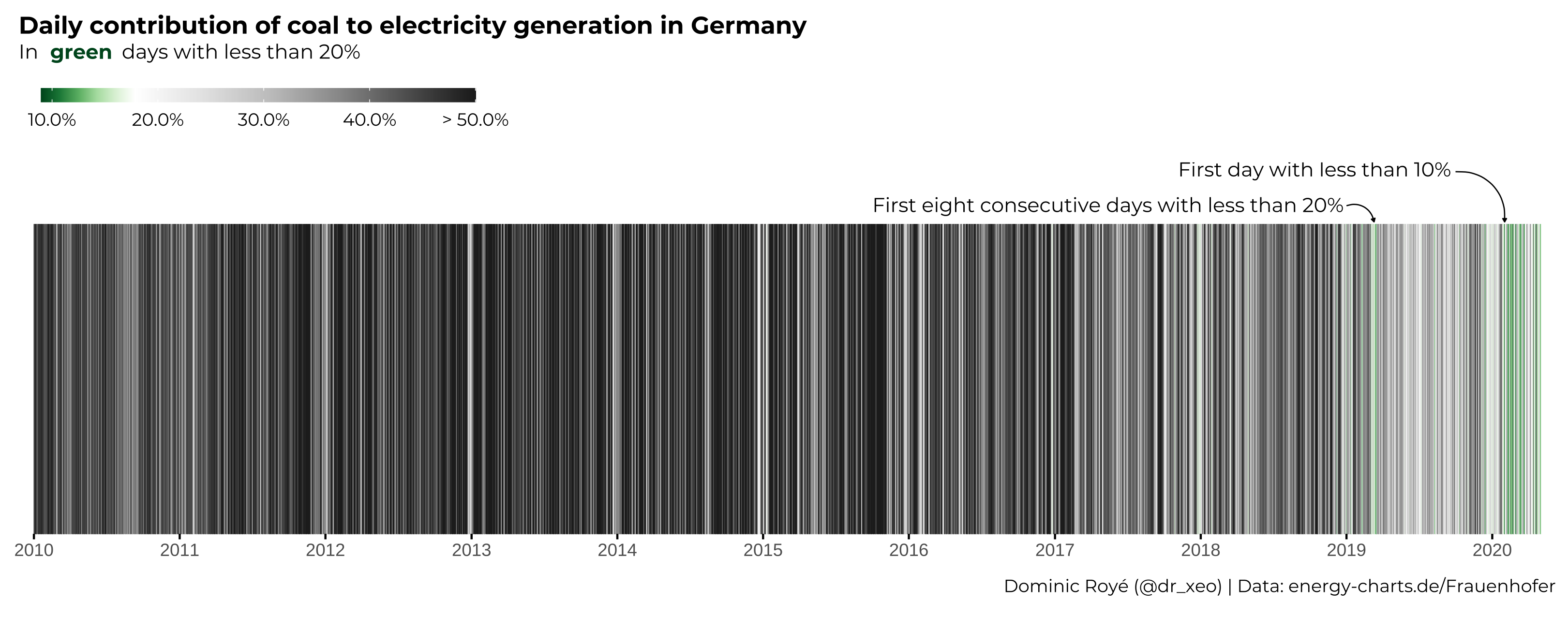
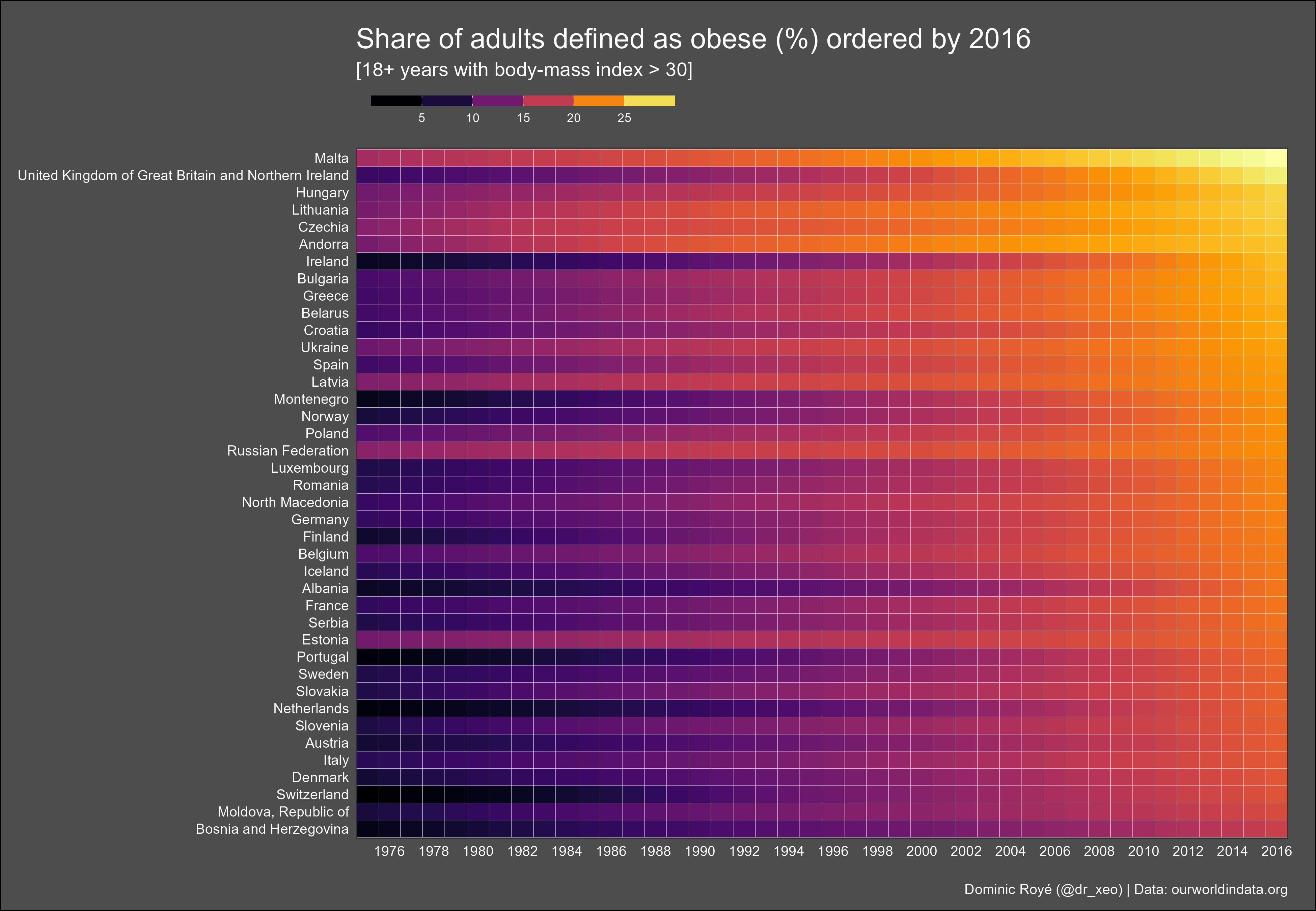
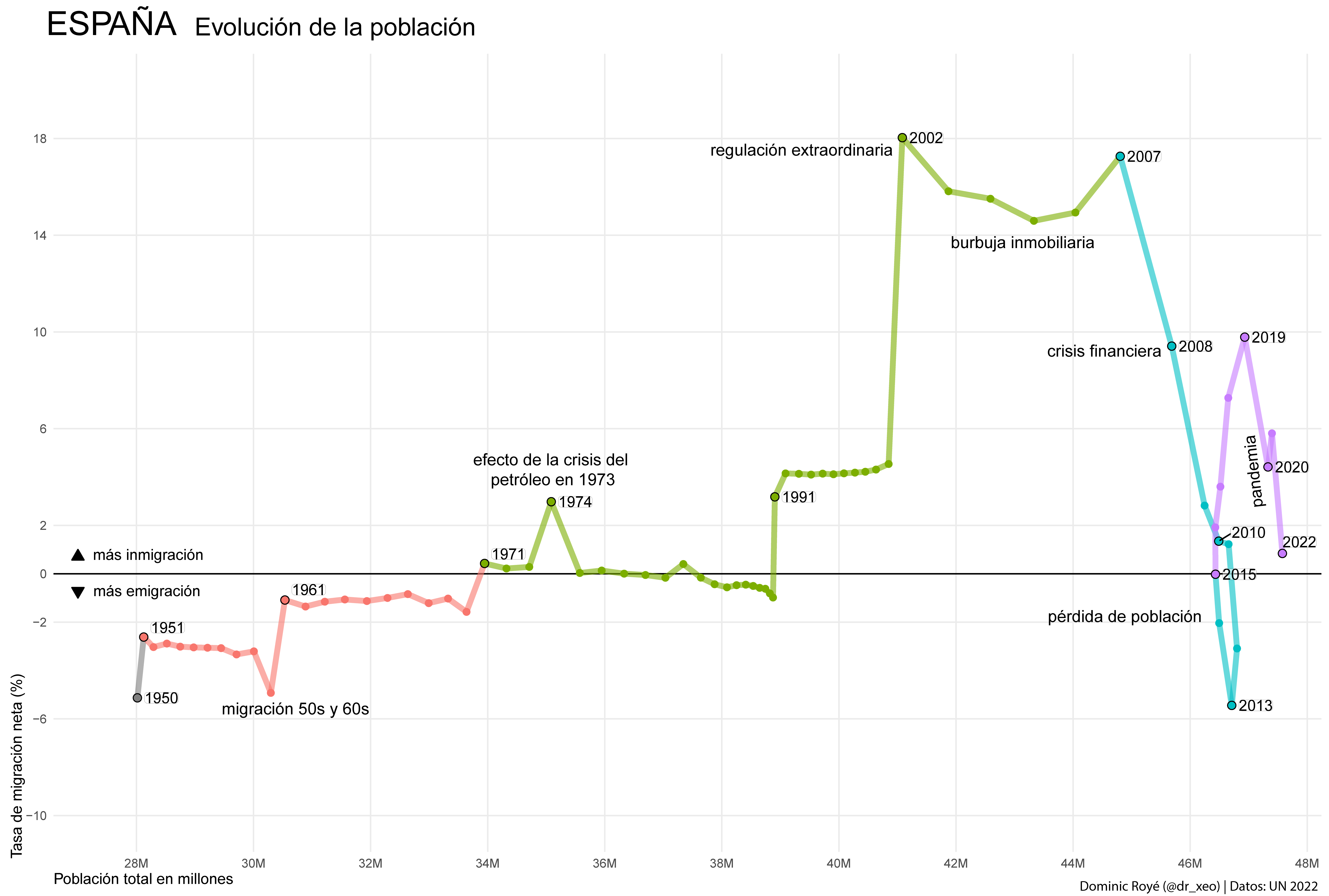
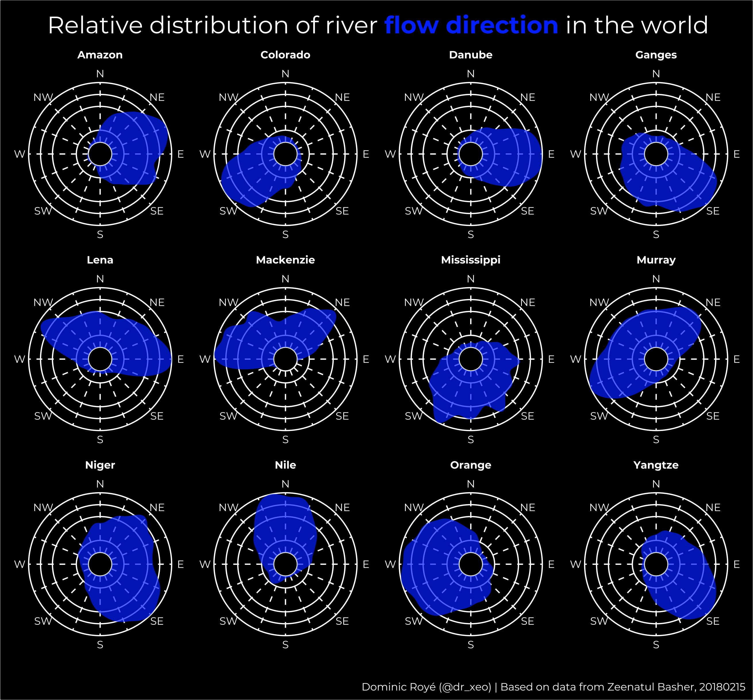
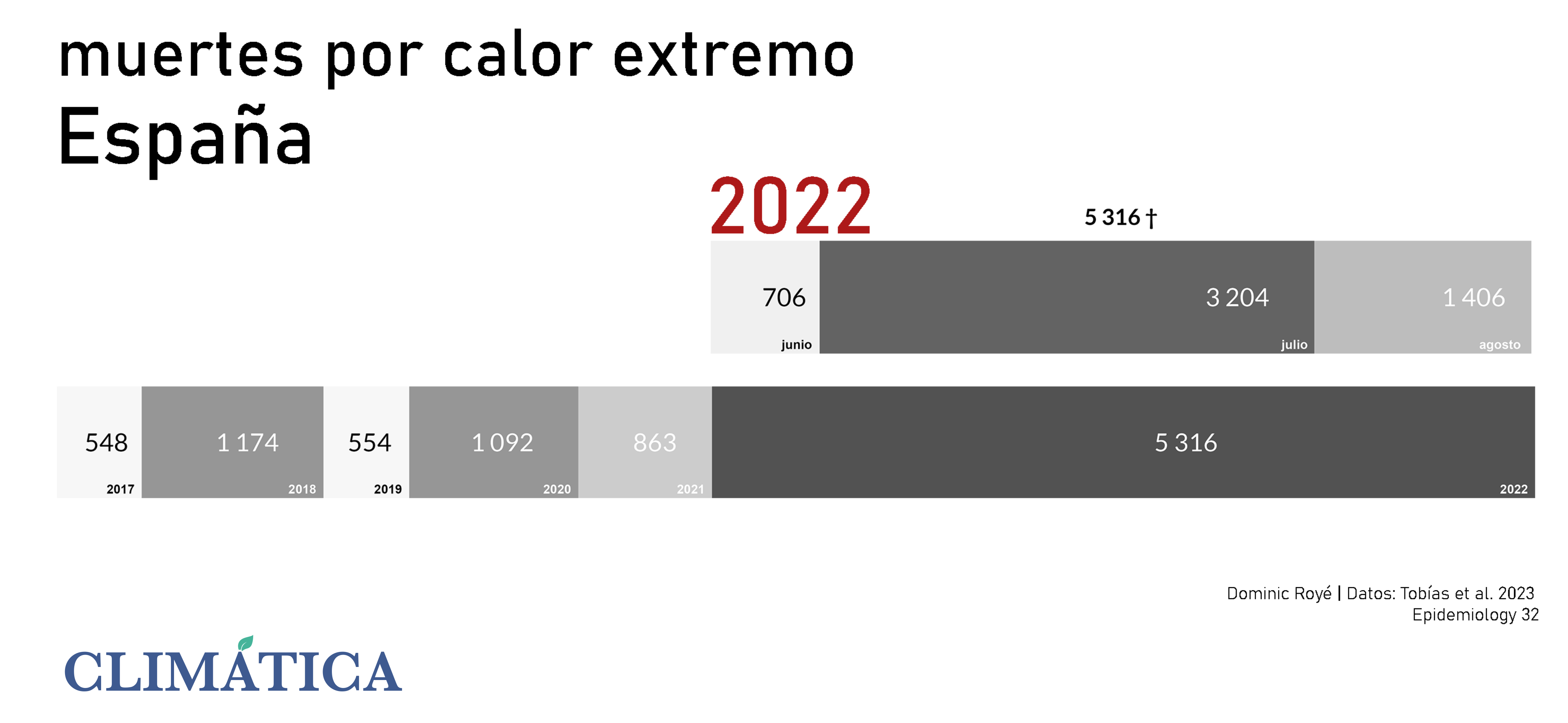
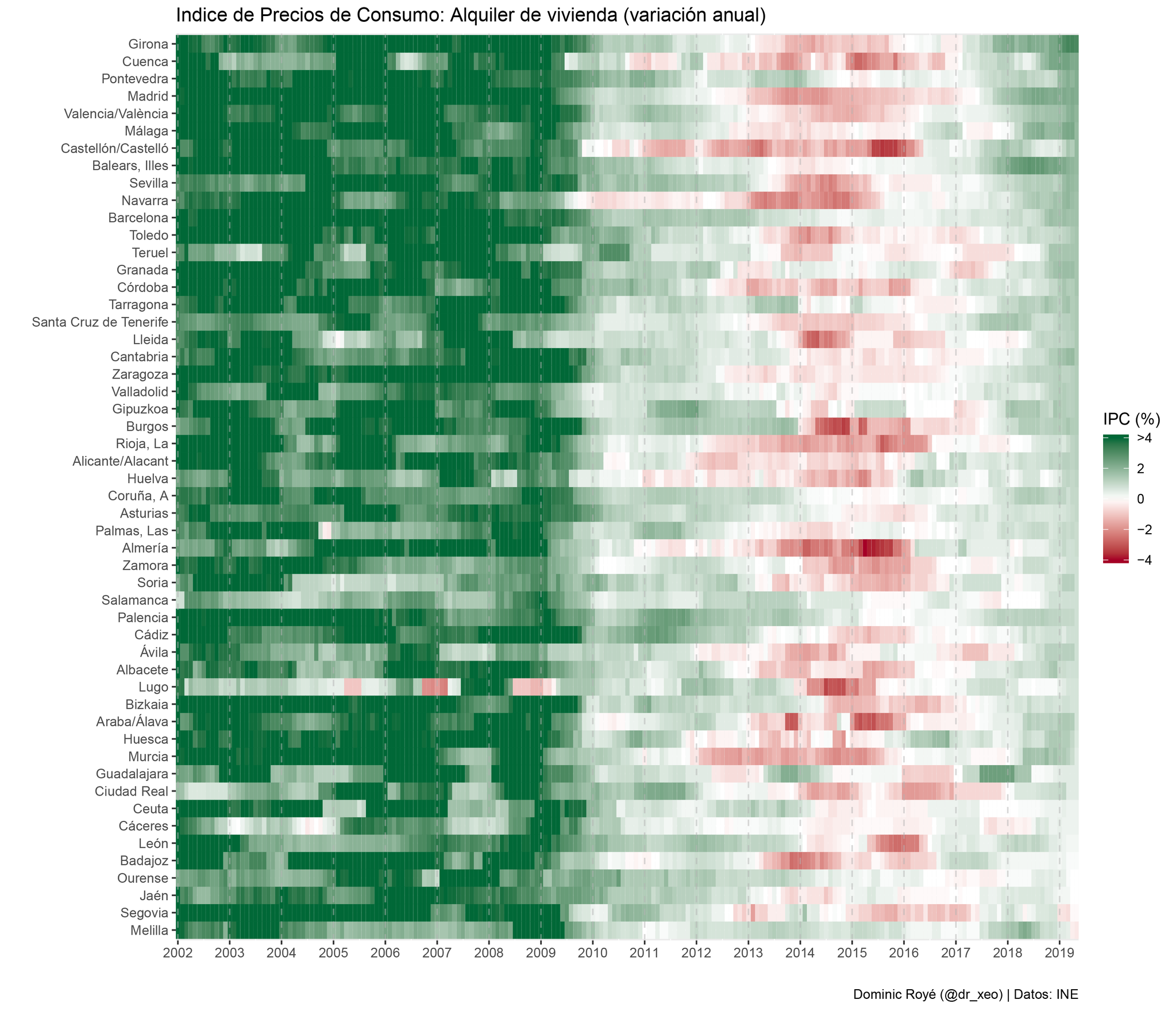
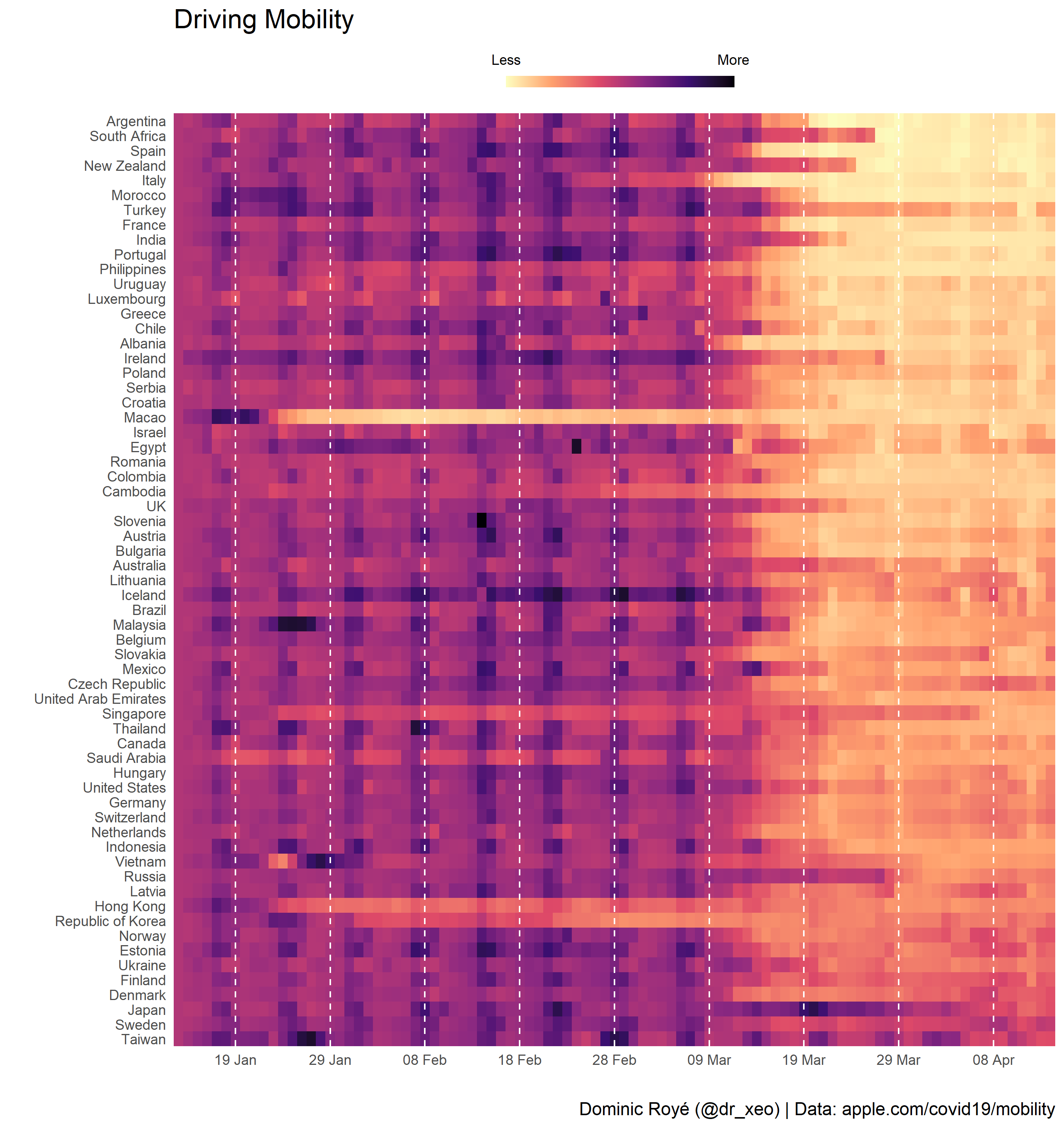
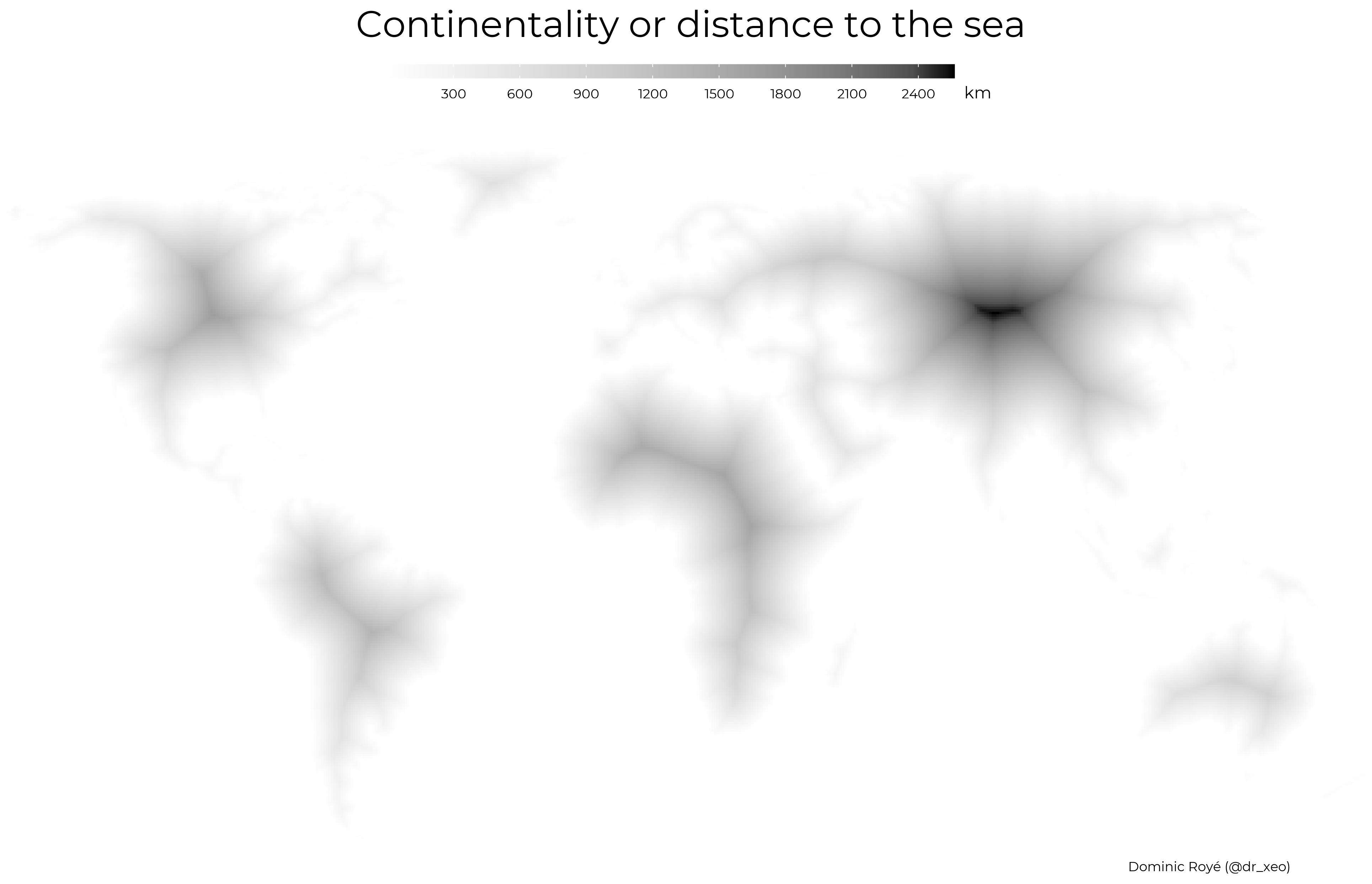
CLIMATE
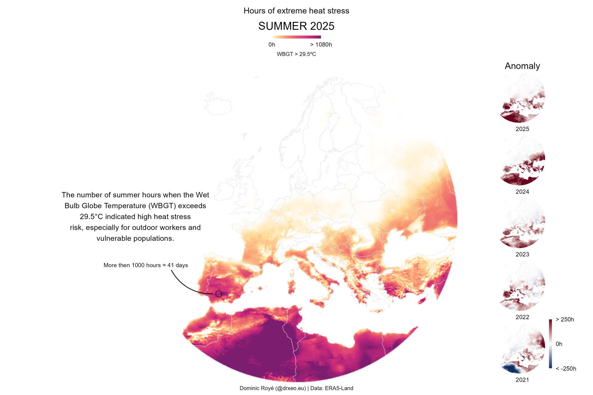
.png)
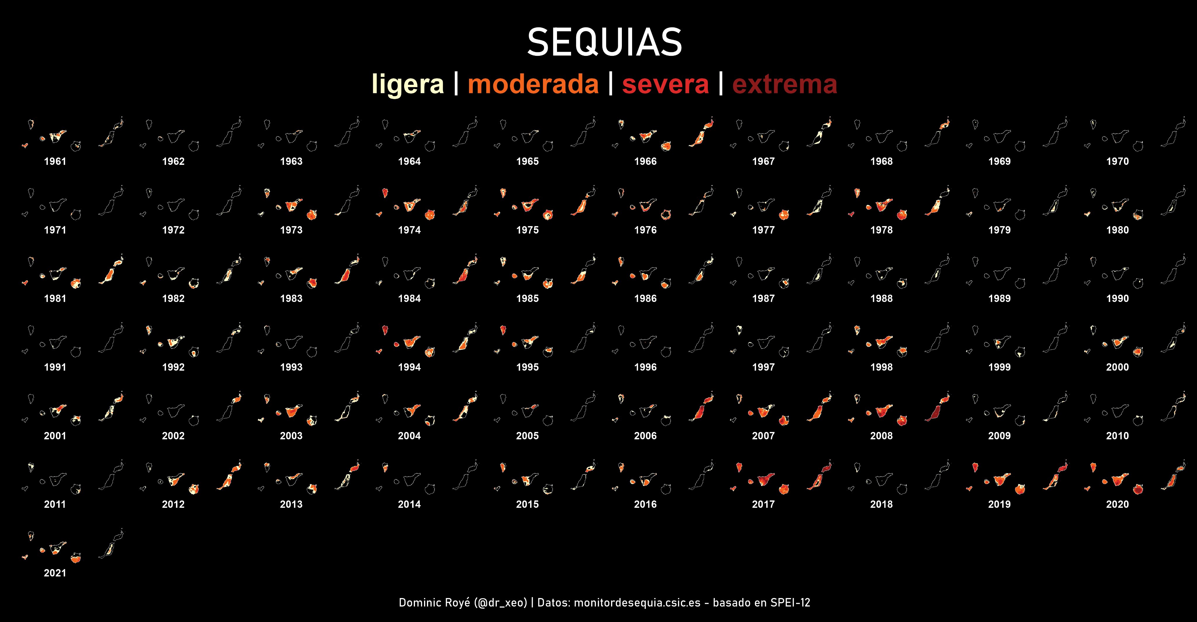
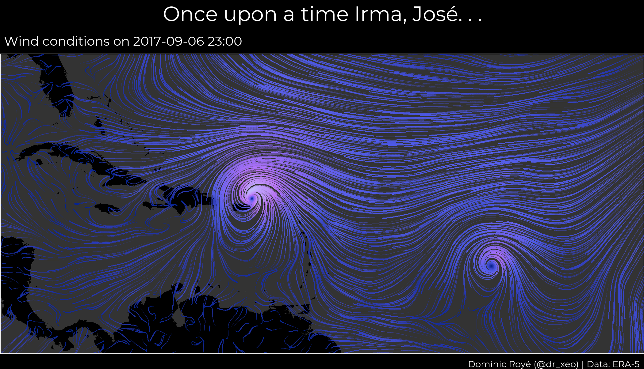
.gif)
.gif)
No matching items
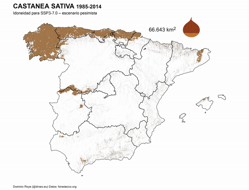
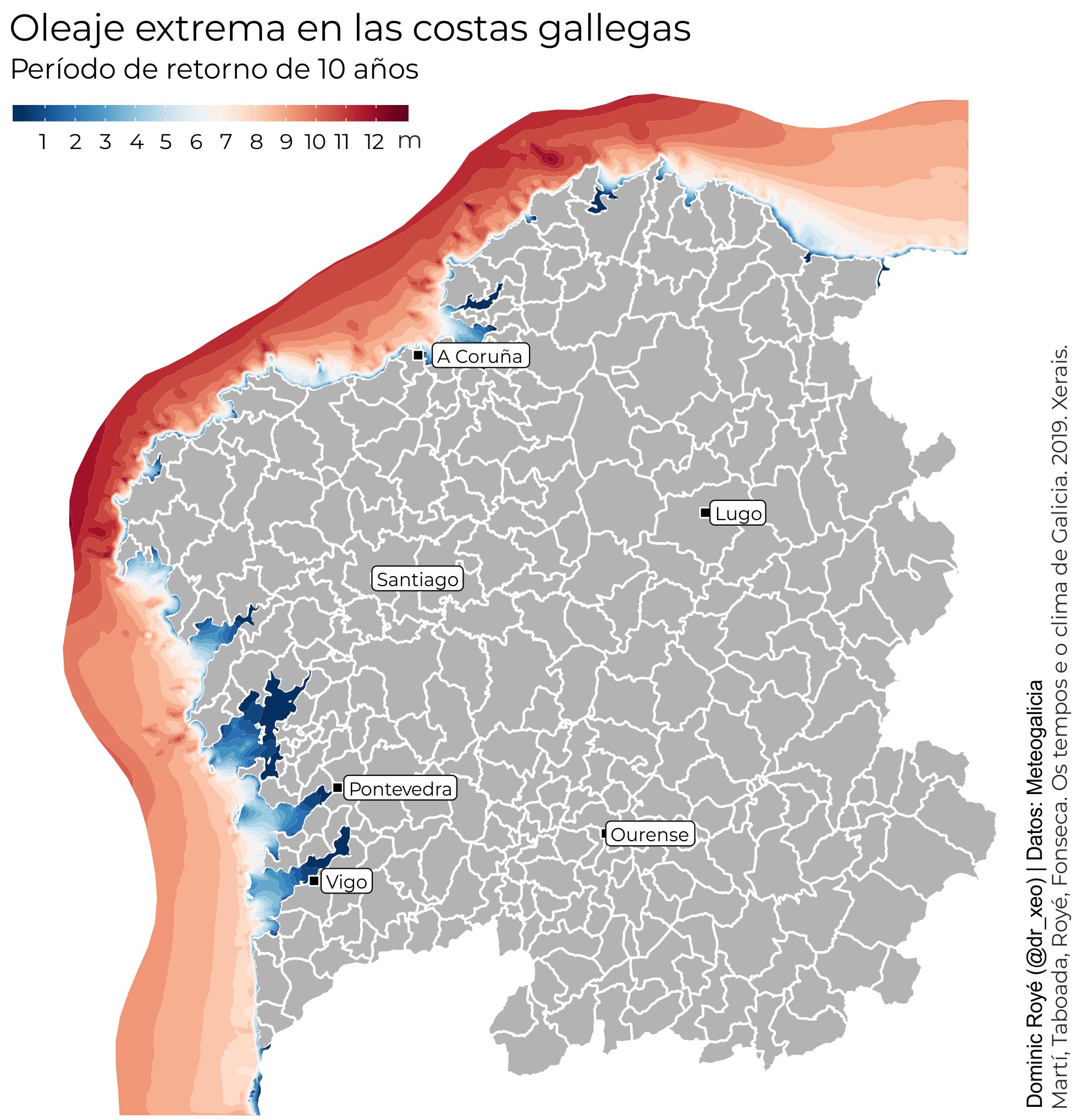
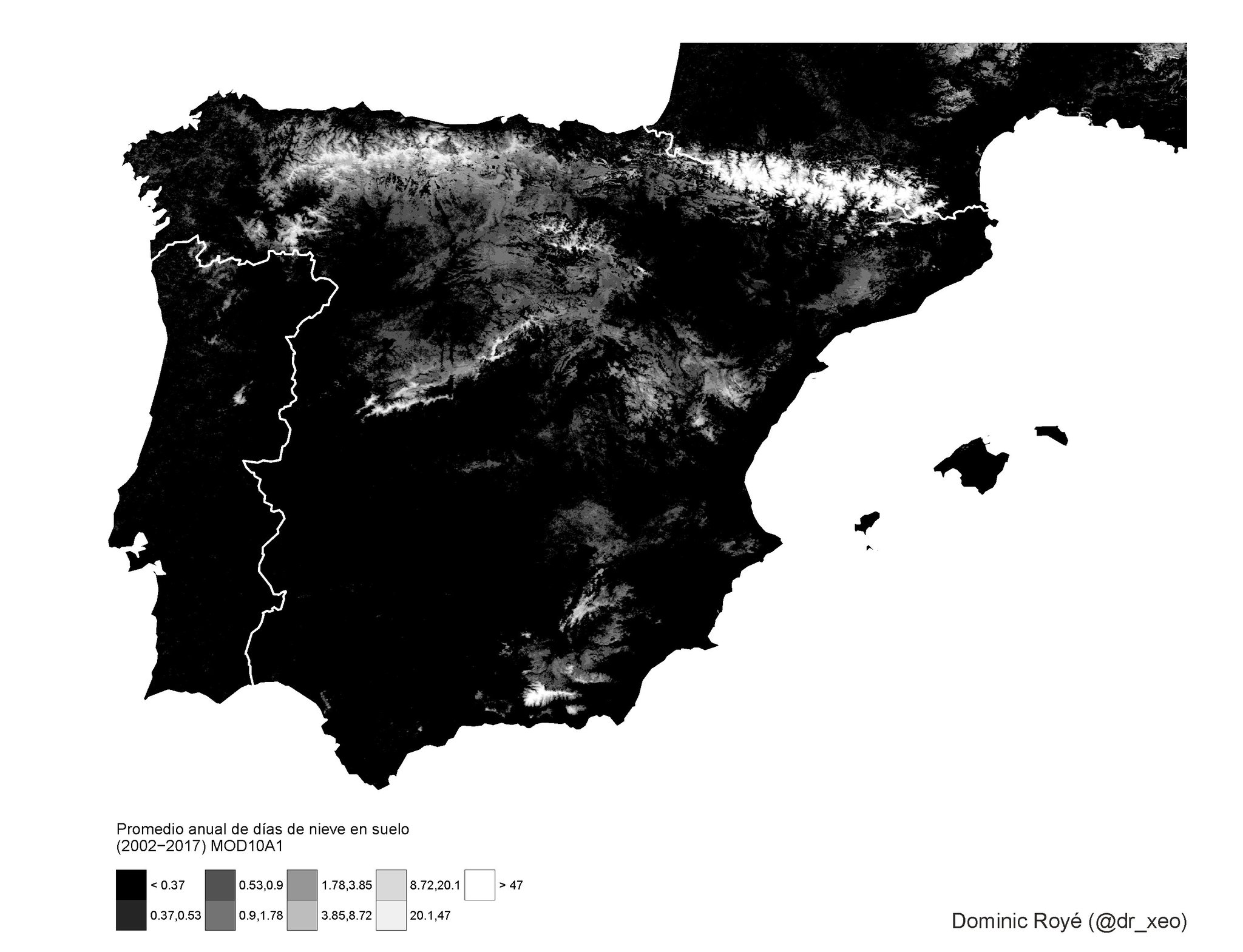
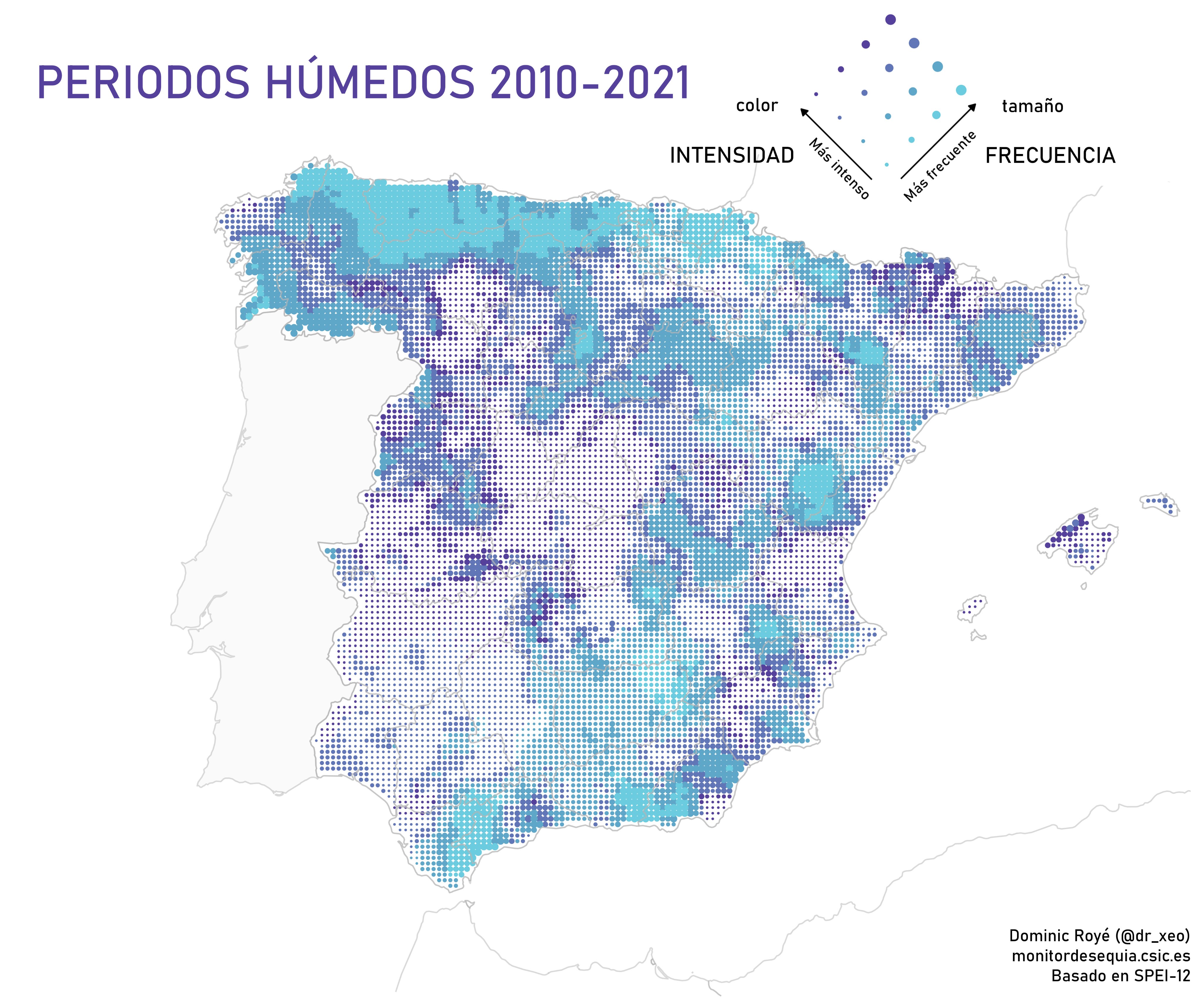
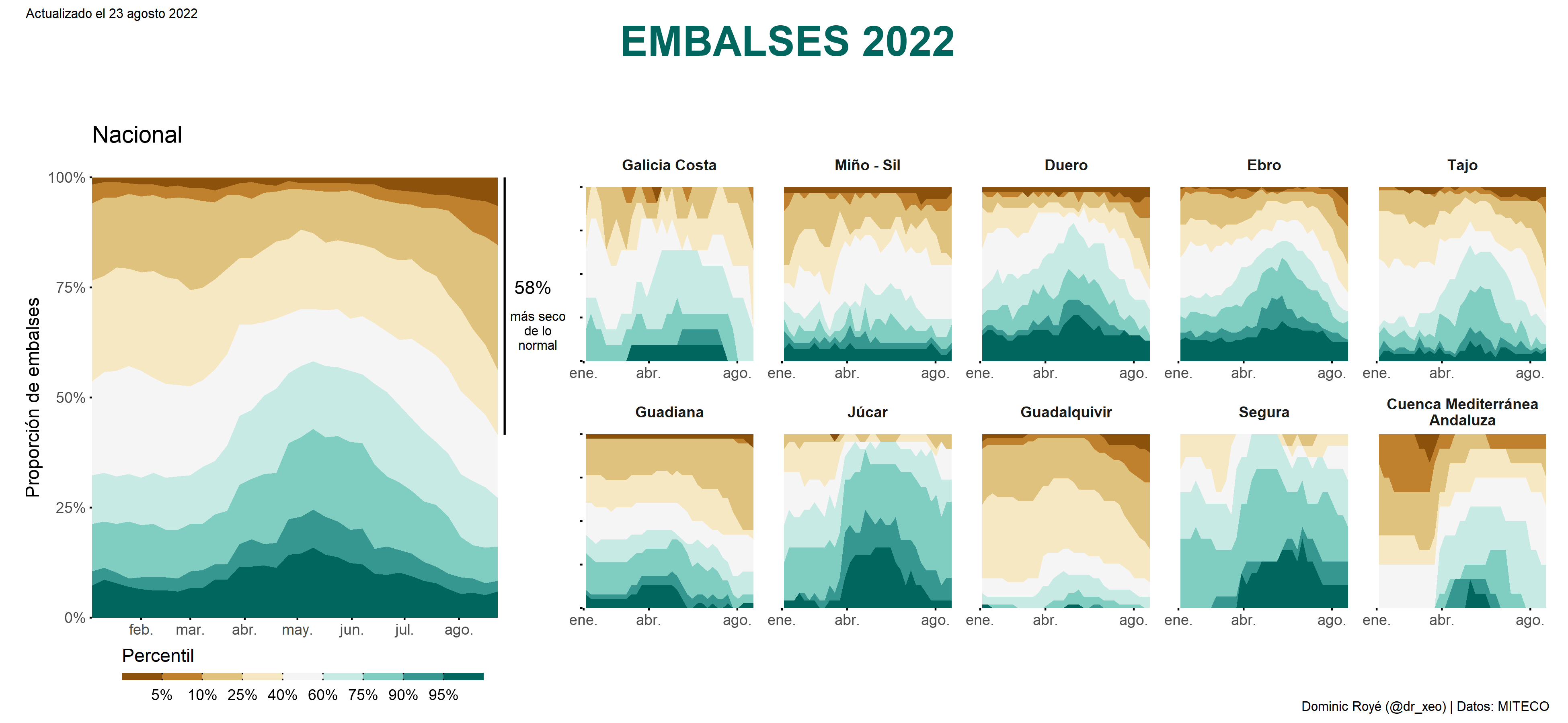
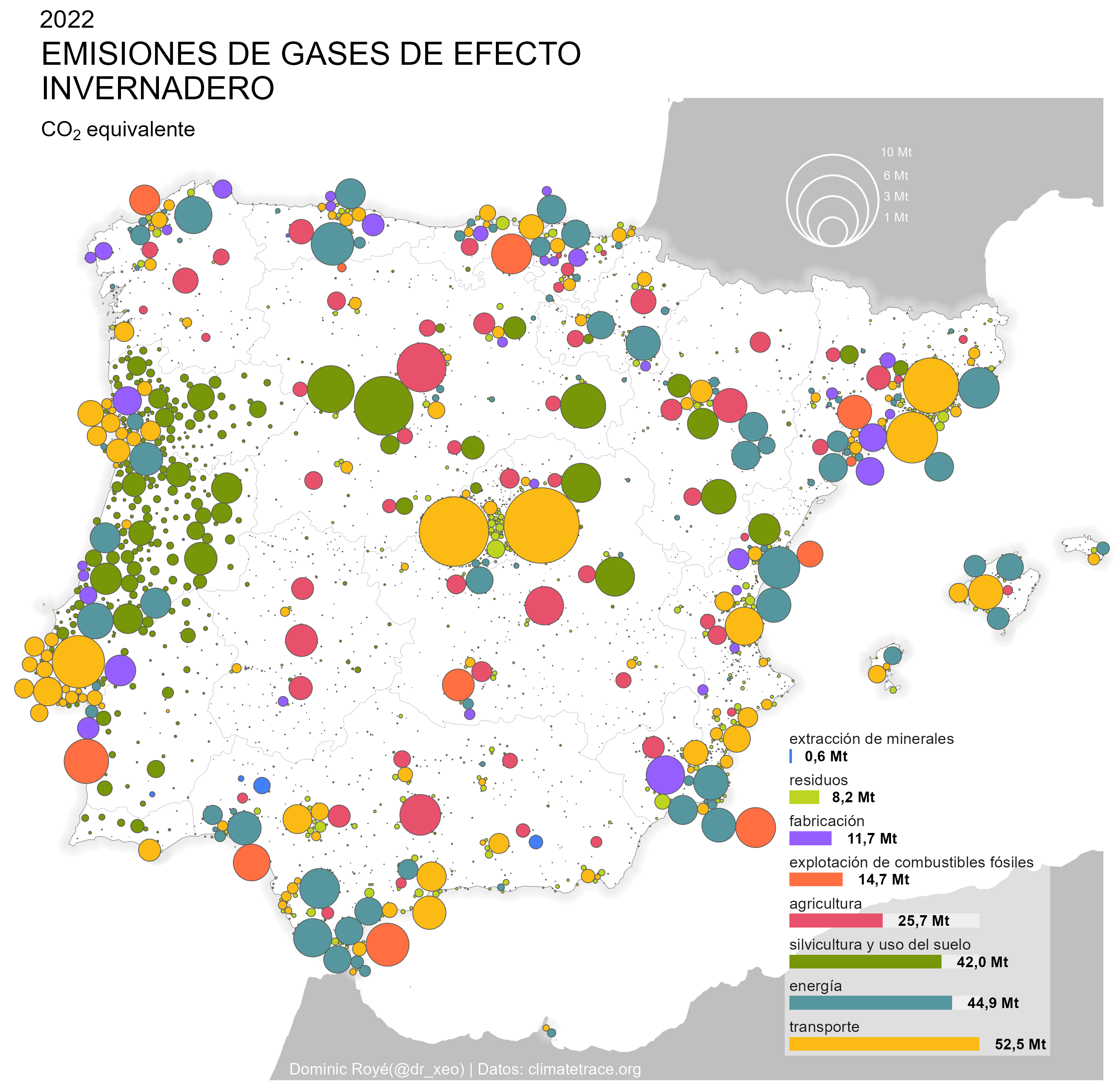
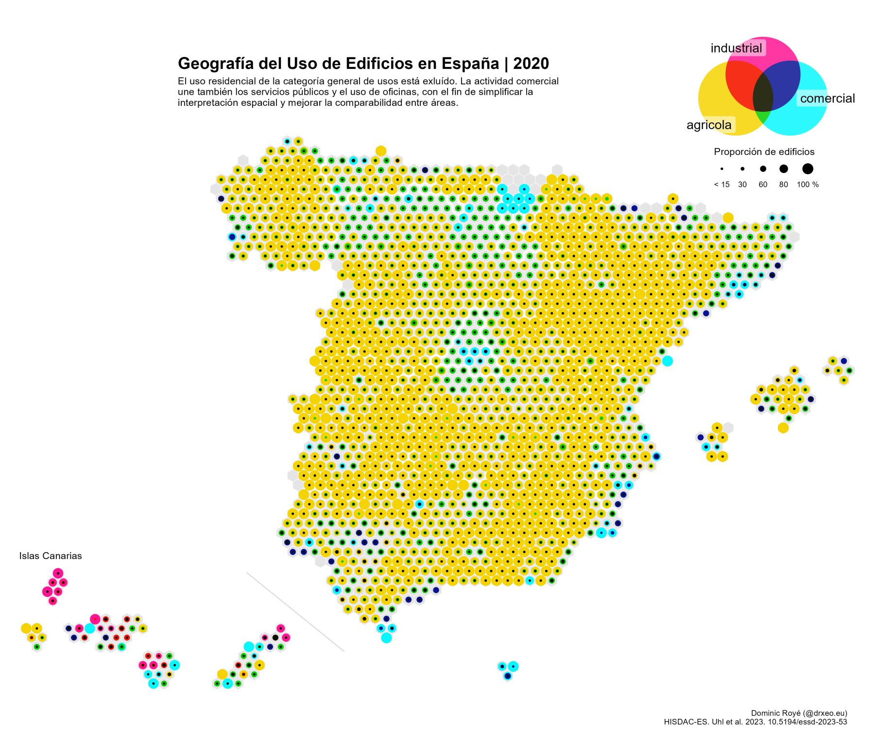
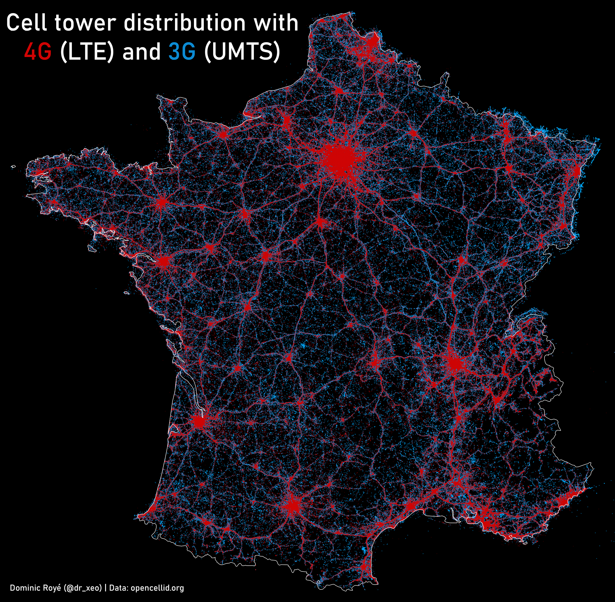
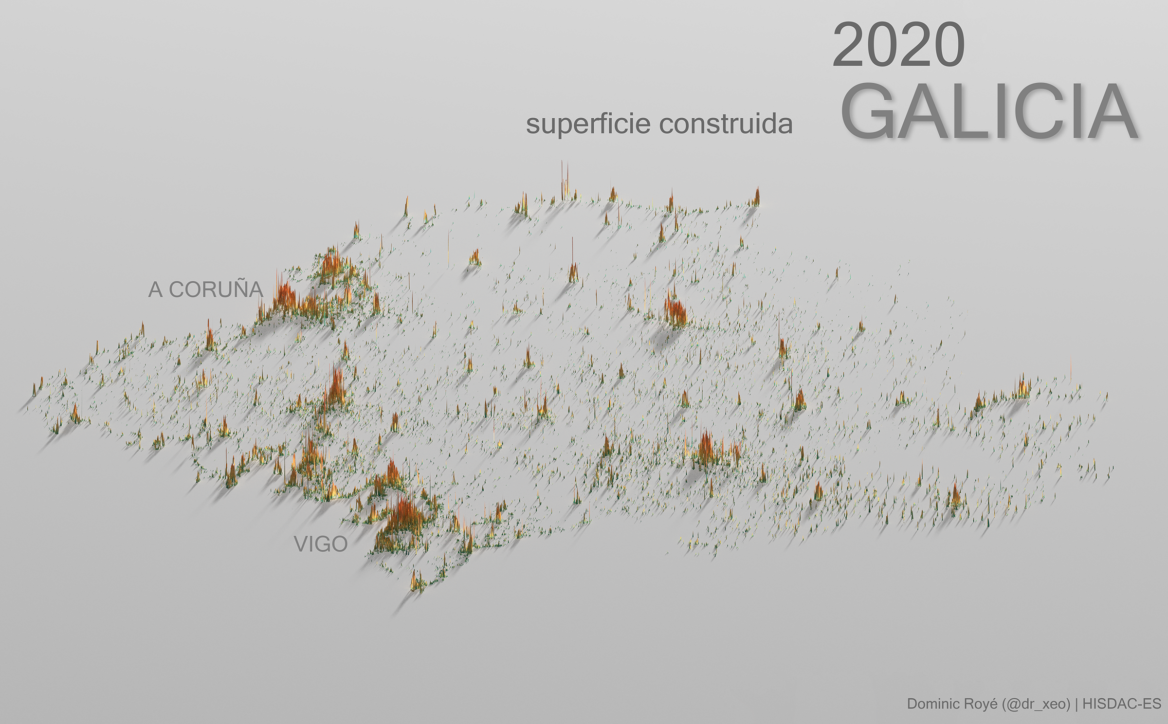
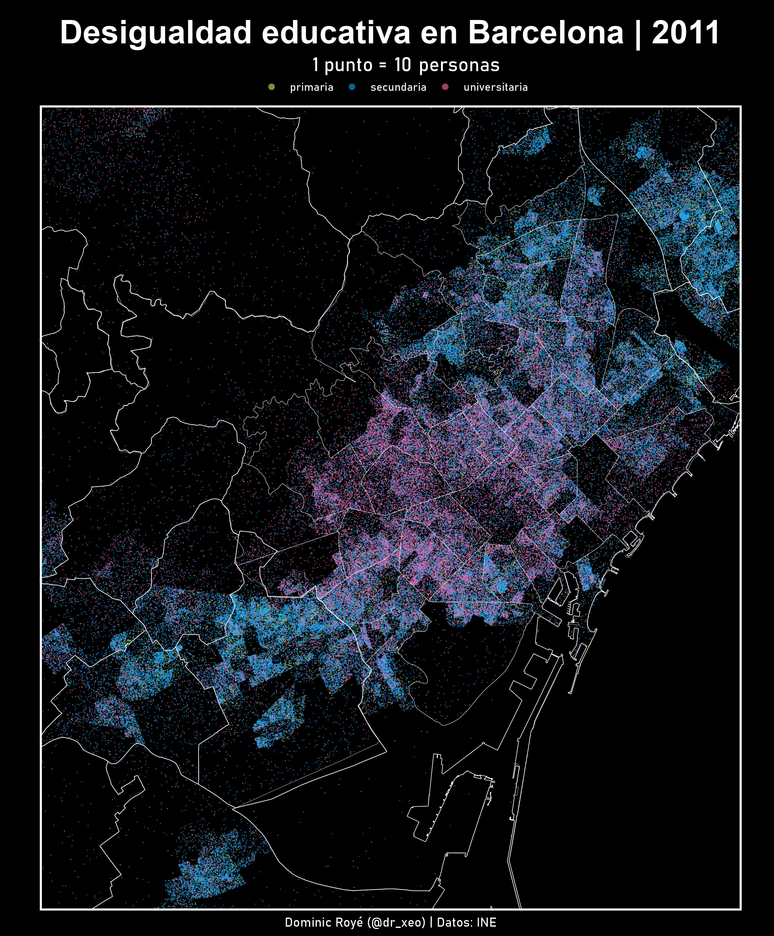
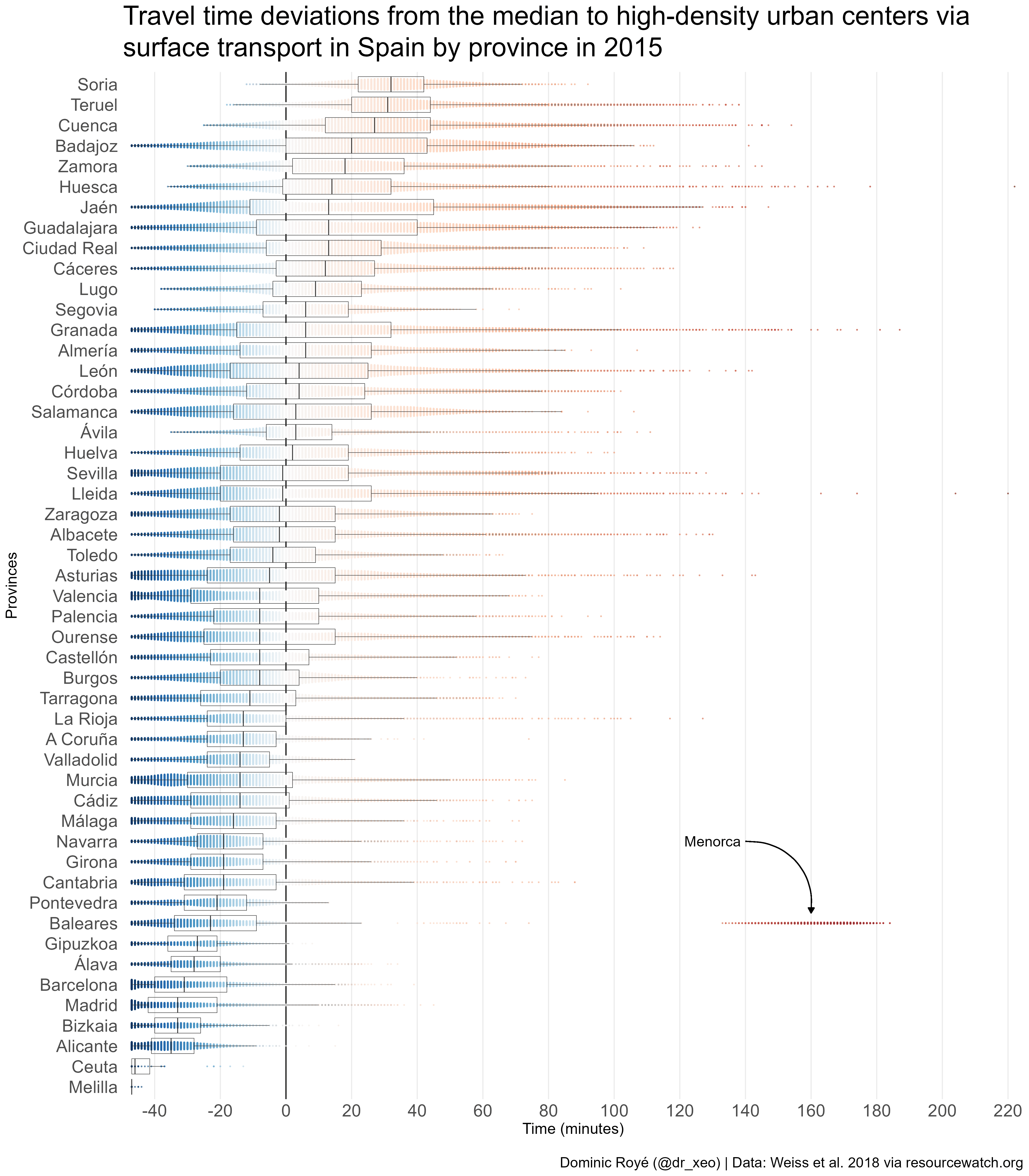
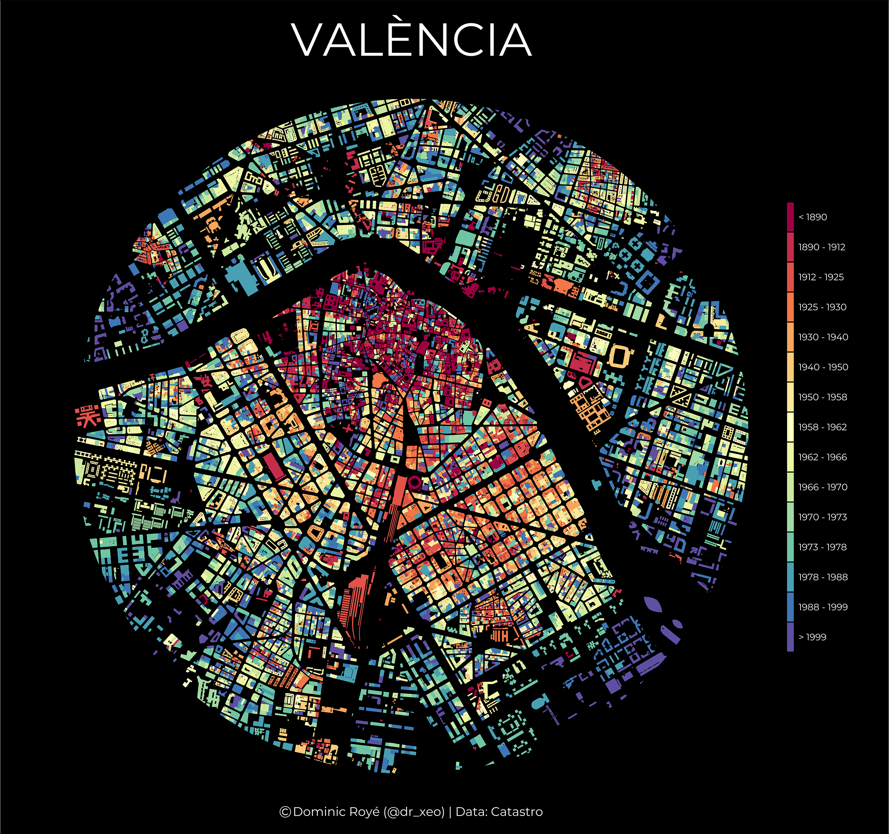
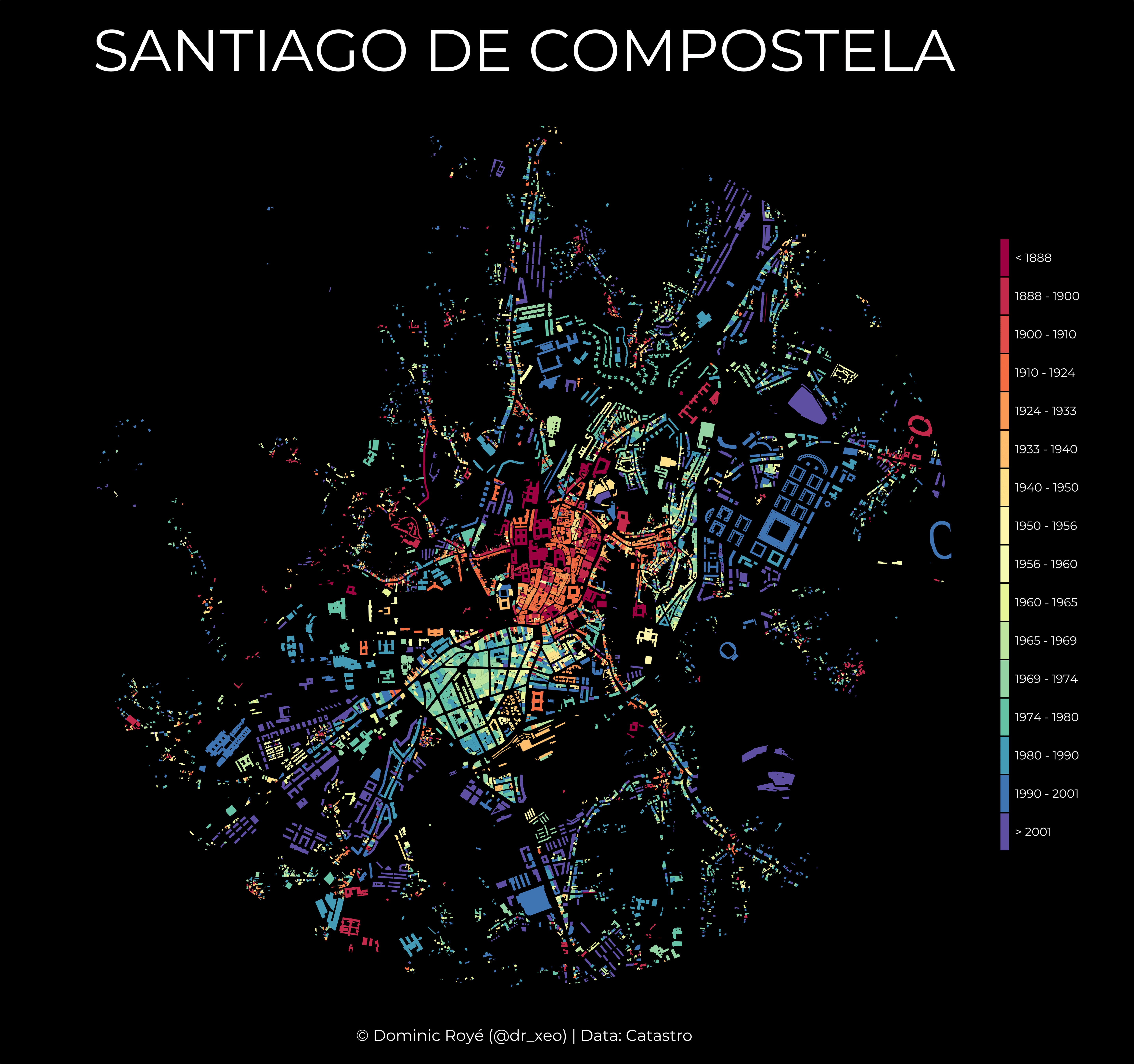
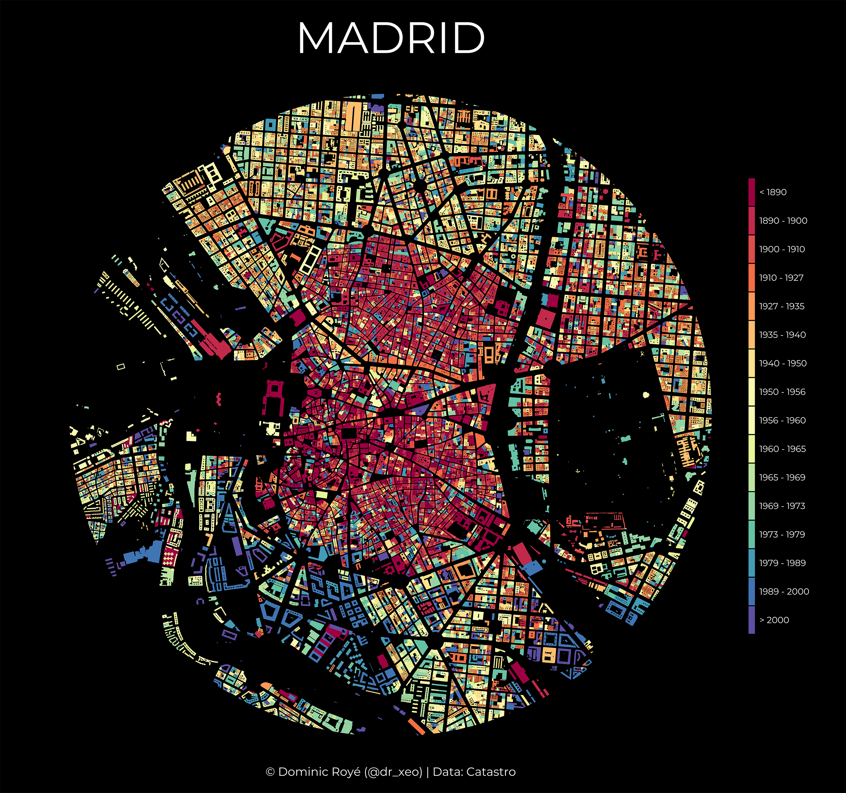
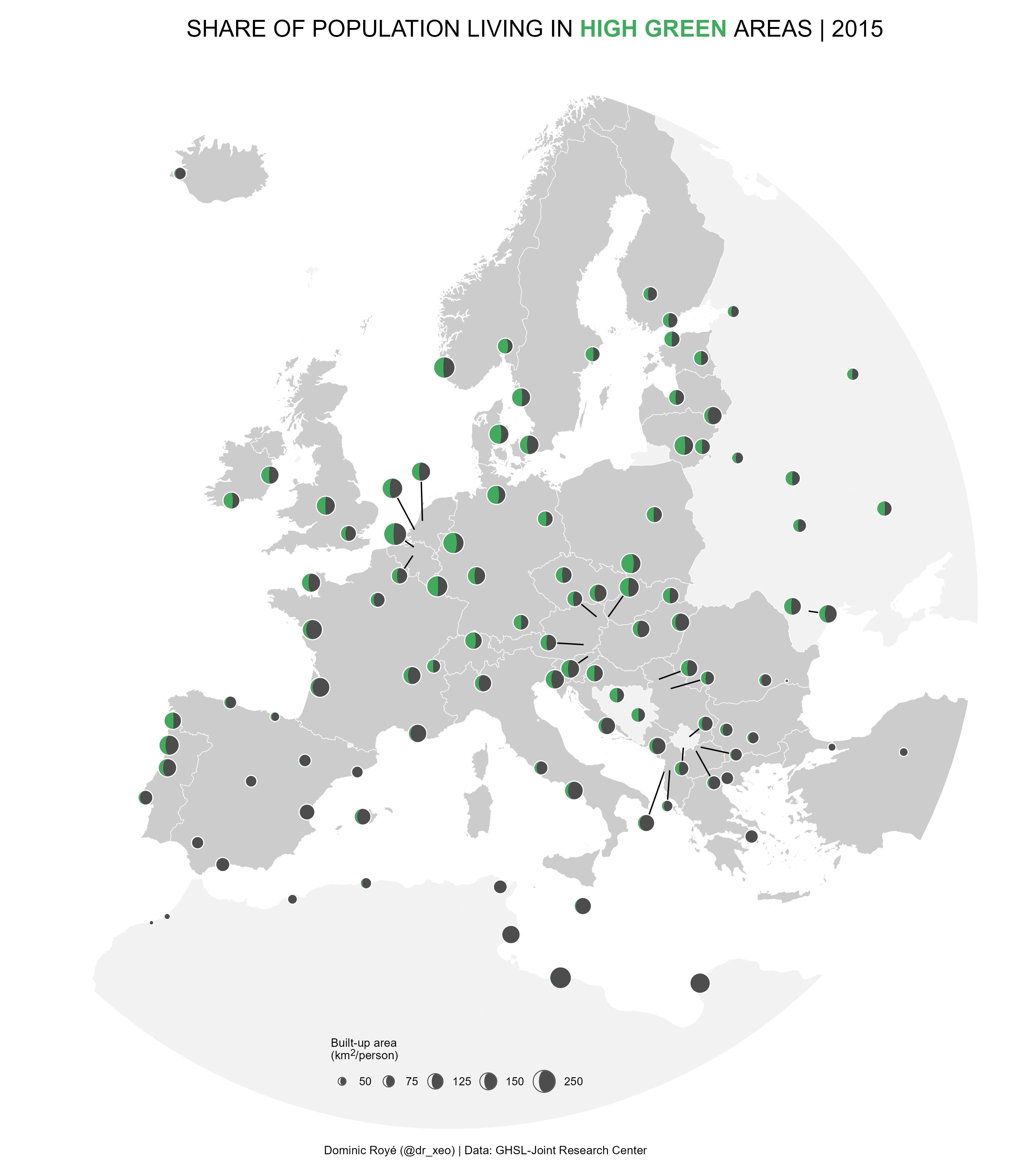
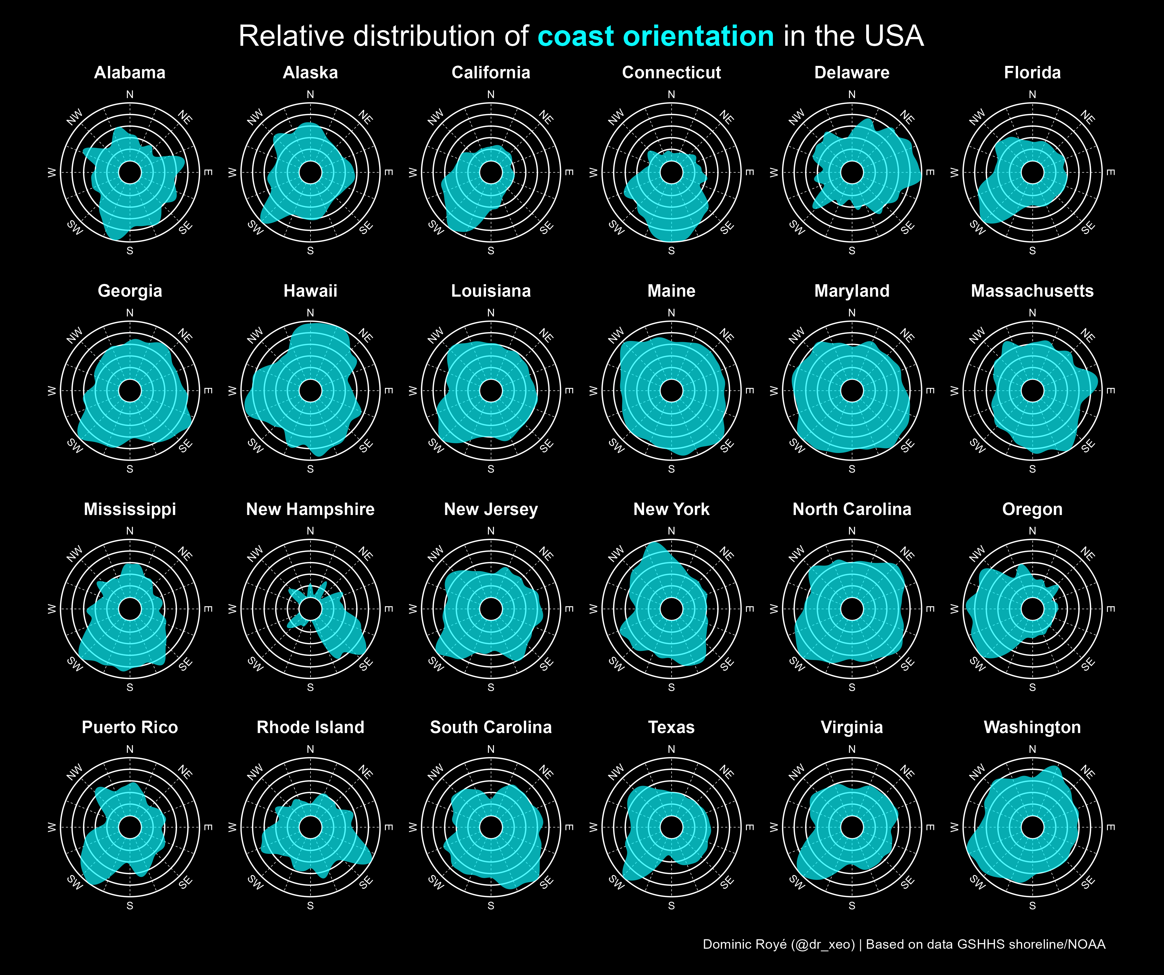
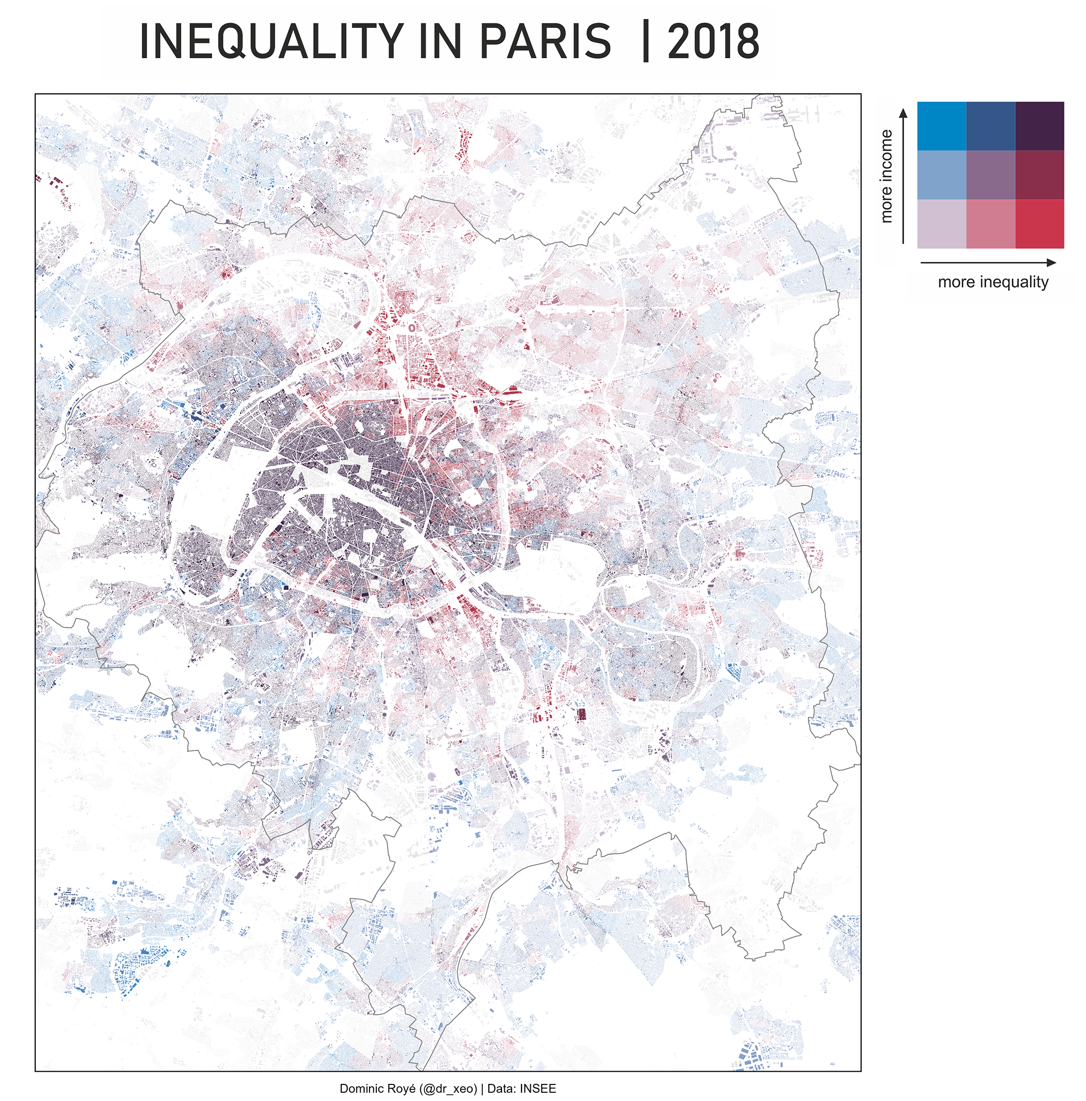
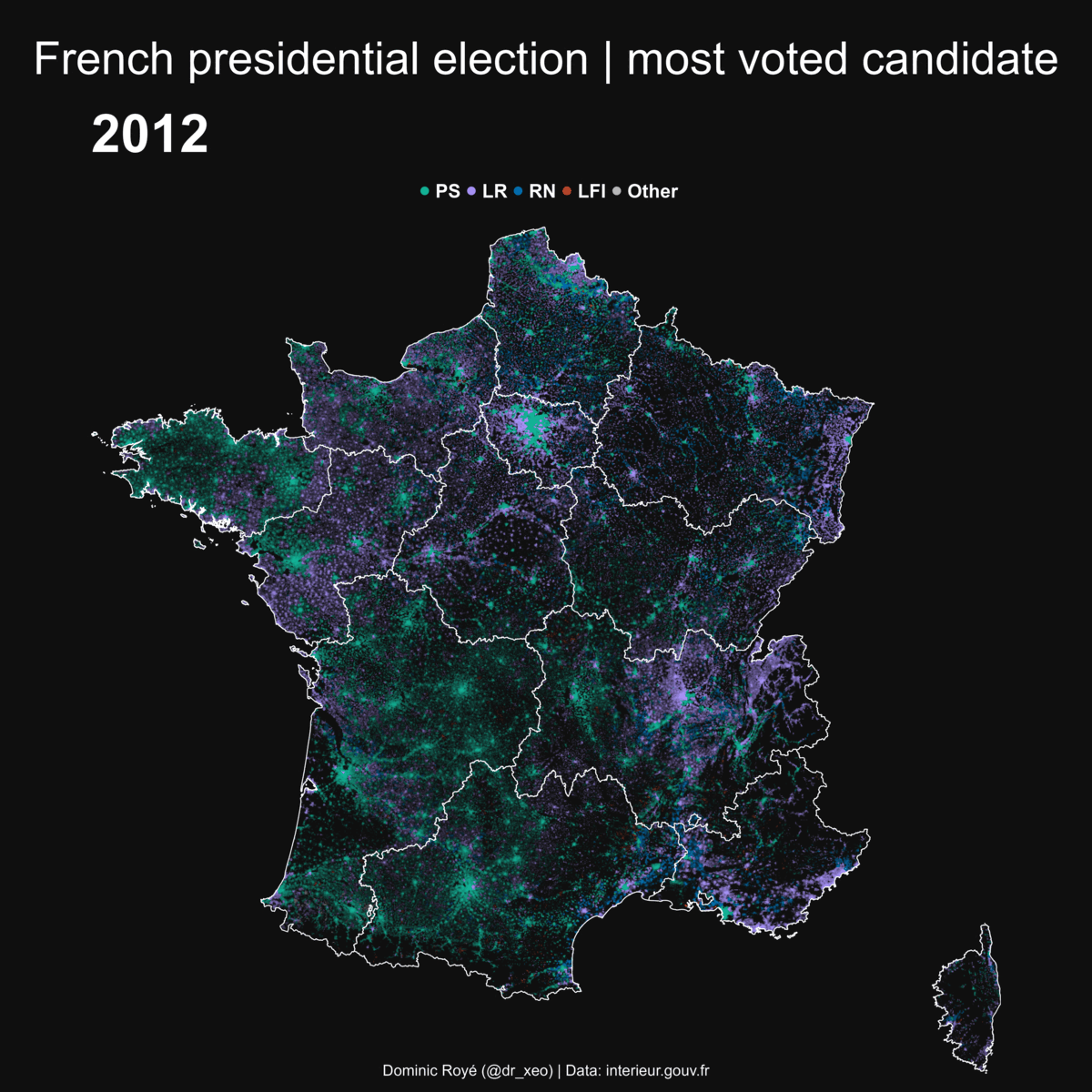
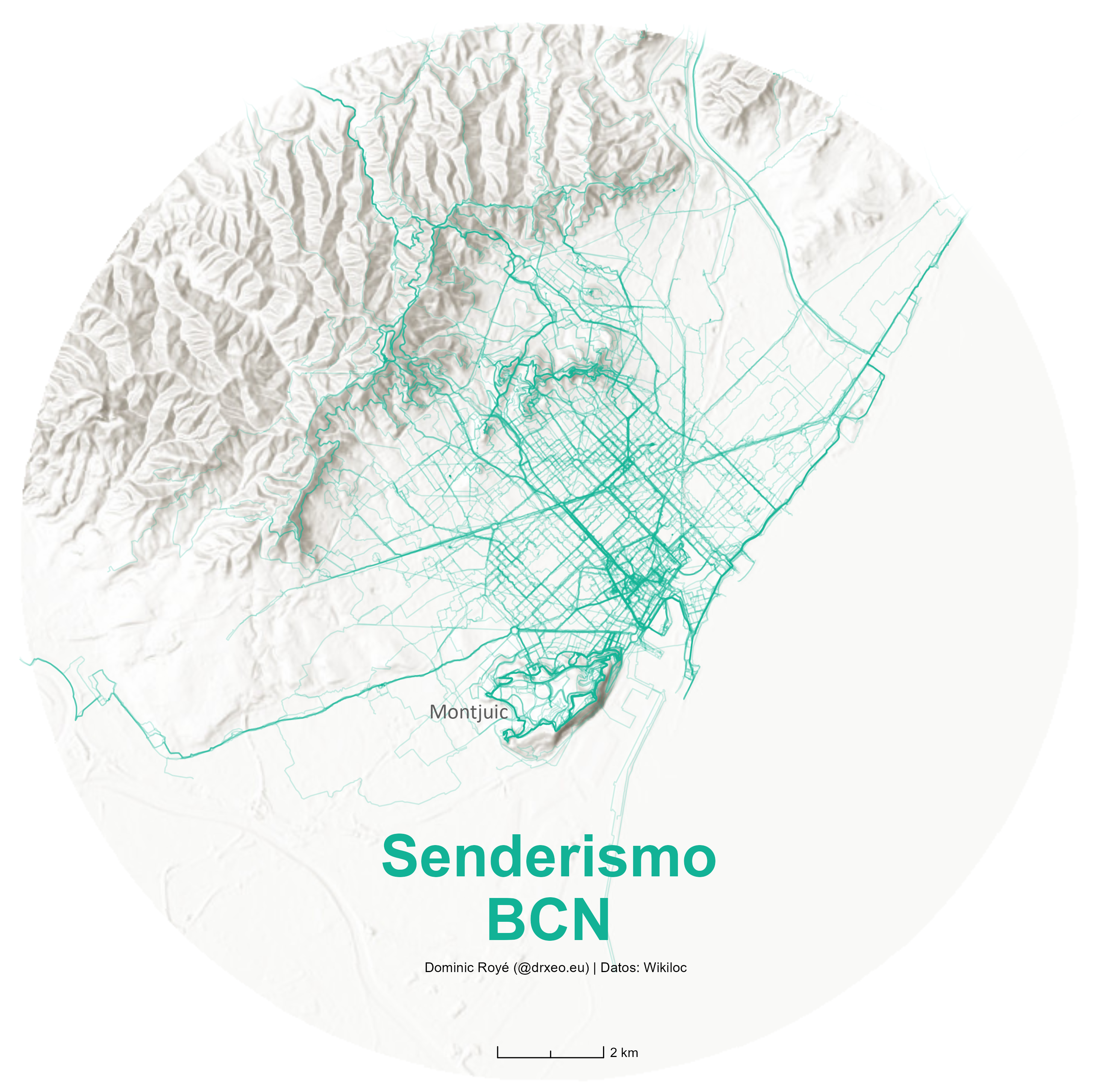
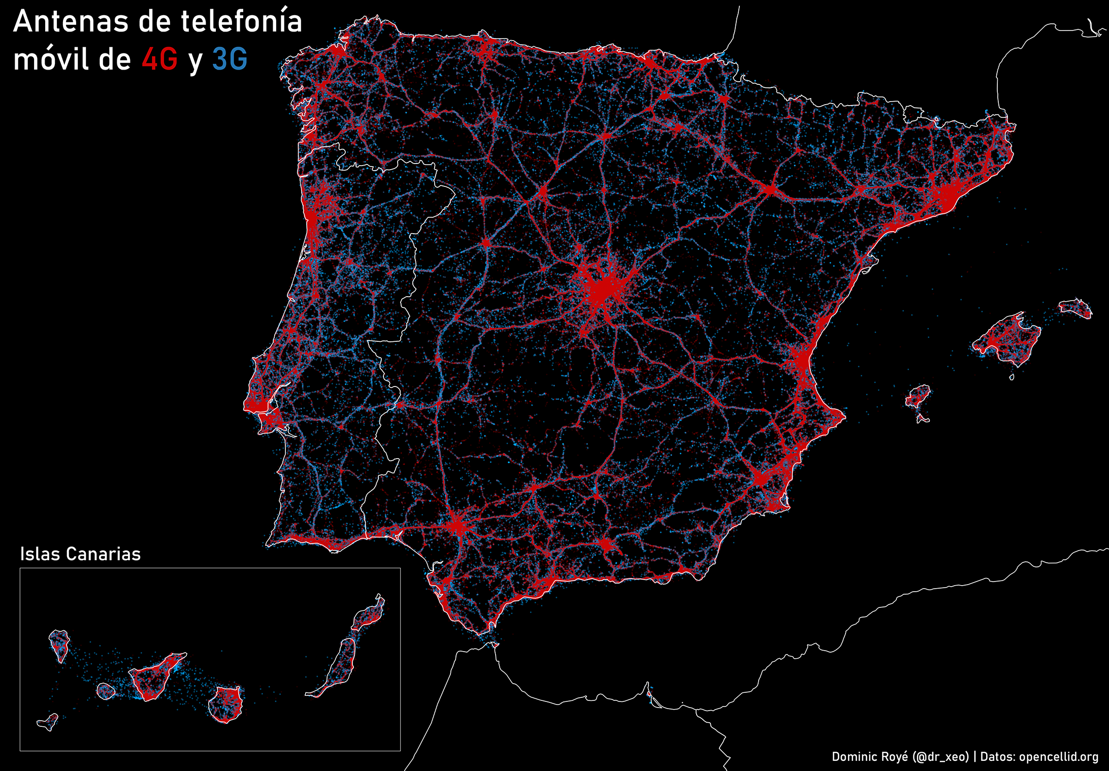
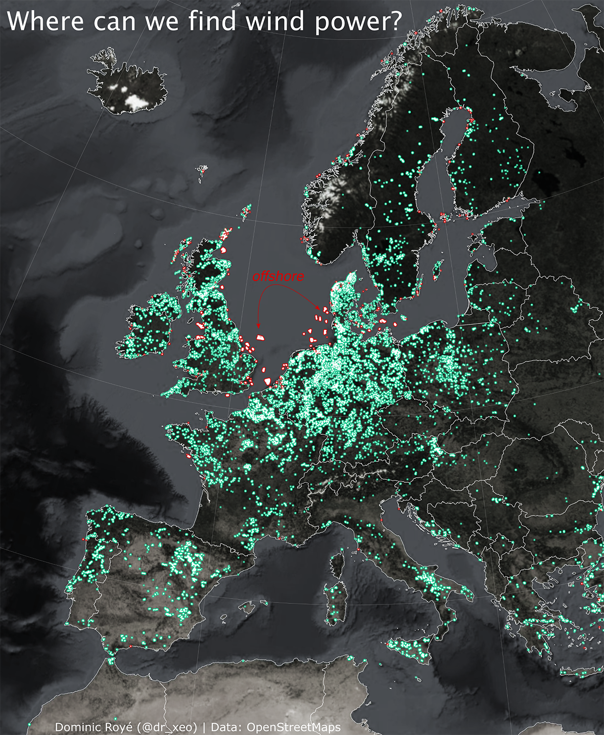
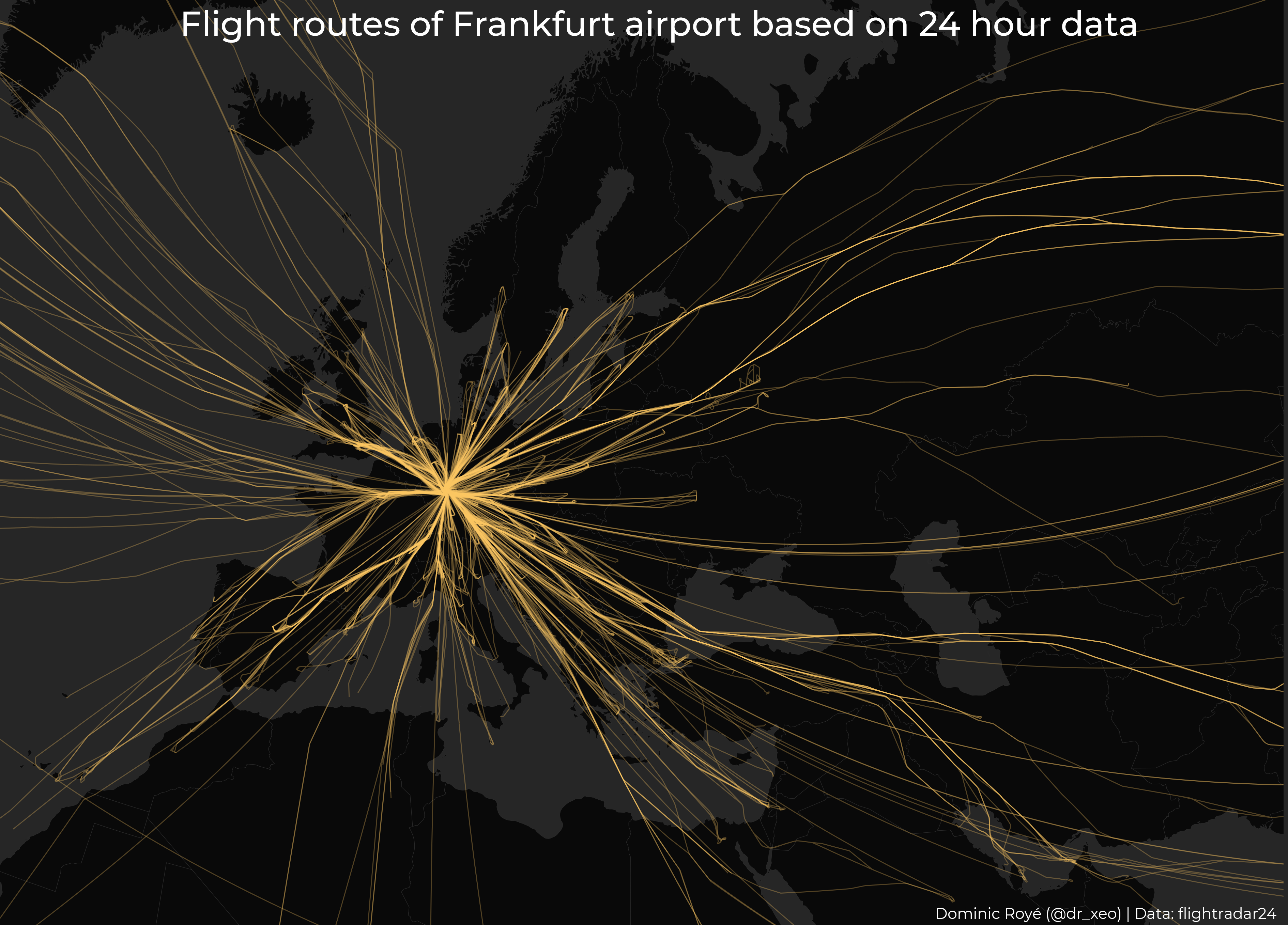
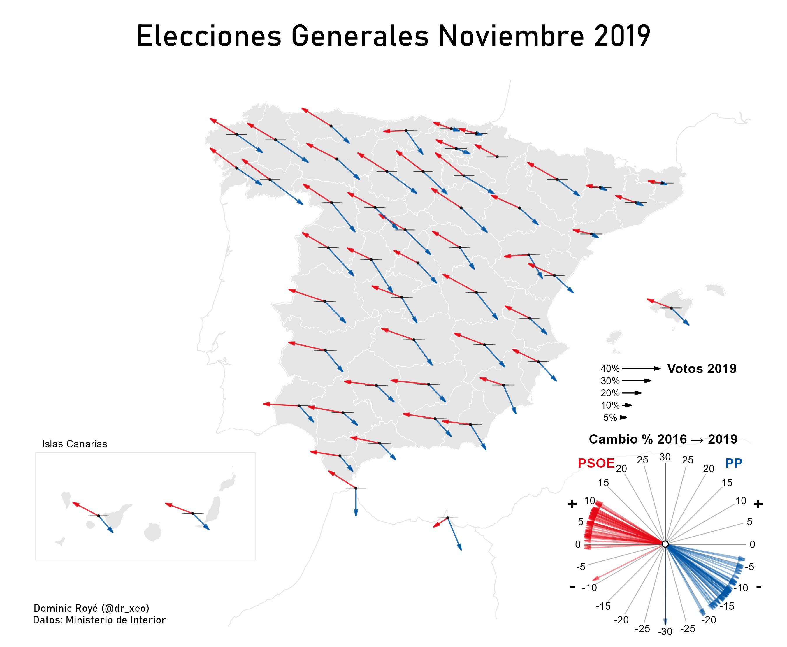
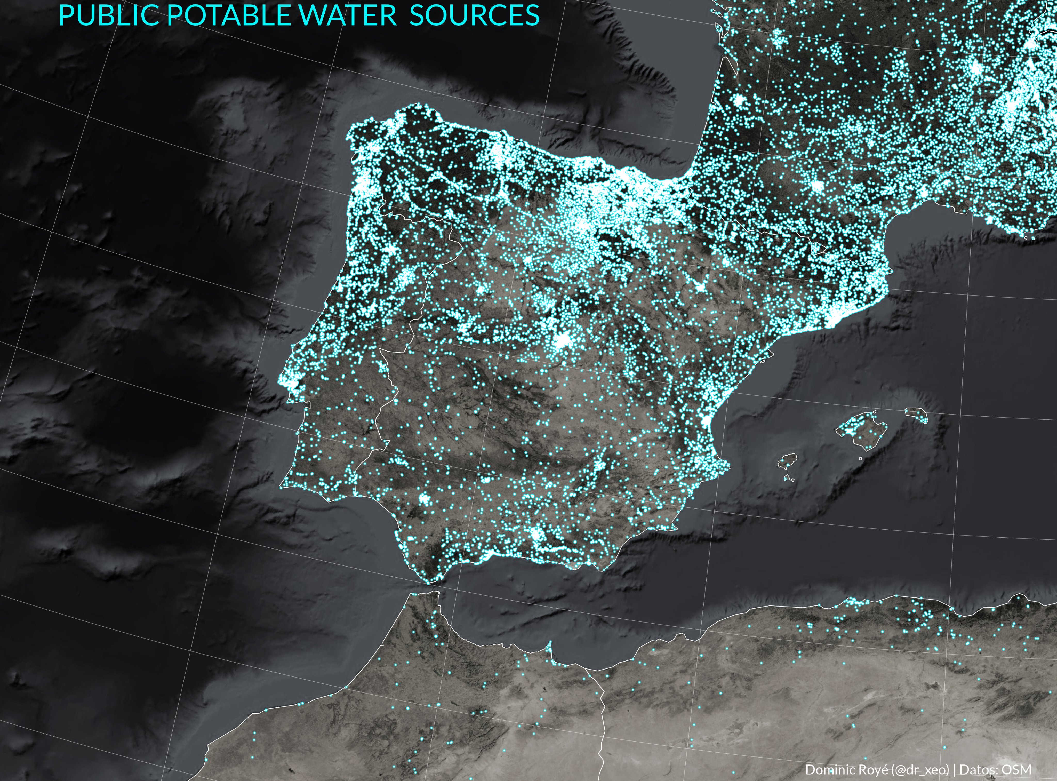
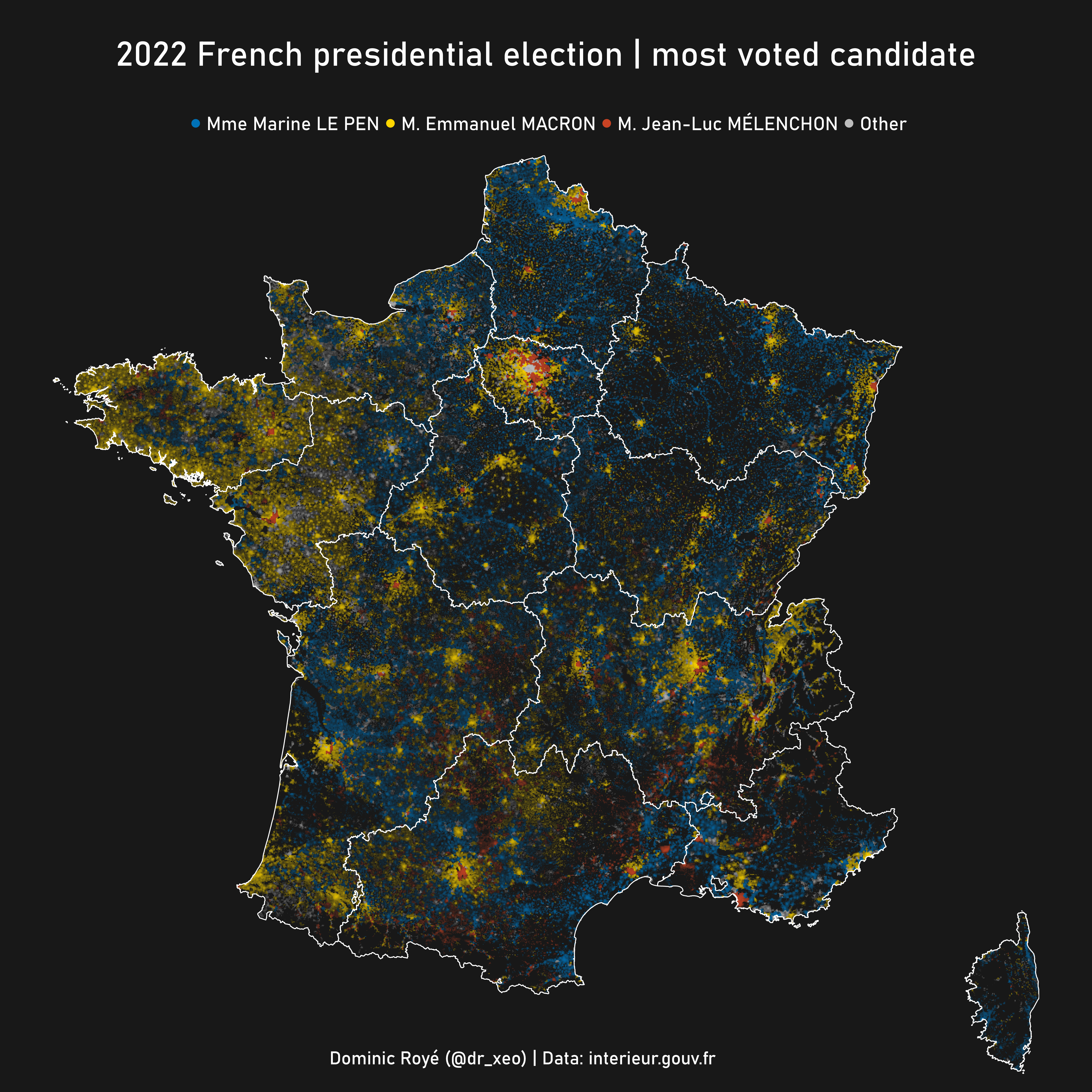
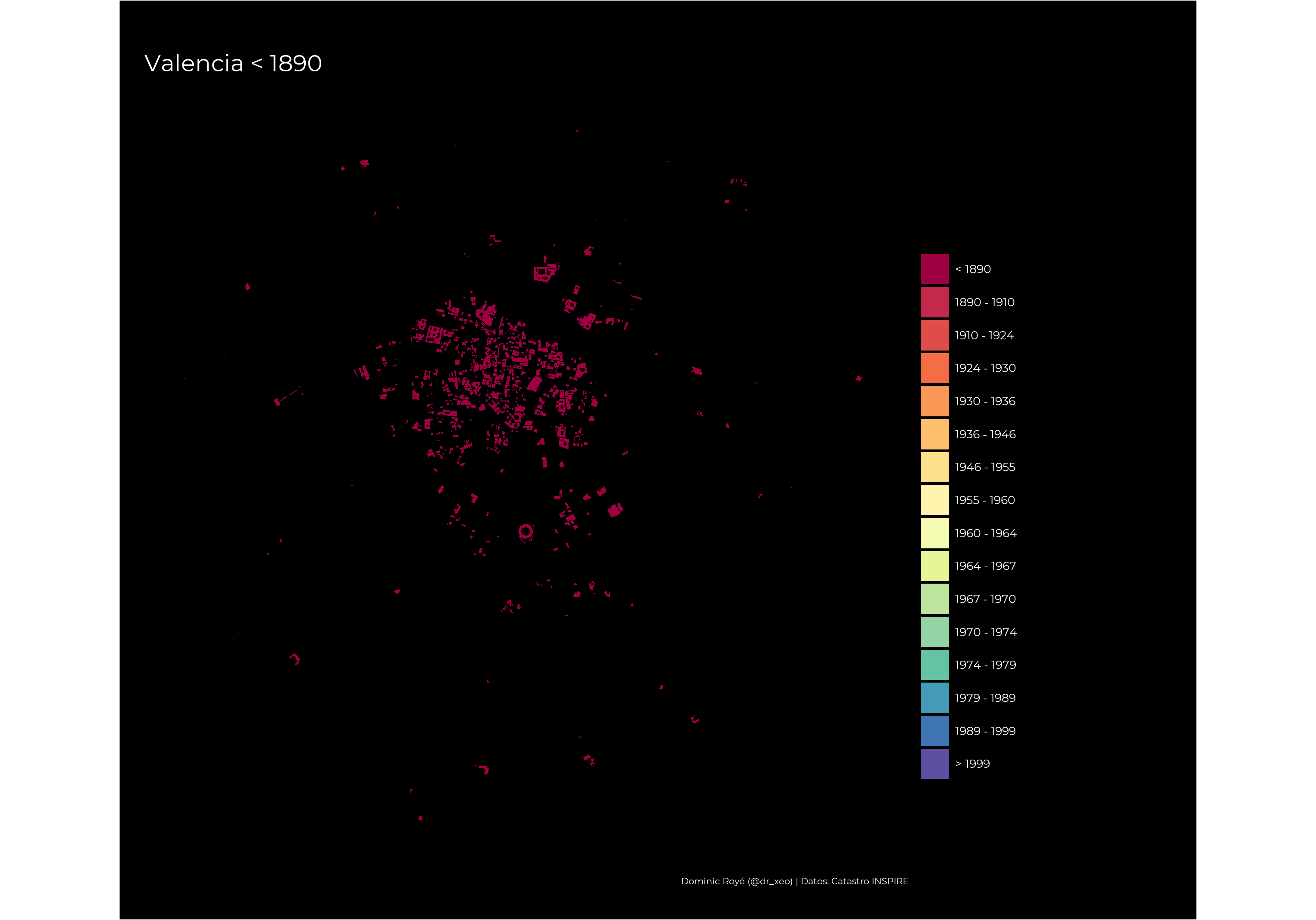
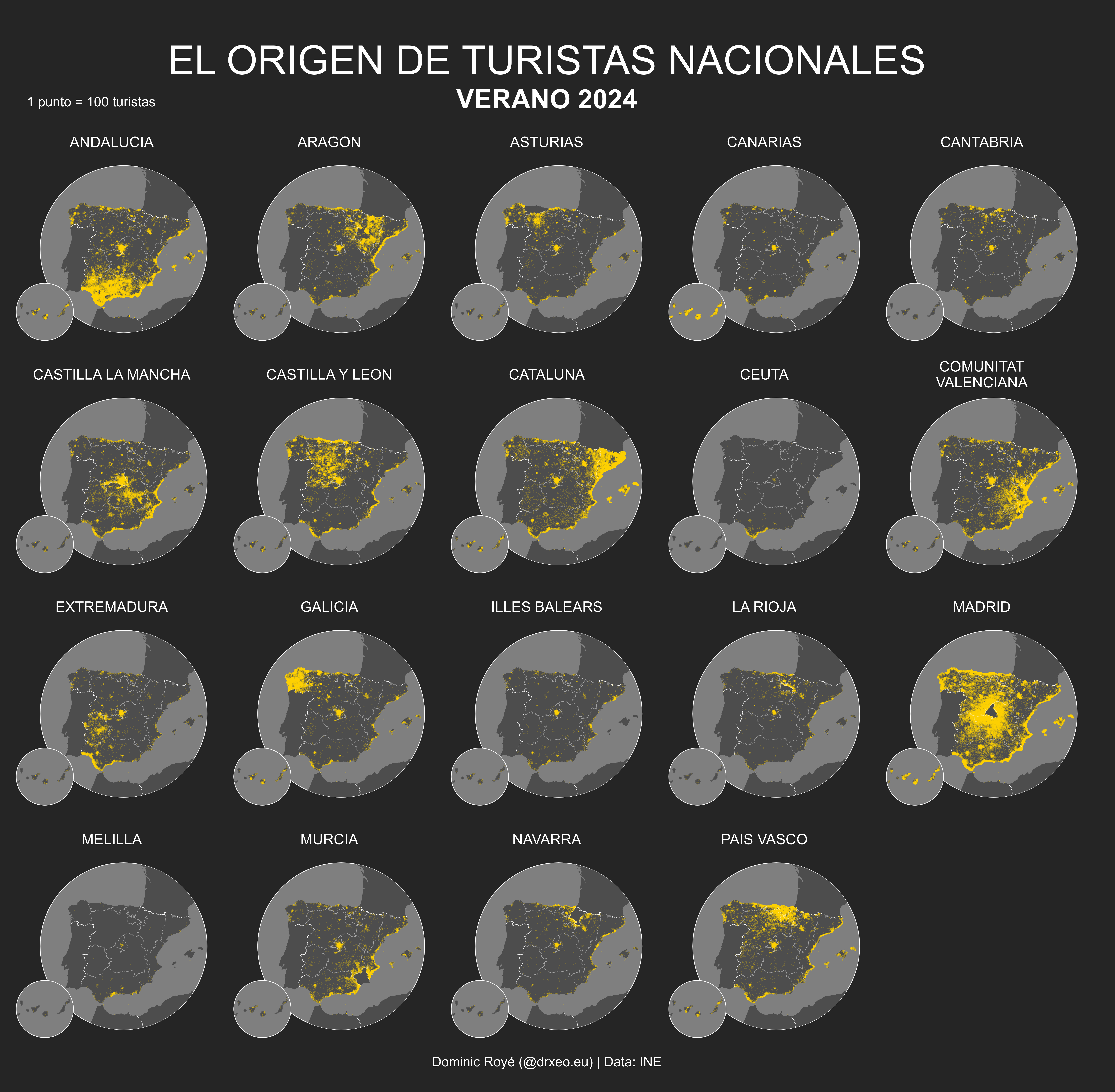
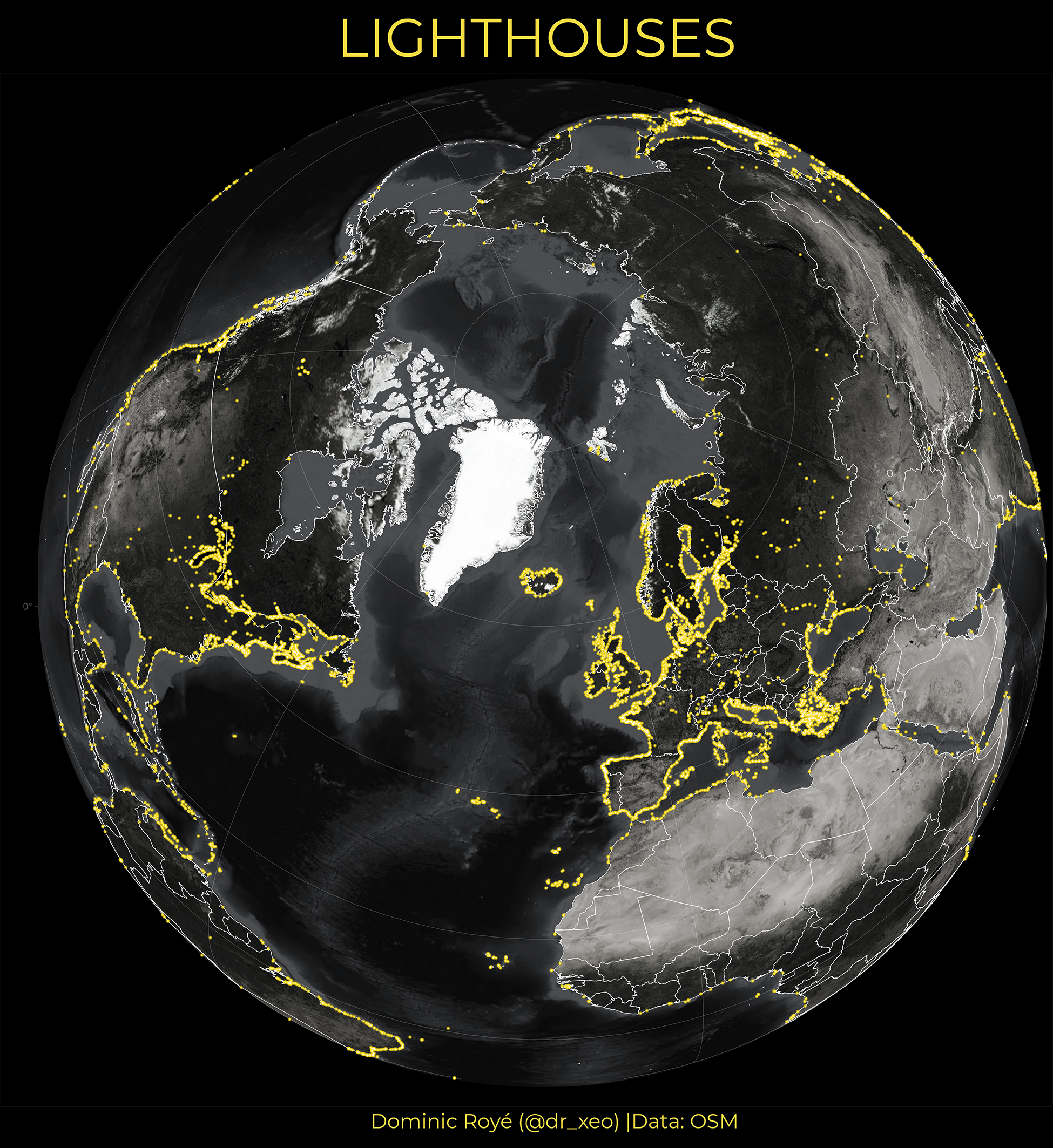
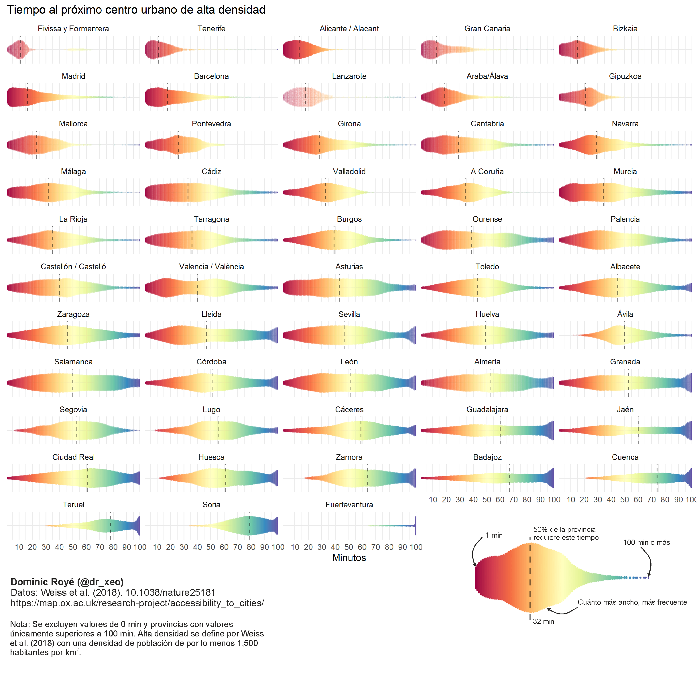
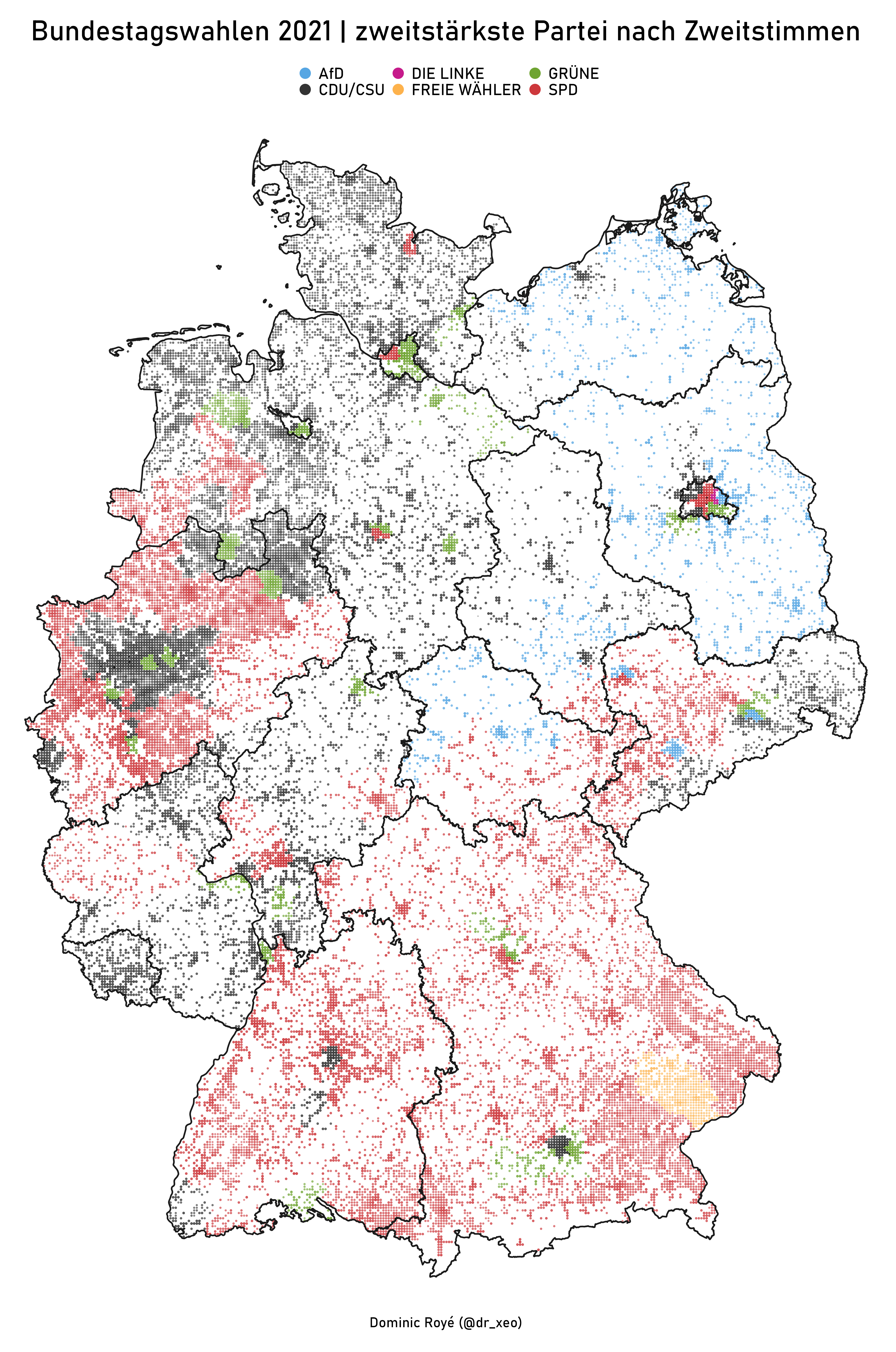
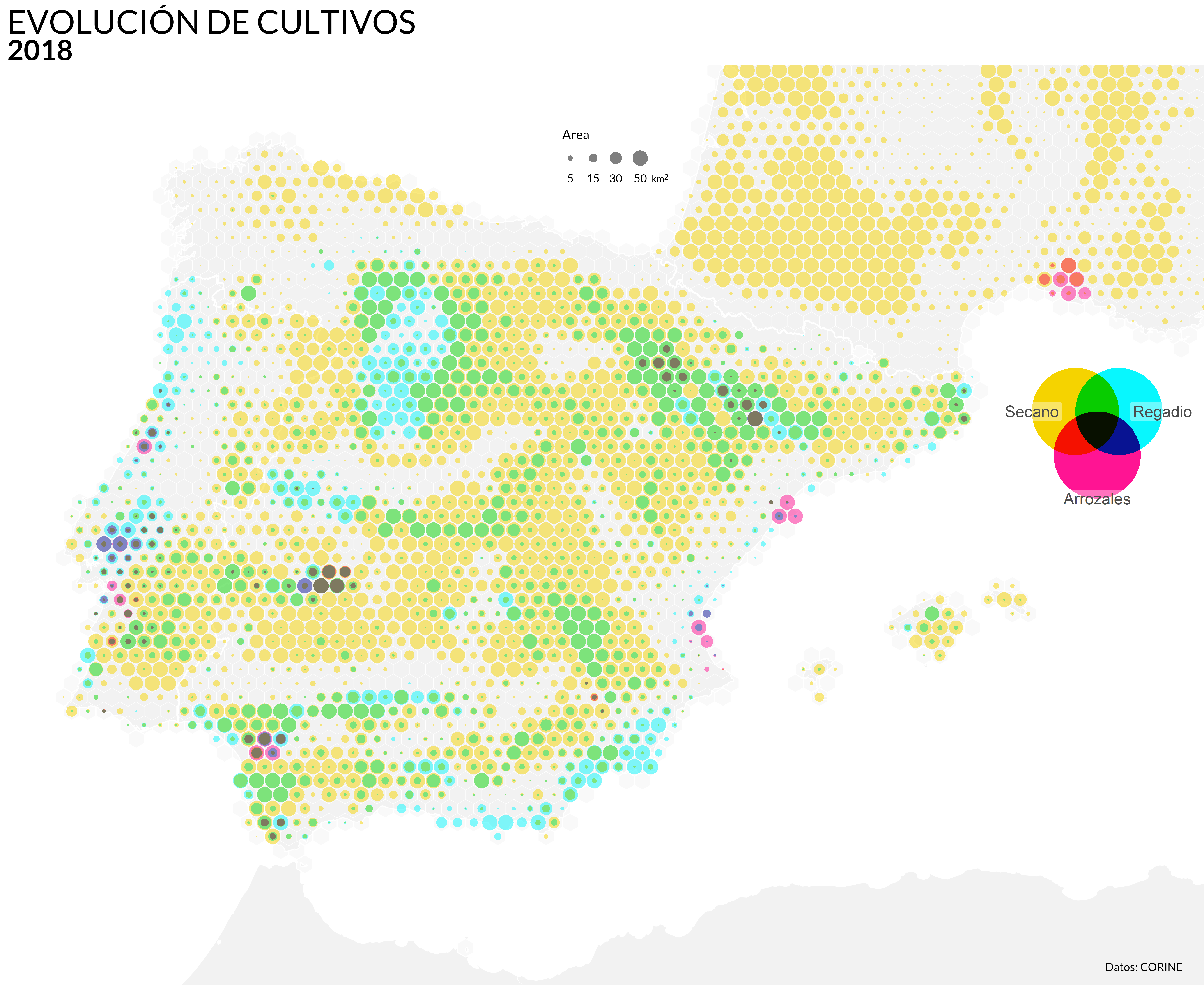
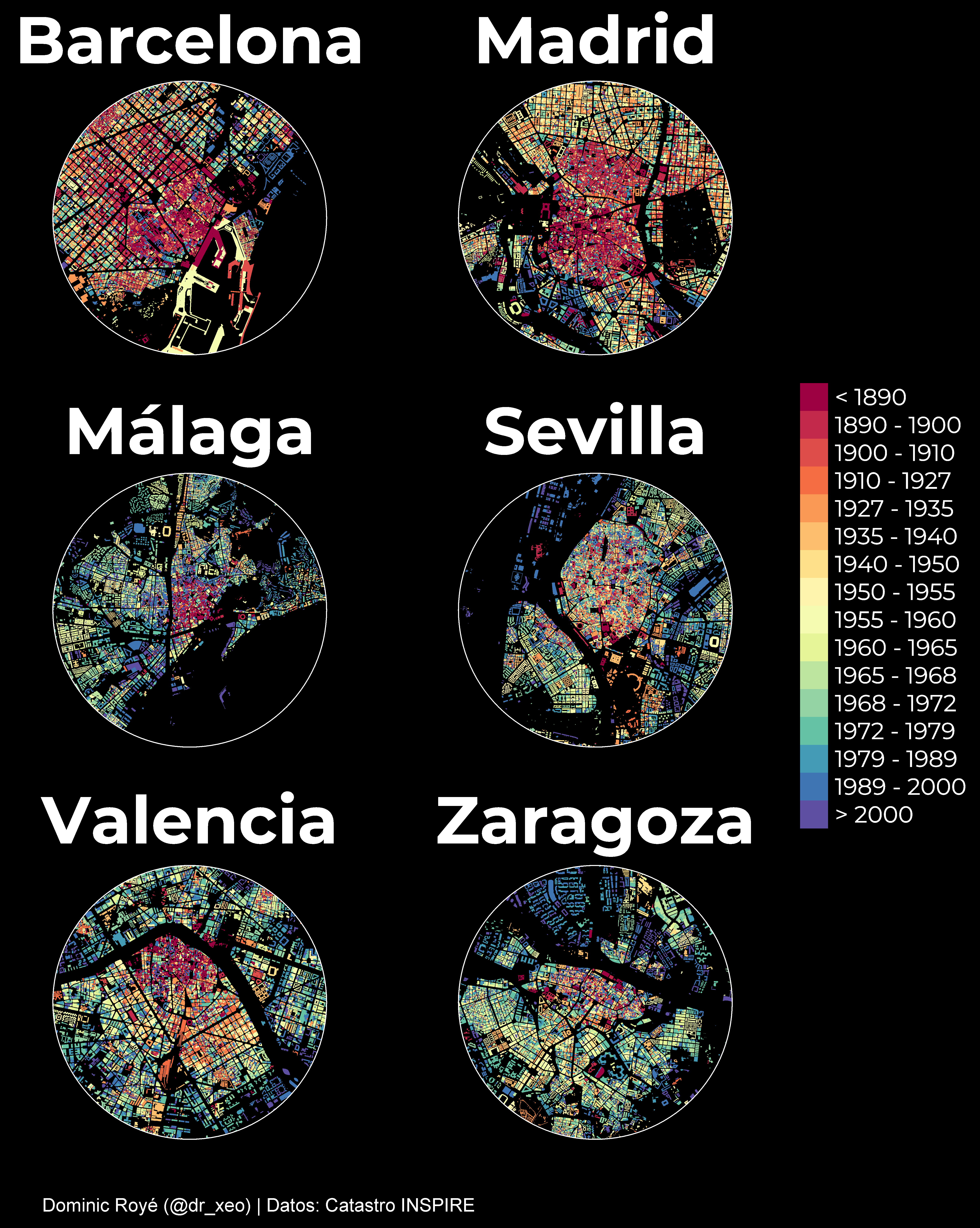
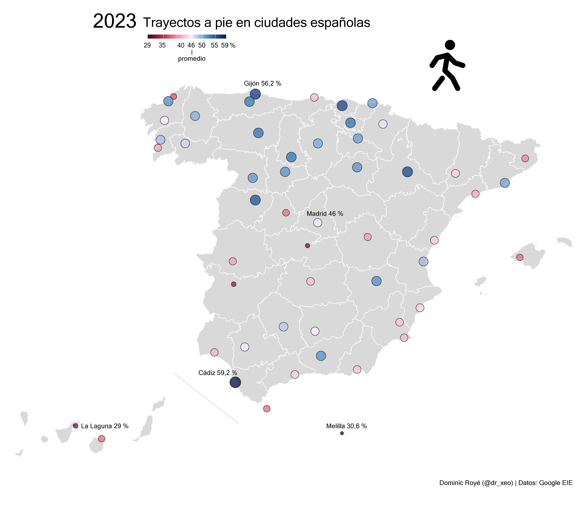
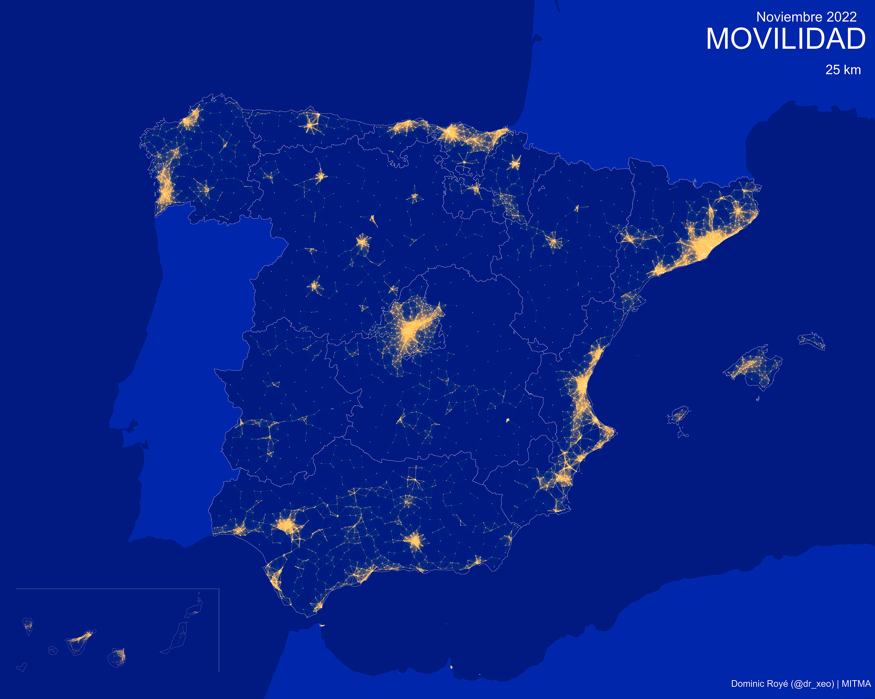
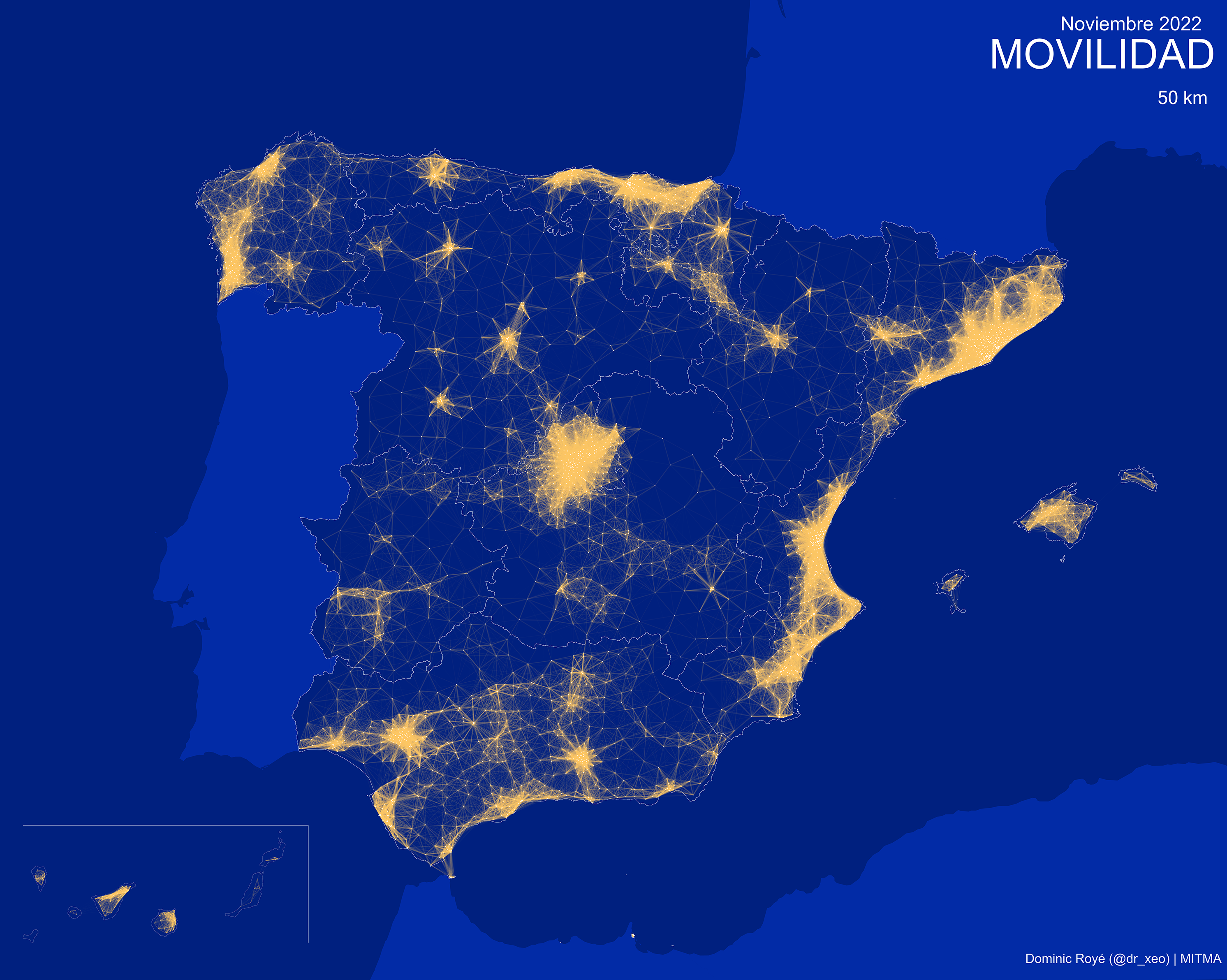
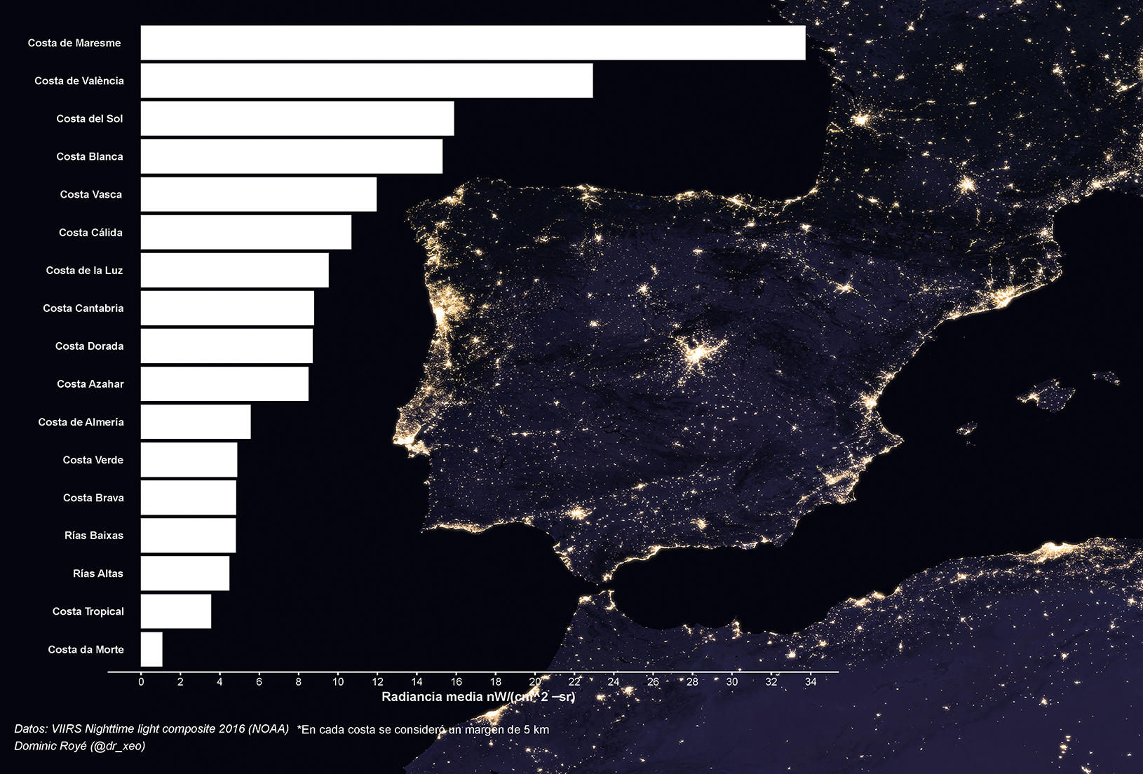
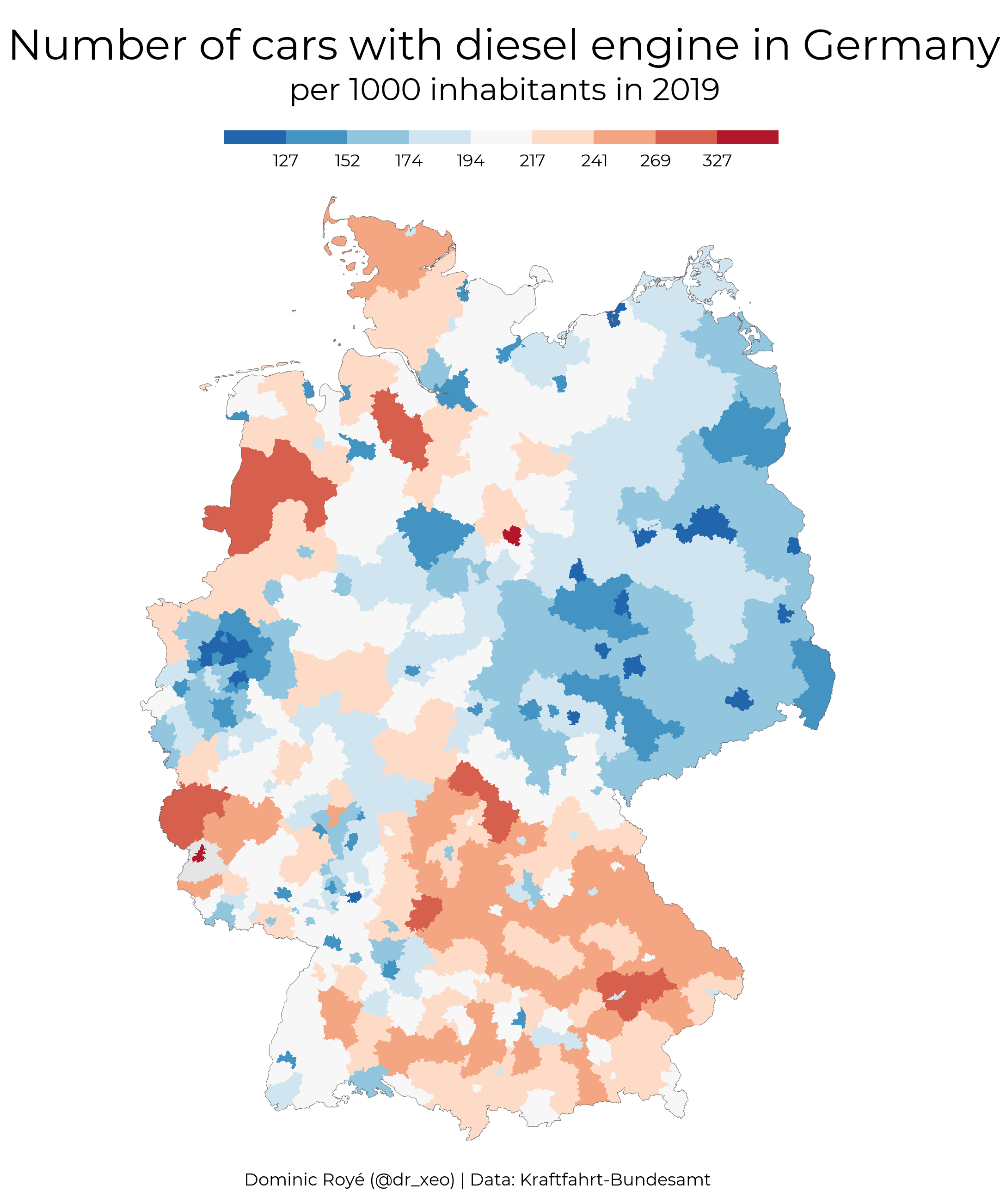
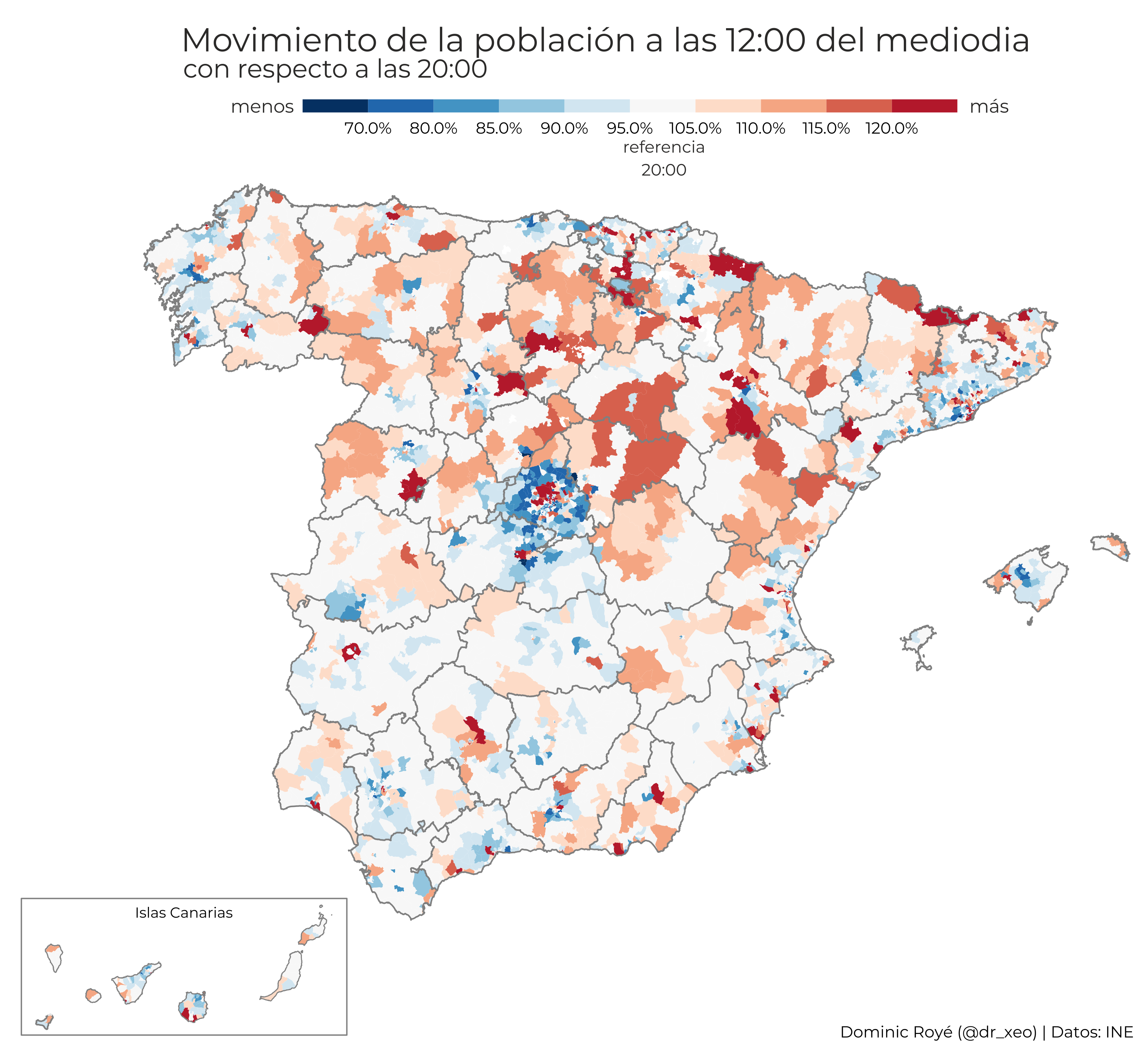
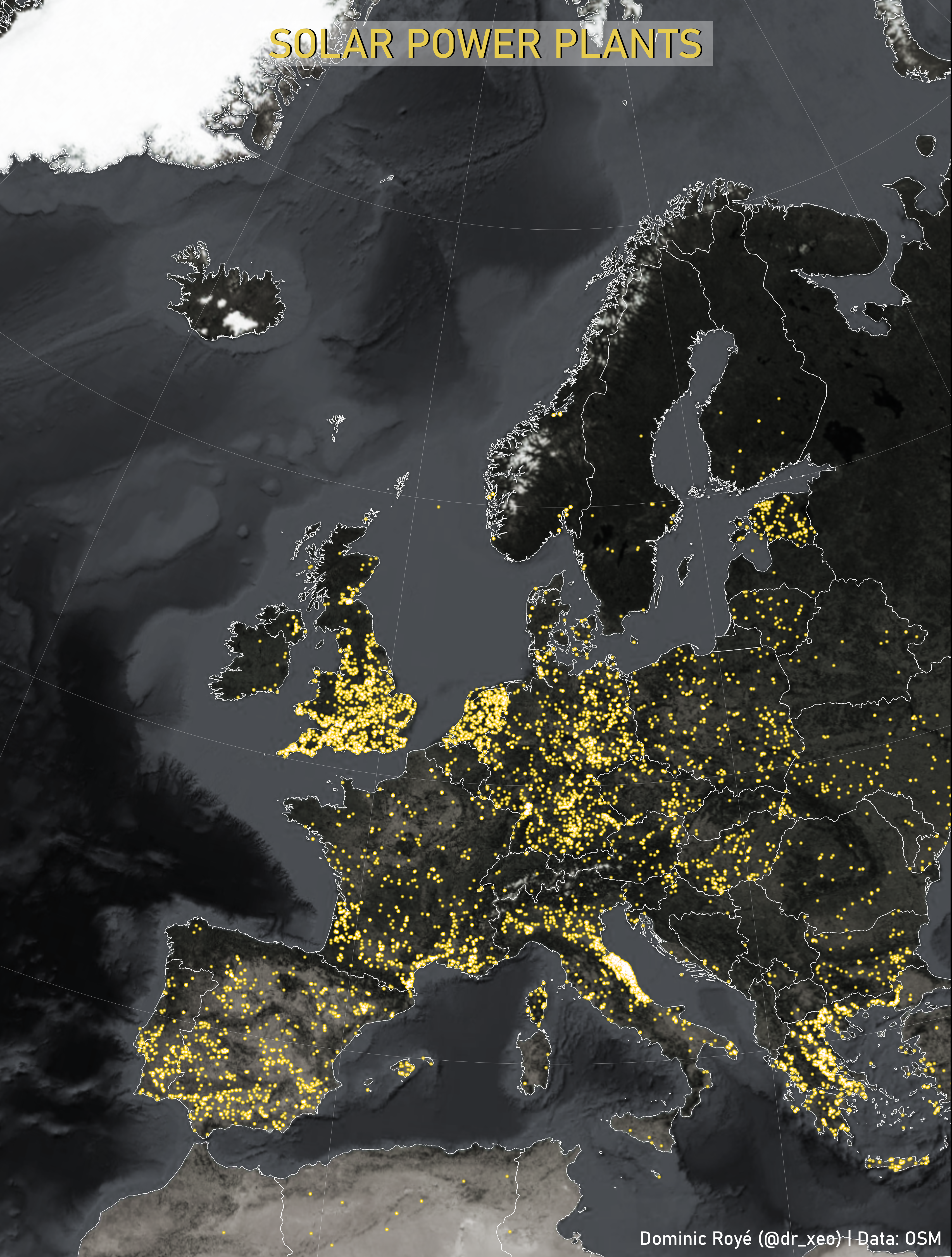
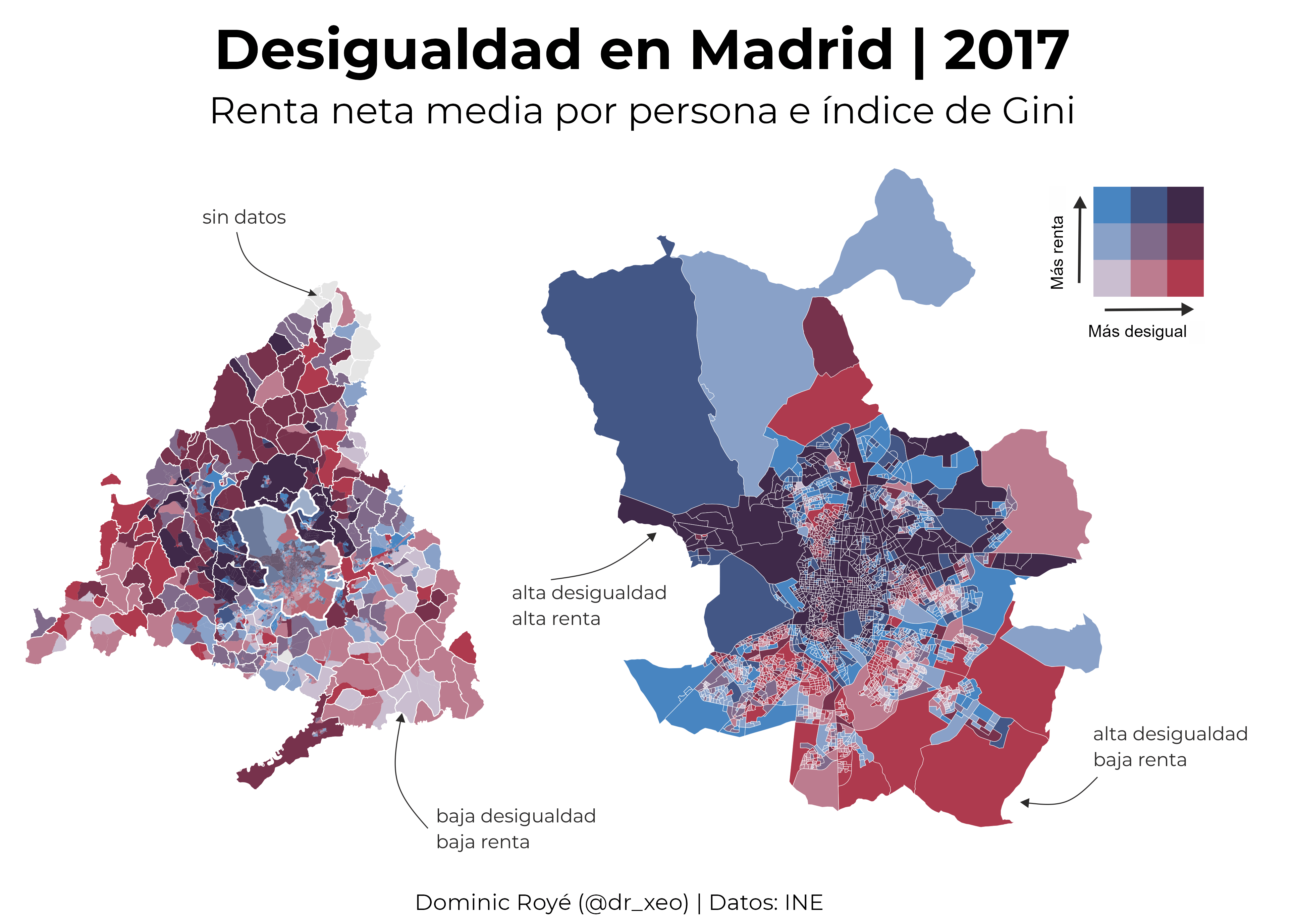
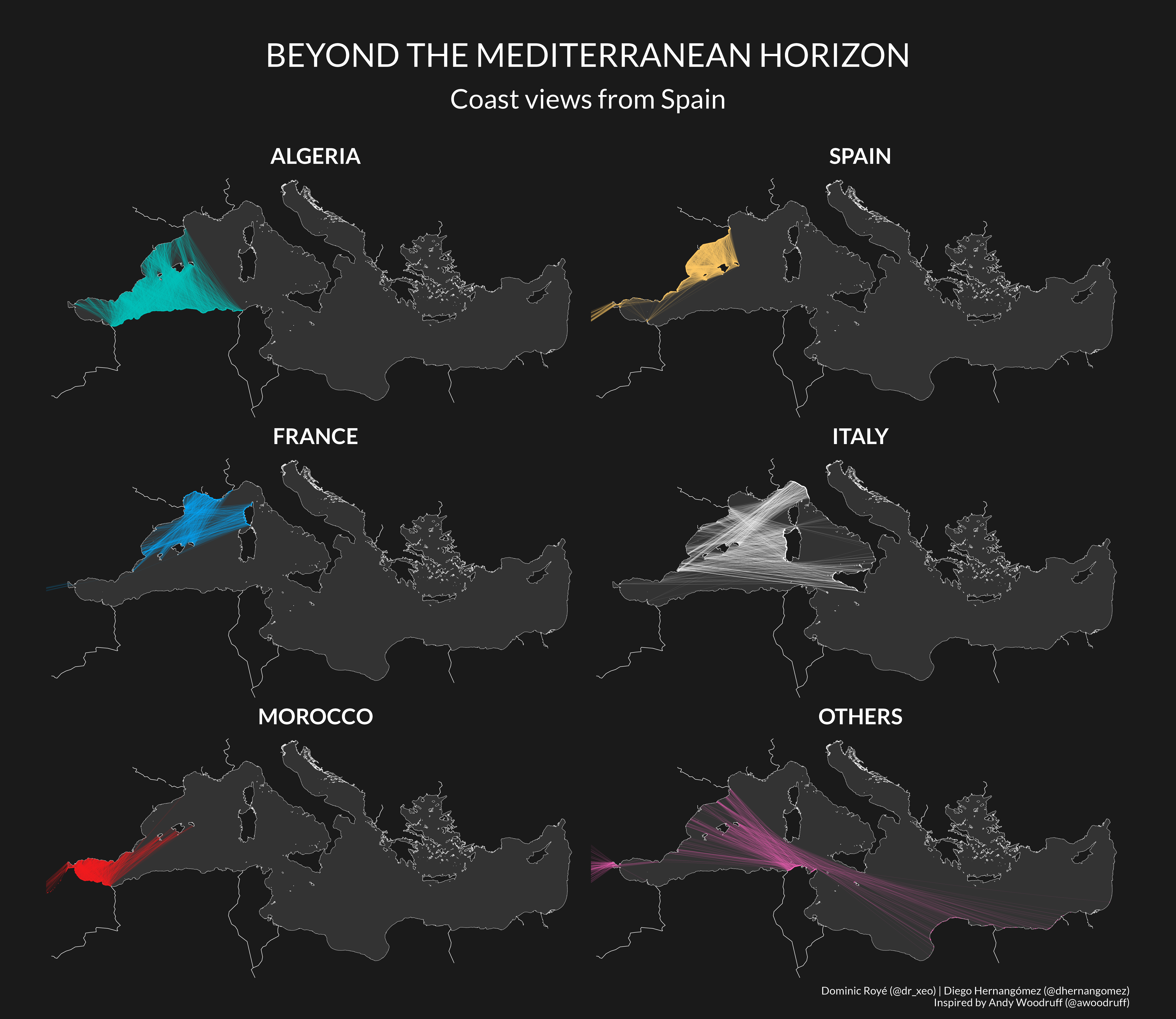
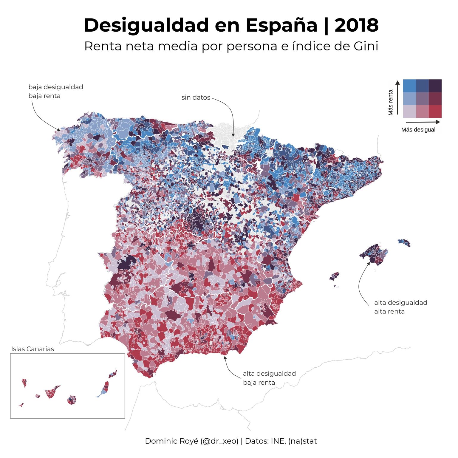
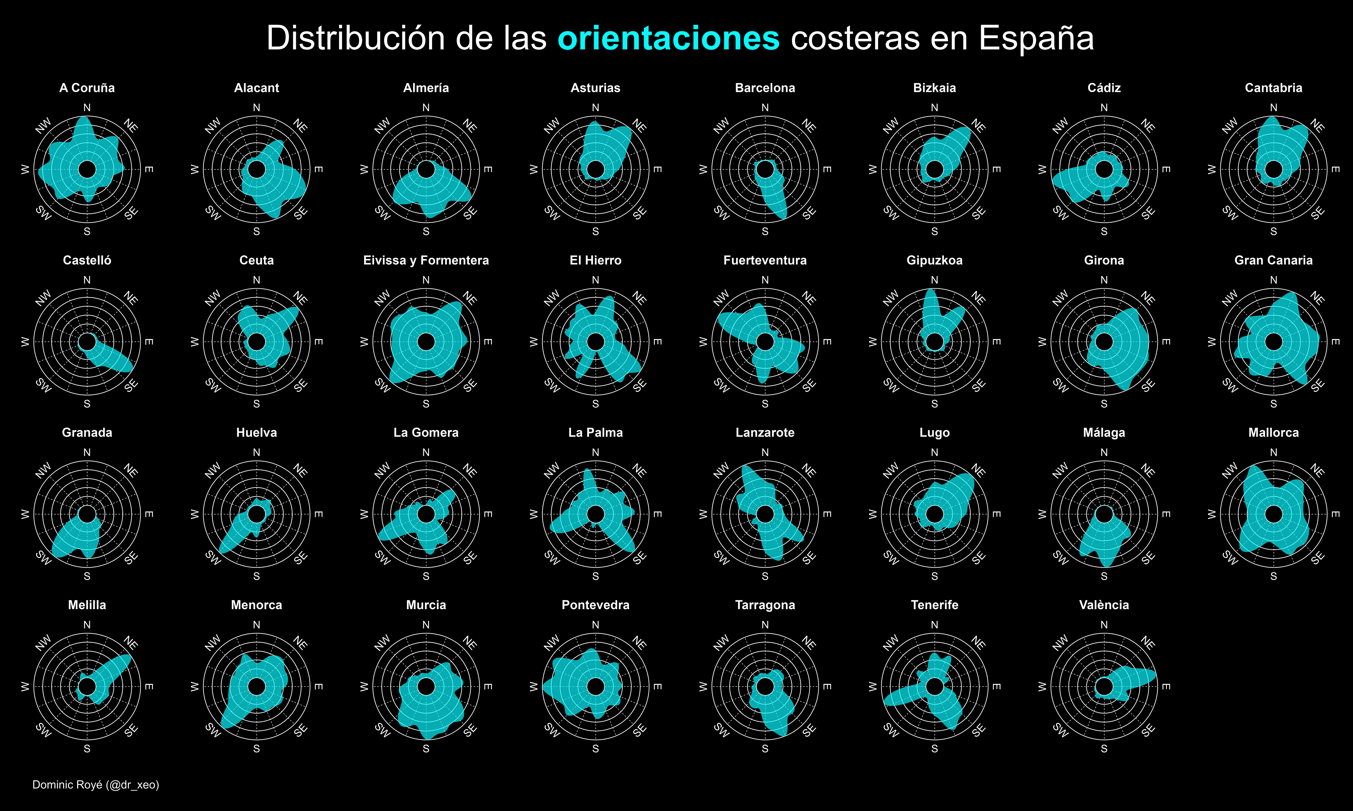
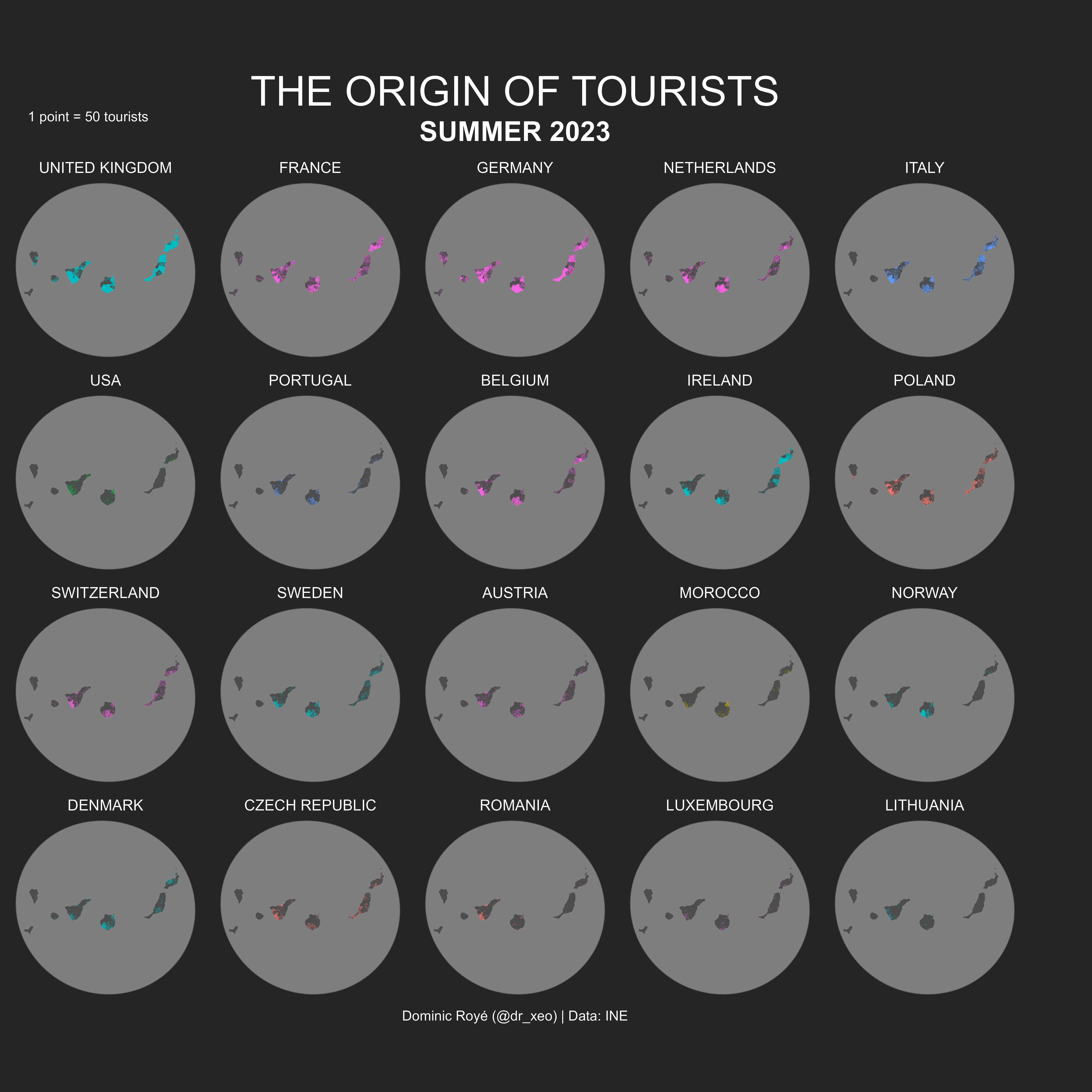
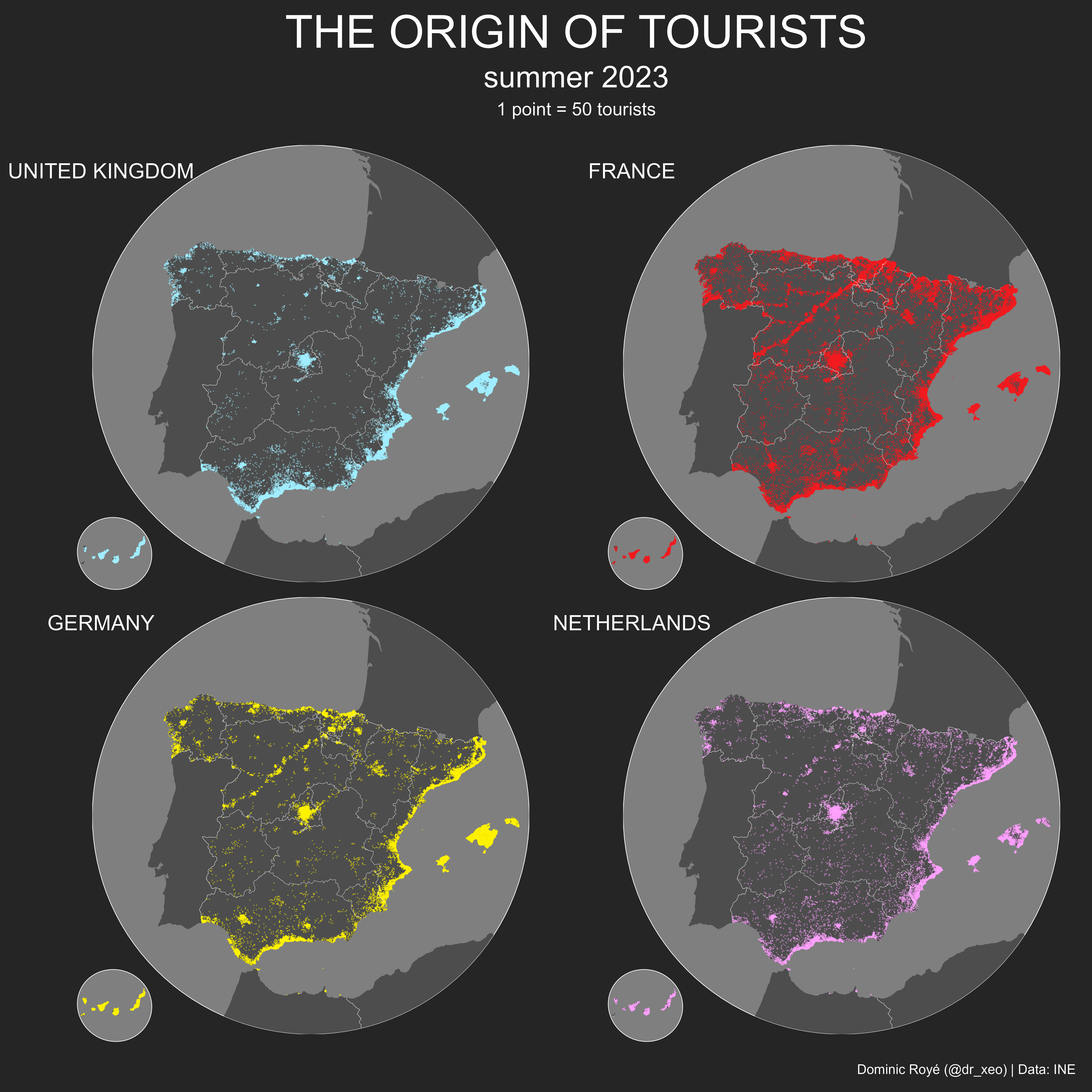
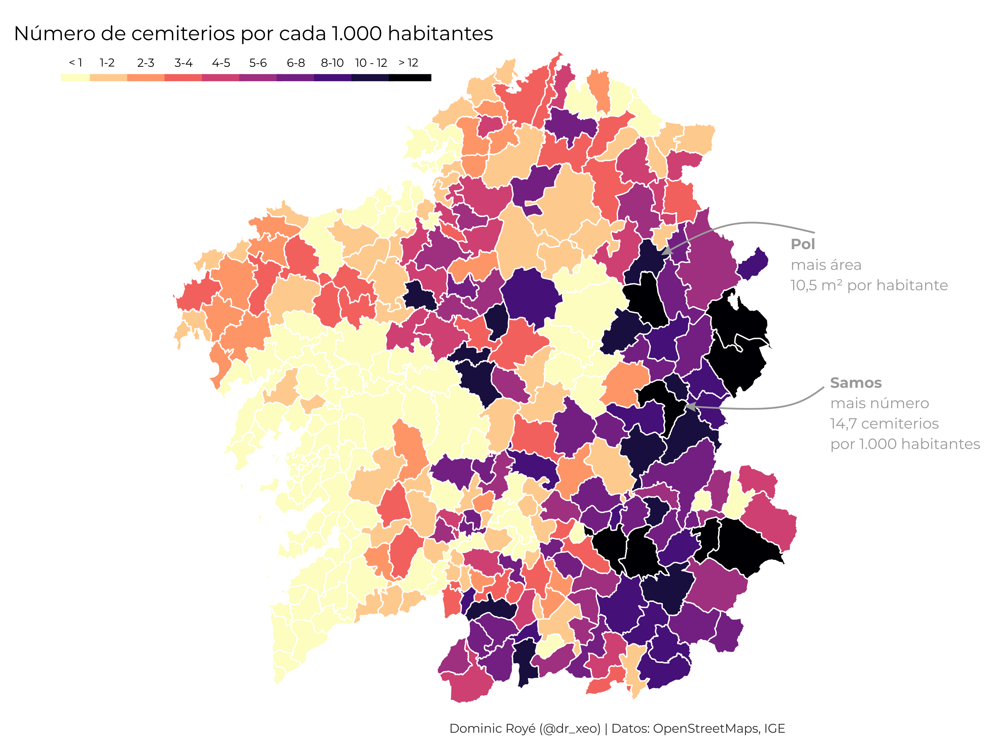
GEOGRAPHY
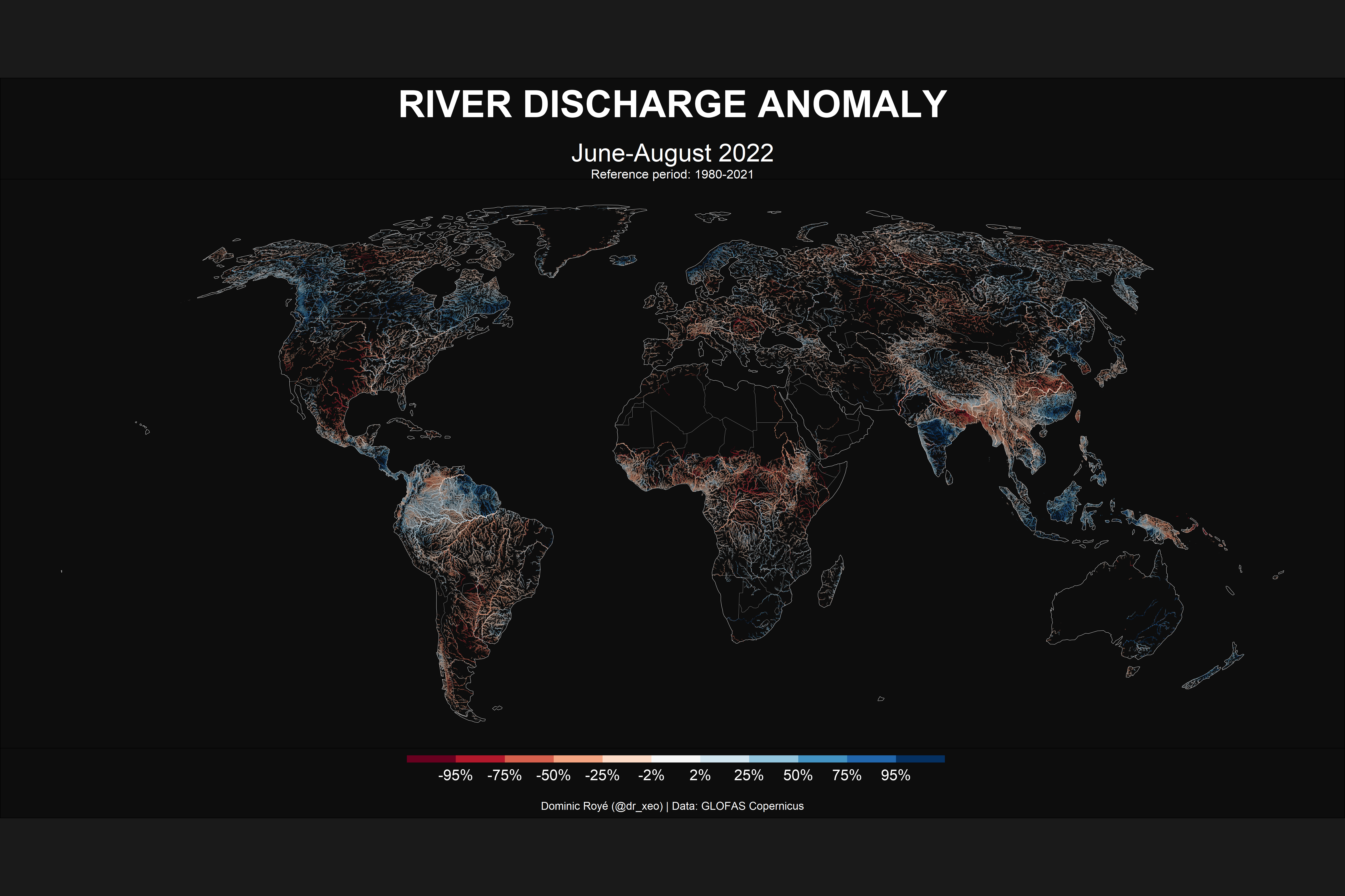
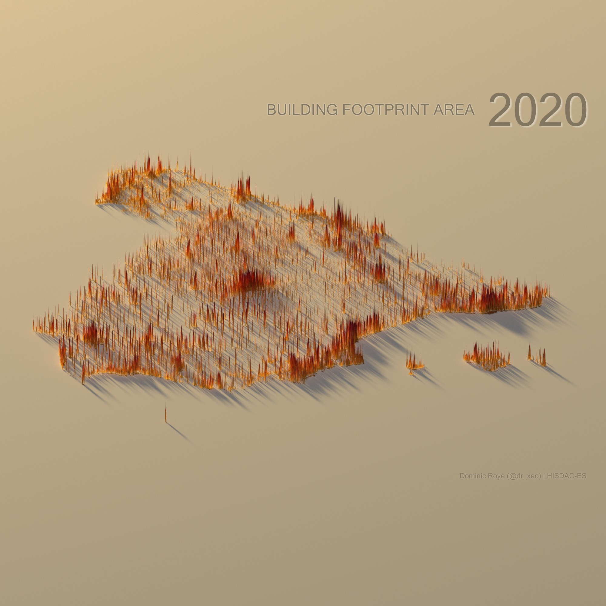
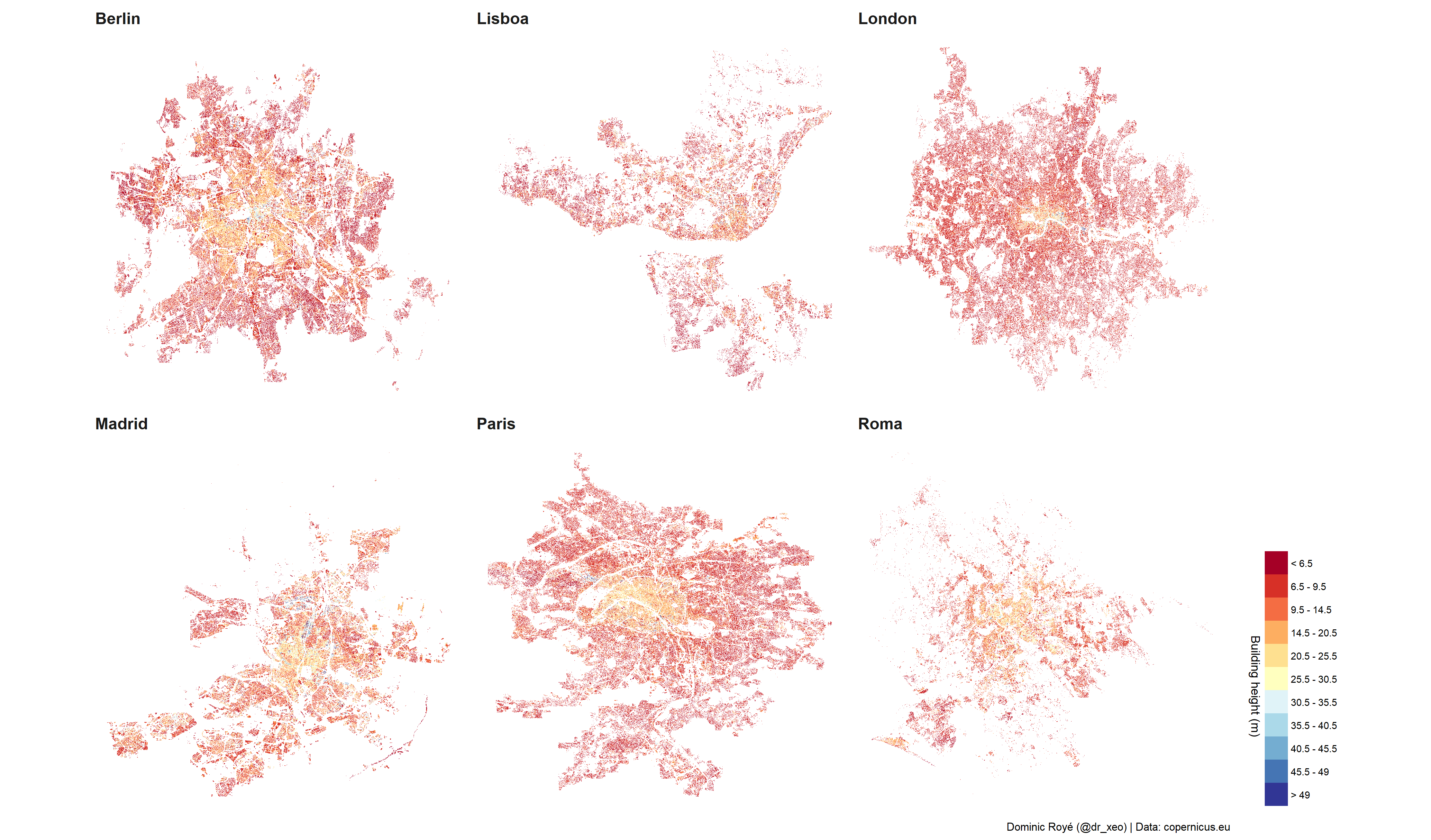
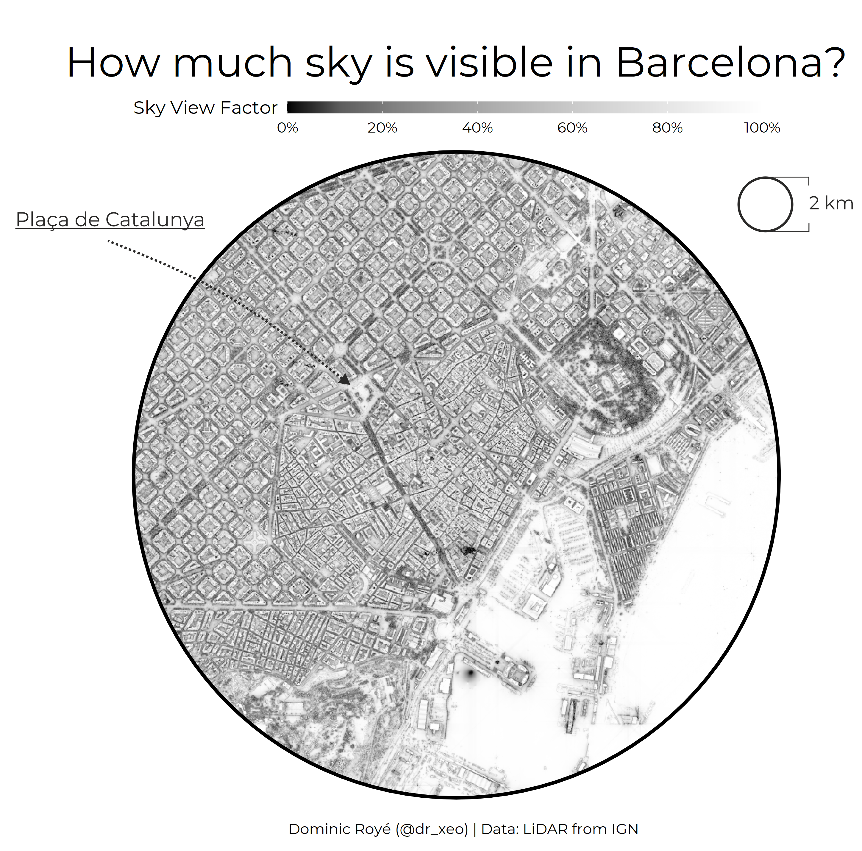
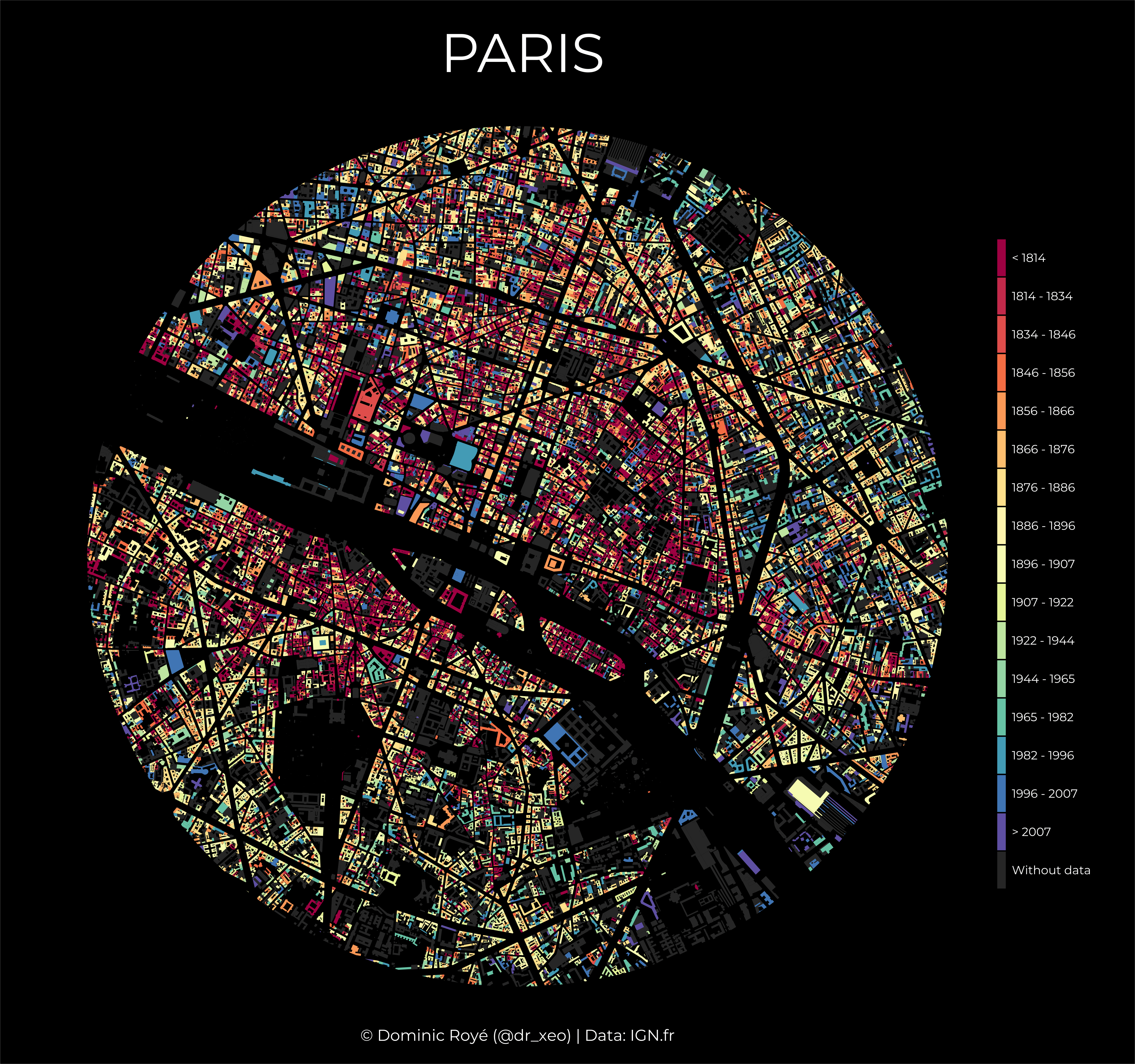
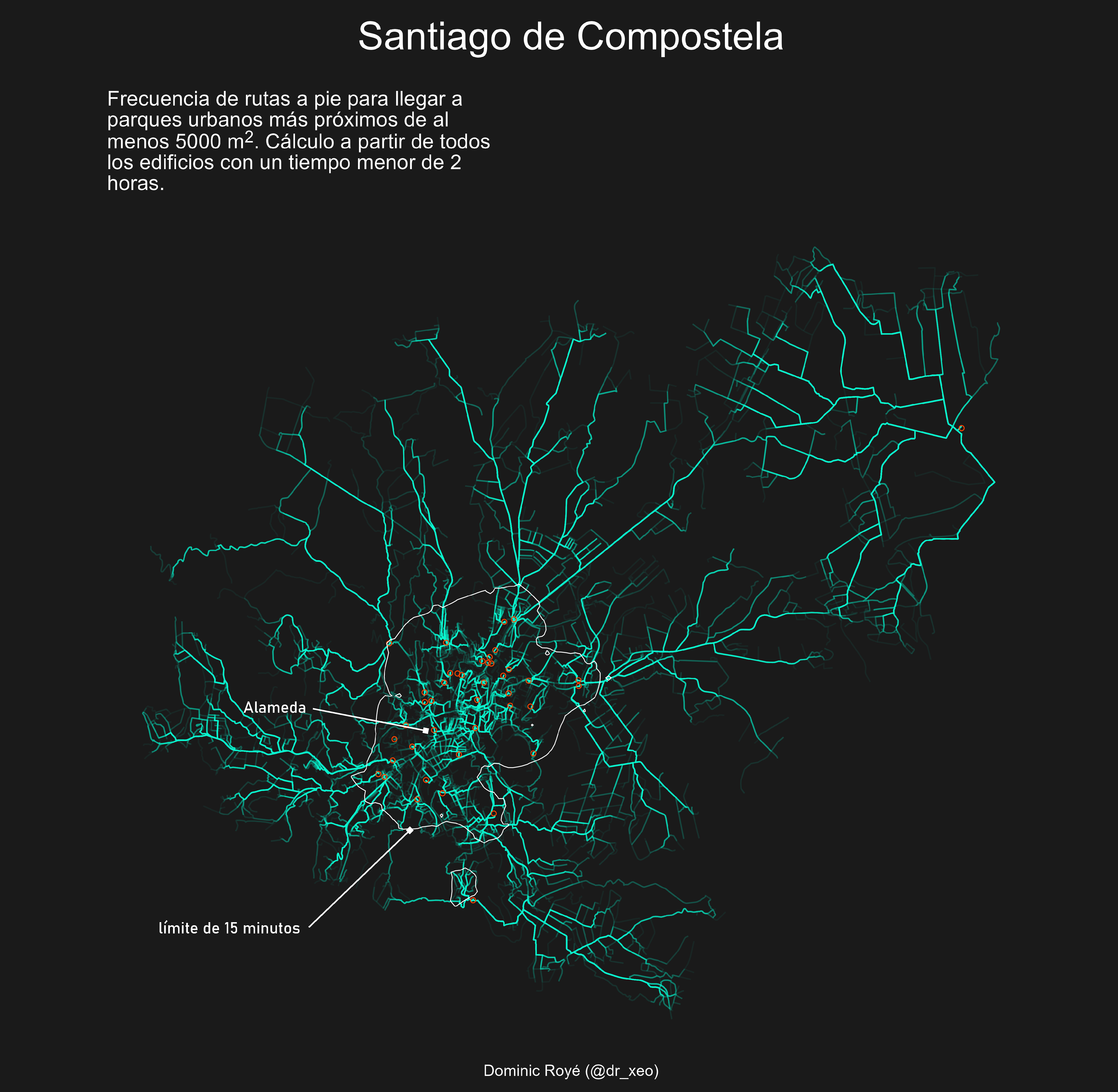
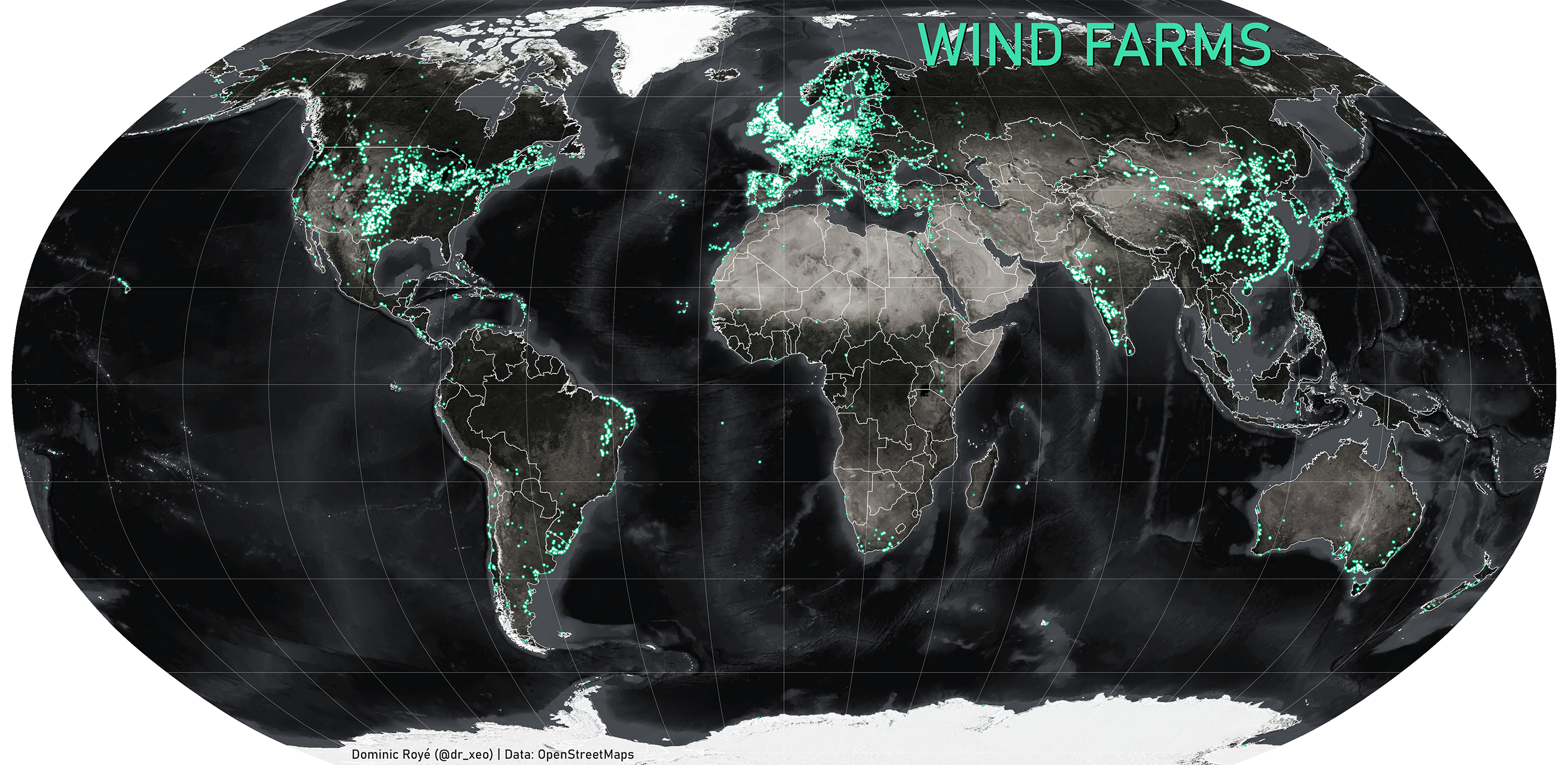
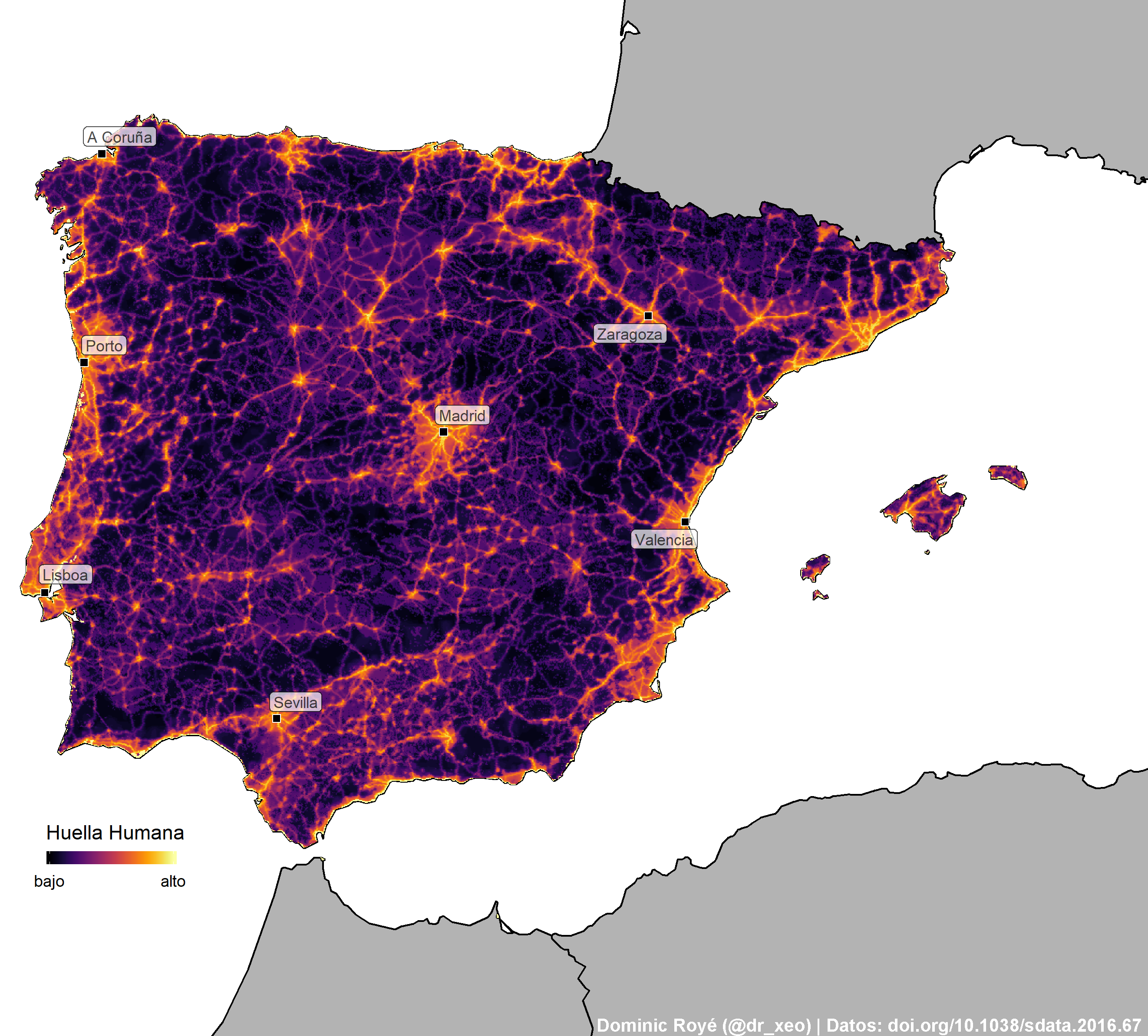
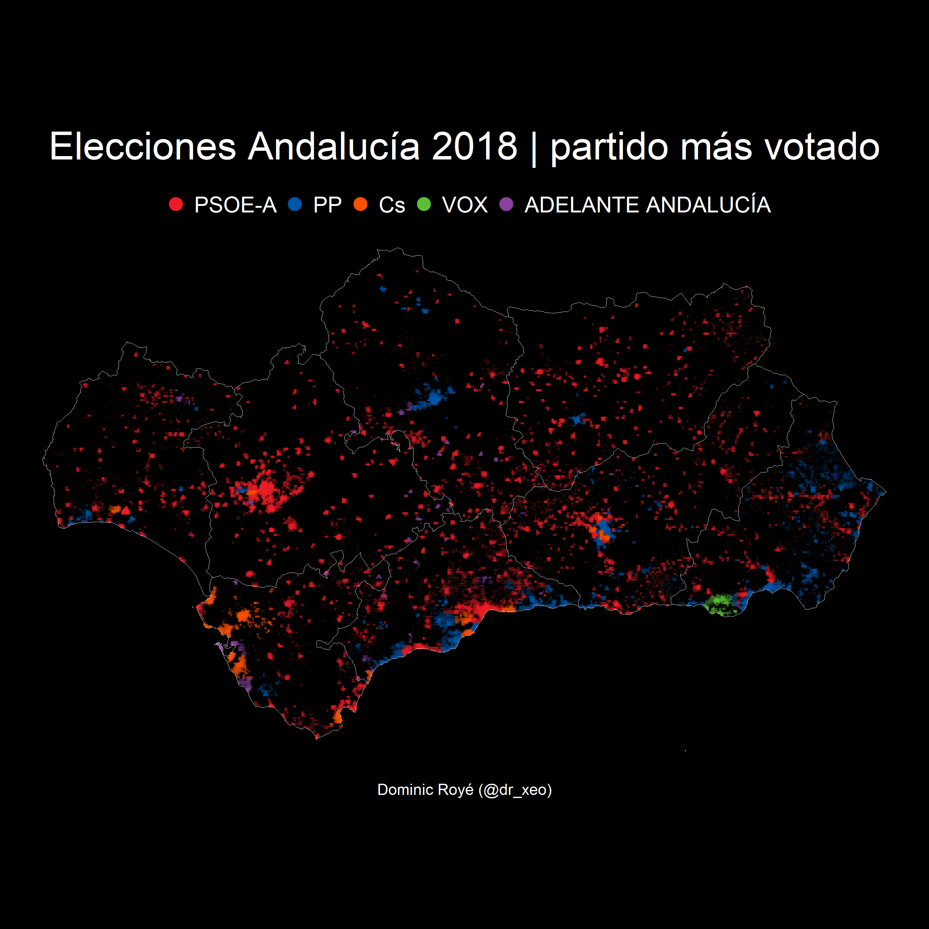
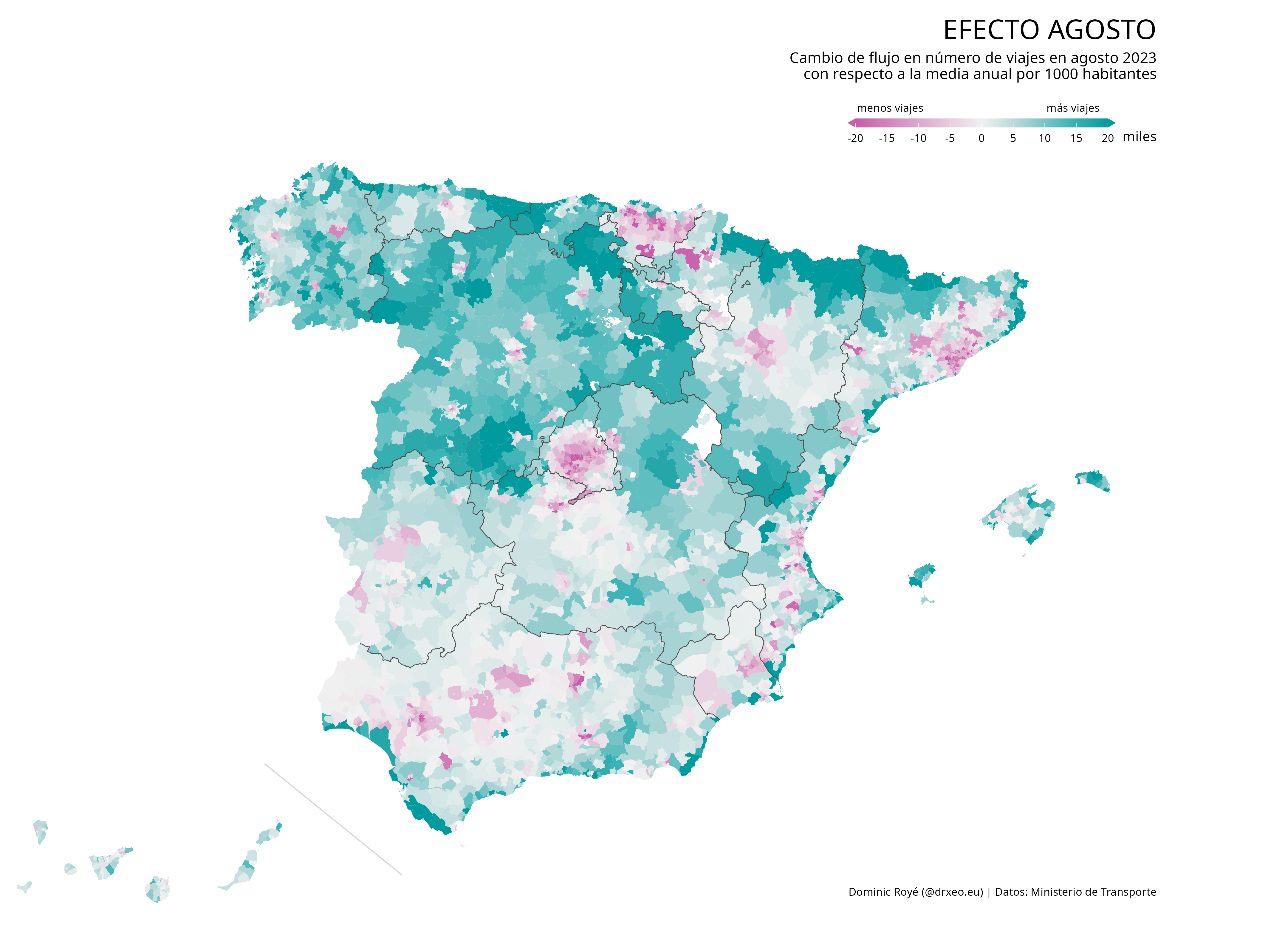


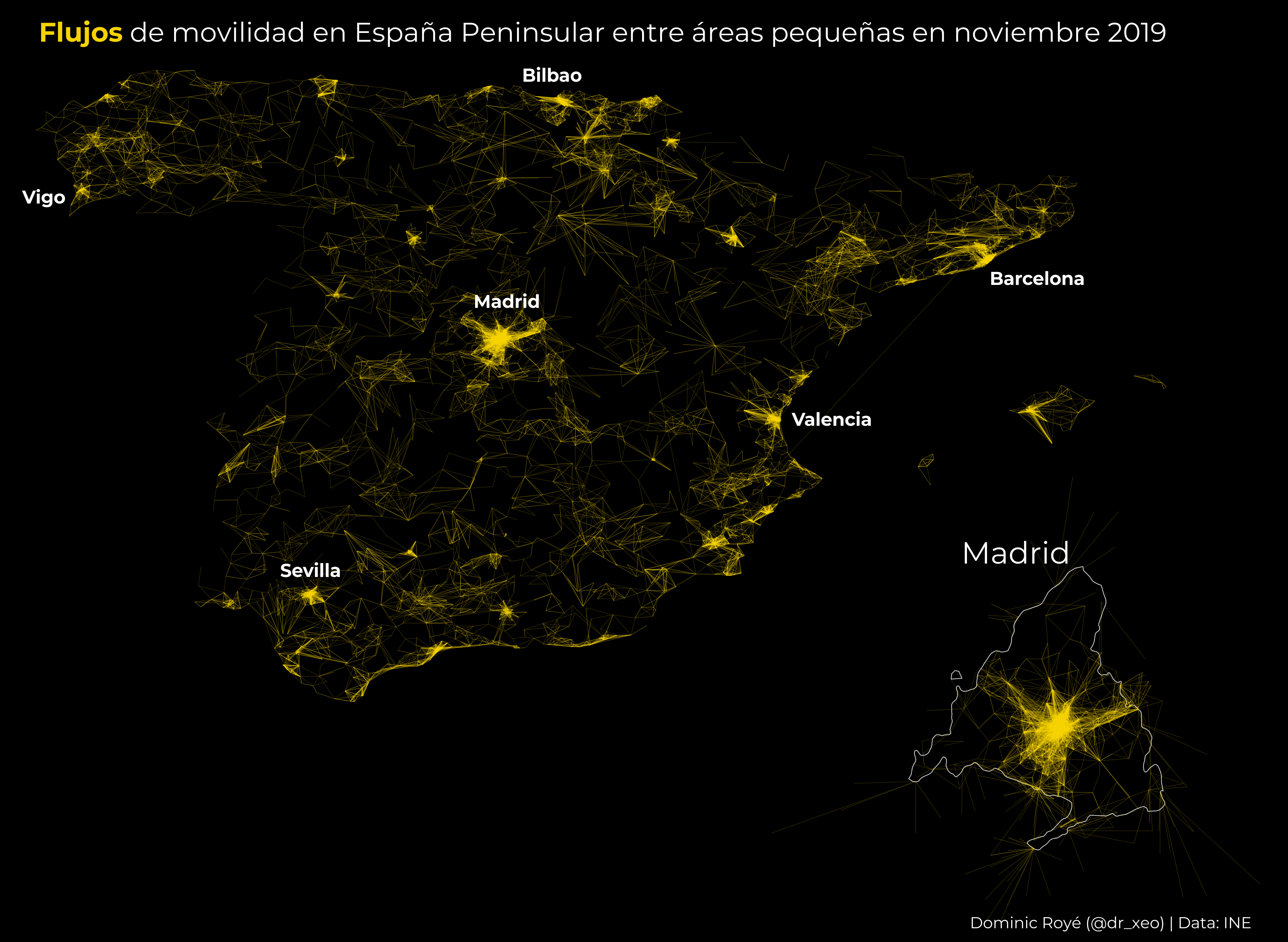
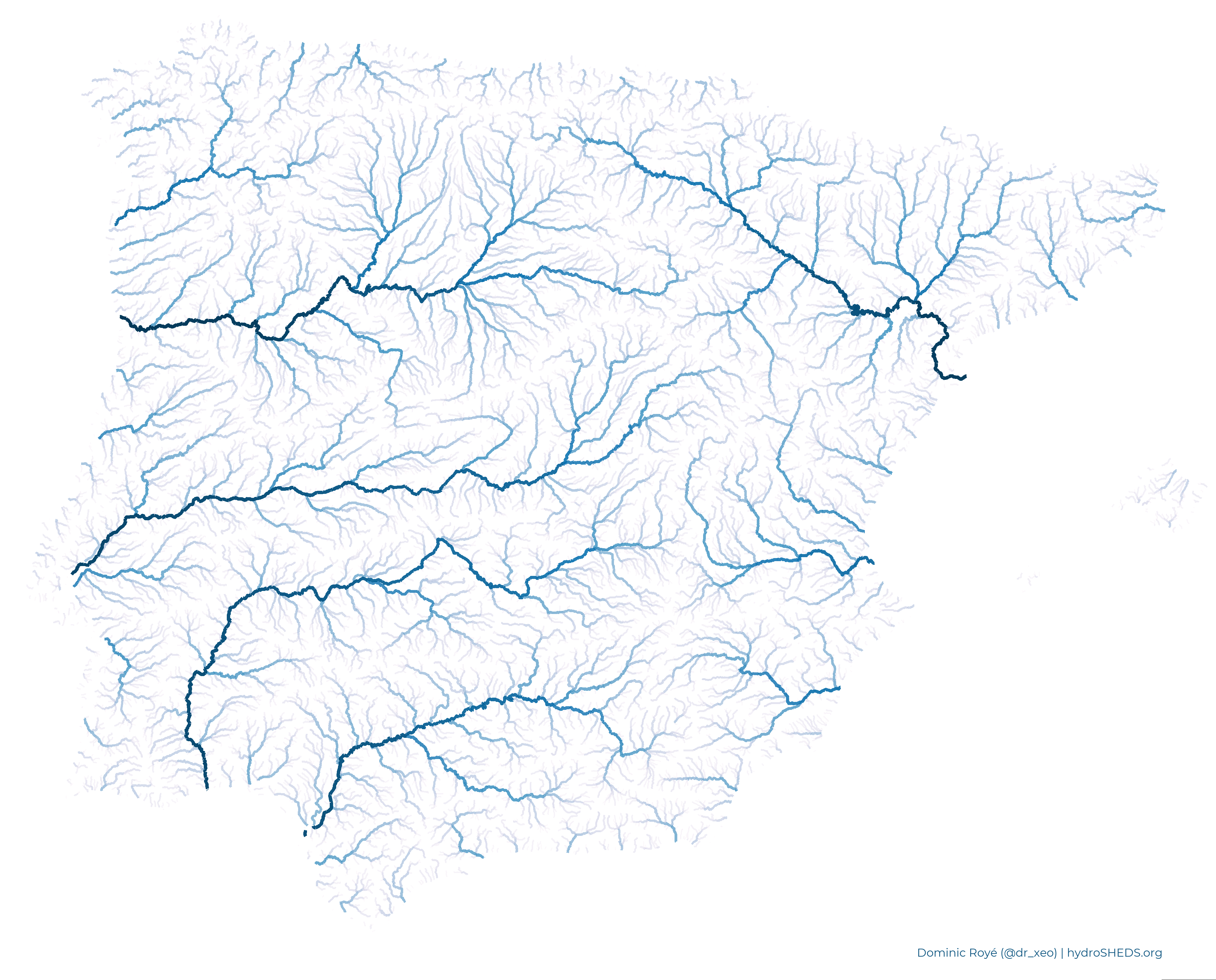
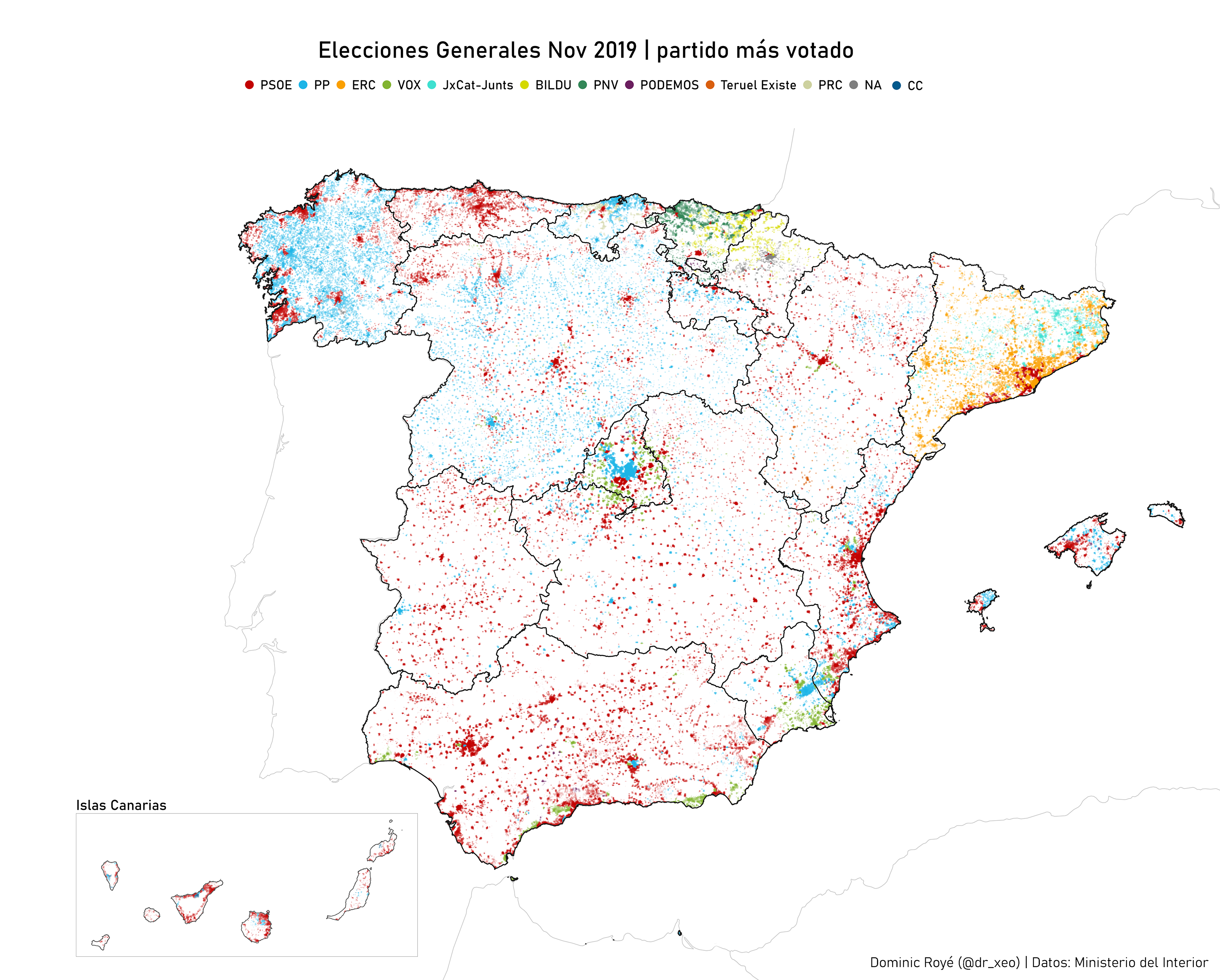
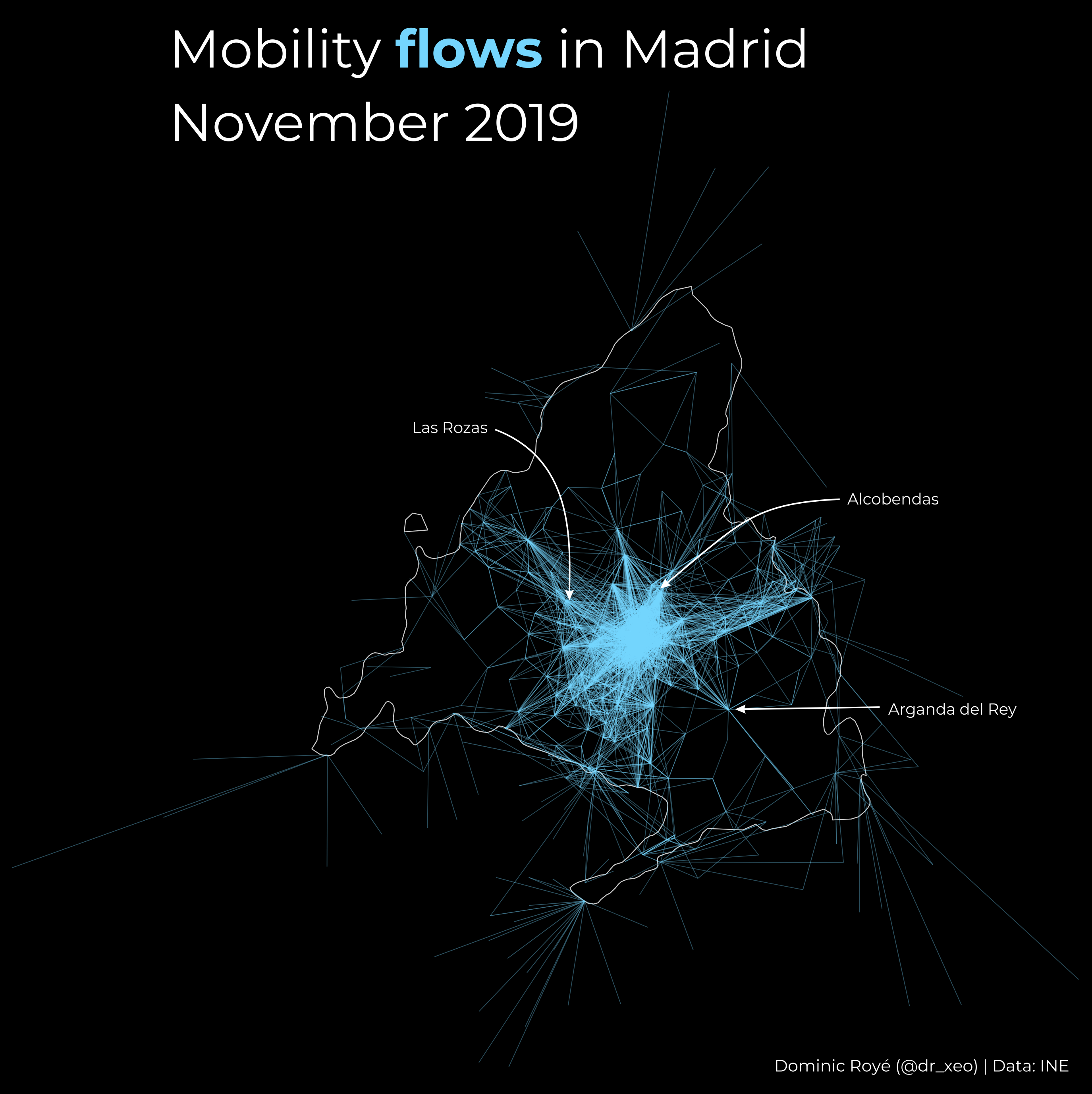
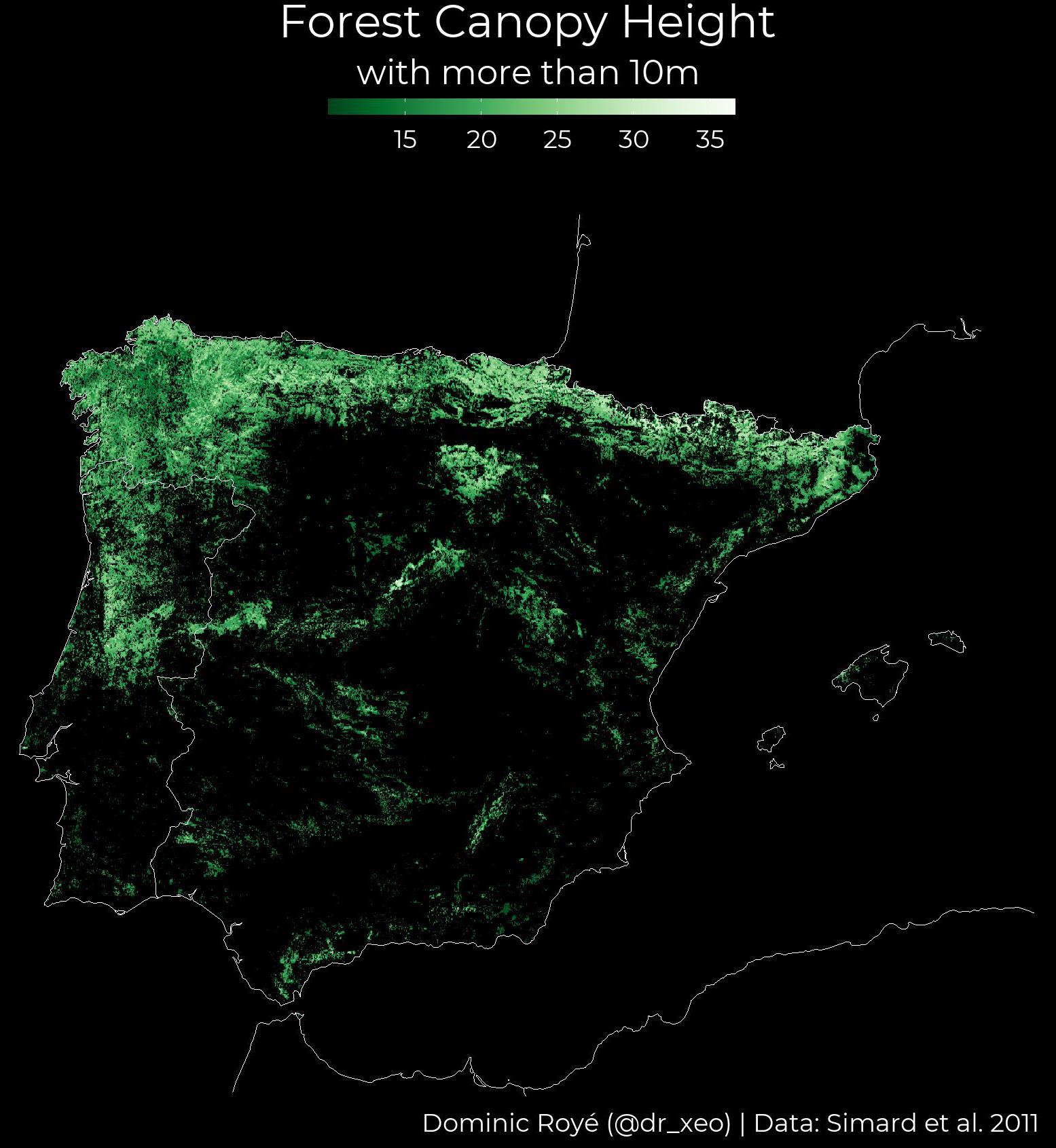
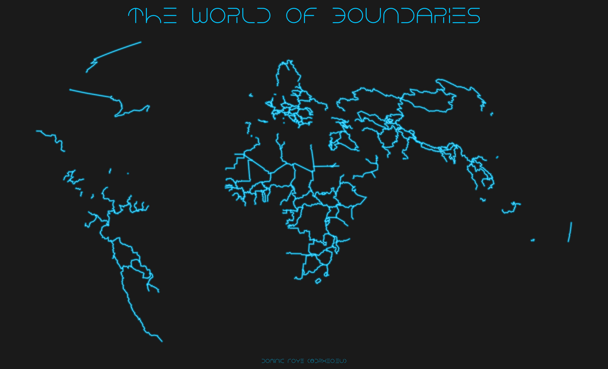
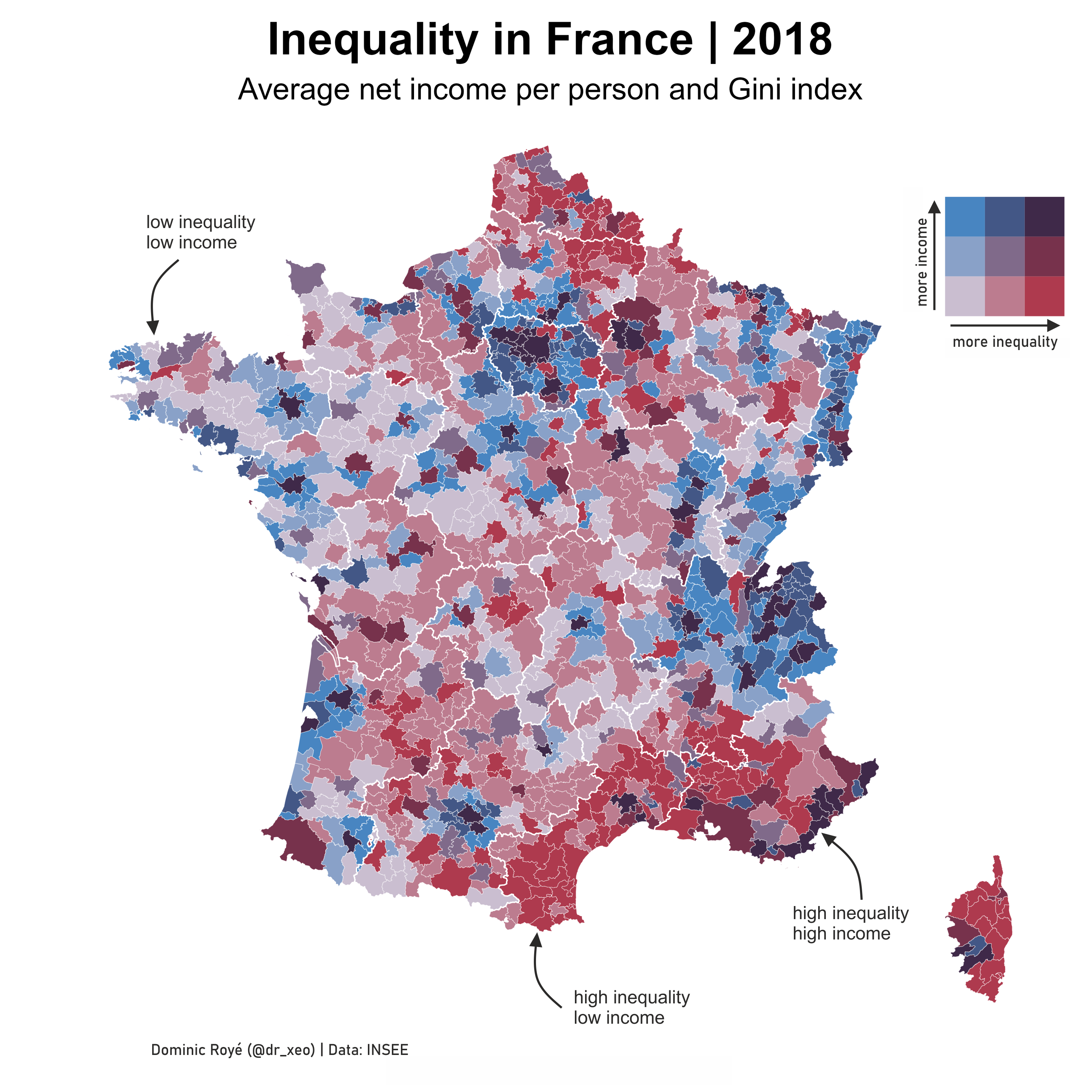
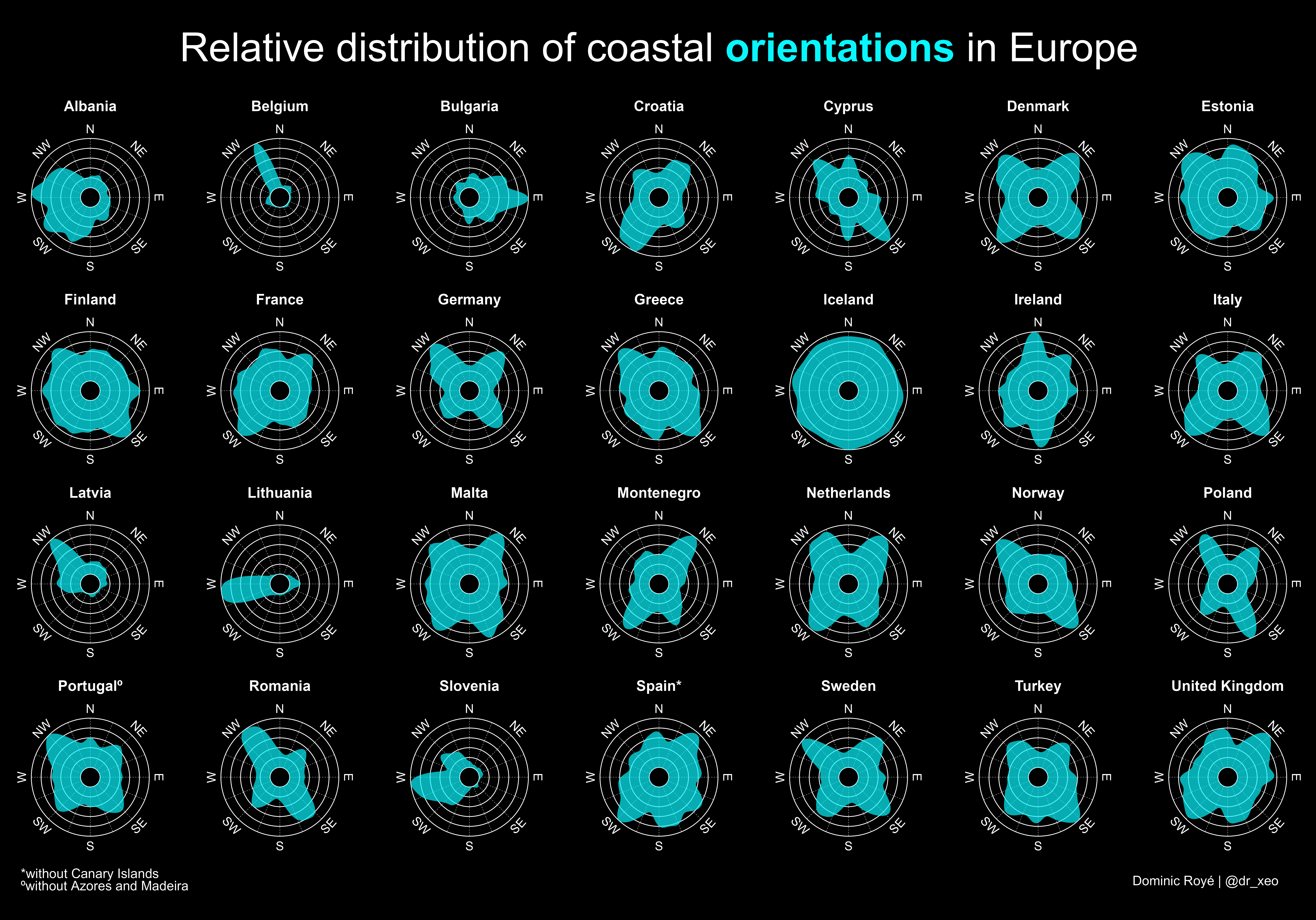
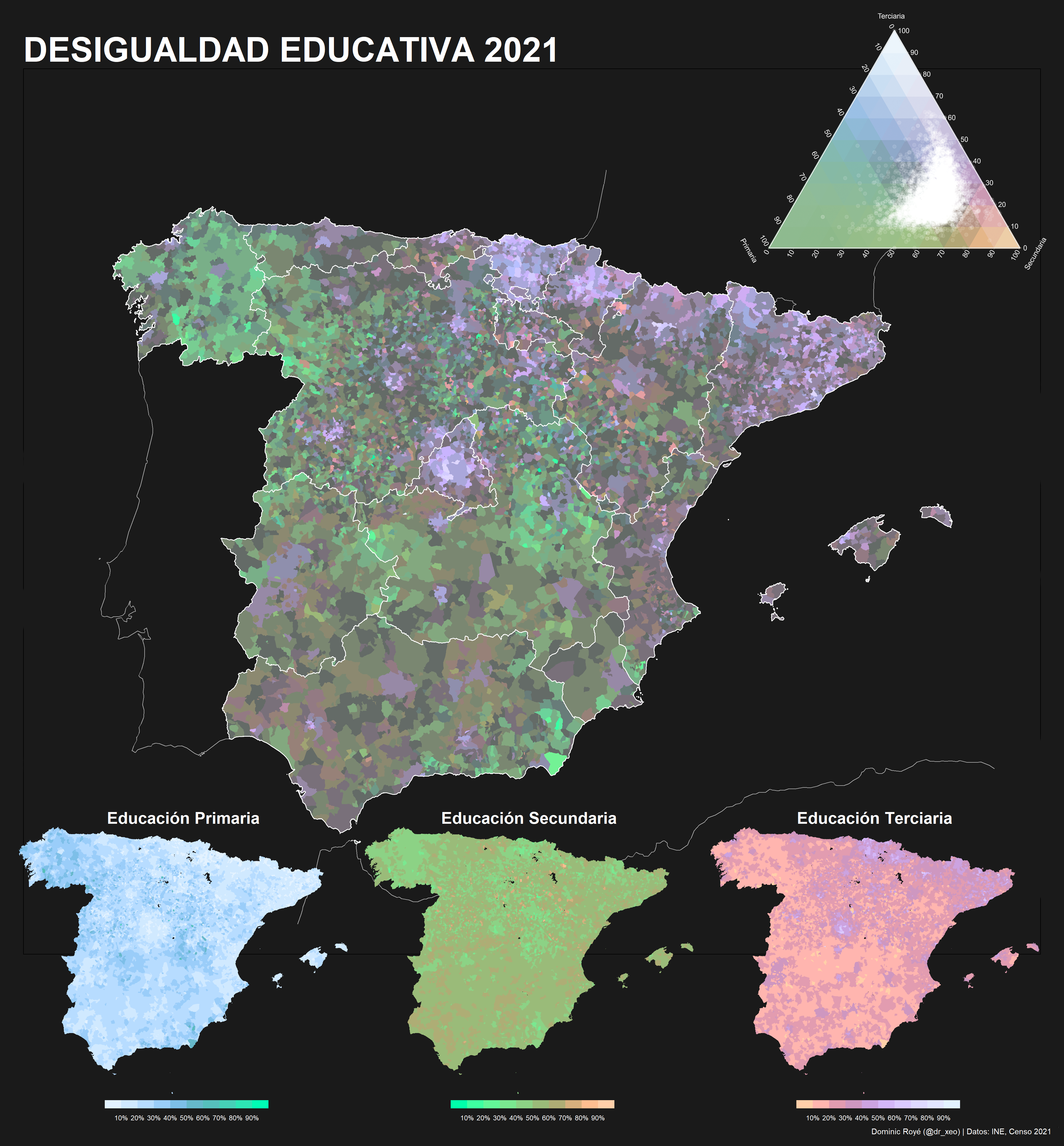
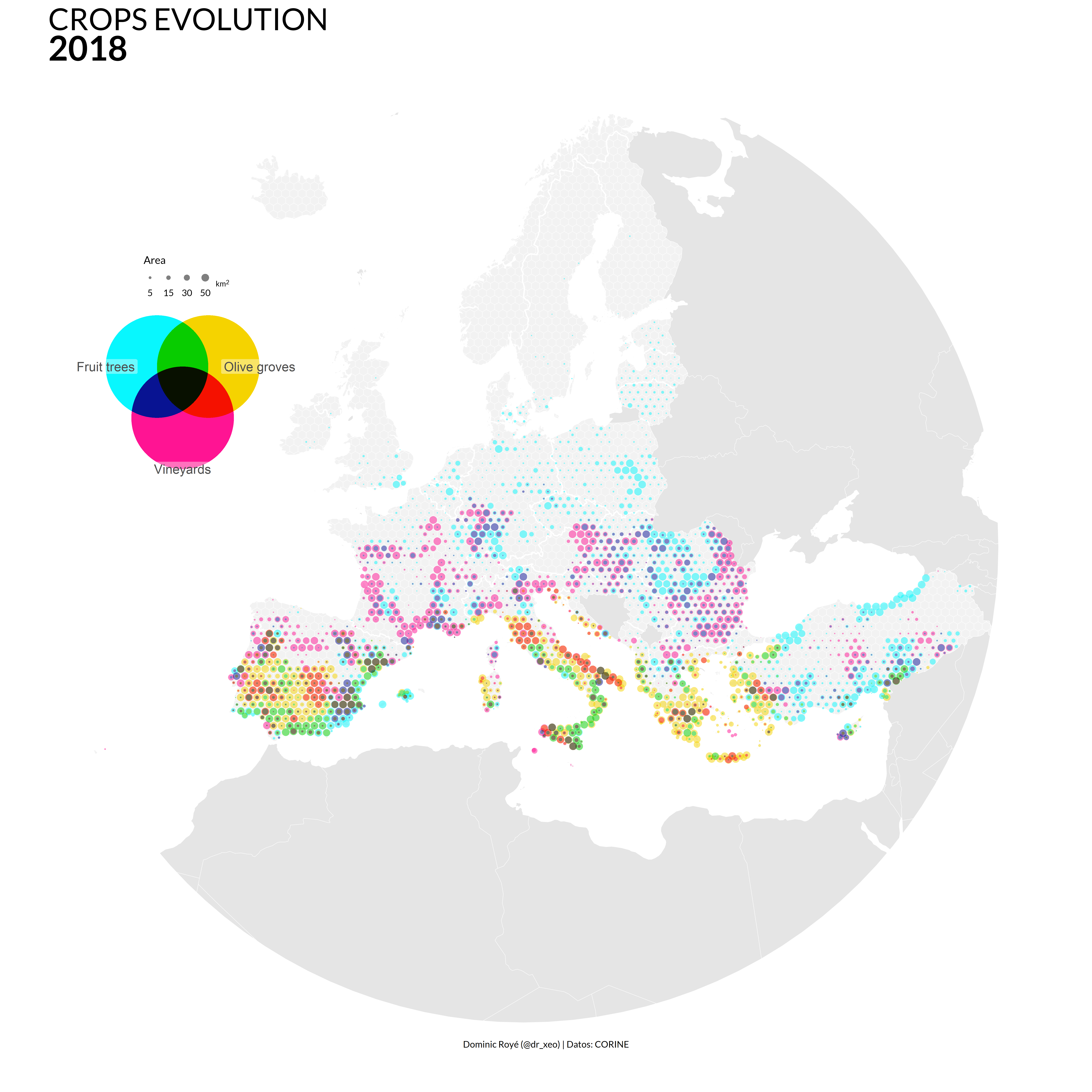
.png)


No matching items