This is a selection of charts from my recent post on a broken chart to visualize monthly temperature. Column charts are inappropriate for absolut temperature. So, what kind of good alternatives can we choose?
Package
Description
tidyverse
Collection of packages (visualization, manipulation): ggplot2, dplyr, purrr, etc.
geomtextpath
an extension of the ggplot2 package, designed to simplify the process of adding text in charts, especially when you need the text to follow a curved path
ggrepel
provides geoms for ggplot2 to repel overlapping text labels
First, we load the prepared dataset and compute the monthly average temperature across all stations. Next, we calculate the climatological normals for the reference periods 1971-2000, 1991–2020. Finally, we add additional columns for the month and label to complete the data preparation.
# load station dataload("aemet_refstations.RData")# add year-month column and calculate average temperature by month-yeartmed_esp<-mutate(data_daily, yrmo =floor_date(date, "month"))|>select(yrmo, tmed)|>group_by(yrmo)|>summarise(tmed =mean(tmed, na.rm =T))# normal reference for each month 1971-2000, 1991-2020norm_p1<-filter(tmed_esp, year(yrmo)%in%1971:2000)|>group_by(mo =month(yrmo))|>summarise( tmed_norm =mean(tmed))|>mutate(period ="1971-2000")norm_p2<-filter(tmed_esp, year(yrmo)%in%1991:2020)|>group_by(mo =month(yrmo))|>summarise( tmed_norm =mean(tmed))|>mutate(period ="1991-2020")# main dataset with month labeltmed_esp<-mutate(tmed_esp, mo =month(yrmo), mo_lab =month(yrmo, label =T))
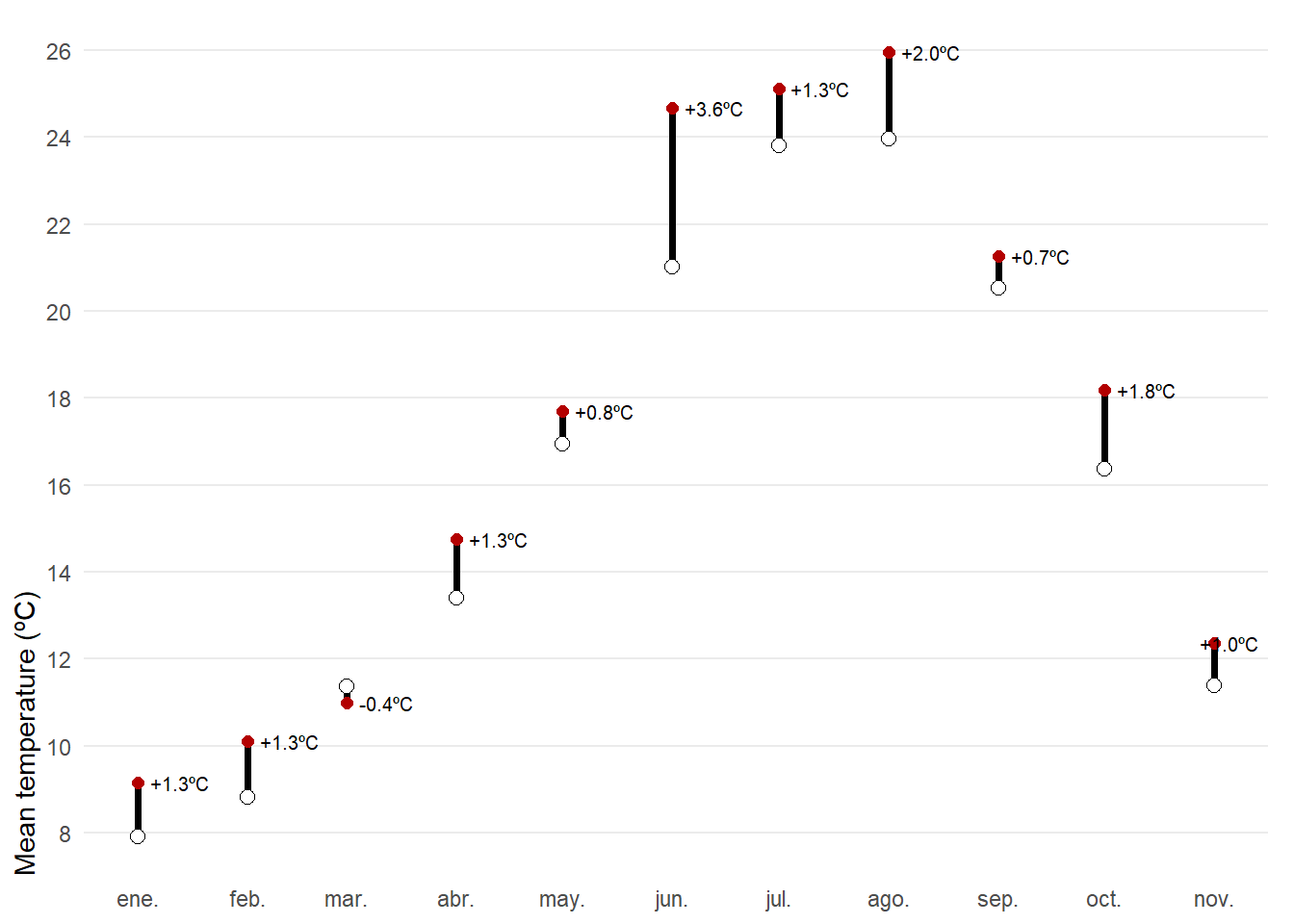
The first posibility would be a dumbbell chart. For each month of 2025, the chart shows observed mean temperature (red) against the climatological normal (white), connected by a vertical segment. A dumbbell chart is essentially a way to show the difference between two values for the same category, connected by a line. The label above each point reports the anomaly, allowing quick identification of warmer or cooler months and the magnitude of the difference. The use of geom_text_repel(), a function from the ggrepel R package that allows you to add text labels while automatically preventing overlap, ensuring that annotations remain clear and readable even when points are densely packed.
left_join(tmed_esp, norm_p2, by ="mo")|>filter(year(yrmo)==2025)|># filter only 2025mutate(anom =tmed-tmed_norm)|>ggplot(aes(yrmo, tmed))+# the connected line is first added, you need here to specify the end point geom_segment(aes(y =tmed_norm, yend =tmed), linewidth =1.3)+# observed temperature with red colorgeom_point(colour ="#b30000", size =2)+# reference temperature geom_point(aes(y =tmed_norm), shape =21, fill ="white", size =2.5)+# anomaly value for each monthgeom_text_repel(aes(label =scales::number(anom, accuracy =0.1, #formats the numeric variable suffix ="ºC", style_positive ="plus"), y =tmed), direction ="x", # prioritize repelling labels along the horizontal axis nudge_x =0.05, # fixed horizontal offset seed =12345, # deterministic label placement. size =2.7, hjust =.5)+scale_x_date(date_breaks ="month", date_labels ="%b")+scale_y_continuous(breaks =seq(8, 30, 2), expand =expansion(c(0.05, .05)))+labs(x =NULL, y ="Mean temperature (ºC)")+theme_minimal()+theme( panel.grid.minor =element_blank(), axis.ticks =element_blank(), axis.title.y =element_text(hjust =0), panel.grid.major.x =element_blank(), plot.margin =margin(5, 10, 5, 5))
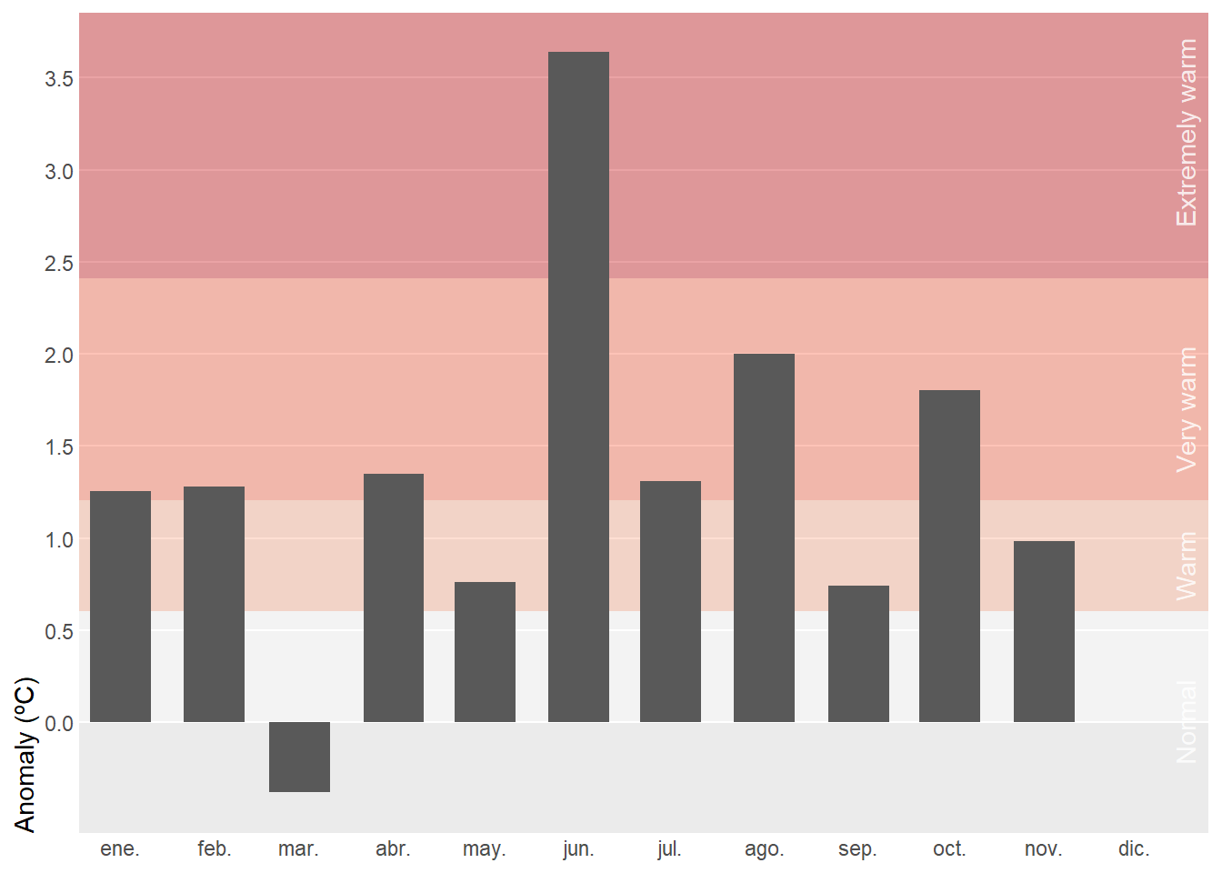
Instead of using absolut values, we can summarize monthly temperature for Spain in 2025 relative to the recent normal. Background bands mark severity thresholds at 0.5σ, 1σ, and 2σ (σ: standard deviation), computed from 1991–2020 anomalies, while bars show the actual anomaly for each month. Centering the scale at zero makes it straightforward to judge both the sign and the magnitude of departures from normal. In this case, however, using bars is appropriate because the anomalies are centered around a clear reference point at zero.
Tip
Monthly standard deviation (σ) varies greatly, so using month-specific thresholds would make the same anomaly appear “extreme” in winter but only “warm” in summer, which is confusing in a single annual chart. A single annual σ provides a consistent scale and makes comparisons across months clear.
# standard deviation for the whole yearstd_7120<-filter(tmed_esp, between(year(yrmo), 1991, 2020))|># shortcut for x >= left & x <= rightleft_join(norm_p1, by ="mo")|>summarise(std =sd(tmed-tmed_norm, na.rm =TRUE))|>pull(std)# anomaly plot left_join(tmed_esp, norm_p2, by ="mo")|>filter(year(yrmo)==2025)|># filter only current yearmutate(anom =tmed-tmed_norm)|># anomalyggplot(aes(yrmo, anom))+# background for severity thresholdsannotate("rect", xmin =-Inf, ymin =c(0, std_7120*.5, std_7120, std_7120*2), xmax =Inf, ymax =c(std_7120*.5, std_7120, std_7120*2, Inf), fill =c("white", "#fcae91", "#fb6a4a", "#cb181d"), alpha =.4)+# severity labels at right sideannotate("text", x =ymd("2025-12-01"), y =c(0, .85, 1.7, 3.2), angle =90, vjust =3, label =c("Normal", "Warm", "Very warm", "Extremely warm"), alpha =.8, color ="white")+# column for anomaliesgeom_col(width =20)+scale_x_date(date_breaks ="month", date_labels ="%b", expand =expansion(c(.01, .07)))+scale_y_continuous(breaks =seq(0, 5, .5), expand =expansion(c(0, .05)), limits =c(-std_7120*.5, NA))+labs(x =NULL, y ="Anomaly (ºC)")+theme( panel.grid.minor =element_blank(), axis.ticks =element_blank(), axis.title.y =element_text(hjust =0), panel.grid.major.x =element_blank(), panel.grid.major =element_line(colour ="white"))
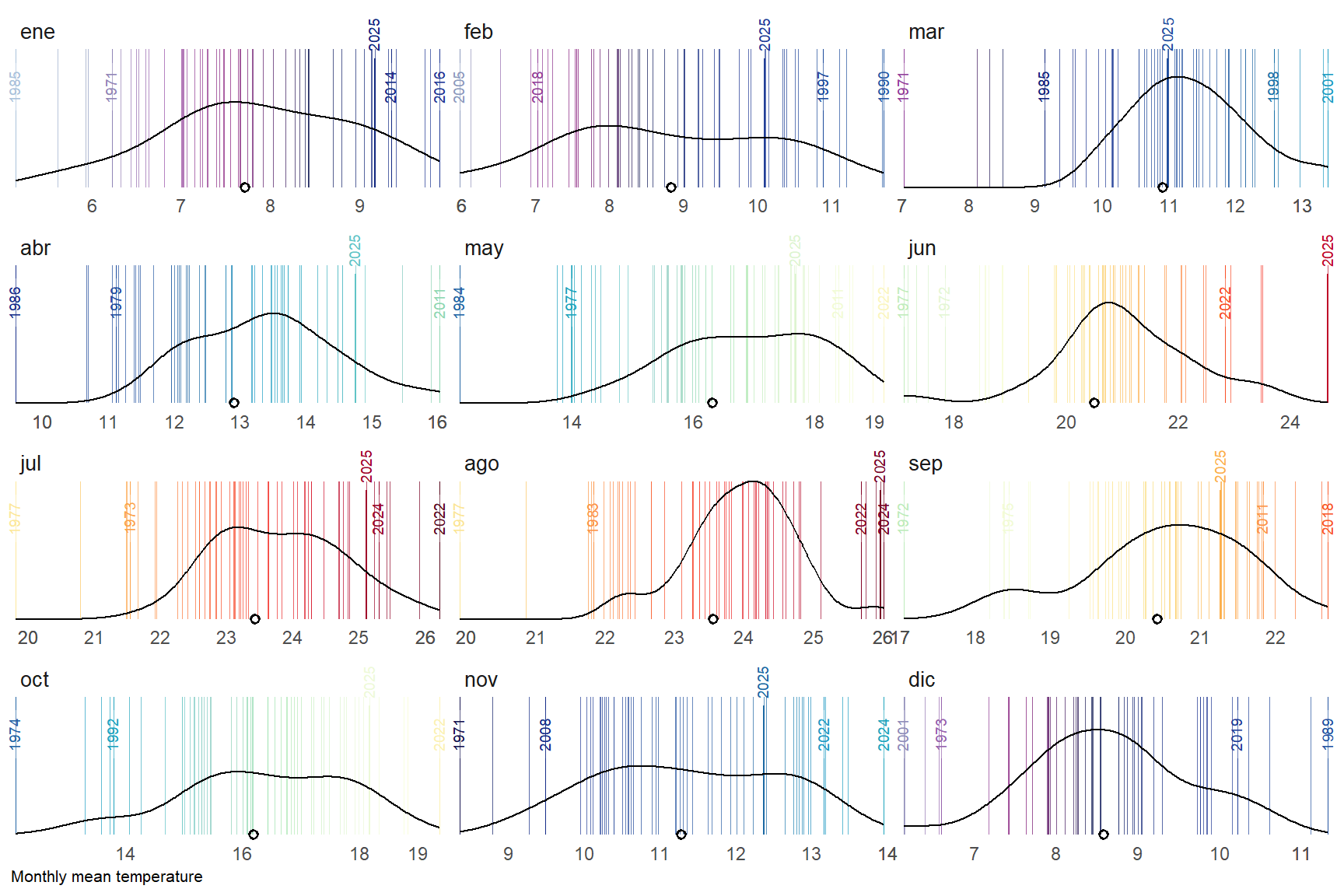
A final alternative approach could be a barcode-style chart where each thin vertical bar represents a single year within the historical record for a given month. The bars are positioned along the horizontal axis according to their monthly mean temperature, creating a visual distribution of all observed values. To highlight key information, the most extreme years—both the warmest and the coldest—are labelled, while the current year is marked with a more prominent style, such as a thicker bar. Additionally, a point indicates the long-term climatological average, allowing viewers to quickly assess how individual years compare to the historical norm. By faceting the chart by month, this design provides a compact yet detailed view of variability, extremes, and the position of the current year within the broader climate context.
For this barcode chart, we want to highlight extreme years, but at the same time they shouldn’t overlap, so we need a function that removes labels that are too close to each other. The operator { } is called curly-curly (also “embracing”). It unquotes the quosure so that a dplyr verb (like group_by(), arrange(), mutate(), filter()) can treat it exactly as if you had typed the column name directly.
# global parametersthres<-2# how close should be labels?current_yr<-2025# labeled years lowest/highest 5 by monthobs_lab<-tmed_esp|>group_by(mo_lab)|>slice_min(order_by =tmed, n =5, with_ties =FALSE)|>bind_rows(tmed_esp|>group_by(mo_lab)|>slice_max(order_by =tmed, n =5, with_ties =FALSE))|>arrange(mo_lab, yrmo)|>ungroup()# current yearobs_current<-filter(tmed_esp, year(yrmo)==current_yr)# filter function to avoid very close valuesfilter_extreme_and_current<-function(data, x, group, threshold, current_year){#1) Detect clusters of very close values.group_by(data, {{group}})|>arrange({{x}})|>mutate(cluster =cumsum(({{x}}-lag({{x}}, default =-Inf))>threshold))|>ungroup()|># 2) For each month and cluster, extract only the minimum and the maximum.group_by({{group}}, cluster)|>filter({{x}}==min({{x}})|{{x}}==max({{x}}))|>ungroup()|>select(-cluster)|># 3) Add the rows for the current year (if they exist).filter(year(yrmo)!=current_year)|># 4) Remove duplicates (in case the current year was already marked as an extreme)distinct()}# filter out labels to closeobs_lab_sel<-filter_extreme_and_current(obs_lab, tmed, mo_lab, thres, current_yr)# mean temperature by monthmed<-group_by(tmed_esp, mo_lab)|>summarise(normal =mean(tmed, na.rm =T))
In this chart, what stands out is the use of geom_textvline(), a function from the geomtextpath R package. It allows you to draw a vertical reference line and place a text label directly on that line, even when you have curved lines.
# barcode plotggplot(tmed_esp)+# barcode vertical linesgeom_vline(aes(xintercept =tmed, colour =tmed), alpha =.7, linewidth =0.1)+# selected extreme years with labelgeom_textvline( data =obs_lab_sel,aes( xintercept =tmed, label =year(yrmo), colour =tmed), linewidth =0.1, hjust =.8, size =2.5, vjust =.5)+# current year labels geom_textvline( data =obs_current,aes( xintercept =tmed, label =year(yrmo), colour =tmed), linewidth =0.4, hjust =1.3, size =2.5, vjust =.5)+# add density distribution based on reference periodgeom_density(data =filter(tmed_esp, year(yrmo)%in%1991:2020), aes(tmed))+# add average value from reference period for each monthgeom_point(data =med, aes(x =normal, y =0), shape =1, stroke =1)+scale_colour_gradientn( colours =col_temp, limits =c(4.4, 26.8), guide ="none")+scale_x_continuous( breaks =custom_breaks, expand =expansion(.01))+scale_y_continuous(expand =expansion())+labs(y =NULL, x ="Monthly mean temperature")+facet_wrap(mo_lab~., ncol =3, scale ="free_x")+coord_cartesian(clip ="off")+theme_minimal()+theme( axis.text.y =element_blank(), axis.ticks.y =element_blank(), panel.grid =element_blank(), axis.title.x =element_text(hjust =0, size =8), strip.text.x =element_text(hjust =0, size =10))