How to create 'Warming Stripes' in R
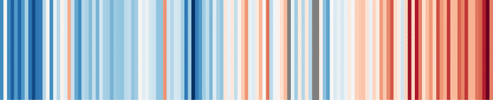
This year, the so-called warming stripes, which were created by the scientist Ed Hawkins of the University of Reading, became very famous all over the world. These graphs represent and communicate climate change in a very illustrative and effective way.
Visualising global temperature change since records began in 1850. Versions for USA, central England & Toronto available too: https://t.co/H5Hv9YgZ7v pic.twitter.com/YMzdySrr3A
— Ed Hawkins (@ed_hawkins) May 23, 2018
From his idea, I created strips for examples of Spain, like the next one in Madrid.
#Temperatura anual en #MadridRetiro desde 1920 a 2017. #CambioClimatico #dataviz #ggplot2 (idea de @ed_hawkins 🙏) @Divulgameteo @edupenabad @climayagua @ClimaGroupUB @4gotas_com pic.twitter.com/wmLb5uczpT
— Dr. Dominic Royé (@dr_xeo) June 2, 2018
In this post I will show how you can create these strips in R with the library ggplot2. Although I must say that there are many ways in R that can lead us to the same result or to a similar one, even within ggplot2.
Data
In this case we will use the annual temperatures of Lisbon GISS Surface Temperature Analysis, homogenized time series, comprising the period from 1880 to 2018. Monthly temperatures or other time series could also be used. The file can be downloaded here. First, we should, as long as we have not done it, install the collection of tidyverse libraries that also include ggplot2. In addition, we will need the library lubridate for the treatment of dates. Then, we import the data of Lisbon in csv format.
#install the lubridate and tidyverse libraries
if(!require("lubridate")) install.packages("lubridate")
if(!require("tidyverse")) install.packages("tidyverse")

#packages
library(tidyverse)
library(lubridate)
library(RColorBrewer)

#import the annual temperatures
temp_lisboa <- read_csv("temp_lisboa.csv")

str(temp_lisboa)
## spec_tbl_df [139 x 18] (S3: spec_tbl_df/tbl_df/tbl/data.frame)
## $ YEAR : num [1:139] 1880 1881 1882 1883 1884 ...
## $ JAN : num [1:139] 9.17 11.37 10.07 10.86 11.16 ...
## $ FEB : num [1:139] 12 11.8 11.9 11.5 10.6 ...
## $ MAR : num [1:139] 13.6 14.1 13.5 10.5 12.4 ...
## $ APR : num [1:139] 13.1 14.4 14 13.8 12.2 ...
## $ MAY : num [1:139] 15.7 17.3 15.6 14.6 16.4 ...
## $ JUN : num [1:139] 17 19.2 17.9 17.2 19.1 ...
## $ JUL : num [1:139] 19.1 21.8 20.3 19.5 21.4 ...
## $ AUG : num [1:139] 20.6 23.5 21 21.6 22.4 ...
## $ SEP : num [1:139] 20.7 20 18 18.8 19.5 ...
## $ OCT : num [1:139] 17.9 16.3 16.4 15.8 16.4 ...
## $ NOV : num [1:139] 12.5 14.7 13.7 13.5 12.5 ...
## $ DEC : num [1:139] 11.07 9.97 10.66 9.46 10.25 ...
## $ D-J-F : num [1:139] 10.7 11.4 10.6 11 10.4 ...
## $ M-A-M : num [1:139] 14.1 15.2 14.3 12.9 13.6 ...
## $ J-J-A : num [1:139] 18.9 21.5 19.7 19.4 20.9 ...
## $ S-O-N : num [1:139] 17 17 16 16 16.1 ...
## $ metANN: num [1:139] 15.2 16.3 15.2 14.8 15.3 ...
## - attr(*, "spec")=
## .. cols(
## .. YEAR = col_double(),
## .. JAN = col_double(),
## .. FEB = col_double(),
## .. MAR = col_double(),
## .. APR = col_double(),
## .. MAY = col_double(),
## .. JUN = col_double(),
## .. JUL = col_double(),
## .. AUG = col_double(),
## .. SEP = col_double(),
## .. OCT = col_double(),
## .. NOV = col_double(),
## .. DEC = col_double(),
## .. `D-J-F` = col_double(),
## .. `M-A-M` = col_double(),
## .. `J-J-A` = col_double(),
## .. `S-O-N` = col_double(),
## .. metANN = col_double()
## .. )
## - attr(*, "problems")=<externalptr>We see in the columns that we have monthly and seasonal values, and the annual temperature value. But before proceeding to visualize the annual temperature, we must replace the missing values 999.9 with NA, using the ifelse( ) function that evaluates a condition and perform the given argument corresponding to true and false.
#select only the annual temperature and year column
temp_lisboa_yr <- select(temp_lisboa, YEAR, metANN)

#rename the temperature column
temp_lisboa_yr <- rename(temp_lisboa_yr, ta = metANN)

#missing values 999.9
summary(temp_lisboa_yr)
## YEAR ta
## Min. :1880 Min. : 14.53
## 1st Qu.:1914 1st Qu.: 15.65
## Median :1949 Median : 16.11
## Mean :1949 Mean : 37.38
## 3rd Qu.:1984 3rd Qu.: 16.70
## Max. :2018 Max. :999.90temp_lisboa_yr <- mutate(temp_lisboa_yr, ta = ifelse(ta == 999.9, NA, ta))When we use the year as a variable, we do not usually convert it into a date object, however it is advisable. This allows us to use the date functions of the library lubridate and the support functions inside of ggplot2. The str_c( ) function of the library stringr, part of the collection of tidyverse, is similar to paste( ) of R Base that allows us to combine characters by specifying a separator (sep = “-”). The ymd( ) (year month day) function of the lubridate library converts a date character into a Date object. It is possible to combine several functions
using the pipe operator %>% that helps to chain without assigning the result to a new object. Its use is very extended especially with the library tidyverse. If you want to know more about its use, here you have a tutorial.
temp_lisboa_yr <- mutate(temp_lisboa_yr, date = str_c(YEAR, "01-01", sep = "-") %>% ymd())Creating the strips
First, we create the style of the graph, specifying all the arguments of the theme we want to adjust. We start with the default style of theme_minimal( ). In addition, we assign
the colors from RColorBrewer to an object col_srip. More information about the colors used here.
theme_strip <- theme_minimal()+
                 theme(axis.text.y = element_blank(),
                       axis.line.y = element_blank(),
                       axis.title = element_blank(),
                       panel.grid.major = element_blank(),
                       legend.title = element_blank(),
                       axis.text.x = element_text(vjust = 3),
                       panel.grid.minor = element_blank(),
                        plot.title = element_text(size = 14, face = "bold")
                       )


col_strip <- brewer.pal(11, "RdBu")

brewer.pal.info
## maxcolors category colorblind
## BrBG 11 div TRUE
## PiYG 11 div TRUE
## PRGn 11 div TRUE
## PuOr 11 div TRUE
## RdBu 11 div TRUE
## RdGy 11 div FALSE
## RdYlBu 11 div TRUE
## RdYlGn 11 div FALSE
## Spectral 11 div FALSE
## Accent 8 qual FALSE
## Dark2 8 qual TRUE
## Paired 12 qual TRUE
## Pastel1 9 qual FALSE
## Pastel2 8 qual FALSE
## Set1 9 qual FALSE
## Set2 8 qual TRUE
## Set3 12 qual FALSE
## Blues 9 seq TRUE
## BuGn 9 seq TRUE
## BuPu 9 seq TRUE
## GnBu 9 seq TRUE
## Greens 9 seq TRUE
## Greys 9 seq TRUE
## Oranges 9 seq TRUE
## OrRd 9 seq TRUE
## PuBu 9 seq TRUE
## PuBuGn 9 seq TRUE
## PuRd 9 seq TRUE
## Purples 9 seq TRUE
## RdPu 9 seq TRUE
## Reds 9 seq TRUE
## YlGn 9 seq TRUE
## YlGnBu 9 seq TRUE
## YlOrBr 9 seq TRUE
## YlOrRd 9 seq TRUEFor the final graphic we use the geometry geom_tile( ). Since the data does not have a specific value for the Y axis, we need a dummy value, here I used 1. Also, I adjust the width of the color bar in the legend.
     ggplot(temp_lisboa_yr,
             aes(x = date, y = 1, fill = ta))+
        geom_tile()+
           scale_x_date(date_breaks = "6 years",
                     date_labels = "%Y",
                     expand = c(0, 0))+
           scale_y_continuous(expand = c(0, 0))+
           scale_fill_gradientn(colors = rev(col_strip))+
             guides(fill = guide_colorbar(barwidth = 1))+
            labs(title = "LISBOA 1880-2018",
                caption = "Datos: GISS Surface Temperature Analysis")+
              theme_strip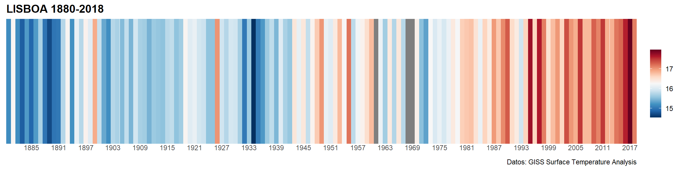
In case we want to get only the strips, we can use theme_void( ) and the argument show.legend = FALSE in geom_tile( ) to remove all style elements. We can also change the color for the NA values, including the argument na.value = “gray70” in the scale_fill_gradientn( ) function.
     ggplot(temp_lisboa_yr,
             aes(x = date, y = 1, fill = ta))+
        geom_tile(show.legend = FALSE)+
           scale_x_date(date_breaks = "6 years",
                     date_labels = "%Y",
                     expand = c(0, 0))+
           scale_y_discrete(expand = c(0, 0))+
           scale_fill_gradientn(colors = rev(col_strip))+
             theme_void()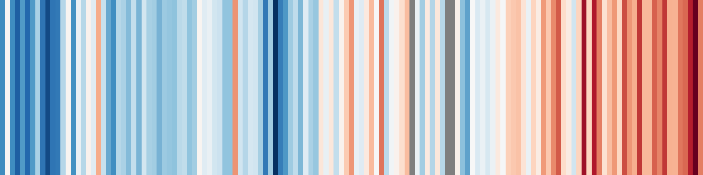
![]()