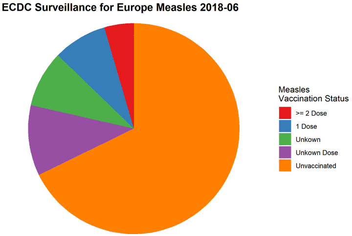
the pie chart
Welcome to my blog! I am Dominic Royé, researcher and lecturer of physical geography at the University of Santiago de Compostela. One of my passions is R programming to visualize and analyze any type of data. Hence, my idea of this blog has its origin in my datavis publications I have been cooking in the last year on Twitter on different topics describing the world. In addition, I would like to take advantage of the blog and publish short introductions and explanation on data visualization, management and manipulation in R. I hope you like it. Any suggestion or ideas are welcomed.
Background
I have always wanted to write about the use of the pie chart. The pie chart is widely used in research, teaching, journalism or technical reports. I do not know if it is due to Excel, but even worse than the pie chart itself, is its 3D version (the same for the bar chart). About the 3D versions, I only want to say that they are not recommended, since in these cases the third dimension does not contain any information and therefore it does not help to correctly read the information of the graphic. Regarding the pie chart, among many experts its use is not advised. But why?
Already in a study conducted by Simkin (1987) they found that the interpretation and processing of angles is more difficult than that of linear forms. Mostly it is easier to read a bar chart than a pie chart. A problem that becomes very visible when we have; 1) too many categories 2) few differences between categories 3) a misuse of colors as legend or 4) comparisons between various pie charts.
In general, to decide what possible graphic representations exist for our data, I recommend using the website www.data-to-viz.com or the Financial Times Visual Vocabulary.

Well, now what alternative ways can we use in R?
Alternatives to the pie chart
The dataset we will use about the vaccination status of measles correspond to June 2018 in Europe and come from the ECDC.
#packages
library(tidyverse)
library(scales)
library(RColorBrewer)

#data
measles <- data.frame(
          vacc_status=c("Unvaccinated","1 Dose",
                        ">= 2 Dose","Unkown Dose","Unkown"),
          prop=c(0.75,0.091,0.05,0.012,0.096)
          )

#we order from the highest to the lowest and fix it with a factor

measles <- arrange(measles,
                   desc(prop))%>%
mutate(vacc_status=factor(vacc_status,vacc_status))| vacc_status | prop |
|---|---|
| Unvaccinated | 0.750 |
| Unkown | 0.096 |
| 1 Dose | 0.091 |
| >= 2 Dose | 0.050 |
| Unkown Dose | 0.012 |
Bar plot or similar
ggplot(measles,aes(vacc_status,prop))+
            geom_bar(stat="identity")+
             scale_y_continuous(breaks=seq(0,1,.1),
                                labels=percent,    #convert to %
                                limits=c(0,1))+
            labs(x="",y="")+
            theme_minimal()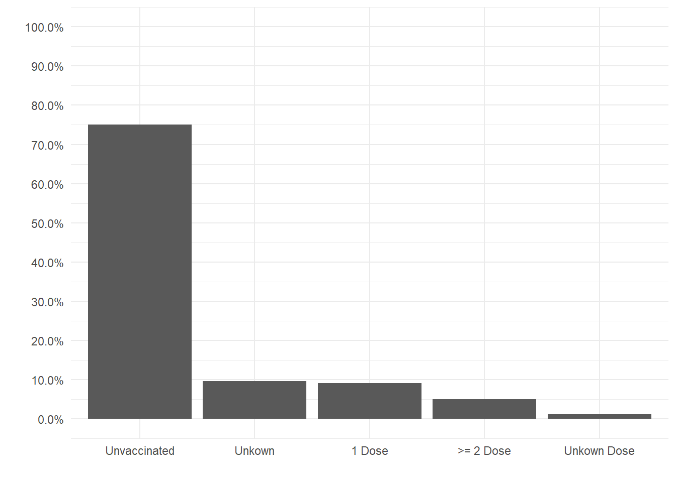
ggplot(measles,aes(x=vacc_status,prop,ymin=0,ymax=prop))+
            geom_pointrange()+
             scale_y_continuous(breaks=seq(0,1,.1),
                                labels=percent,    #convert to %
                                limits=c(0,1))+
            labs(x="",y="")+
            theme_minimal()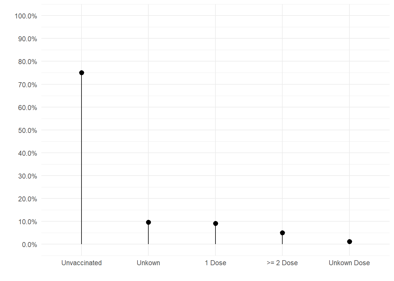
#custom themes definitions
theme_singlebar <- theme_bw()+
  theme(
    legend.position = "bottom",
    axis.title = element_blank(),
    axis.ticks.y = element_blank(),
    axis.text.y = element_blank(),
    panel.border = element_blank(),
    panel.grid=element_blank(),
    plot.title=element_text(size=14, face="bold")
  )

#plot
mutate(measles,
       vacc_status=factor(vacc_status,               #we change the order of the categories
                          rev(levels(vacc_status))))%>%
ggplot(aes(1,prop,fill=vacc_status))+  #we put 1 in x to create a single bar
         geom_bar(stat="identity")+
          scale_y_continuous(breaks=seq(0,1,.1),
                             labels=percent,
                             limits=c(0,1),
                             expand=c(.01,.01))+
          scale_x_continuous(expand=c(0,0))+
              scale_fill_brewer("",palette="Set1")+
                coord_flip()+
                  theme_singlebar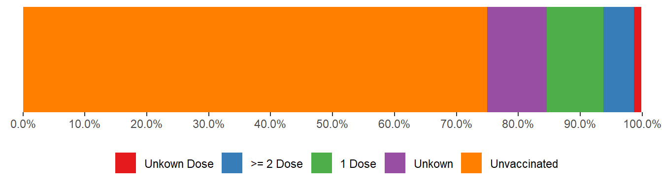
#we expand our data with numbers from Italy
measles2 <- mutate(measles,
                  italy=c(0.826,0.081,0.053,0.013,0.027),
                  vacc_status=factor(vacc_status,rev(levels(vacc_status))))%>%
                rename(europe="prop")%>%
                gather(region,prop,europe:italy)

#plot
ggplot(measles2,aes(region,prop,fill=vacc_status))+
            geom_bar(stat="identity",position="stack")+ #stack bar
             scale_y_continuous(breaks=seq(0,1,.1),
                                labels=percent,    #convert to %
                                limits=c(0,1),
                                expand=c(0,0))+
            scale_fill_brewer(palette = "Set1")+
            labs(x="",y="",fill="Vaccination Status")+
            theme_minimal()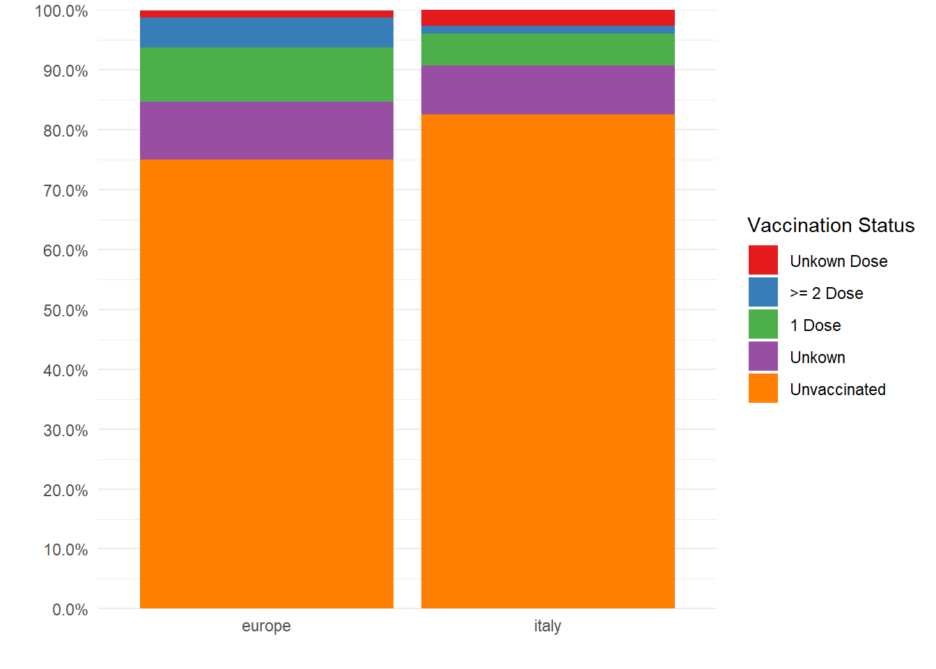
Waffle plot
#package
library(waffle)

#the waffle function uses a vector with names
val_measles <- round(measles$prop*100)
names(val_measles) <- measles$vacc_status

#plot
waffle(val_measles, #data
        colors=brewer.pal(5,"Set1"), #colors
rows=5) #row number 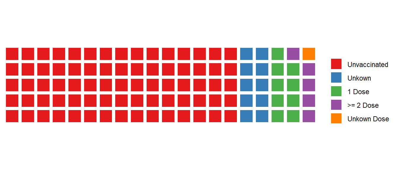
The Waffle chart seems very interesting to me when we want to show a proportion of an individual category.
#data
medida <- c(41,59) #data from the OECD 2015
names(medida) <- c("Estudios Superiores","Otros estudios")

#plot
waffle(medida,
       colors=c("#377eb8","#bdbdbd"),
       rows=5)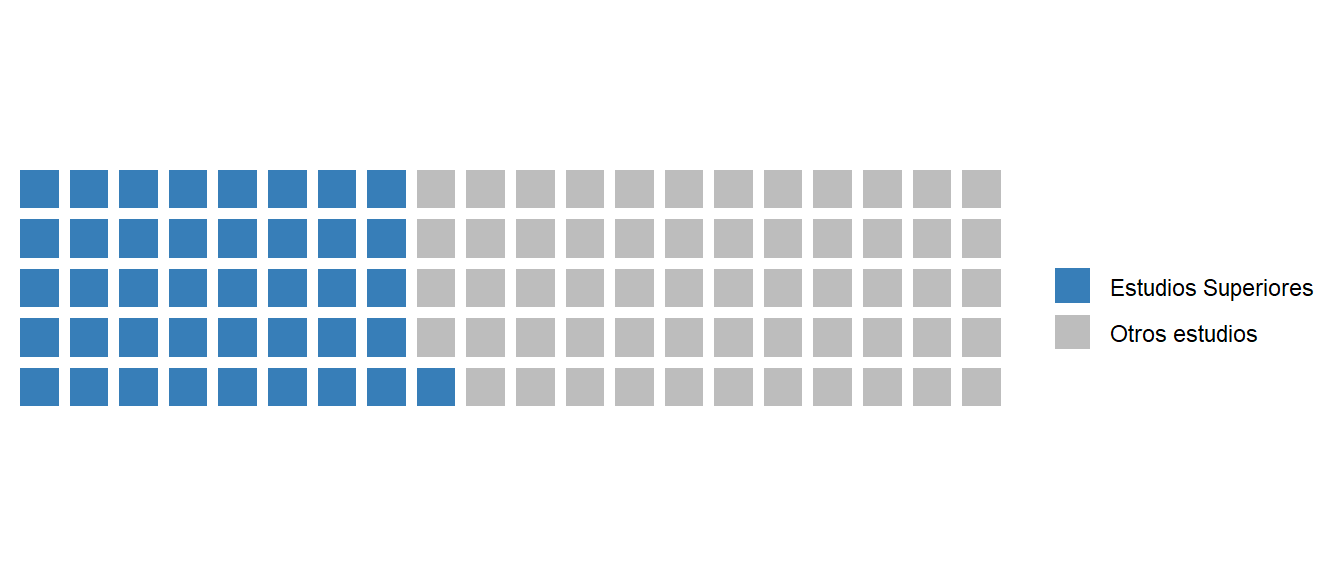
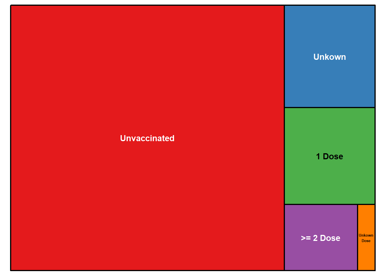
Treemap
#package
library(treemap)

#plot
treemap(measles,
index="vacc_status", #variable with categories
vSize="prop",        #values
type="index",        #style more in ?treemap
title="",
palette = brewer.pal(5,"Set1") #colors
)
Personally, I think that all types of graphic representations have their advantages and disadvantages. However, we currently have a huge variety of alternatives to avoid using the pie chart. If you still want to make a pie chart, which I would not rule out either, I recommend following certain rules, which you can find very well summarized in a recent post by Lisa Charlotte Rost. For example, you should order from the highest to the lowest unless there is a natural order or use a maximum of five categories. Finally, I leave you a link to a cheat sheet from policyviz with basic rules of data visualization. A good reference on graphics using different programs from Excel to R can be found in the book Creating More Effective Graphs (Robbins 2013).