Visualize monthly precipitation anomalies
Normally when we visualize monthly precipitation anomalies, we simply use a bar graph indicating negative and positive values with red and blue. However, it does not explain the general context of these anomalies. For example, what was the highest or lowest anomaly in each month? In principle, we could use a boxplot to visualize the distribution of the anomalies, but in this particular case they would not fit aesthetically, so we should look for an alternative. Here I present a very useful graphic form.
Packages
In this post we will use the following packages:
| Package | Description |
|---|---|
| tidyverse | Collection of packages (visualization, manipulation): ggplot2, dplyr, purrr, etc. |
| readr | Import data |
| ggthemes | Themes for ggplot2 |
| lubridate | Easy manipulation of dates and times |
| cowplot | Easy creation of multiple graphics with ggplot2 |
#we install the packages if necessary
if(!require("tidyverse")) install.packages("tidyverse")
if(!require("ggthemes")) install.packages("broom")
if(!require("cowplot")) install.packages("cowplot")
if(!require("lubridate")) install.packages("lubridate")

#packages
library(tidyverse) #include readr
library(ggthemes)
library(cowplot)
library(lubridate)
Preparing the data
First we import the daily precipitation of the selected weather station (download). We will use data from Santiago de Compostela (Spain) accessible through ECA&D.
Step 1: import the data
We not only import the data in csv format, but we also make the first changes. We skip the first 21 rows that contain information about the weather station. In addition, we convert the date to the date class and replace missing values (-9999) with NA. The precipitation is given in 0.1 mm, therefore, we must divide the values by 10. Then we select the columns DATE and RR, and rename them.
data <- read_csv("RR_STAID001394.txt", skip = 21) %>%
             mutate(DATE = ymd(DATE), RR = ifelse(RR == -9999, NA, RR/10)) %>%
               select(DATE:RR) %>%
             rename(date = DATE, pr = RR)
## Rows: 27606 Columns: 5
## -- Column specification --------------------------------------------------------
## Delimiter: ","
## dbl (5): STAID, SOUID, DATE, RR, Q_RR
##
## i Use `spec()` to retrieve the full column specification for this data.
## i Specify the column types or set `show_col_types = FALSE` to quiet this message.data## # A tibble: 27,606 x 2
## date pr
## <date> <dbl>
## 1 1943-11-01 0.6
## 2 1943-11-02 0
## 3 1943-11-03 0
## 4 1943-11-04 0
## 5 1943-11-05 0
## 6 1943-11-06 0
## 7 1943-11-07 0
## 8 1943-11-08 0
## 9 1943-11-09 0
## 10 1943-11-10 0
## # ... with 27,596 more rowsStep 2: creating monthly values
In the second step we calculate the monthly amounts of precipitation. To do this, a) we limit the period to the years after 1950, b) we add the month with its labels and the year as variables.
data <- mutate(data, mo = month(date, label = TRUE), yr = year(date)) %>%
            filter(date >= "1950-01-01") %>%
                group_by(yr, mo) %>%
                   summarise(prs = sum(pr, na.rm = TRUE))
## `summarise()` has grouped output by 'yr'. You can override using the `.groups`
## argument.data## # A tibble: 833 x 3
## # Groups: yr [70]
## yr mo prs
## <dbl> <ord> <dbl>
## 1 1950 Jan 55.6
## 2 1950 Feb 349.
## 3 1950 Mar 85.8
## 4 1950 Apr 33.4
## 5 1950 May 272.
## 6 1950 Jun 111.
## 7 1950 Jul 35.4
## 8 1950 Aug 76.4
## 9 1950 Sep 85
## 10 1950 Oct 53
## # ... with 823 more rowsStep 3: estimating anomalies
Now we must estimate the normals of each month and join this table to our main data in order to calculate the monthly anomaly. We express the anomalies in percentage and subtract 100 to set the average to 0. In addition, we create a variable which indicates if the anomaly is negative or positive, and another with the date.
pr_ref <- filter(data, yr > 1981, yr <= 2010) %>%
                   group_by(mo) %>%
                      summarise(pr_ref = mean(prs))

data <- left_join(data, pr_ref, by = "mo")

data <- mutate(data,
               anom = (prs*100/pr_ref)-100,
               date = str_c(yr, as.numeric(mo), 1, sep = "-") %>% ymd(),
               sign= ifelse(anom > 0, "pos", "neg") %>% factor(c("pos", "neg")))
We can do a first test graph of anomalies (the classic one), for that we filter the year 2018. In this case we use a bar graph, remember that by default the function geom_bar() applies the counting of the variable. However, in this case we know y, hence we indicate with the argument stat = "identity" that it should use the given value in aes().
filter(data, yr == 2018) %>%
   ggplot(aes(date, anom, fill = sign)) +
       geom_bar(stat = "identity", show.legend = FALSE) +
    scale_x_date(date_breaks = "month", date_labels = "%b") +
    scale_y_continuous(breaks = seq(-100, 100, 20)) +
    scale_fill_manual(values = c("#99000d", "#034e7b")) +
         labs(y = "Precipitation anomaly (%)", x = "") +
          theme_hc()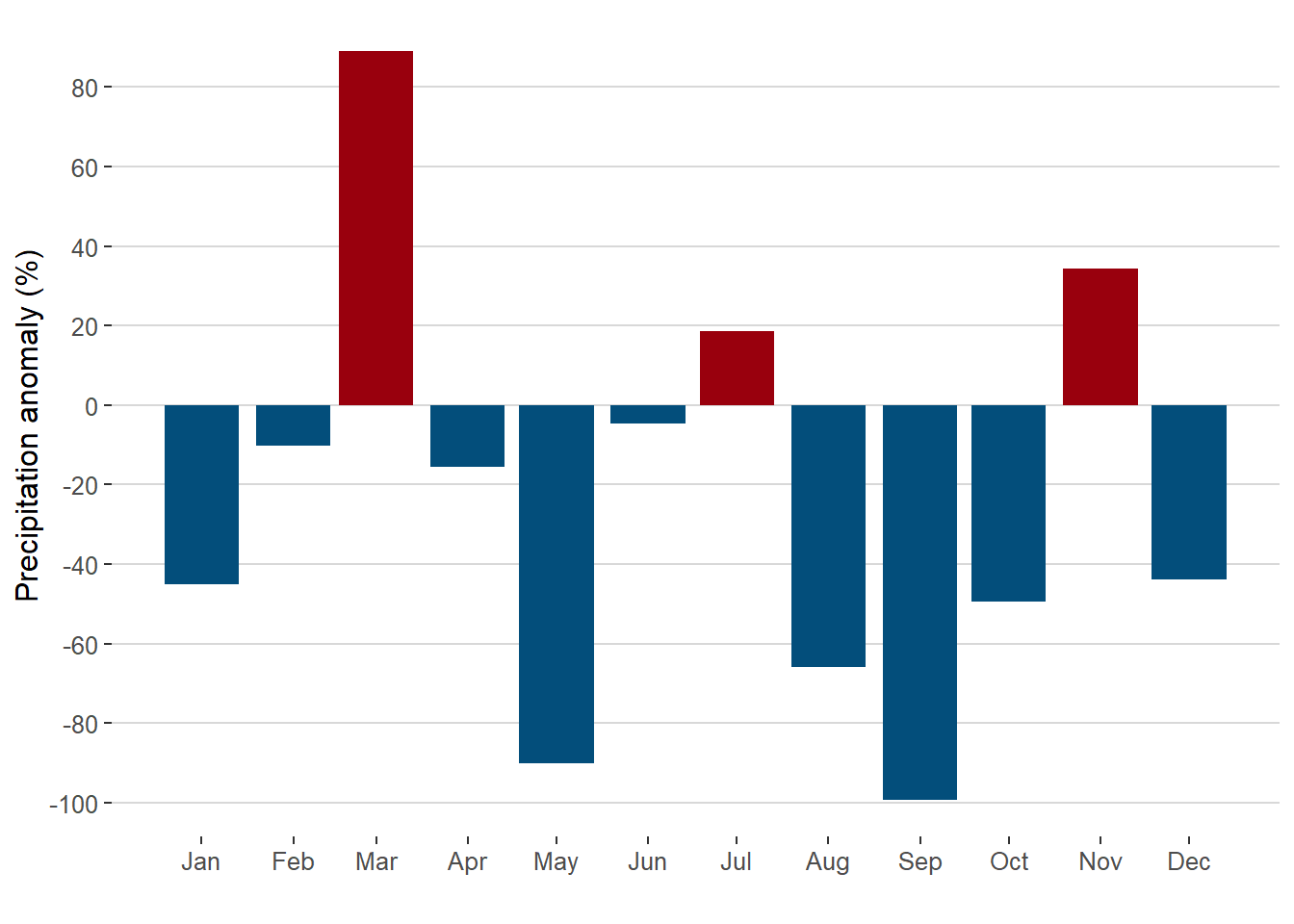
Step 4: calculating the statistical metrics
In this last step we estimate the maximum, minimum value, the 25%/75% quantiles and the interquartile range per month of the entire time series.
data_norm <-     group_by(data, mo) %>%
                     summarise(mx = max(anom),
                               min = min(anom),
                               q25 = quantile(anom, .25),
                               q75 = quantile(anom, .75),
                               iqr = q75-q25)
data_norm
## # A tibble: 12 x 6
## mo mx min q25 q75 iqr
## <ord> <dbl> <dbl> <dbl> <dbl> <dbl>
## 1 Jan 193. -89.6 -43.6 56.3 99.9
## 2 Feb 320. -96.5 -51.2 77.7 129.
## 3 Mar 381. -100 -40.6 88.2 129.
## 4 Apr 198. -93.6 -51.2 17.1 68.3
## 5 May 141. -90.1 -45.2 17.0 62.2
## 6 Jun 419. -99.3 -58.2 50.0 108.
## 7 Jul 311. -98.2 -77.3 27.1 104.
## 8 Aug 264. -100 -68.2 39.8 108.
## 9 Sep 241. -99.2 -64.9 48.6 113.
## 10 Oct 220. -99.0 -54.5 4.69 59.2
## 11 Nov 137. -98.8 -44.0 39.7 83.7
## 12 Dec 245. -91.8 -49.8 36.0 85.8Creating the graph
To create the anomaly graph with legend it is necessary to separate the main graph from the legends.
Part 1
In this first part we are adding layer by layer the different elements: 1) the range of anomalies maximum-minimum 2) the interquartile range and 3) the anomalies of the year 2018.
#range of anomalies maximum-minimum
g1.1 <- ggplot(data_norm)+
           geom_crossbar(aes(x = mo, y = 0, ymin = min, ymax = mx),
                        fatten = 0, fill = "grey90", colour = "NA")

g1.1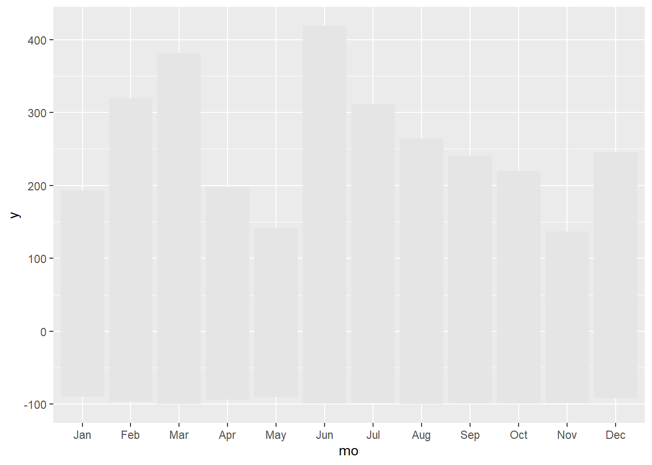
#adding interquartile range
g1.2 <- g1.1 + geom_crossbar(aes(x = mo, y = 0, ymin = q25, ymax = q75),
                              fatten = 0, fill = "grey70")

g1.2
#adding anomalies of the year 2018

g1.3 <- g1.2 + geom_crossbar(data = filter(data, yr == 2018),
                aes(x = mo, y = 0, ymin = 0, ymax = anom, fill = sign),
                fatten = 0, width = 0.7, alpha = .7, colour = "NA",
                show.legend = FALSE)
g1.3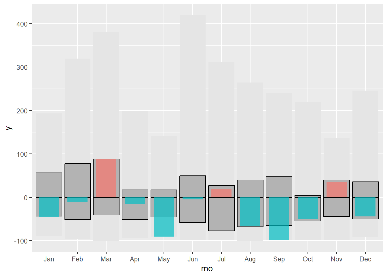
Finally we change some last style settings.
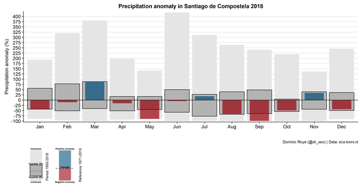
g1 <- g1.3 + geom_hline(yintercept = 0)+
               scale_fill_manual(values=c("#99000d","#034e7b"))+
               scale_y_continuous("Precipitation anomaly (%)",
                                   breaks = seq(-100, 500, 25),
                                   expand = c(0, 5))+
            labs(x = "",
                 title = "Precipitation anomaly in Santiago de Compostela 2018",
                 caption="Dominic Royé (@dr_xeo) | Data: eca.knmi.nl")+
            theme_hc()
g1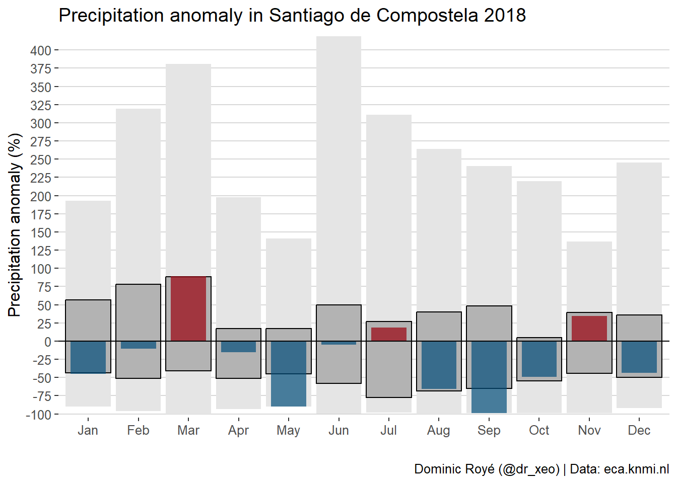
Part 2
We still need a legend. First we create it for the normals.
#legend data
legend <- filter(data_norm, mo == "Jan")

legend_lab <- gather(legend, stat, y, mx:q75) %>%
                 mutate(stat = factor(stat, stat, c("maximum",
                                                   "minimum",
                                                   "Quantile 25%",
                                                   "Quantile 75%")) %>%
                                            as.character())
## Warning: attributes are not identical across measure variables;
## they will be dropped#legend graph
g2 <- legend %>% ggplot()+
geom_crossbar(aes(x = mo, y = 0, ymin = min, ymax = mx),
fatten = 0, fill = "grey90", colour = "NA", width = 0.2) +
geom_crossbar(aes(x = mo, y = 0, ymin = q25, ymax = q75),
fatten = 0, fill = "grey70", width = 0.2) +
geom_text(data = legend_lab,
aes(x = mo, y = y+c(12,-8,-10,12), label = stat),
fontface = "bold", size = 2) +
annotate("text", x = 1.18, y = 40,
label = "Period 1950-2018", angle = 90, size = 3) +
theme_void() +
theme(plot.margin = unit(c(0, 0, 0, 0), "cm"))
g2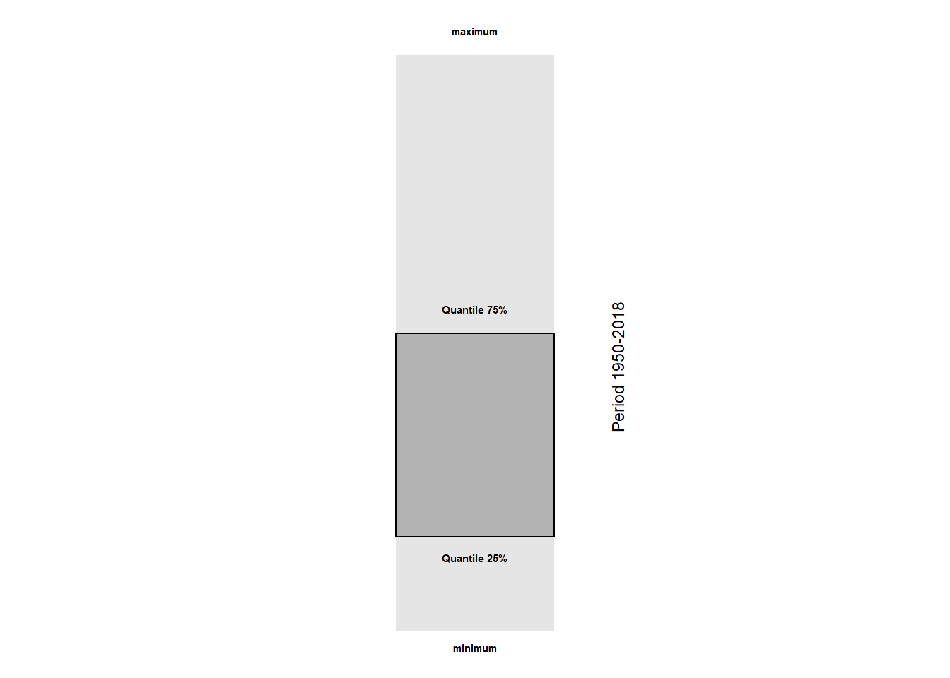
Second, we create another legend for the current anomalies.
#legend data
legend2 <- filter(data, yr == 1950, mo %in% c("Jan","Feb")) %>%
              ungroup() %>%
            select(mo, anom, sign)

legend2[2,1] <- "Jan"

legend_lab2 <- data.frame(mo = rep("Jan", 3),
                          anom= c(110, 3, -70),
                          label = c("Positive anomaly", "Average", "Negative anomaly"))

#legend graph
g3 <-  ggplot() +
         geom_bar(data = legend2,
                aes(x = mo, y = anom, fill = sign),
                   alpha = .6, colour = "NA", stat = "identity", show.legend = FALSE, width = 0.2) +
         geom_segment(aes(x = .85, y = 0, xend = 1.15, yend = 0), linetype = "dashed") +
         geom_text(data = legend_lab2,
                   aes(x = mo, y = anom+c(10,5,-13), label = label),
                   fontface = "bold", size = 2) +
         annotate("text", x = 1.25, y = 20,
                  label ="Reference 1971-2010", angle = 90, size = 3) +
         scale_fill_manual(values = c("#99000d", "#034e7b")) +
        theme_void() +
         theme(plot.margin = unit(c(0, 0, 0, 0), "cm"))

g3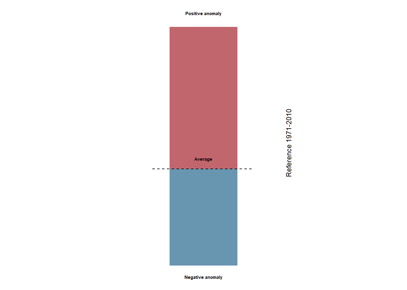
Part 3
Finally, we only have to join the graph and the legends with the help of the cowplot package. The main function of cowplot is plot_grid() which is used for combining different graphs. However, in this case it is necessary to use more flexible functions to create less common formats. The ggdraw() function configures the basic layer of the graph, and the functions that are intended to operate on this layer start with draw_*.
p <- ggdraw() +
       draw_plot(g1, x = 0, y = .3, width = 1, height = 0.6) +
       draw_plot(g2, x = 0, y = .15, width = .2, height = .15) +
       draw_plot(g3, x = 0.08, y = .15, width = .2, height = .15)

p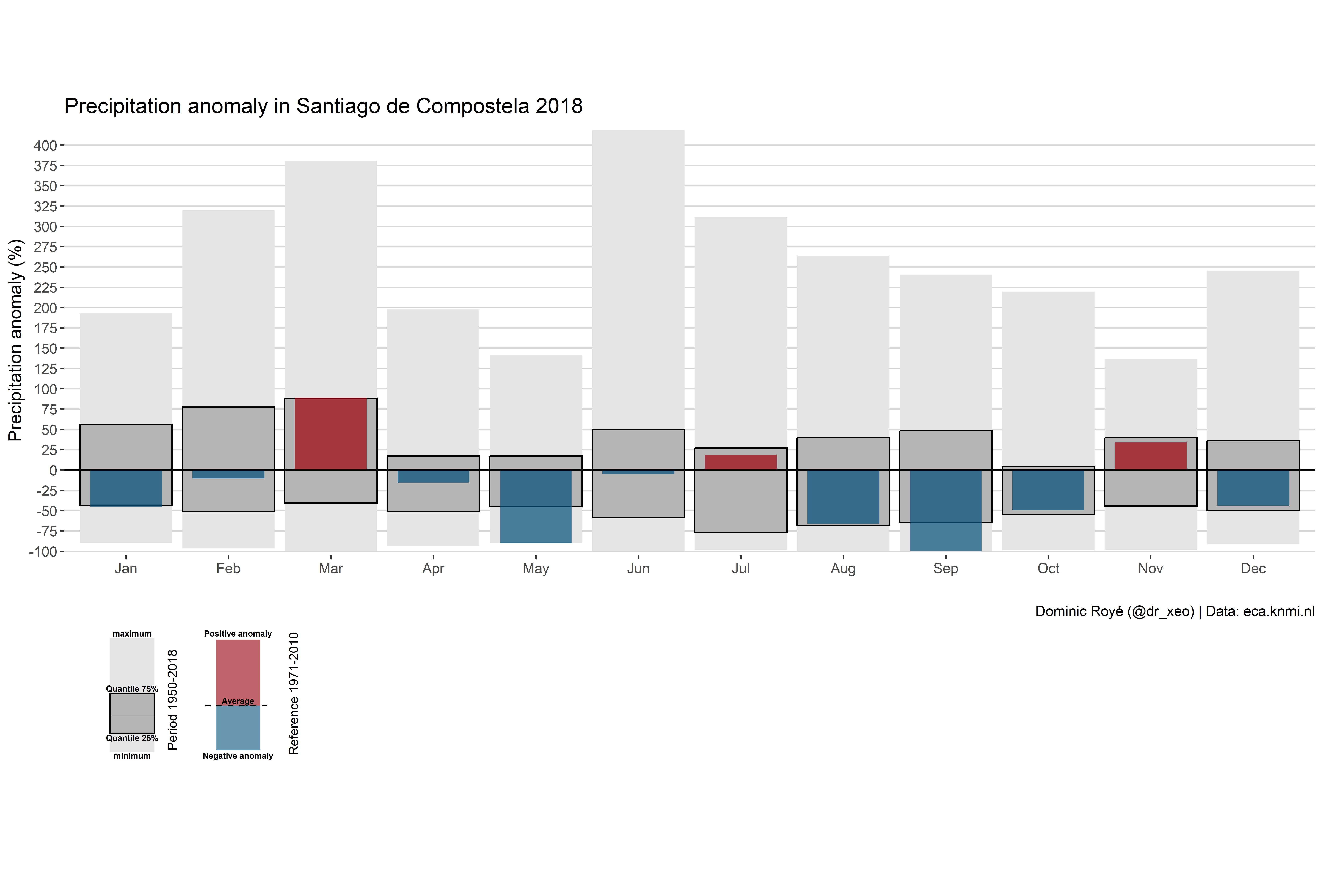
save_plot("pr_anomaly2016_scq.png", p, dpi = 300, base_width = 12.43, base_height = 8.42)Multiple facets
In this section we will make the same graph as in the previous one, but for several years.
Part 1
First we need to filter again by set of years, in this case from 2016 to 2018, using the operator %in%, we also add the function facet_grid() to ggplot, which allows us to plot the graph according to a variable. The formula used for the facet function is similar to the use in models: variable_by_row ~ variable_by_column. When we do not have a variable in the column, we should use the ..
#range of anomalies maximum-minimum
g1.1 <- ggplot(data_norm)+
           geom_crossbar(aes(x = mo, y = 0, ymin = min, ymax = mx),
                        fatten = 0, fill = "grey90", colour = "NA")

g1.1
#adding the interquartile range
g1.2 <- g1.1 + geom_crossbar(aes(x = mo, y = 0, ymin = q25, ymax = q75),
                              fatten = 0, fill = "grey70")

g1.2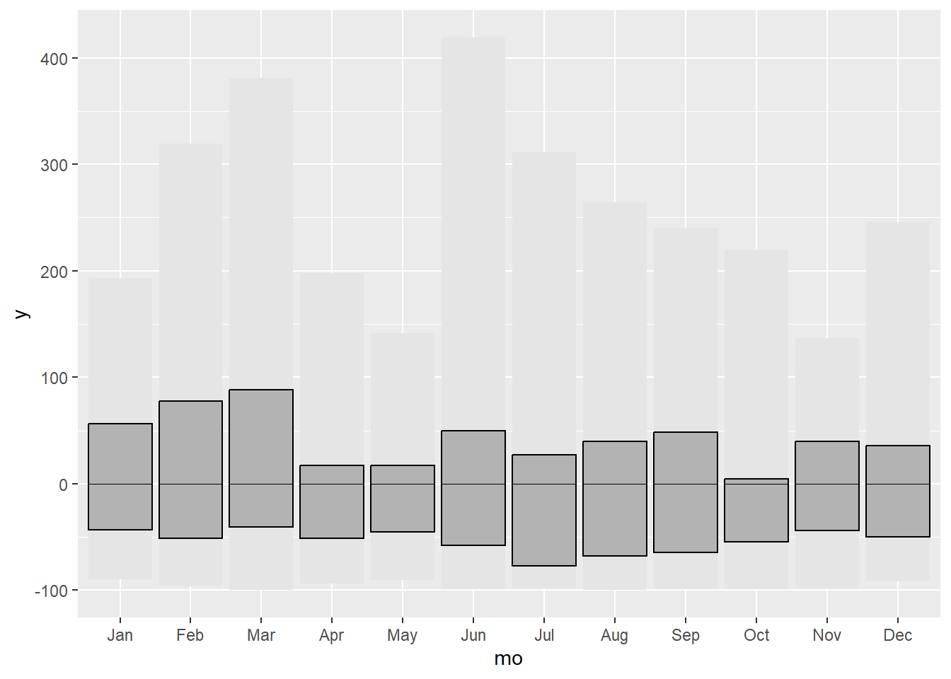
#adding the anomalies of the year 2016-2018

g1.3 <- g1.2 + geom_crossbar(data = filter(data, yr %in% 2016:2018),
                aes(x = mo, y = 0, ymin = 0, ymax = anom, fill = sign),
                fatten = 0, width = 0.7, alpha = .7, colour = "NA",
                show.legend = FALSE) +
               facet_grid(yr ~ .)
g1.3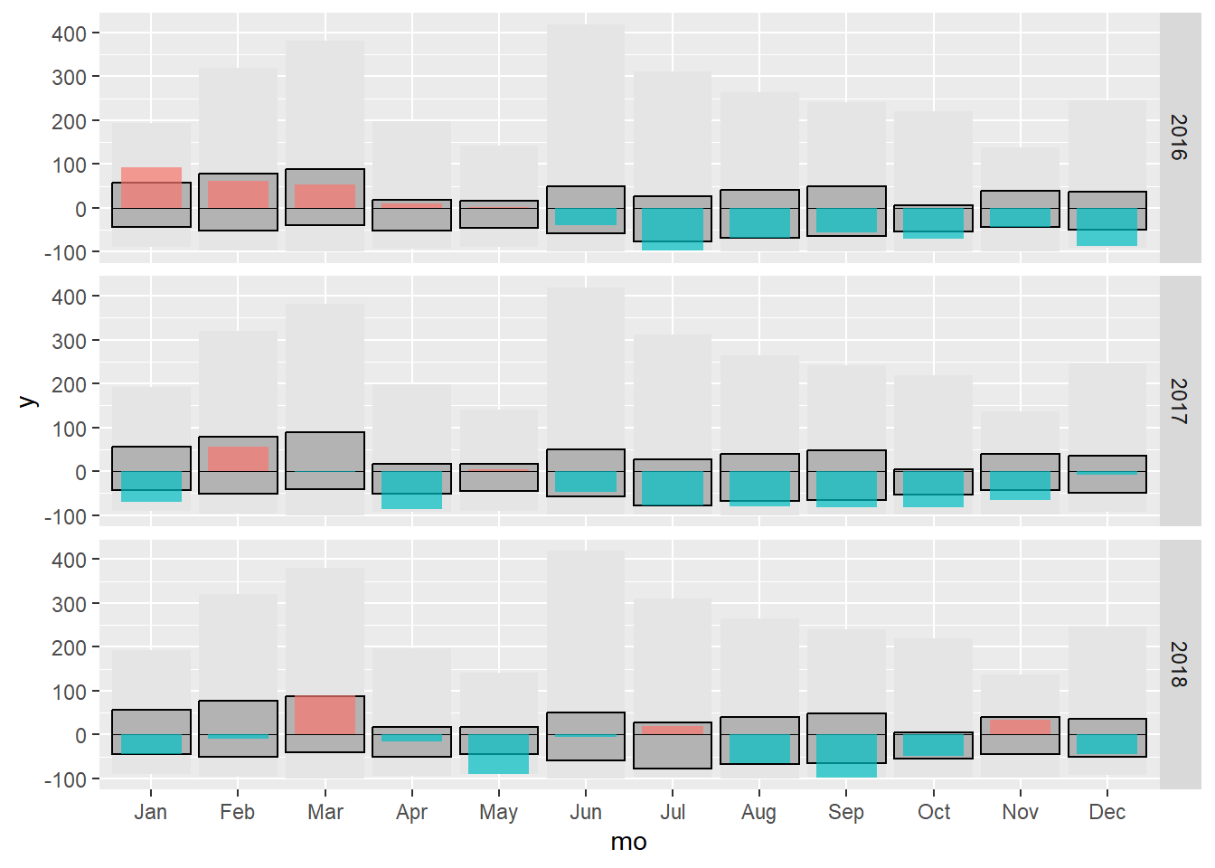
Finally we change some last style settings.
g1 <- g1.3 + geom_hline(yintercept = 0)+
               scale_fill_manual(values=c("#99000d","#034e7b"))+
               scale_y_continuous("Anomalía de precipitación (%)",
                                   breaks = seq(-100, 500, 50),
                                   expand = c(0, 5))+
            labs(x = "",
                 title = "Anomalía de precipitación en Santiago de Compostela",
                 caption="Dominic Royé (@dr_xeo) | Datos: eca.knmi.nl")+
            theme_hc()
g1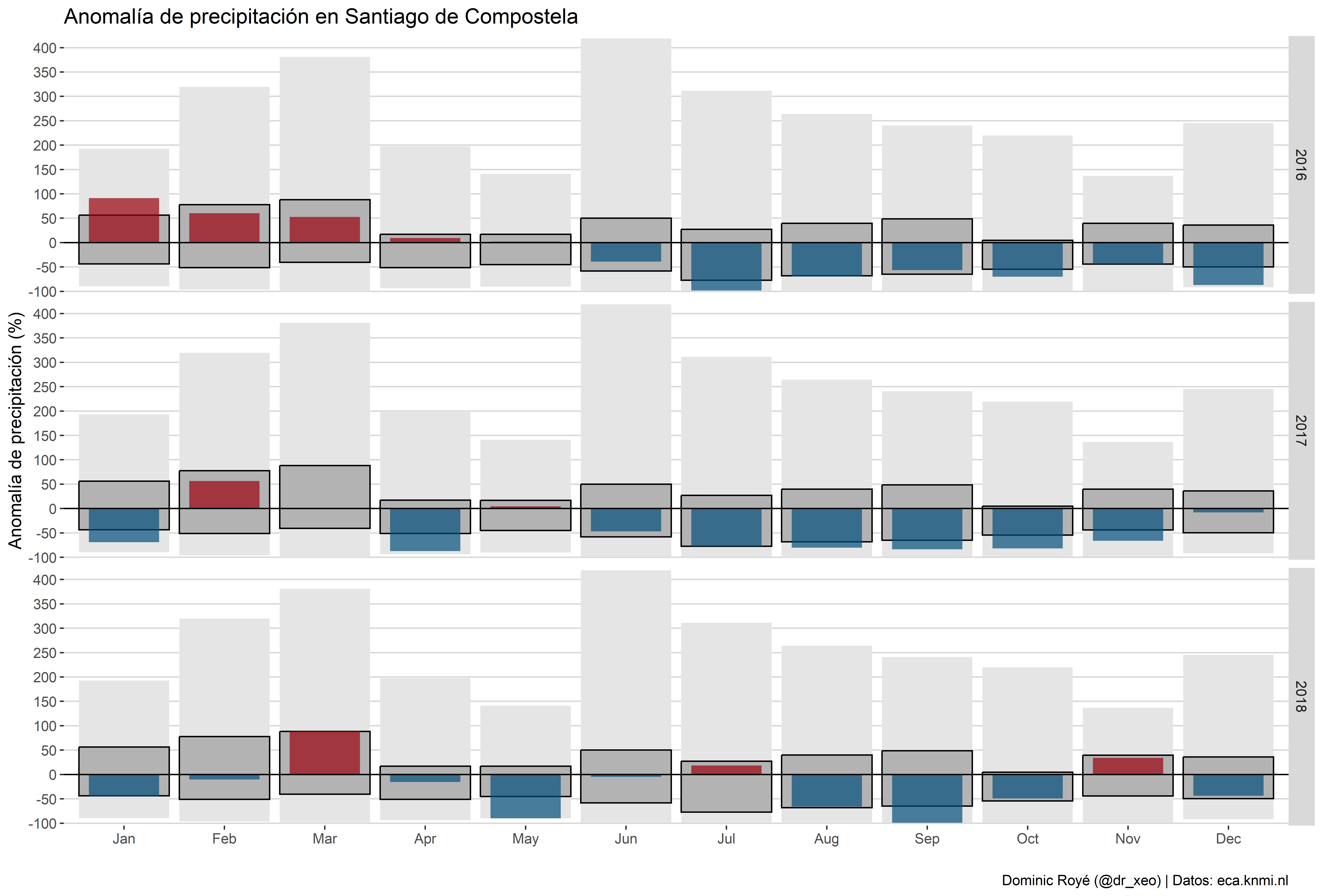
We use the same legend created for the previous graph.
Part 2
Finally, we join the graph and the legends with the help of the cowplot package. The only thing we must adjust here are the arguments in the draw_plot() function to correctly place the different parts.
p <- ggdraw() +
       draw_plot(g1, x = 0, y = .18, width = 1, height = 0.8) +
       draw_plot(g2, x = 0, y = .08, width = .2, height = .15) +
       draw_plot(g3, x = 0.08, y = .08, width = .2, height = .15)

p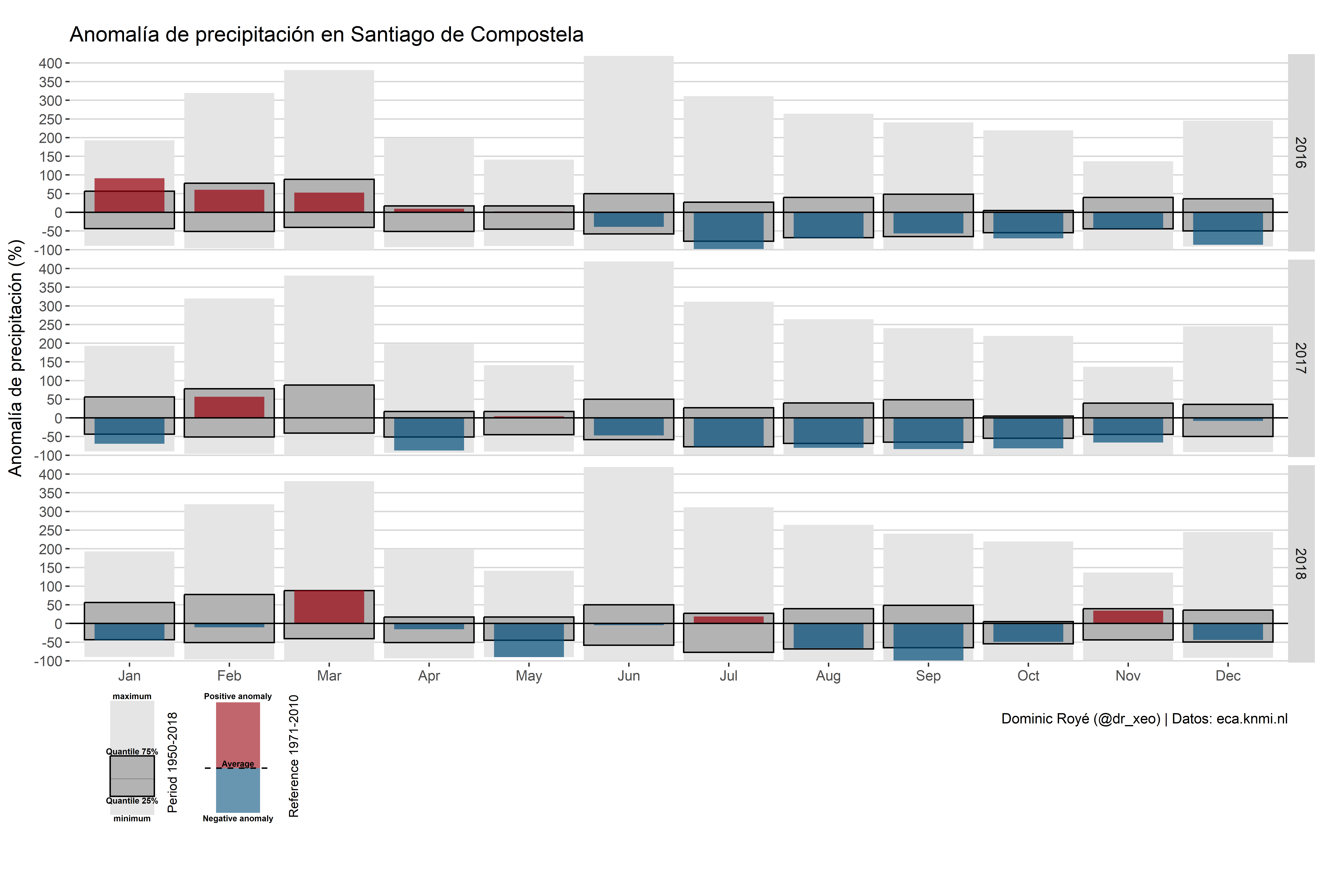
save_plot("pr_anomaly20162018_scq.png", p, dpi = 300, base_width = 12.43, base_height = 8.42)![]()