Tomorrow's weather
My climate this week looks at the Arctic freeze that is sweeping across large parts of northern Asia, w/ @Emiliyadotcom https://t.co/u49jvHKxvK #dataviz #gistribe #cartography pic.twitter.com/6mX22bKZqF
— Chris Campbell (@digitalcampbell) January 28, 2023
A while back I saw Chris Campbell’s global maps from the Financial Times like in this Tweet and I thought I needed to do it in R. In this first post of 2023 we’ll see how we can access the GFS (Global Forecast System) data and visualize it with {ggplot2}, even though there are several ways, in this case we use the Google Earth Engine API via the {rgee} package for accessing the GFS data. We will select the most recent run and calculate the maximum temperature for the next few days.
1 Packages
| Package | Description |
|---|---|
| tidyverse | Collection of packages (visualization, manipulation): ggplot2, dplyr, purrr, etc. |
| lubridate | Easy manipulation of dates and times |
| sf | Simple Feature: import, export and manipulate vector data |
| terra | Import, export and manipulate raster ({raster} successor package) |
| rgee | Access to Google Earth Engine API |
| giscoR | Administrative boundaries of the world |
| ggshadow | Extension to ggplot2 for shaded and glow geometries |
| fs | Provides a cross-platform, uniform interface to file system operations |
| ggforce | Provides missing functionality to ggplot2 |
#  install the packages if necessary
if(!require("tidyverse")) install.packages("tidyverse")
if(!require("sf")) install.packages("sf")
if(!require("terra")) install.packages("terra")
if(!require("fs")) install.packages("fs")
if(!require("rgee")) install.packages("rgee")
if(!require("giscoR")) install.packages("giscoR")
if(!require("ggshadow")) install.packages("ggshadow")
if(!require("ggforce")) install.packages("ggforce")

#  packages
library(rgee)
library(terra)
library(sf)
library(giscoR)

library(fs)
library(tidyverse)
library(lubridate)
library(ggshadow)
library(ggforce)
2 Part I. Geoprocessing with Google Earth Engine (GEE)
2.1 Before using GEE in R
The first step is to sign up at earthengine.google.com. In addition, it is necessary to install CLI of gcloud (https://cloud.google.com/sdk/docs/install?hl=es-419), you just have to follow the instructions in Google. Regarding the GEE language, many functions that are applied are similar to what is known from {tidyverse}. More help can be found at https://r-spatial.github.io/rgee/reference/rgee-package.html and on the GEE page itself.
The most essential of GEE’s native Javascript language is that it is characterized by the way of combining functions and variables using the dot, which is replaced by the $ in R. All GEE functions start with the prefix ee_* (ee_print( ), ee_image_to_drive()).
Once we have gcloud and the {rgee} package installed we can proceed to create the Python virtual environment. The ee_install() function takes care of installing Anaconda 3 and all necessary packages. To check the correct installation of Python, and particularly of the numpy and earthengine-api packages, we can use ee_check().
ee_install() # create python virtual environment
ee_check() # check if everything is correct
Before programming with GEE’s own syntax, GEE must be authenticated and initialized using the ee_Initialize() function.
ee_Initialize(drive = TRUE) ## ── rgee 1.1.5 ─────────────────────────────────────── earthengine-api 0.1.339 ──
## ✔ user: not_defined
## ✔ Google Drive credentials:
✔ Google Drive credentials: FOUND
## ✔ Initializing Google Earth Engine:
✔ Initializing Google Earth Engine: DONE!
##
✔ Earth Engine account: users/dominicroye
## ────────────────────────────────────────────────────────────────────────────────2.2 Access the Global Forecast System
A time series of images or multidimensional data is called an ImageCollection in GEE. Each dataset is assigned an ID and we can access it by making the following call ee$ImageCollection('ID_IMAGECOLLECTION'). There are helper functions that allow conversion of purely R classes to Javascript, e.g. for dates rdate_to_eedate(). The first thing we do is to filter to the most recent date with the last run of the GFS model.
We have to know that, unlike R, only when GEE tasks are sent, the calculation are executed on the servers using all the created GEE objects. Most steps create only EarthEngine objects what you will see soon in this post.
## GFS forecast
dataset <- ee$ImageCollection('NOAA/GFS0P25')$filter(ee$Filter$date(rdate_to_eedate(today()-days(1)),
                                                                    rdate_to_eedate(today()+days(1))))
dataset
## EarthEngine Object: ImageCollectionThe model runs every 6 hours (0, 6, 12, 18), so the ee_get_date_ic() function extracts the dates to choose the most recent one. This is the first time that calculations are run.
# vector of unique run dates
last_run <- ee_get_date_ic(dataset)$time_start |> unique()
last_run
## [1] "2023-02-22 00:00:00 GMT" "2023-02-22 06:00:00 GMT"
## [3] "2023-02-22 12:00:00 GMT" "2023-02-22 18:00:00 GMT"
## [5] "2023-02-23 00:00:00 GMT"# select the last one
last_run <- max(last_run)Next we filter the date of the last run and select the band of the air temperature at 2m. Forecast dates are attributes of each model run up to 336 hours (14 days) from the day of execution. When we want to make changes to each image in an ImageCollection we must make use of the map() function, similar to the one we know from the {purrr} package. In this case we redefine the date of each image (system:time_start: run date) by that of the forecast (forecast_time). It is important that the R function to apply is inside ee_utils_pyfunc(), which translates it into Python. Then we extract the dates from the 14 day forecast.
# last run and variable selection
temp <- dataset$filter(ee$Filter$date(rdate_to_eedate(last_run)))$select('temperature_2m_above_ground')

# define the forecast dates for each hour
forcast_time <- temp$map(ee_utils_pyfunc(function(img)  {

 return(ee$Image(img)$set('system:time_start',ee$Image(img)$get("forecast_time")))

  })
)

# get the forecast dates
date_forcast <- ee_get_date_ic(forcast_time)
head(date_forcast)
## id time_start
## 1 NOAA/GFS0P25/2023022300F000 2023-02-23 00:00:00
## 2 NOAA/GFS0P25/2023022300F001 2023-02-23 01:00:00
## 3 NOAA/GFS0P25/2023022300F002 2023-02-23 02:00:00
## 4 NOAA/GFS0P25/2023022300F003 2023-02-23 03:00:00
## 5 NOAA/GFS0P25/2023022300F004 2023-02-23 04:00:00
## 6 NOAA/GFS0P25/2023022300F005 2023-02-23 05:00:00Here we could export the hourly temperature data, but it would also be possible to estimate the maximum or minimum daily temperature for the next 14 days. To achieve this we define the beginning and end of the period, and calculate the number of days. What we do in simple terms is map over the number of days to filter on each day and apply the max() function or any other similar function.
# define start end of the period
endDate <- rdate_to_eedate(round_date(max(date_forcast$time_start)-days(1), "day"))
startDate <- rdate_to_eedate(round_date(min(date_forcast$time_start), "day"))

# number of days
numberOfDays <- endDate$difference(startDate, 'days')

# calculate the daily maximum
daily <- ee$ImageCollection(
  ee$List$sequence(0, numberOfDays$subtract(1))$
  map(ee_utils_pyfunc(function (dayOffset) {
    start = startDate$advance(dayOffset, 'days')
    end = start$advance(1, 'days')
    return(forcast_time$
    filterDate(start, end)$
    max()$ # alternativa: min(), mean()
    set('system:time_start', start$millis()))
  }))
)

# dates of the daily maximum
head(ee_get_date_ic(daily))
## id time_start
## 1 no_id 2023-02-23
## 2 no_id 2023-02-24
## 3 no_id 2023-02-25
## 4 no_id 2023-02-26
## 5 no_id 2023-02-27
## 6 no_id 2023-02-282.3 Dynamic map via GEE
Since there is the possibility of adding images to a dynamic map in the GEE code editor, we can also do it from R using the GEE function Map.addLayer(). We simply select the first day with first(). In the other argument we define the range of the temperature values and the color ramp.
Map$addLayer(
       eeObject = daily$first(),
       visParams = list(min = -45, max = 45,
                        palette = rev(RColorBrewer::brewer.pal(11, "RdBu"))),
       name = "GFS") +
Map$addLegend(
  list(min = -45, max = 45,
       palette = rev(RColorBrewer::brewer.pal(11, "RdBu"))),
       name = "Maximum temperature",
       position = "bottomright",
       bins = 10)
2.4 Export multiple images
The {rgee} package has a very useful function for exporting an ImageCollection: ee_imagecollection_to_local(). Before using it, we need to set a region, the one that is intended to be exported. In this case, we export the entire globe with a rectangle covering the whole Earth.
# earth extension
geom <- ee$Geometry$Polygon(coords = list(
  c(-180, -90),
  c(180, -90),
  c(180, 90),
  c(-180, 90),
  c(-180, -90)
),
proj = "EPSG:4326",
geodesic = FALSE)

geom # EarthEngine object of type geometry
## EarthEngine Object: Geometry# temporary download folder
tmp <- tempdir()
# run tasks and download each day
ic_drive_files_2 <- ee_imagecollection_to_local(
ic = daily$filter(ee$Filter$date(rdate_to_eedate(today()), rdate_to_eedate(today()+days(2)))), # we choose only the next 2 days
region = geom,
scale = 20000,# resolution
lazy = FALSE,
dsn = path(tmp, "rast_"), # name of each raster
add_metadata = TRUE
)## ───────────────────────────────────── Downloading ImageCollection - via drive ──- region parameters
## sfg : POLYGON ((-180 -90, 180 -90, 180 90, -180 90, -180 -90))
## CRS : GEOGCRS["WGS 84",
## DATUM["World Geodetic System 1984",
## ELLIPSOID["WGS 84",6378137,298.257223563, .....
## geodesic : FALSE
## evenOdd : TRUE
##
## Downloading: C:/Users/xeo19/AppData/Local/Temp/Rtmp8UpV6S/rast_0.tif
## Downloading: C:/Users/xeo19/AppData/Local/Temp/Rtmp8UpV6S/rast_1.tif
## ────────────────────────────────────────────────────────────────────────────────3 Part II. Orthographic map
3.1 Data
Of course, the first step is to import the data with the help of rast(). We also define the name of each layer according to its temporal dimension correctly.
# paths to downloaded data
forecast_world <- dir_ls(tmp, regexp = "tif")

# guarantee the file order
file_ord <- str_extract(forecast_world, "_[0-9]{1,2}") |> parse_number()

forecast_rast <- rast(forecast_world[order(file_ord)]) # import
forecast_rast
## class : SpatRaster
## dimensions : 1002, 2004, 2 (nrow, ncol, nlyr)
## resolution : 0.1796631, 0.1796631 (x, y)
## extent : -180.0224, 180.0224, -90.01119, 90.01119 (xmin, xmax, ymin, ymax)
## coord. ref. : lon/lat WGS 84 (EPSG:4326)
## sources : rast_0.tif
## rast_1.tif
## names : temperature_2m_above_ground, temperature_2m_above_ground# define the temporal dimension as the name of each layer
names(forecast_rast) <- seq(today(), today() + days(1), "day")
forecast_rast## class : SpatRaster
## dimensions : 1002, 2004, 2 (nrow, ncol, nlyr)
## resolution : 0.1796631, 0.1796631 (x, y)
## extent : -180.0224, 180.0224, -90.01119, 90.01119 (xmin, xmax, ymin, ymax)
## coord. ref. : lon/lat WGS 84 (EPSG:4326)
## sources : rast_0.tif
## rast_1.tif
## names : 2023-02-23, 2023-02-24# plot
plot(forecast_rast)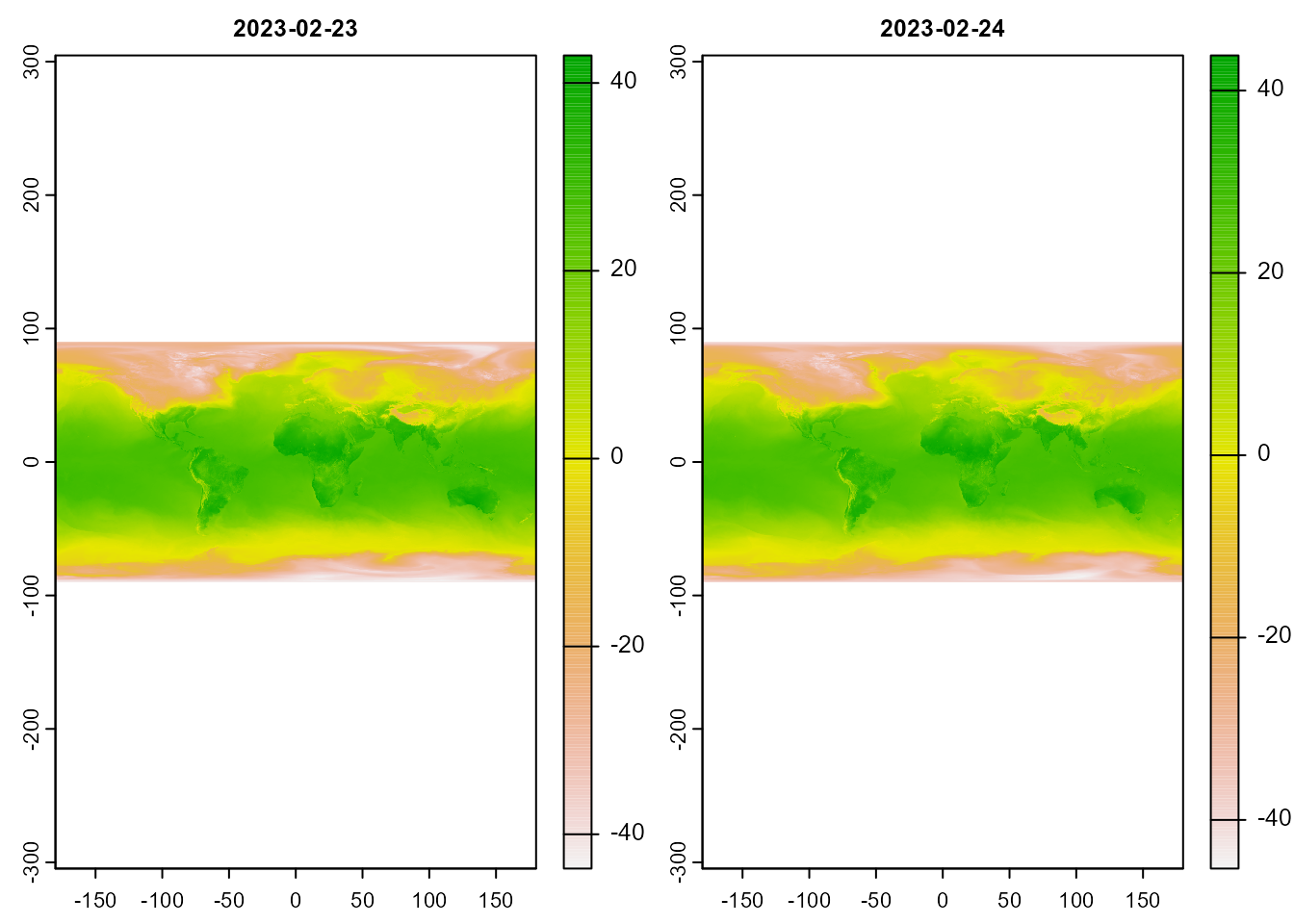
Now we can define the orthographic projection indicating with +lat_0 and +lon_0 the center of the projection. We then reproject and convert the raster to a data.frame.
# projection definition
ortho_crs <-'+proj=ortho +lat_0=51 +lon_0=0.5 +x_0=0 +y_0=0 +R=6371000 +units=m +no_defs +type=crs'

# reproject the raster
ras_ortho <- project(forecast_rast, ortho_crs)

# convert the raster to a data.frame of xyz
forecast_df <- as.data.frame(ras_ortho, xy = TRUE)

# transform to a long format
forecast_df <- pivot_longer(forecast_df, 3:length(forecast_df), names_to = "date", values_to = "ta")
3.2 Administrative boundaries and graticules
We import the administrative boundaries with gisco_get_countries() which we need prepare for the orthographic projection. In the same way we create the graticule using st_graticule(). In order to preserve the geometry, it will be necessary to cut to only the visible part. The ocean is created starting from a point at 0.0 with the radius of the earth. Using the st_intersection() function we reduce to the visible part and reproject the boundaries.
# obtain the administrative limits
world_poly <- gisco_get_countries(year = "2016", epsg = "4326", resolution = "10")

# get the global graticule
grid <- st_graticule()

# define what would be ocean
ocean <- st_point(x = c(0,0)) |>
            st_buffer(dist = 6371000) |> # earth radius
              st_sfc(crs = ortho_crs)
plot(ocean)
# select only visible from the boundaries and reproject
world <- world_poly |>
            st_intersection(st_transform(ocean, 4326)) |>
            st_transform(crs = ortho_crs) #
plot(world)
For the graticules we must repeat the same selection, although we previously limit the grid of lines to the ocean. The ocean boundary is used to create the globe’s shadow, but to use it in geom_glowpath() you need to convert it to a data.frame.
# eliminate the lines that pass over the continents
grid_crp <- st_difference(grid, st_union(world_poly))

# select the visible part
grid_crp <- st_intersection(grid_crp, st_transform(ocean, 4326)) |>
                  st_transform(crs = ortho_crs)

plot(grid_crp)
# convert the boundary of the globe into a data.frame
ocean_df <- st_cast(ocean, "LINESTRING") |> st_coordinates() |> as.data.frame()
3.3 Map construction
3.3.1 Select tomorrow
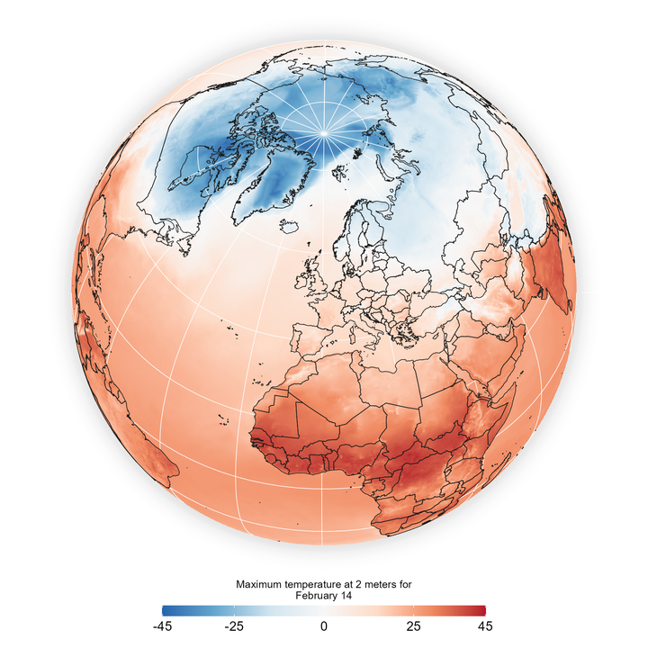
First we select the day of tomorrow, in my case when I write this post it is February 22, 2023. In addition, we limit the temperature range to -45ºC and +45ºC.
forecast_tomorrow <- filter(forecast_df, date == today() + days(1)) |>
                        mutate(ta_limit = case_when(ta > 45 ~ 45,
                                              ta < -45 ~ -45,
                                               TRUE ~ ta))
3.3.2 The shadow of the globe
We create the shadow effect using the geom_glowpath() function from the {ggshadow} package. Aiming for a more smooth transition I duplicate this layer with different transparency and shadow settings.
# build a simple shadow
ggplot() +
   geom_glowpath(data = ocean_df,
                aes(X, Y, group = "L1"),
                shadowcolor='grey90',
                     colour = "white",
                alpha = .01,
                shadowalpha=0.05,
                shadowsize = 1.5) +
    geom_glowpath(data = ocean_df,
                aes(X, Y, group = "L1"),
                shadowcolor='grey90',
                       colour = "white",
                alpha = .01,
                shadowalpha=0.01,
                shadowsize = 1) +
   coord_sf() +
   theme_void()
# combining several layers of shadow
g <- ggplot() +
   geom_glowpath(data = ocean_df,
                aes(X, Y, group = "L1"),
                shadowcolor='grey90',
                     colour = "white",
                alpha = .01,
                shadowalpha=0.05,
                shadowsize = 1.8) +
   geom_glowpath(data = ocean_df,
                aes(X, Y, group = "L1"),
                shadowcolor='grey90',
                       colour = "white",
                alpha = .01,
                shadowalpha=0.02,
                shadowsize = 1) +
   geom_glowpath(data = ocean_df,
                aes(X, Y, group = "L1"),
                shadowcolor='grey90',
                       colour = "white",
                alpha = .01,
                shadowalpha=0.01,
                shadowsize = .5)
3.3.3 Adding other layers
In the next step we add the temperature layer and both vector layers.
g2 <- g + geom_raster(data = forecast_tomorrow, aes(x, y, fill = ta_limit)) +
          geom_sf(data = grid_crp,
                  colour = "white",
                  linewidth = .2) +
          geom_sf(data = world,
                   fill = NA,
                   colour = "grey10",
                   linewidth = .2)
What we need to add are the last definitions of the color, the legend and the general style of the map.
g2 + scale_fill_distiller(palette = "RdBu",
                          limits = c(-45, 45),
                          breaks = c(-45, -25, 0, 25, 45)) +
     guides(fill = guide_colourbar(barwidth = 15,
                                   barheight = .5,
                                   title.position = "top",
                                   title.hjust = .5)) +
  coord_sf() +
  labs(fill = str_wrap("Maximum temperature at 2 meters for February 14", 35)) +
  theme_void() +
  theme(legend.position = "bottom",
        legend.title = element_text(size = 7),
plot.margin = margin(10, 10, 10, 10)) 
If we wanted to add labels for the points with the lowest and highest temperatures, we would need to filter the extremes from our table.
labeling <- slice(forecast_tomorrow, which.min(ta), which.max(ta))
labeling
## # A tibble: 2 × 5
## x y date ta ta_limit
## <dbl> <dbl> <chr> <dbl> <dbl>
## 1 -1397101. 3923352. 2023-02-24 -42.5 -42.5
## 2 2119554. -4121598. 2023-02-24 43.9 43.9The geom_mark_circle() function allows you to include a circle label at any position. We create the label using str_glue() where the variable will be replaced by each temperature of both extremes, at the same time we can define the format of the number with number() from the {scales} package.
g2 +  geom_mark_circle(data = labeling,
                       aes(x, y,
                          description = str_glue('{scales::number(ta, accuracy = .1, decimal.mark = ".", style_positive = "plus", suffix = "ºC")}')
                          ),
                   expand = unit(1, "mm"),
                   label.buffer = unit(4, "mm"),
                   label.margin = margin(1, 1, 1, 1, "mm"),
                   con.size = 0.3,
                   label.fontsize = 8,
                   label.fontface = "bold",
                   con.type = "straight",
                  label.fill = alpha("white", .5)) +
     scale_fill_distiller(palette = "RdBu",
                          limits = c(-45, 45),
                          breaks = c(-45, -25, 0, 25, 45)) +
     guides(fill = guide_colourbar(barwidth = 15,
                                   barheight = .5,
                                   title.position = "top",
                                   title.hjust = .5)) +
  coord_sf(crs = ortho_crs) +
  labs(fill = str_wrap("Maximum temperature at 2 meters for February 14", 35)) +
  theme_void() +
  theme(legend.position = "bottom",
        legend.title = element_text(size = 7),
plot.margin = margin(10, 10, 10, 10)) 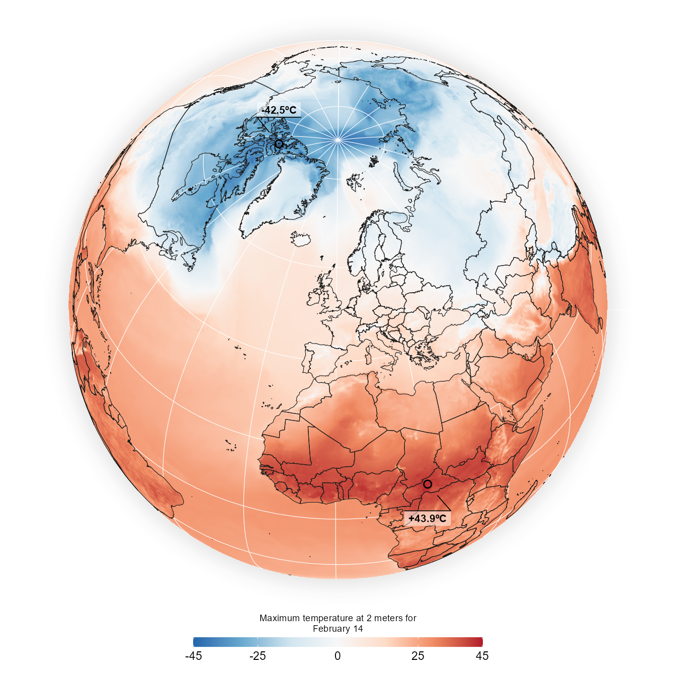
![]()