Map of circles grouped in multiple locations

In my first post of 2024, which unfortunately has not been possible before April, I will explain how we can group in the same location several proportional circles. In 2022 I was looking for how to represent the number of heat wave days according to the degree of severity in Spain. I found the solution using the circle packing which is also used in the Dorling cartogram.
Packages
| Package | Description |
|---|---|
| tidyverse | Collection of packages (visualization, manipulation): ggplot2, dplyr, purrr, etc. |
| mapSpain | Administrative boundaries of Spain at different levels |
| giscoR | Administrative boundaries of the world |
| sf | Simple Feature: import, export and manipulate vector data |
| ggtext | Improved text rendering support for ggplot2 |
| ggrepel | Provide ggplot2 geometries to repel overlapping text labels |
| geomtextpath | Add text to lines that can follow any path and will remain correctly spaced and angled. |
| packcircles | Algorithms for finding non-overlapping circles. |
| cartogram | Build different types of cartograms |
# install the packages if necessary
if(!require("tidyverse")) install.packages("tidyverse")
if(!require("mapSpain")) install.packages("mapSpain")
if(!require("sf")) install.packages("sf")
if(!require("packcircles")) install.packages("packcircles")
if(!require("ggtext")) install.packages("ggtext")
if(!require("ggrepel")) install.packages("ggrepel")
if(!require("cartogram")) install.packages("cartogram")
if(!require("giscoR")) install.packages("giscoR")
if(!require("rmapshaper")) install.packages("rmapshaper")
if(!require("geomtextpath")) install.packages("geomtextpath")

# packages
library(tidyverse)
library(lubridate)
library(sf)
library(mapSpain)
library(ggrepel)
library(ggtext)
library(packcircles)
library(cartogram)
library(giscoR)
library(rmapshaper)
library(geomtextpath)
Data
In this post we will use a dataset of heat waves registered in the year 2022 (download). At the time I calculated the Excess Heat Factor index for different locations in Spain. You can find the formulas of the index in Díaz-Poso et al. (2023{:target=“_blank”}). It is a geojson with the number of heat wave days according to severity (low, severe, extreme) for 51 weather stations. The data needs to be projected, in this case it is ETRS89 UTM 30 (EPSG:25830). In addition, we import and modify the provincial and global boundaries to use them as a basis for the map.
# import EHF heat wave 2022 data
ehf <- st_read("ehf_2022_spain.geojson")
## Reading layer `ehf_2022_spain' from data source
## `E:\GitHub\blog_update_2021\content\en\post\2024-04-20-map-circle-packing\ehf_2022_spain.geojson'
## using driver `GeoJSON'
## Simple feature collection with 148 features and 3 fields
## Geometry type: POINT
## Dimension: XY
## Bounding box: xmin: -839774.5 ymin: 3150771 xmax: 1117513 ymax: 4815734
## Projected CRS: ETRS89 / UTM zone 30Nehf## Simple feature collection with 148 features and 3 fields
## Geometry type: POINT
## Dimension: XY
## Bounding box: xmin: -839774.5 ymin: 3150771 xmax: 1117513 ymax: 4815734
## Projected CRS: ETRS89 / UTM zone 30N
## First 10 features:
## stat_name levels n geometry
## 1 BARCELONA AEROPUERTO low 48 POINT (924574.5 4583673)
## 2 BARCELONA AEROPUERTO severe 21 POINT (924574.5 4583673)
## 3 GIRONA AEROPUERTO extreme 2 POINT (978052.4 4656058)
## 4 GIRONA AEROPUERTO low 53 POINT (978052.4 4656058)
## 5 GIRONA AEROPUERTO severe 14 POINT (978052.4 4656058)
## 6 DONOSTIA / SAN SEBASTIÁN, IGELDO extreme 2 POINT (577768.2 4795286)
## 7 DONOSTIA / SAN SEBASTIÁN, IGELDO low 24 POINT (577768.2 4795286)
## 8 DONOSTIA / SAN SEBASTIÁN, IGELDO severe 14 POINT (577768.2 4795286)
## 9 BILBAO AEROPUERTO extreme 6 POINT (507593.1 4793918)
## 10 BILBAO AEROPUERTO low 31 POINT (507593.1 4793918)# basic plot
plot(ehf)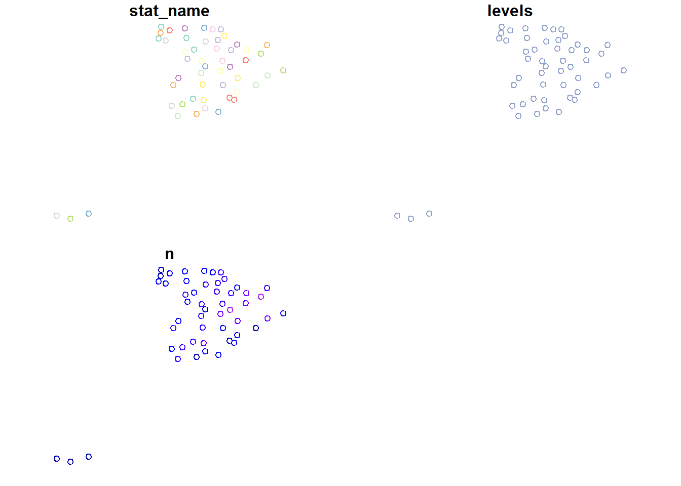
# provincial boundaries Spain
esp <- esp_get_prov(moveCAN = FALSE, epsg = "4326")
plot(esp)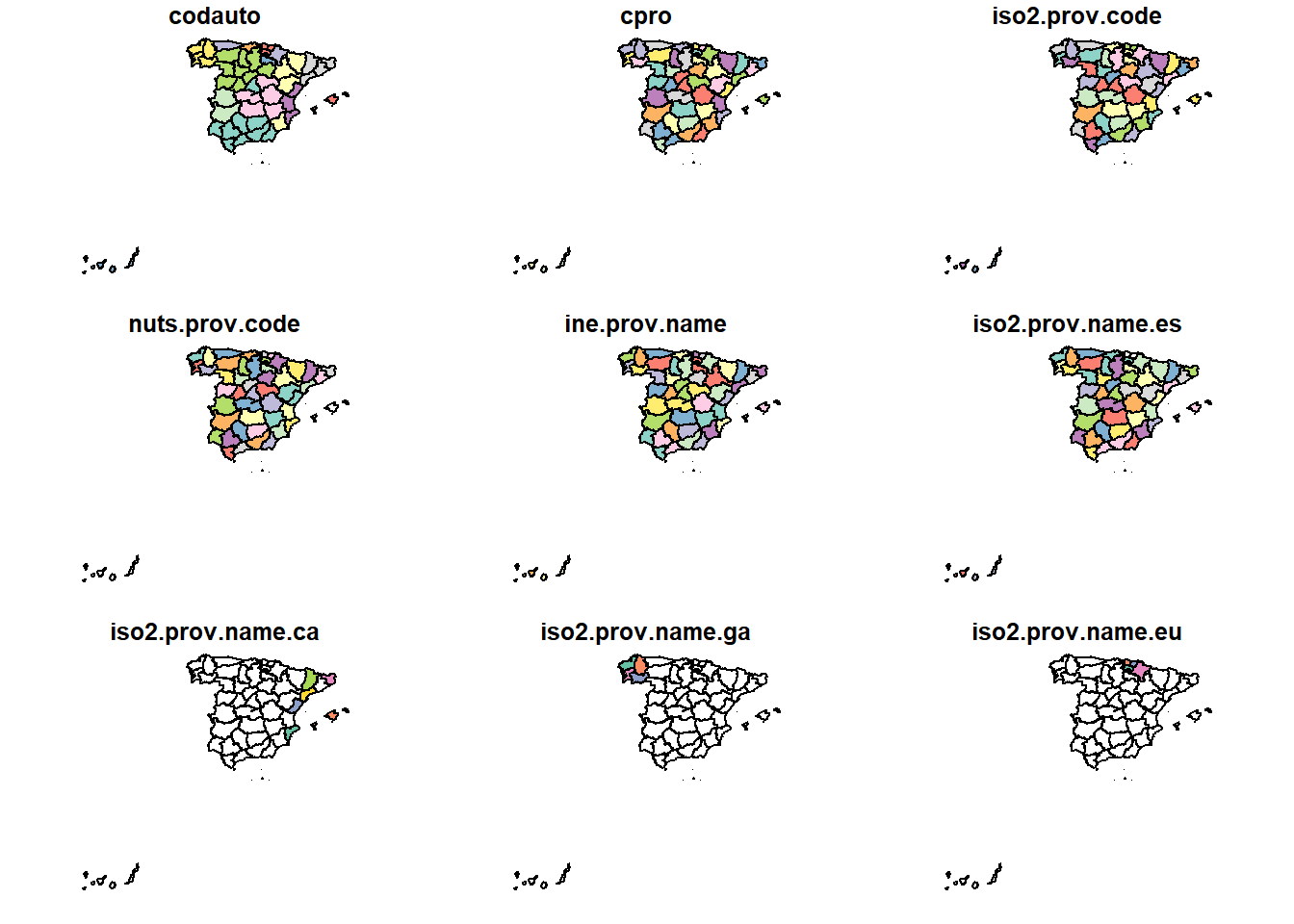
esp_pen <- filter(esp, nuts2.name != "Canarias")

# interior boundaries of Spain
esp_inline <- rmapshaper::ms_innerlines(esp_pen)

# global boundaries
eu <- gisco_get_countries(res = 10) |>
          st_cast("MULTILINESTRING") |>
              st_crop(xmin = -10, ymin = 34.7,
                      xmax = 4.4, ymax = 43.8)
plot(eu)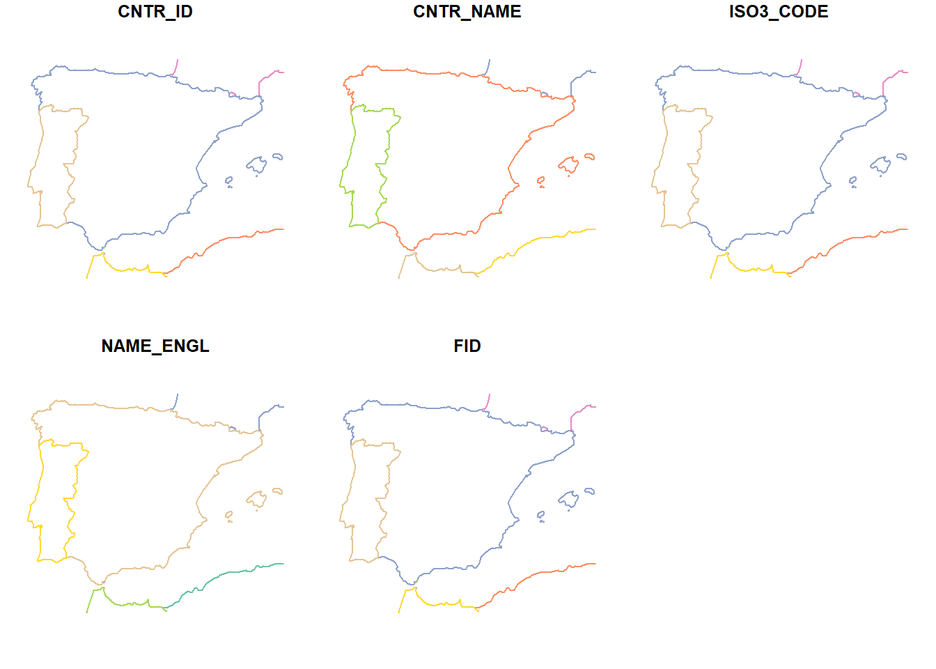
## Canary Islands
canlim <- esp_get_ccaa("Canarias", moveCAN = FALSE)
bx <- st_bbox(canlim)
Dorling diagram
When I started investigating possibilities to achieve circles in a grouped position without overlapping, I thought directly of the {cartogram_dorling() function from the {cartogram} package. The problem I faced was that it is designed for only one category or level, however, as we can see we have up to three levels of severity. If we use the function for low severity we get the following result.
# Dorling low gravity map
dor <- cartogram_dorling(filter(ehf, levels == "low"), "n", k = .3)

# map
ggplot(dor,
       aes(fill = n)) +
  geom_sf(data = esp,
          fill = "grey80",
          colour = "white",
          linewidth = .3) +
  geom_sf() +
  scale_fill_distiller(palette = "YlOrRd", direction = 1) +
  labs(fill = NULL, title = "Number of heat weave days with low severity") +
  theme_void() +
  theme(legend.position = "top",
        legend.key.height = unit(.5, "lines"),
        legend.key.width = unit(3, "lines"),
        plot.title = element_text(margin = margin(t = 5, b = 10), hjust = .5))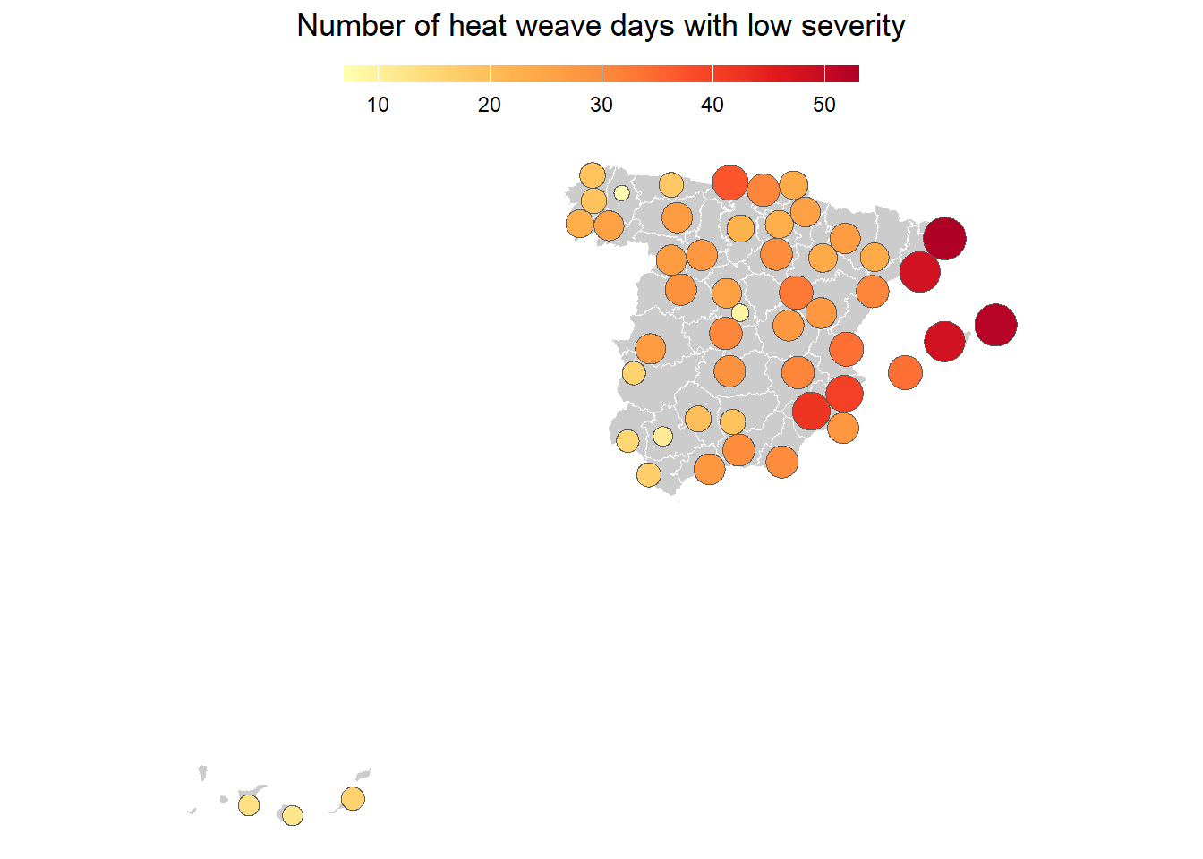
So, what can we do? We should take a closer look at the function, which facilitates the creation of the Dorling map (link). First we could create a map of small multiples, but one problem we encounter is that we cannot set a maximum value of a variable. So, we add and modify it slightly to the line where the area is calculated (dat.init$v).
cartogram_dorling2.sf <- function(x, weight,
                                 limit_mx = NULL, #new argument
                                 k = 5,
                                 m_weight = 1,
                                 itermax= 1000){
  # proj or unproj
  if (sf::st_is_longlat(x)) {
    stop('Using an unprojected map. This function does not give correct centroids and distances for longitude/latitude data:\nUse "st_transform()" to transform coordinates to another projection.', call. = F)
  }
  # no 0 values
  x <- x[x[[weight]]>0,]
  # data prep
  dat.init <- data.frame(sf::st_coordinates(sf::st_centroid(sf::st_geometry(x))),
                         v = x[[weight]])
  surf <- (max(dat.init[,1]) - min(dat.init[,1])) *  (max(dat.init[,2]) - min(dat.init[,2]))
  #dat.init$v <- dat.init$v * (surf * k / 100) / max(dat.init$v) # old

  dat.init$v <- dat.init$v * (surf * k / 100) / ifelse(is_null(limit_mx),
                                                  max(dat.init$v),
                                                   limit_mx)  # new argument

  # circles layout and radiuses
  res <- packcircles::circleRepelLayout(x = dat.init, xysizecols = 1:3,
                                        wrap = FALSE, sizetype = "area",
                                        maxiter = itermax, weights = m_weight)
  # sf object creation
  . <- sf::st_buffer(sf::st_as_sf(res$layout,
                                  coords =c('x', 'y'),
                                  crs = sf::st_crs(x)),
                     dist = res$layout$radius)
  sf::st_geometry(x) <- sf::st_geometry(.)
  return(x)
}
If we now use the modified function, we will achieve multiple small Dorling’s. We simply map the new function on each category.
# estimate the maximum value
max_value <- max(ehf$n)

# map over each category
dor2 <- split(ehf, ~ levels) |>
           map(cartogram_dorling2.sf,
               weight = "n",
               k = .3,
               limit_mx = max_value)

# rejoin the tables and set the order
dor2 <- bind_rows(dor2) |>
           mutate(levels = factor(levels, c("low", "severe", "extreme")))

# map of small multiples
ggplot(dor2,
       aes(fill = n)) +
  geom_sf(data = esp,
          fill = "grey80",
          colour = "white",
          linewidth = .3) +
  geom_sf() +
  facet_grid(~levels) +
  scale_fill_distiller(palette = "YlOrRd", direction = 1) +
  labs(fill = NULL, title = "Number of heat weave days with low severity") +
  theme_void() +
  theme(legend.position = "top",
        legend.key.height = unit(.5, "lines"),
        legend.key.width = unit(3, "lines"),
        plot.title = element_text(margin = margin(t = 5, b = 10), hjust = .5))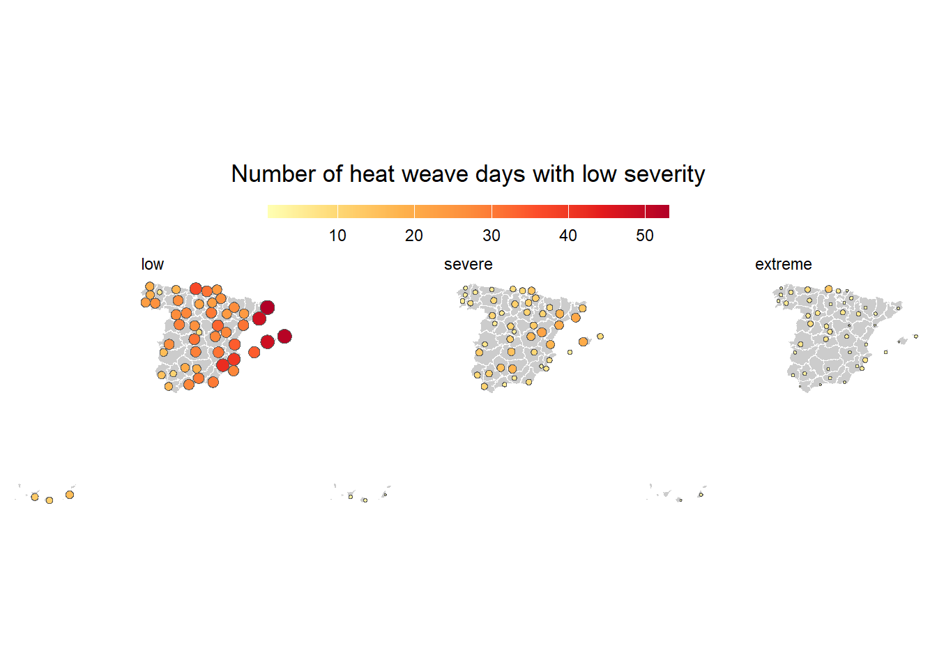
I found it interesting, but it was not what I was looking for. I also considered making a proportional symbol map with circles in the same location, using color mixing and transparency in the style of this map (link). Finally I decided to modify the function to achieve a grouped position with circle packing. I introduced another argument surf = null for the extension of the data set, also kept the change of introducing the possibility of the maximum value with the same aim, and I changed the circleRepelLayout() function to the circleProgressiveLayout() one. The second one arranges a set of circles, denoted by their sizes, placing consecutively each circle externally tangent to two previously placed circles avoiding overlaps. Unlike the original layout in which the circles are ordered by iterative pairwise repulsion within a bounding rectangle. Another potential alternative could be the use of networks or graphs with {ggraph}, but I have not yet gotten around to testing it.
packedcircle_dodge_position.sf <- function(x,
                                 weight,
                                 surf = NULL,
                                 limit_mx = NULL, #new argument
                                 k = .5){
  # proj or unproj
  if (sf::st_is_longlat(x)) {
    stop('Using an unprojected map. This function does not give correct centroids and distances for longitude/latitude data:\nUse "st_transform()" to transform coordinates to another projection.', call. = F)
  }
  # no 0 values
  x <- x[x[[weight]]>0,]
  # data prep
  dat.init <- data.frame(sf::st_coordinates(sf::st_centroid(sf::st_geometry(x))),
                         v = x[[weight]])

  if(is_null(surf))  surf <- (max(dat.init[,1]) - min(dat.init[,1])) *  (max(dat.init[,2]) - min(dat.init[,2]))

  dat.init$v <- dat.init$v * (surf * k / 100) / ifelse(is_null(limit_mx),
                                                       max(dat.init$v),
                                                       limit_mx)  # new argument
  # circles layout and radiuses
  res <- packcircles::circleProgressiveLayout(x = dat.init,
                                              sizecol = "v") # other layout

  res <- mutate(res, x = dat.init$X+x, y = dat.init$Y+y) # reconvert to lon, lat

  # sf object creation
  . <- sf::st_buffer(sf::st_as_sf(res,
                                  coords =c('x', 'y'),
                                  crs = sf::st_crs(x)),
                    dist = res$radius)
  sf::st_geometry(x) <- sf::st_geometry(.)

  return(x)

}
Creation of grouped circles
First, we must define global variables for all locations. Among others, the spatial extent of the data, the maximum value, the scale factor for the size, and the variable of interest.
limit_mx <- max(ehf$n) # maximum value
longlat <- st_coordinates(ehf) # UTM coordinates
surf <- (max(longlat[,1]) - min(longlat[,1])) *  (max(longlat[,2]) - min(longlat[,2])) # extension
weight <- "n" # variable
k = .1 # size factor
In the next step, we split our data into as many subsets as locations using the split() function. Then we apply the circle packing function to each one individually with map() passing all the previously defined global arguments. After that, we would only have to gather all the spatial tables.
# map over all locations
circle_dodge <- split(ehf, ~ stat_name) |>
                  map(packedcircle_dodge_position.sf,
                      surf = surf, k = k,
                      weight = weight,
                      limit_mx = limit_mx)

# rejoin
circle_dodge <- bind_rows(circle_dodge) |>
                    mutate(levels = factor(levels,
                                      c("low", "severe", "extreme"))) # fijamos orden

plot(circle_dodge["n"]) # resultado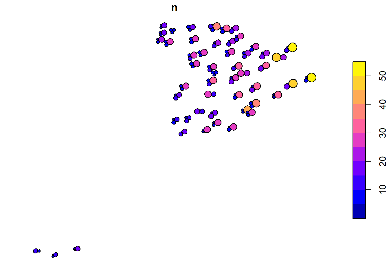
Map construction
Legend
In the map construction the first thing we should make is the legend. We must create it manually by defining different magnitudes, in our case, number of days. Then we estimate the area and construct the circles artificially on a constant line of latitude at +45º, position where we will insert the legend as if it were a spatial object.
# areas
legend_area <- c(5, 10, 15, 30, 50) * (surf * k / 100) / limit_mx

# circles construction at artificial coordinates
legend_dat <- tibble(area = legend_area, r = sqrt(area/pi),
                   n = c(5, 10, 15, 30, 50), y = 45) |>
            arrange(area) |>
            mutate(x = -4:0) |>
            st_as_sf(coords = c("x", "y"), crs = st_crs(esp)) |>
            st_transform(25830) %>% # switch to the other pipe for nested placehodler .
            st_buffer(dist = .$r) |>
             st_cast("LINESTRING")

plot(legend_dat["n"])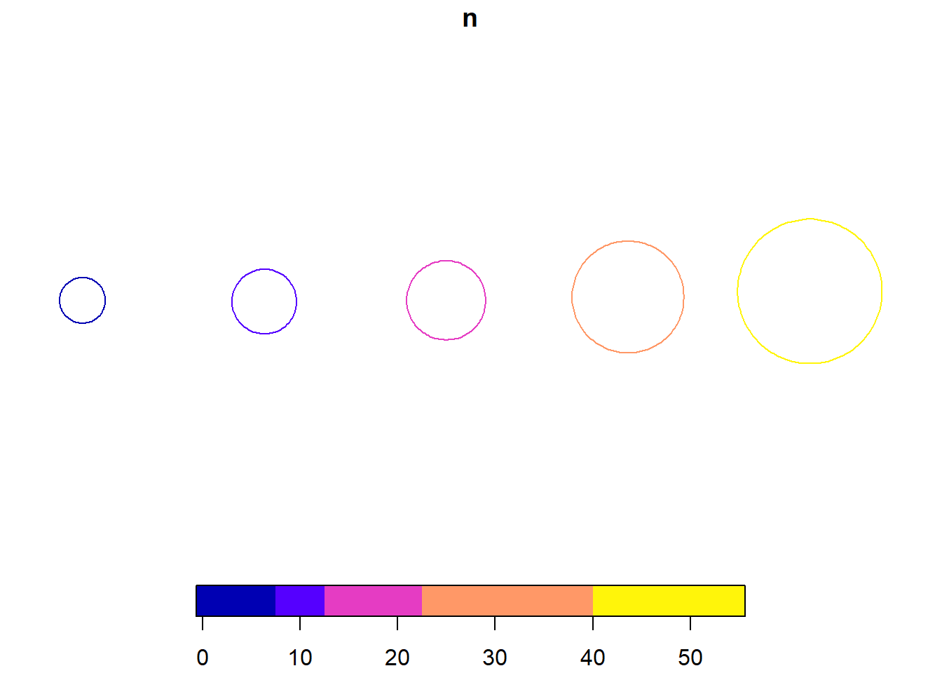
A more compact alternative legend would be collapsed circles, which can be achieved by changing the position with respect to the largest circle. However, the legend in this case remains small because of the maximum size of the circles. An increase in the size of the circles would lead to overlapping between different locations.
# circles construction at artificial coordinates
legend_dat2 <- tibble(area = legend_area, r = sqrt(area/pi),
                   n = c(5, 10, 15, 30, 50), y = 45) |>
            arrange(area) |>
            mutate(x = -3) |>
            st_as_sf(coords = c("x", "y"), crs = st_crs(esp)) |>
                st_transform(25830)

legend_dat2 <- cbind(legend_dat2, st_coordinates(legend_dat2)) |>
                 mutate(Y = Y-(max(r)-r)) |>
                  st_drop_geometry() |>
                      st_as_sf(coords = c("X", "Y"), crs = 25830) %>%
                  st_buffer(dist = .$r) |>
                  st_cast("LINESTRING")

plot(legend_dat2["n"])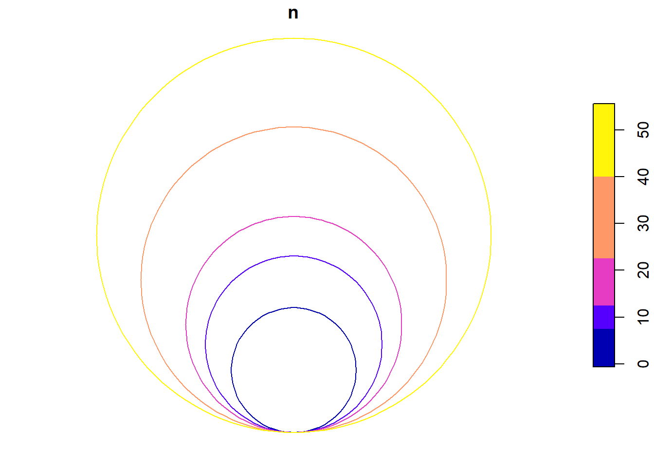
Canary Islands
The first map would correspond to the Canary Islands, which is added to the main map in a false position. In ggplot2 any simple feature geometry can be added with geom_sf() by adjusting the own characteristics of points, lines or polygons.
can <- ggplot() +
  geom_sf(data = esp, fill = "grey20", colour = NA) +
  geom_sf(data = esp_inline, colour = "white",
          size = .2) +
  geom_sf(data = circle_dodge,
          aes(fill = levels),
          alpha = .8,
          colour = "white",
          stroke = .025,
          show.legend = FALSE) +
  scale_fill_manual(values = c("#feb24c", "#fc4e2a", "#b10026"),
                    guide = "none") +
  theme_void(base_family = "Lato") +
  labs(title = "Canary Islands") +
  theme(plot.background = element_rect(fill = NA, colour = "black"),
        plot.title = element_text(vjust = 8, margin = margin(b = 4, l = 3))) +
  coord_sf(xlim = bx[c(1,3)],
           ylim = bx[c(2,4)],
           crs = 4326)

can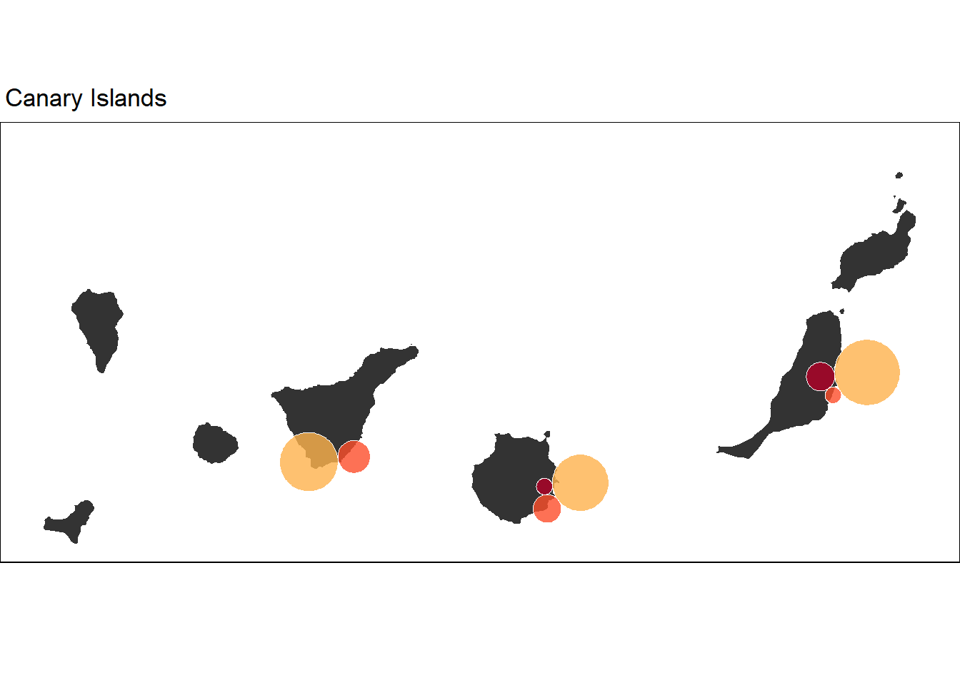
Spain
To build the main map, we will exclude the locations of the Canary Islands. In addition, we need to have the new position of the Canary Islands in the southwest of the Peninsula. The main difference with the previous map is that we include the legend as a spatial object using the geom_textsf() function. It is a variant of the {geomtextpath} package to add a label following any geometry path. Unfortunately, not all possible arguments of the package (issue) can be used. It is important that the geometry must be of type LINESTRING. Therefore, we changed the type with st_cast() above. Finally, we insert the map of the Canary Islands using the annotation_custom() function. More details about inserted maps can be found here.
# filter out locations in mainland Spain and the Balearic Islands
esp_data <- st_filter(circle_dodge, st_transform(esp_pen, 25830))

# coordinates of the Canary Islands moved position
can_ext <- c(xmin = -11.74, ymin = 34.92, xmax = -7, ymax = 36.70)
class(can_ext) <- "bbox"

can_bbx <- st_as_sfc(can_ext) |>
  st_set_crs(4326) |>
  st_transform(25830) |>
  st_bbox()

# part one adding the base map limits
g1 <- ggplot() +
        geom_sf(data = eu, colour = "grey80", size = .3) +
        geom_sf(data = esp_pen, fill = "grey20", colour = NA) +
        geom_sf(data = esp_inline, colour = "white",
                size = .2)

# add the grouped proportional circles
g2 <- g1 + geom_sf(data = esp_data,
          aes(fill = levels),
          alpha = .7,
          colour = "white",
          stroke = .02,
          show.legend = "point") +
     geom_textsf(data = legend_dat,  # legend in artifical position lat 45º.
              aes(label = n),
              size = 2.5, hjust = .21) +
     annotation_custom(ggplotGrob(can), # Canary Islands
                      xmin = can_bbx[1], xmax = can_bbx[3],
                      ymin = can_bbx[2], ymax = can_bbx[4])

# final adjustments of legend and style
g2 + scale_fill_manual(values = c("#feb24c", "#fc4e2a", "#b10026")) +
     guides(fill = guide_legend(override.aes = list(size = 5, shape = 21))) +
      labs(fill = "severity", title = "HEAT WAVE DAYS 2022") +
      theme_void() +
      theme(legend.position = "top",
            legend.text.position = "bottom",
            legend.title.position = "top",
            legend.text = element_text(vjust = 3),
            legend.title = element_text(hjust = .5,
                                        size = 14),
            legend.margin = margin(t = 5),
            plot.title = element_text(hjust = .5,
                                      face = "bold",
                                      size = 25,
                                      margin = margin(b = 5, t = 20)),
            plot.margin = margin(15, 2, 2, 5)) +
      coord_sf(crs = 25830, clip = "off")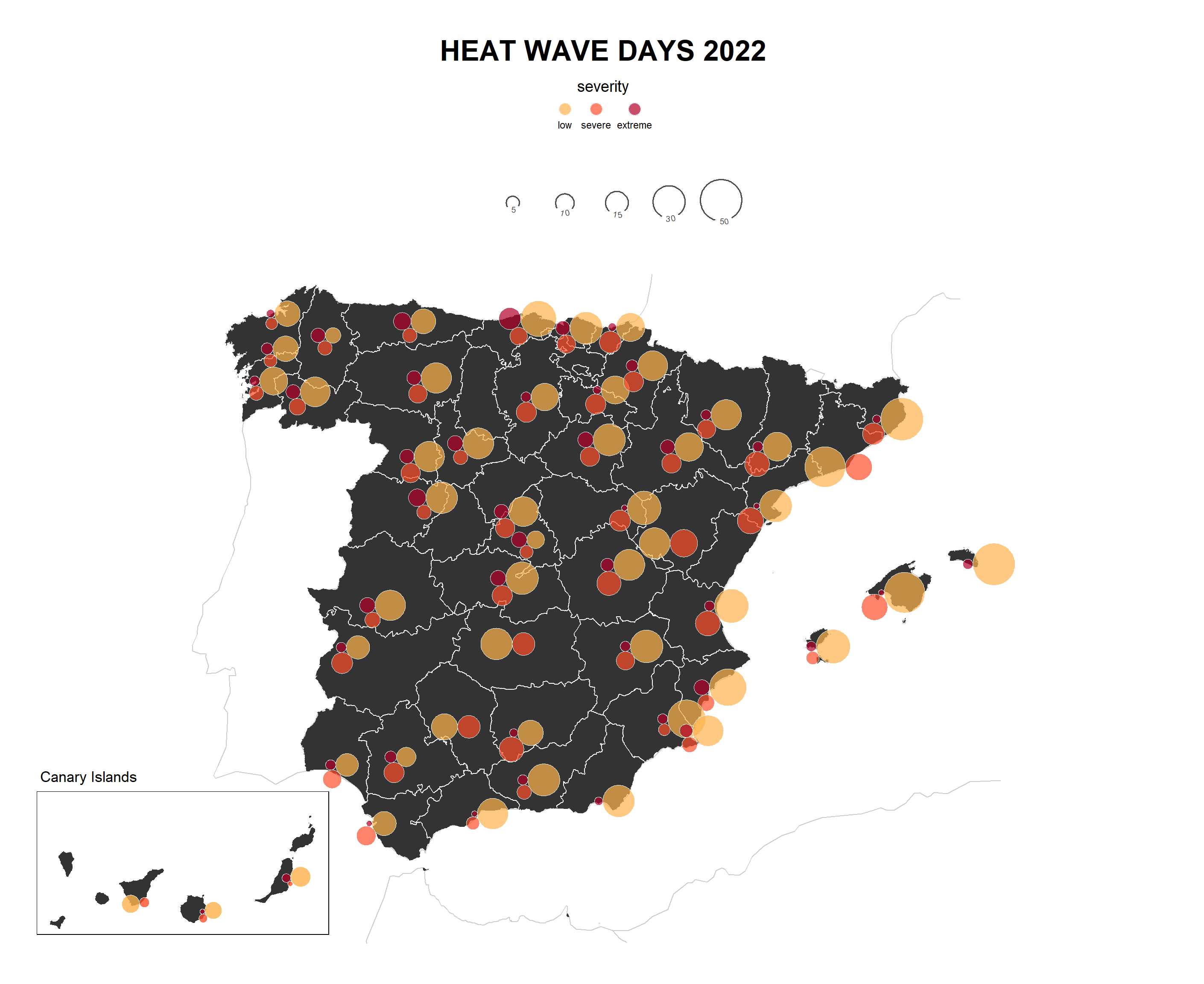
Interactive version
As an extra of this post, I show you how we can make the same map interactively using the {ggiraph} package. We only change the geom_sf() function for its geom_sf_interactive() variant. In addition, we indicate what we want to show in the tooltip. We put the result in an object to finish building the interactive version using giraph() and including style settings.
if(!require("ggiraph")) install.packages("ggiraph")
library(ggiraph) # versión interactiva de geometrias ggplot

g1 <- ggplot() +
        geom_sf(data = eu, colour = "grey80", size = .3) +
        geom_sf(data = esp_pen, fill = "grey20", colour = NA) +
        geom_sf(data = esp_inline, colour = "white",
                size = .2)

g2 <- g1 +  geom_sf_interactive(data = esp_data,
                    aes(fill = levels, tooltip = n), # interactive version with tooltip
                        alpha = .7,
                        colour = "white",
                        stroke = .02,
                        show.legend = "point") +
           geom_textsf(data = legend_dat,
                       aes(label = n),
                       size = 2.5, hjust = .21)

g_final <- g2 + scale_fill_manual(values = c("#feb24c", "#fc4e2a", "#b10026")) +
     guides(fill = guide_legend(override.aes = list(size = 5, shape = 21))) +
         labs(fill = "severity", title = "HEAT WAVE DAYS 2022") +
      theme_void() +
      theme(legend.position = "top",
            legend.text.position = "bottom",
            legend.title.position = "top",
            legend.text = element_text(vjust = 3),
            legend.title = element_text(hjust = .5,
                                        size = 14),
            legend.margin = margin(t = 5),
            plot.title = element_text(hjust = .5,
                                      face = "bold",
                                      size = 25,
                                      margin = margin(b = 5, t = 20)),
            plot.margin = margin(15, 2, 2, 5)) +
      coord_sf(crs = 25830, clip = "off")

# creation of the final interactive map
girafe(ggobj = g_final,
       width_svg = 14.69,
       height_svg = 12,
  options = list(
    opts_tooltip(opacity = 0.7, use_fill = T)
))![]()