Climate animation of maximum temperatures

In the field of data visualization, the animation of spatial data in its temporal dimension can show fascinating changes and patterns. As a result of one of the last publications in the social networks that I have made, I was asked to make a post about how I created it. Well, here we go to start with an example of data from mainland Spain. You can find more animations in the graphics section of my blog.
I couldn't resist to make another animation. Smoothed daily maximum temperature throughout the year in Europe. #rstats #ggplot2 #dataviz #climate pic.twitter.com/ZC9L0vh3vR
— Dr. Dominic Royé (@dr_xeo) May 9, 2020
Packages
In this post we will use the following packages:
| Packages | Description |
|---|---|
| tidyverse | Collection of packages (visualization, manipulation): ggplot2, dplyr, purrr, etc. |
| rnaturalearth | Vector maps of the world ‘Natural Earth’ |
| lubridate | Easy manipulation of dates and times |
| sf | Simple Feature: import, export and manipulate vector data |
| raster | Import, export and manipulate raster |
| ggthemes | Themes for ggplot2 |
| gifski | Create gifs |
| showtext | Use fonts more easily in R graphs |
| sysfonts | Load fonts in R |
# install the packages if necessary
if(!require("tidyverse")) install.packages("tidyverse")
if(!require("rnaturalearth")) install.packages("rnaturalearth")
if(!require("lubridate")) install.packages("lubridate")
if(!require("sf")) install.packages("sf")
if(!require("ggthemes")) install.packages("ggthemes")
if(!require("gifski")) install.packages("gifski")
if(!require("raster")) install.packages("raster")
if(!require("sysfonts")) install.packages("sysfonts")
if(!require("showtext")) install.packages("showtext")

# packages
library(raster)
library(tidyverse)
library(lubridate)
library(ggthemes)
library(sf)
library(rnaturalearth)
library(extrafont)
library(showtext)
library(RColorBrewer)
library(gifski)
For those with less experience with tidyverse, I recommend the short introduction on this blog (post).
Preparation
Data
First, we need to download the STEAD dataset of the maximum temperature (tmax_pen.nc) in netCDF format from the CSIC repository here (the size of the data is 2 GB). It is a set of data with a spatial resolution of 5 km and includes daily maximum temperatures from 1901 to 2014. In climatology and meteorology, a widely used format is that of netCDF databases, which allow to obtain a multidimensional structure and to exchange data independently of the usued operating system. It is a space-time format with a regular or irregular grid. The multidimensional structure in the form of arrays or cubes can handle not only spatio-temporal data but also multivariate ones. In our dataset we will have an array of three dimensions: longitude, latitude and time of the maximum temperature.

Royé 2015. Sémata: Ciencias Sociais e Humanidades 27:11-37
Import the dataset
The netCDF format with .nc extension can be imported via two main packages: 1) ncdf4 and 2) raster. Actually, the raster package use the first package to import the netCDF datasets. In this post we will use the raster package since it is somewhat easier, with some very useful and more universal functions for all types of raster format. The main import functions are: raster(), stack() and brick(). The first function only allows you to import a single layer, instead, the last two functions are used for multidimensional data. In our dataset we only have one variable, therefore it would not be necessary to use the varname argument.
# import netCDF data
tmx <- brick("tmax_pen.nc", varname = "tx")
## Loading required namespace: ncdf4tmx # metadata## class : RasterBrick
## dimensions : 190, 230, 43700, 41638 (nrow, ncol, ncell, nlayers)
## resolution : 0.0585, 0.045 (x, y)
## extent : -9.701833, 3.753167, 35.64247, 44.19247 (xmin, xmax, ymin, ymax)
## crs : +proj=longlat +datum=WGS84 +no_defs
## source : tmax_pen.nc
## names : X1, X2, X3, X4, X5, X6, X7, X8, X9, X10, X11, X12, X13, X14, X15, ...
## Time (days since 1901-01-01): 1, 41638 (min, max)
## varname : txThe RasterBrick object details show you all the necessary metadata: the resolution, the dimensions or the type of projection, or the name of the variable. It also tells us that it only points to the data source and has not imported them into the memory, which makes it easier to work with large datasets.
To access any layer we use [[ ]] with the corresponding index. So we can easily plot any day of the 41,638 days we have.
# map any day
plot(tmx[[200]], col = rev(heat.colors(7)))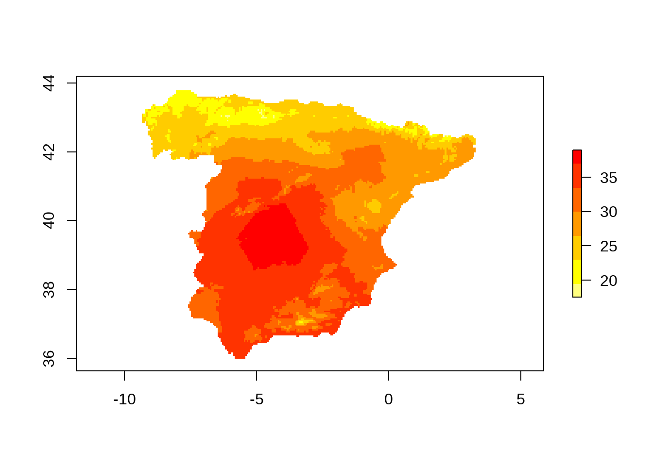
Calculate the average temperature
In this step the objective is to calculate the average maximum temperature for each day of the year. Therefore, the first thing we do is to create a vector, indicating the day of the year for the entire time series. In the raster package we have the stackApply() function that allows us to apply another function on groups of layers, or rather, indexes. Since our dataset is large, we include this function in parallelization functions.
For the parallelization we start and end always with the beginClusterr() and endCluster(). In the first function we must indicate the number of cores we want to use. In this case, I use 4 of 7 possible cores, however, the number must be changed according to the characteristics of each CPU, the general rule is n-1. So the clusterR function execute a function in parallel with multiple cores. The first argument corresponds to the raster object, the second to the used function, and as list argument we pass the arguments of the stackApply() function: the indexes that create the groups and the function used for each of the groups. Adding the argument progress = 'text' shows a progress bar of the calculation process.
# convert the dates between 1901 and 2014 to days of the year
time_days <- yday(seq(as_date("1901-01-01"), as_date("2014-12-31"), "day"))

# calculate the average
beginCluster(4)
tmx_mean <- clusterR(tmx, stackApply, args = list(indices = time_days, fun = mean))
endCluster()
Smooth the temperature variability
Before we start to smooth the time series of our RasterBrick, an example of why we do it. We extract a pixel from our dataset at coordinates -1º of longitude and 40º of latitude using the extract() function. Since the function with the same name appears in several packages, we must change to the form package_name::function_name. The result is a matrix with a single row corresponding to the pixel and 366 columns of the days of the year. The next step is to create a data.frame with a dummy date and the extracted maximum temperature.
# extract a pixel
point_ts <- raster::extract(tmx_mean, matrix(c(-1, 40), nrow = 1))
dim(point_ts) # dimensions
## [1] 1 366# create a data.frame
df <- data.frame(date = seq(as_date("2000-01-01"), as_date("2000-12-31"), "day"),
tmx = point_ts[1,])
# visualize the maximum temperature
ggplot(df,
aes(date, tmx)) +
geom_line() +
scale_x_date(date_breaks = "month", date_labels = "%b") +
scale_y_continuous(breaks = seq(5, 28, 2)) +
labs(y = "maximum temperature", x = "", colour = "") +
theme_minimal()
The graph clearly shows the still existing variability, which would cause an animation to fluctuate quite a bit. Therefore, we create a smoothing function based on a local polynomial regression fit (LOESS), more details can be found in the help of the loess() function. The most important argument is span, which determines the degree of smoothing, the smaller the value the less smooth the curve will be. I found the best result showed a value of 0.5.
daily_smooth <- function(x, span = 0.5){

  if(all(is.na(x))){

    return(x)

  } else {

  df <- data.frame(yd = 1:366, ta = x)
  m <- loess(ta ~ yd, span = span, data = df)
  est <- predict(m, 1:366)

  return(est)

  }
}
We apply our new smoothing function to the extracted time series and make some changes to be able to visualize the difference between the original and smoothed data.
# smooth the temperature
df <- mutate(df, tmx_smoothed = daily_smooth(tmx)) %>%
          pivot_longer(2:3, names_to = "var", values_to = "temp")

# visualize the difference
ggplot(df,
       aes(date, temp,
           colour = var)) +
     geom_line() +
  scale_x_date(date_breaks = "month", date_labels = "%b") +
  scale_y_continuous(breaks = seq(5, 28, 2)) +
  scale_colour_manual(values = c("#f4a582", "#b2182b")) +
  labs(y = "maximum temperature", x = "", colour =  "") +
  theme_minimal()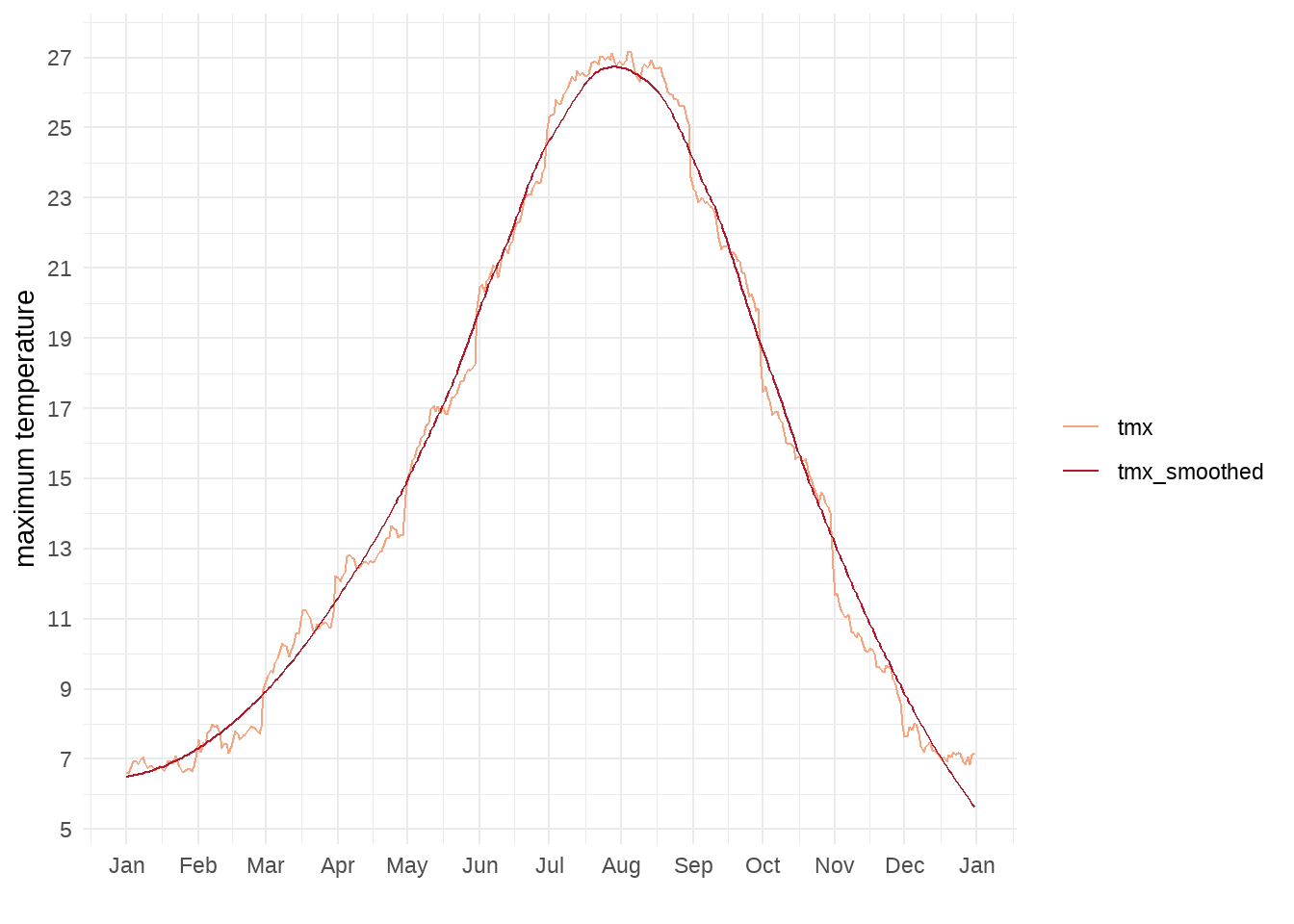
As we see in the graph, the smoothed curve follows the original curve very well. In the next step we apply our function to the RasterBrick with the calc() function. The function returns as many layers as those returned by the function used for each of the time series.
# smooth the RasterBrick
tmx_smooth <- calc(tmx_mean, fun = daily_smooth)
Visualization
Preparation
To visualize the maximum temperatures throughout the year, first, we convert the RasterBrick to a data.frame, including longitude and latitude, but removing all time series without values (NA).
# convert to data.frame
tmx_mat <- as.data.frame(tmx_smooth, xy = TRUE, na.rm = TRUE)

# rename the columns
tmx_mat <- set_names(tmx_mat, c("lon", "lat", str_c("D", 1:366)))
str(tmx_mat[, 1:10])
## 'data.frame': 20676 obs. of 10 variables:
## $ lon: num -8.03 -7.98 -7.92 -7.86 -7.8 ...
## $ lat: num 43.8 43.8 43.8 43.8 43.8 ...
## $ D1 : num 10.5 10.3 10 10.9 11.5 ...
## $ D2 : num 10.5 10.3 10.1 10.9 11.5 ...
## $ D3 : num 10.5 10.3 10.1 10.9 11.5 ...
## $ D4 : num 10.6 10.4 10.1 10.9 11.5 ...
## $ D5 : num 10.6 10.4 10.1 11 11.6 ...
## $ D6 : num 10.6 10.4 10.1 11 11.6 ...
## $ D7 : num 10.6 10.4 10.2 11 11.6 ...
## $ D8 : num 10.6 10.4 10.2 11 11.6 ...Second, we import the administrative boundaries with the ne_countries() function from the rnaturalearth package, limiting the extension to the region of the Iberian Peninsula, southern France and northern Africa.
# import global boundaries
map <- ne_countries(scale = 10, returnclass = "sf") %>% st_cast("MULTILINESTRING")

# limit the extension
map <- st_crop(map, xmin = -10, xmax = 5, ymin = 35, ymax = 44)
## Warning: attribute variables are assumed to be spatially constant throughout all
## geometries# map of boundaries
plot(map)## Warning: plotting the first 9 out of 94 attributes; use max.plot = 94 to plot
## all
Third, we create a vector with the day of the year as labels in order to include them later in the animation. In addition, we define the break points for the maximum temperature, adapted to the distribution of our data, to obtain a categorization with a total of 20 classes.
Fourth, we apply the cut() function with the breaks to all the columns with temperature data of each day of the year.
# labels of day of the year
lab <- as_date(0:365, "2000-01-01") %>% format("%d %B")

# breaks for the temperature data
ct <- c(-5, 0, 4, 6, 8, 10, 12, 14, 16, 18, 20, 22, 24, 26, 28, 30, 32, 34, 40, 45)

# categorized data with fixed breaks
tmx_mat_cat <- mutate_at(tmx_mat, 3:368, cut, breaks = ct)
Fifth, we download the Montserrat font and define the colors corresponding to the created classes.
# download font
font_add_google("Montserrat", "Montserrat")

# use of showtext with 300 DPI
showtext_opts(dpi = 300)
showtext_auto()

# define the color ramp
col_spec <- colorRampPalette(rev(brewer.pal(11, "Spectral")))
Static map
In this first plot we make a map of May 29 (day 150). I am not going to explain all the details of the construction with ggplot2, however, it is important to note that I use the aes_string() function instead of aes() to use the column names in string format. With the geom_raster() function we add the gridded temperature data as the first layer of the graph and with geom_sf() the boundaries in sf class. Finally, the guide_colorsteps() function allows you to create a nice legend based on the classes created by the cut() function.
ggplot(tmx_mat_cat) +
         geom_raster(aes_string("lon", "lat", fill = "D150")) +
         geom_sf(data = map,
                 colour = "grey50", size = 0.2) +
  coord_sf(expand = FALSE) +
  scale_fill_manual(values = col_spec(20), drop = FALSE) +
  guides(fill = guide_colorsteps(barwidth = 30,
                                 barheight = 0.5,
                                 title.position = "right",
                                 title.vjust = .1)) +
   theme_void() +
   theme(legend.position = "top",
      legend.justification = 1,
      plot.caption = element_text(family = "Montserrat",
                                  margin = margin(b = 5, t = 10, unit = "pt")),
      plot.title = element_text(family = "Montserrat",
                                size = 16, face = "bold",
                                margin = margin(b = 2, t = 5, unit = "pt")),
     legend.text = element_text(family = "Montserrat"),
     plot.subtitle = element_text(family = "Montserrat",
                                  size = 13,
                                  margin = margin(b = 10, t = 5, unit = "pt"))) +
   labs(title = "Average maximum temperature during the year in Spain",
     subtitle = lab[150],
     caption = "Reference period 1901-2014. Data: STEAD",
     fill = "ºC")
Animation of the whole year
The final animation consists of creating a gif from all the images of 366 days, in principle, the gganimate package could be used, but in my experience it is slower, since it requires a data.frame in long format. In this example a long table would have more than seven million rows. So what we do here is to use a loop over the columns and join all the created images with the gifski package that also uses gganimate for rendering.
Before looping we create a vector with the time steps or names of the columns, and another vector with the name of the images, including the name of the folder. In order to obtain a list of images ordered by their number, we must maintain three figures, filling the positions on the left with zeros.
time_step <- str_c("D", 1:366)

files <- str_c("./ta_anima/D", str_pad(1:366, 3, "left", "0"), ".png")
Lastly, we include the above plot construction in a for loop.
for(i in 1:366){

 ggplot(tmx_mat_cat) +
         geom_raster(aes_string("lon", "lat", fill = time_step[i])) +
         geom_sf(data = map,
                 colour = "grey50", size = 0.2) +
  coord_sf(expand = FALSE) +
  scale_fill_manual(values = col_spec(20), drop = FALSE) +
  guides(fill = guide_colorsteps(barwidth = 30,
                                 barheight = 0.5,
                                 title.position = "right",
                                 title.vjust = .1)) +
   theme_void() +
   theme(legend.position = "top",
      legend.justification = 1,
      plot.caption = element_text(family = "Montserrat",
                                  margin = margin(b = 5, t = 10, unit = "pt")),
      plot.title = element_text(family = "Montserrat",
                                size = 16, face = "bold",
                                margin = margin(b = 2, t = 5, unit = "pt")),
     legend.text = element_text(family = "Montserrat"),
     plot.subtitle = element_text(family = "Montserrat",
                                  size = 13,
                                  margin = margin(b = 10, t = 5, unit = "pt"))) +
   labs(title = "Average maximum temperature during the year in Spain",
     subtitle = lab[i],
     caption = "Reference period 1901-2014. Data: STEAD",
     fill = "ºC")

  ggsave(files[i], width = 8.28, height = 7.33, type = "cairo")

}
After having created images for each day of the year, we only have to create the gif.
gifski(files, "tmx_spain.gif", width = 800, height = 700, loop = FALSE, delay = 0.05)
![]()